Drawing the Figure in Movement

Figure in Movement

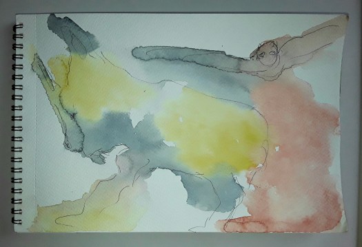
Good morning everyone. This is another page in the art journaling course Sketchbook Revival by Karen Abend. And I really enjoyed this tutorial by Barbara Baumann all about the gestural method of sketching the figure. That is, concentrating on the figure in movement. Basically, you sketch out the direction of the limbs, the torso and the head. Most importantly you study the angles of the tilt of the head and torso. Also, the direction of the outstretched arms and legs. Obviously the photo reference for this sketch was ideal – the pose was quite extreme. Also, unbelievably high off the ground!

The Proportions of the Body

After that, the really hard part! To be honest, I already knew about planning out the shoulders, elbows and knees as circles. But in the lesson I learned about the shapes of the upper and lower torso. And that is new to me and extremely helpful. In addition, I appreciated the tips about creating a background of dynamic lines and splodges. In my opinion is does suggest the figure in movement, which is not easy.

Ballerina in Flight

As you may know if you follow my blog, I have attended life drawing classes for a few years now. And I’ll finish up with one of my favourite drawings, done from life when we were also thinking about Matisse. In fact, a lot of his later cut- out work is very gestural. So, here’s my tribute to that great French artist. Actually, you could see more of my paintings of the figure in People, a section of my gallery.

Model in Blue

Two Paintings from my Archive

The Road to the Mountains

Good morning everyone. As part of my grand tidy-up, I looked through this old sketchbook to check for any empty pages. And I found these two paintings from my archive. Admittedly, I am not very organised, I have several sketchbooks on the go at once, with no particular plan! But the time comes when I must fill them up and put them away. Actually, I found that I had filled up this book and, in the process, I discovered these two mixed media pieces.

Over the Bay

Although I love them both, I must confess that I can barely remember doing them! Except, I do recall that it was round about the time that I was busy experimenting with coloured pencils. Perhaps six or seven years ago, possibly. And, me being me, I also couldn’t refrain from using watercolour pencil, oil pastel and marker pen too! Anyway, I am certain that I drew them from postcards or magazine cut-outs, not plein air. However, when I examine them now, I can clearly see bits that remind me of places I love to draw from life. For example, Over the Bay is definitely influenced by the hours I have spent looking and sketching at the Bay at Scarbrough on the north east coast of Yorkshire.

As for the mountain one, I can see in it the vegetation that grows on the moorland around where I live. So, I do remember happy days when I look at these paintings from my archive after all! You could see some more evocative landscape paintings in my gallery here.

Two Birds in One Week

Royal Tern, inspired by Shari Blaukopf

Good morning everyone. This is a cheeky little bird I painted from a good tutorial by Shari Blaukopf in the Karen Abend ‘Sketchbook Revival ‘ series. And it was great fun, so that makes two birds in one week! (More of that later). Anyway, the reference photo and the tuition were excellent, and I learnt how to make the feathers look more realistic. Hopefully the bird then doesn’t seem too ‘solid’, a pitfall I have fallen into sometimes. In the case of this watercolour sketch, things were a bit more tricky because of the windy weather. Perhaps you can see that the wing and breast feathers are ruffled up into a fluffy ball by the breeze. In fact, the bit I am most proud of is the effect of the reflections of the legs. Unfortunately, I know nothing about the bird itself, how about you?

The Reflections

Two Birds in One Week

A Mallard

Well, I did say two birds, so this is the other one! Actually, there were plenty of birds to spot on our quiet walk around the Dearne Valley Country Park . But this one very obligingly stood still for me to do a quick pencil sketch, as we sat in front of the small lake. By the way, we did go to see the bluebell display in the ancient woodland. And, Nature didn’t disappoint – I really love this time of year. ( You could see more of my bird sketches in this post here . )

Discover Shapes in Paint Doodles

Flight

Good morning everyone. This is a fun exercise I did in the tutorial by Charlie O’Shields in the Sketchbook Revival course by Karen Abend. And I tried to discover shapes in simple paint doodles, following the method described by Charlie. To be honest, it was easy to follow. First, scribble some marks with clean water on your brush, on watercolour paper. Most importantly, leave some blank spaces and don’t cover all the sheet. Next, quickly drop in some very wet paint and allow it to mingle. As you can probably tell, my paint blotches did start to dry a little. So I added more and ‘grew’ a few cauliflowers! But, it didn’t matter and just added to the design. When it’s thoroughly dry, take a bit of time to study it. Then pick out the outlines of anything you see in pen or fine marker. Just let your imagination go wild!

Actually, I did enjoy this playing with paint and ideas, and I felt it was a good antidote to worrying about all the sad things I hear on the news. So, if you want a little chuckle, have a look at the other daft doodles I produced.

In the Depths of the Sea
Night Time
Puppy

Finally, here’s an example of a ten minute doodle (done last night). And this shows my usual method of doodling abstracts and how to discover shapes. In fact, I draw or paint colours and shapes at random and then develop it from there. In this case, first, chop courgettes for the dinner, then sit down with marker pens, oil pastels, a biro and tiny notebook!

Courgettes for Dinner

Trying New Approaches with Flowers

The Tulips on the Table

Good morning everyone. Lately I have been working my way through the excellent tutorials in the free Sketchbook Revival course with Karen Abend. Actually, it’s finished now, but I will certainly look out for it next year. In particular I have enjoyed the sections on painting flowers. And I have been trying the new approaches introduced by several of the tutors. For example, using a looser painting technique when observing flowers from life.

Bouquet with Roses

To be honest, this was quite difficult to do, as I have always observed each flower carefully before. And then attempted to paint all details on each bloom separately. But here I observed closely first. And then tried to paint the different elements and shapes into flowers that were pleasing in the overall design. Anyway, this was my first attempt and things can only get better! In fact, this exercise ‘Mixed Media Floral Study’ was led by Joy Ting.

Trying New Approaches in Design

Flower Design 1

This was another exercise that I enjoyed, a simple flower design by Viddhi Saschit. And the tutor broke it down into easy steps, so that I created this reasonably attractive design. Afterwards I felt that I could try to paint another little pattern by myself.

Finally, I just wanted to show you The Tulips on the Table, which I did quite spontaneously in watercolour and oil pastel. And, I like to think that I put into practice some of the new ideas that I learnt. You could see more of my flower pictures here.

Look at my Group Projects

Amazonian Waterlily Pond

Good morning everyone. I did a bit of tidying yesterday, because we could hardly move in the living room and hall. And all because I brought my stuff back from two exhibitions and failed to store it away! Anyway, to be honest, the space was already packed to capacity with sketchbooks and loose pieces on paper. And while I was shuffling paper, I came across some work I had done for my group projects. Somehow, this kind of painting ranks a bit lower in my mind than my own self lead creations. Actually, I shouldn’t really think that way, so, to make up for it, here they are in the spotlight.

Gouache Paintings of Brazil – one of our Group Projects

As you can see, the title says it all and this was for our Beginner Gouache group on the Mewe platform. In fact, we are a friendly bunch. None of us claim to be experts and we help each other along the way. And help is very welcome when you’re trying to make progress with this challenging medium!

The House for a Folding Book of a Street Project

While I was tidying up, I found these paintings I created for some of my group projects. I love the variety of inspiration they give me for my art work.
A House for the Street

This is my second offering for the street and it is also in gouache paint. (Because it is so easy to take out and use at our art society meetings). If you would like to see my first house, look at this post here and keep watching this channel for an update on the book. In construction as we speak!

An Unfinished Project

Reading

Finally, here’s a finished painting for one of the group projects I intended to enter, but never quite completed. To be honest, I didn’t think it was quite good enough, the brief for the open call was very restricting. And the image I ended up with didn’t inspire me. So, this princess stayed at home! And now I’ll get back to finding space to store all of these paintings I’ve “tidied”!

Paintings Inspired by Online Tuition

Dominant

Good morning everyone. When I have ten minutes or so spare, I will always do a quick sketch.( In between finishing off online tuition projects!). On this occasion I quickly sketched a doodle in watercolour, limiting myself to three colours. When it was dry, I doodled some more, adding some black calligraphic marks on top. Later on, I strengthened these marks with one of my new soft oil pastels. Of course, you may have realised that this was influenced by the Painting with Yvette course that I am following. Otherwise I never would have tried putting this kind of a motif on top of a background.

Butterfly Wings

Now this idea is something else that I picked up from online tuition. But unfortunately I can’t remember the details, I look at so much lovely stuff online. Anyway, I did in fact take the idea and do my own version. And the method is to take images of motifs you have chosen to use as inspiration for an abstract composition. Then incorporate them into a design, without doing a realistic painting of them. For example, for this piece I sourced good photos of butterflies and flowers. Then I isolated the shapes and colours that pleased me and tried to make a harmonious pattern. Actually, it does fry your brain a bit in the process! But, I’m still keen to do more. See more intuitive abstracts in this post here

Butterfly Wings – a detail

New Pale Abstracts to See

Something Blue

Good morning everyone. As you may know if you read my blog, I am at present working my way through an excellent online course by Yvette. And I am learning how to create pale abstracts, which are completely different in style to my usual paintings. In fact, in this module we are taking the approach of first creating a background of patterns in dark paint, then applying layer after layer of colours and shapes. Have a look at this image below first to see the process half way through. Then see how it ends up in the next image.

Misty Landscape, half way through
Misty Landscape, finished

In fact, this was my first attempt and I relied quite heavily on the tutor’s version. But this next one I really consider to be my own. And I think it looks well presented in this virtual room. However, my paintings are small and the blown up images really demonstrate how effective large scale abstract paintings can be. See what you think.

Something Blue

Well, I’ve been very busy with these new pale abstracts – they do take some time to do for smallish paintings. Actually, I’m half way through the third one just now, but you’ll have to wait a bit longer to see that one! Meanwhile, here’s a link to a post showing some of my ‘old style’ abstract compositions.

My Abstracts in Virtual Rooms

Blue and Gold 2

Good morning everyone. I thought I would show you the progress I have been making in my abstracts. Actually, these examples are from a lesson I was following last week . And, Yvette’s course is excellent, so I am plodding my way steadily through all the modules.

Blue and Gold 1, inspired by Yvette St Amant

To be honest, this is a copy of the tutor’s work. Because that was the only way I could really understand the techniques used. Consequently, I don’t consider the painting as one of my own. However, it was a good learning experience – I experimented with using a palette knife properly. In addition, this was the first time I applied gold paint with some confidence. But I then needed to produce my own compositions, using the style and colours suggested. As a result, first I painted the one in the virtual room you see above. And this is more close up so that you can hopefully see the textures.

Blue and Gold 2

After that, I just had to try out the method in another painting, this time introducing some soft green. And downplaying the gold. What do you think?

Blue and Gold 3

By the way, it’s quite tricky to photo the gold paint and make it shine. Often it appears to be brown. Maybe I’m using the wrong acrylic paint! Anyway, that’s my little catch up on my abstracts and there will be more to follow. If you missed this post here, an earlier report of my new learning, you may wish to have a look.