‘Floating’ Shapes – an Abstract Composition

A colourful abstract composition in crimson, blue and ochre. Shapes floating through the air or swimming.
Floating

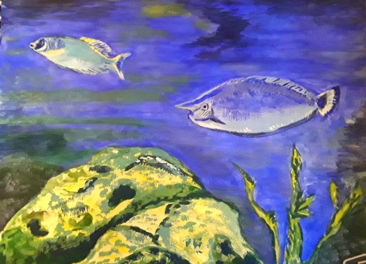
Good morning everyone. Today I’d like to show you an acrylic abstract painting ‘Floating’ that I have just finished. Of course, now that it’s complete, you can see all kinds of motifs. But, I assure you, these were not planned or anything. And, as I painted, after the first impetuous, free stage, I began to see shapes developing. So I just helped them a little bit to emerge more clearly. Actually, what is weird is that I rotate the painting round when I do this. And still something recognisable appears! Incidentally, this is quite a contrast to how I created this post here all about floating objects. As you can perhaps see, this was carefully constructed and planned.

What do You see, Floating in Air or Swimming?

A closeup of the strange face floating up close to the viewer.
Floating – a closeup
Floating – another close up

Obviously, there is a face appearing and that’s because I sort of painted the lips while the painting was upside down. (From the way it was started, I mean). And then I just went with the flow! And, in order to explain away the fishy detail in the second closeup, I can’t! But those fish just seem to find their way into lots of my abstracts.

However, I do remember reading somewhere that the human brain is programmed into finding patterns in what we see. Particularly, we perceive faces and people very readily everywhere. Perhaps it’s some kind of survival instinct. Personally, I do enjoy looking at abstract and semi abstract work more when I can see shapes and make a story. As if this way of seeing allows me into the picture more easily. Instead of feeling that I am blocked from entering.

Straight Lines and Curved Shapes

Finally, I’d like to explore the concept of design a little. Or, to put it more simply, how to decide where to put things, and how to arrange them on the page. Naturally, this element of composition is important for figurative and abstract paintings alike. In my own case, I think about the design about half way through the process in abstract work. To be honest, I have been watching stuff recently on line about various types of composition design. And I read all about the combination of straight lines and curved shapes.

In fact, I realised that I use this style of design quite a lot in my abstracts (see here ) And, I didn’t really know I was doing it! But, I shall carry on because you can create strong compositions with a lot of movement this way. However, now I can think about trying out some more design schemes as well. Well, it’s all part of the lifelong learning plan!

Painting Outside in the Spring Sunshine

A quick watercolour sketch of a charming scene, looking over the reservoir to the cafe on the hill.
Thrybergh Country Park

Good morning everyone. As you may know, I absolutely love painting outside and the glorious fine, sunny weather is perfect for me. So, yesterday I went to Thrybergh Country Park to meet up with some art buddies. And we could paint all morning in complete comfort. That is, no shivering with cold or battling with strong winds to keep hold of paper and so on.

The Colours of Spring when Painting Outside

To be honest, it was the colours of the scene which inspired me most. Because at this time of year, as the trees begin to come into leaf, some of the greens are soft and yellowy and even the more vibrant ones are still easy on the eye. However, in this part of the landscape that I chose, most of the trees are bare and stark. Actually, that gave quite a dramatic effect against the calm, lazy surface of the water, gently reflecting the sky and trees. Of course, I did use artistic licence and I left out all the waterbirds. Also, all the walkers. But, for today it was the sight of nature gradually progressing through Springtime that interested me. Incidentally, this man made lake is available for free swimming on two evening sessions during the week. Maybe one day!

A close up of the scene at Thrybergh, which I did when I was painting outside.  The cafe at the top of the hill, and the path leading down to the water's edge.
The Cafe at Thrybergh Res

Naturally, there was plenty of time for coffee and chat. Plus, most importantly of all, scrumptious cake! And we talked about pochade boxes and outdoor easels. Then how to prepare wooden panels with gesso. And we discussed the different methods of capturing a scene like this using realistic versus impressionistic styles. So, all my artistic batteries were charged up. And I really am looking forward to a lovely summer season of sketch trips with like minded people. Sheer bliss! Have a look at this post here to read all about another sketchcrawl on a hot summer’s day last year.

A Canal Scene in Acrylic

An acrylic painting in muted colours of a canal scene. A lock and a lock keepers cottage.
A Canal Scene

Hello everyone. This is my canal scene, a recent acrylic painting that I did while following an online tutorial by Care Visions. Actually, the teaching by the tutor John Skelcher was very good. And, it was free, so that can’t be bad! To be honest, my natural style of painting is not usually this realistic. On the contrary, I like to take a more loose approach and slightly impressionistic. Really, I do find it very difficult to describe my own painting style. But, on this occasion I found it very helpful to follow the instructions and paint like John! Or, at least, to paint in the style he adopted for the tutorial.

A Canal Scene in a Muted Palette

As you can see, the colours we used are quite toned down – the buildings in cream and brown. And a pale, unobtrusive sky, with brownish green trees in the background. However, I did manage to indulge my love of colour by painting some vivid greens in the foreground. But, I must admit that this restricted palette is very effective. Perhaps it’s a better representation of the actual canal scene than my usual highly saturated, intense colour choices would give? Hmm, something to think about here! Just have a look here at this post of some really monochrome paintings.

I’d like to to pass on to you a good tip that John gave us. Just don’t worry about not having an in depth knowledge of a subject when you’re painting. If you can reproduce the shapes of the elements of a scene fairly accurately, that will suffice. Hopefully the viewers eye will recognise the objects because of the surroundings. And, that’s just as well, for I know nothing at all about lockgates! Apologies to any canal experts!

More Houses by the Water

A bright, vivid painting of the view across the lake to some houses  on the hill.
Cusworth Hall

Finally, by way of contrast, this is an acrylic painting that I did a couple of years ago. And, as you can see, here I gave full rein to my enthusiasm for bright colours. In my defence, I must point out that it was a beautiful, sunny winter’s day. And the water and the grass sang out to me. So, no muting in sight! Admittedly, I can now see several bits that I could improve. Maybe I will! Because, I am quite fond of this painting. Perhaps a before and after version would show me the modest improvements I am making. So, the practice and studying are all worthwhile. And that’s good to know!

Sketching at an Old Colliery Site

A plein air sketch in watercolour.  Pit headgear at an old colliery site surrounded by trees in Spring blossom.
Barnsley Main – an Old Colliery Site

Good morning everyone. One fine day last week we went to have a look at this old colliery site – Barnsley Main in the Dearne Valley. Actually, we knew that the community group who look after it have worked really hard on it. So we had a wander round and I sat down at the picnic table and bench to sketch the view. To be honest, I had planned to do this some time ago. But, I suppose I was always too busy going somewhere else to sketch. And I needed a Lockdown to make me concentrate on the interesting locations that are just on my doorstep.

The Barnsley Main Pithead with Winding Gear at the Old Colliery Site

A close up of the winding gear at the old colliery site
The Pithead

Of course, I did this fairly quick watercolour sketch (40 minutes) on the spot with a little tidy up at home. To be honest, I didn’t want to use pen and ink. But I thought I must add a bit more definition. So I strengthened the black lines with more washes at home. This and the large building that houses it is the only remaining evidence of the pit above ground. However, it is quite unique and now it’s a Grade Two listed building. And it is well known as the mine that blew up in the Oaks mining disaster in 1866. Tragically, the fire from the explosion took the lives of over 380 miners and rescuers. If you want to know more, here is the link to the website.

The Oaks Mining Disaster Memorial

A quick pen sketch of Graham Ibberson's memorial statue.
The Mining Disaster Memorial

This is my quick, rough and ready plein air sketch of the statue by our local sculptor Graham Ibbeson. In fact, it is a very impressive and moving installation right in the town centre. Naturally, you can’t see all the details here. But, the sculptor has made up the hair and shawl of the miner’s wife out of pieces of coal. In effect, she waits at the colliery for news of her husband. And you can just make out the body of a miner, trapped underground beneath her feet.

Anyway, after I had finished my sketch, we walked down the path the miners used to get to work, over the canal and on to the fishing ponds. Really, it was a lovely sight, swans gliding on the water and families enjoying the sunshine and the outdoors together. A perfect day!

Have a look at this post here to see another recent plein air watercolour sketch done in my local surroundings, this time a lovely country park.

A photo of the memorial statue in town centre.
Graham’s Statue

Fishes Swimming in the Deep Blue Sea

Swimming Free

Good morning everyone. This is my latest little gouache painting for our Beginner Gouache group on Mewe. And I painted these fishes swimming among the coral for our March theme – Aquatic Life. If you want to see the other gouache of a lily pond that I did for the theme, see here . To be honest, I try to paint at least two each month for this group. Because it’s a great group and well worth supporting – the work we produce is really rather good. Also, I find that joining in like this is helpful for my development as an artist. For example, I think that the themes are quite inspiring (this month’s challenge is ‘Garden’). In addition, I am still quite a beginner with this medium and I do benefit from the practice of a new skill.

Fishes Swimming among the Coral

A gouche painting of tropical fish, swimming through the coral.
Photo reference by David Cloade in Unsplash

Actually, I did rather enjoy painting the faces of the fish, much to my surprise. And, I did somehow manage to put a little bit of character into them! But, we are, happily, allowed some artistic license in this group!

Swimming Free – a closeup

I was quite pleased with this effort, 11 by 8 inches in my sketchbook. However, I was disappointed that I didn’t work out how to add more vibrant flashes of green on the fish. Perhaps I need a better quality of paints, or more variety of colours. Or, maybe just more practice! I do find gouache more tricky to work with than acrylic. But I just love the chalky quality and the colours.

Fishes in a Tropical Sea

A watercolour background of sea and coral with collaged fish in black and white.
Under the sea

Finally, here’s another sketchbook page of collage fishes swimming in a watercolour sea, with some imagined coral! Well, I created this last year in deep Lockdown, hoping to cheer myself up. And, it still makes me smile! If you want to read more about this post, see here .

Stories of Strong Women in Acrylic

A symbolic view of a woman with wings confined in a cage, ready to break free. one of my strong women.
The Caged Bird

Good morning everyone. Today I’d like to delve into the archive and show you some of my paintings of strong women. These are from a couple of years ago. And as I looked at loads of images, I realised that I quite often work on themes, sometimes without really being aware. Actually, I did this painting ‘The Caged Bird’ for an exhibition ‘Vote 100 – A Century of Change?’ . And it was to mark the one hundredth anniversary of votes for women in the UK. Honestly, I was so thrilled to be included in the show (and even more thrilled when it sold!) But then the curator asked me for more images of women for another exhibition. And I realized how many paintings and drawings I had on this theme of strong, brave women.

Purple, Green and White – the Colours of Strong Women

Incidentally, in this painting I wanted to show how the suffragettes broke free of a confined, stifling life. And then they led the way for all women to claim equal rights. Of course, this was just the beginning of female emancipation here in Britain. As you might have noticed, she is reaching out to a flower painted in the suffragette colours of purple, green and white. Just before she breaks out of the cage. Apologies for the poor image – I have since thrown that camera away!

The Problems of Modern Life

A mixed media painting of a modern woman struggling with the problems in her life - one of my strong women.
Woman Fighting Chaos

Finally, this is a mixed media piece, including oil pastel, chalk pastel, acrylic and ink. And I created it in response to a callout for a show about women facing the problems of modern life. In fact, I did the basic drawing at Life Drawing class – back in the day! Oh how far away that time seems now! Anyway, I found this model very inspiring and I made a few works based on her really dynamic poses. But, perhaps I’ll do another post with those pieces, plus more paintings of strong women. (You could look at Gallery – People for a sneak preview) Watch this space!

Purple and Yellow in Abstract Art

An abstract in purple and yellow,  full of dynamic shapes and intriguing details
Sunny Mood

Good morning everyone. This is an acrylic abstract I did recently, featuring a restricted palette of purple and yellow. With a bit of yellow ochre thrown in, plus black and white, if I remember correctly. So, today I’d like to think about how colours influence mood in abstract painting. Incidentally, I never set out trying to choose a mood or atmosphere at the start. Because I paint instinctively and ‘choose ‘ the colours and shapes unconsciously. And then analyse what I have created afterwards!

Probably I turned to making art on this occasion to help me with a low mood. As I’ve mentioned before, for me (and lots of other people, no doubt) art is therapy. It soothes my soul and very rarely do I not feel better after an hour or two of painting.

Shades of Purple and Yellow

Sunny Mood

Actually, I bought some artist’s grade cadmium yellow a few weeks ago, and I’ve never looked back! Because the pigment is nice and strong, unlike the student grade acrylic I had been using. So, I can use it freely and make a really definite mark. And, to me, the colour signifies sunshine and happy days – the vitality of life. In fact, I use it to create a cheerful atmosphere as in ‘Sunshiny Day’ here .

And, what about the purple? Well, I spent some time thinking about why I so love the colour. Usually straight out of the tube, which is rare for me. Anyway, I’ve come to the realisation that I use it to conjure up the richness and intricate variety of life. And how we should take advantage of that and live life to the full. (Apologies for the darker colours here – I found it almost impossible to get a good reproduction of the true colour purple in this painting and in the next one!)

Family

Another purple and yellow abstract,  bold, vibrant colours,  carefully  balanced with a cheerful atmosphere.
Family

Finally, I’d like to feature another purple and yellow abstract which shows my great love for these two beautiful colours. Now, if I hadn’t given it a title revealing my thoughts on the subject, what would you sense about the mood of this painting? Hopefully something cheering and heartwarming. But, who knows?

All my original artworks are available at reasonable prices. I sell them unframed and if you are interested, you could go to the Contact Me page and send me an email.

Signs of Spring in the Country Park

Signs of Spring – Blackthorn Blossom

Good morning everyone. This is a little watercolour sketch I did at Worsbrough Country Park last week. Finally we had one or two milder days and we really enjoyed the fresh air. Actually, I have been searching out the first signs of Spring this year. Because the winter did seem to me to be very long. And, it was such a pleasure to spot the first hazel catkins and the willow blossoms.

In fact I realised this year something I had never noticed before. That is, that the pussy willow flowers gradually open right out into larger flowers and the pollen escapes. Then the tree seems to be a vivid greeny yellow from a distance. As you approach, it gradually changes to be a dusty yellow colour. Just remember, the stark, dark brown branches are bare of leaves at this time. Honestly, this is the first time I ever noticed this!

One of the first signs of Spring on the willow trees

The Willow Blossom

But, just to return to the blackthorn tree and its creamy white blossom. What a welcome sight at the end of winter! Again, the branches have no leaves, and the trees are covered in clouds of creamy white blossom.

The Blackthorn Blossom

In order to sketch this view en plein air, I sat on a very comfy bench near one of the pedestrian entrances of the park. And we were looking down towards the paths that lead around the shore of the reservoir in both directions. Honestly, it was such a treat to sit in the sunshine, and see happy walkers, children and dogs relaxing. In fact, even the watercolour sketch went well until I tried to indicate the showy, white flowers! Eventually, I had to leave that part of the painting until I got home. Then, out came the little tube of white gouache paint , but even then, I couldn’t quite do the tree justice! But, it was worth it to do my first outdoor sketch of the season.

Last year’s Spring flowers

A colourful acrylic painting - semi-abstract composition of pansies and polyanthus in the rain  - the first signs of Spring in the garden.
Flowers in the Rain

Incidentally, this is an acrylic painting I did last year, in Spring to cheer myself up. It’s a semi abstracted view of pansies and polyanthus flowers in my garden, listening in the Spring showers. Well, it did cheer me up, but I’m so glad that I could go out this year. And appreciate the trees and their impressive blossoms in the Great Outdoors! If you want to read my post about last year’s exhibition ‘Springtime in Yorkshire ‘ see here .