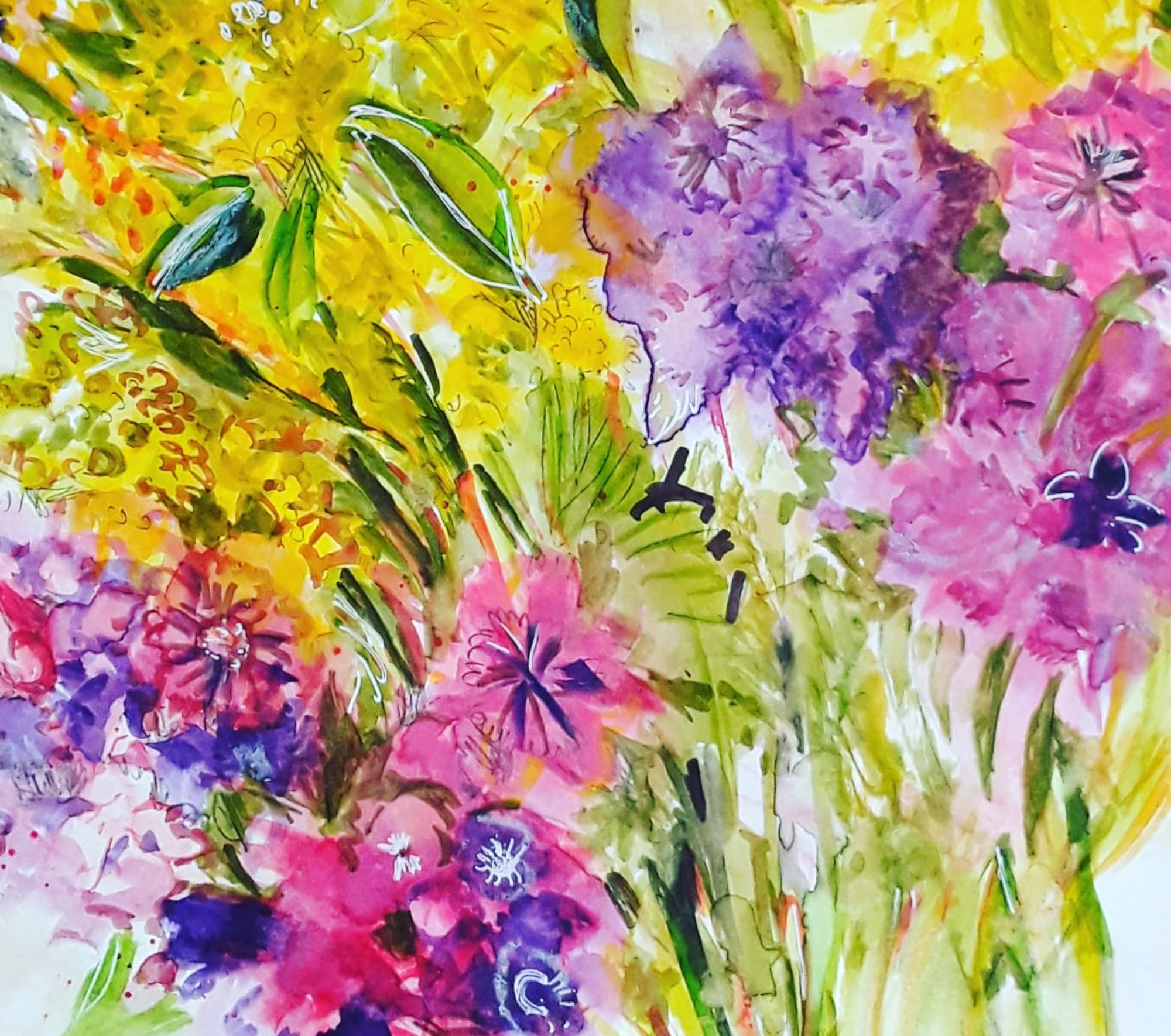
Red for Happiness
Good morning everyone. I finished this bright red abstract in acrylic a couple of weeks ago. And I propped it up on the dining table so that I could look at it everyday. Actually, after all that looking, I’m still not sure what it’s all about! Of course, I am aware that it doesn’t have to be ‘about’ anything. However, I do usually have some ideas on the main themes and so on. Strangely, I don’t in this case, but I do remember that I felt calmer and more settled as I was painting. So, maybe that was its significance, to me anyway.
The Bright Red Abstract, an Earlier Version

As I might have mentioned before, I do now always rotate the painting round as I’m doing an abstract. To be honest, I used to think that this practice was pointless. But I completely changed my mind and now, I find that it helps me to work on each ‘quarter’ individually. Perhaps you noticed that in the image above, I have turned the painting around. It was in fact the first version of the painting in watercolour. Actually, it’s an important part of the development of the piece. Also, it can help to prevent the artist from inadvertently making it into a realistic scene. For example, a landscape or a group of people. But, for me, the most intriguing thing is how the picture does suggest realistic images. Even after all I do to prevent it! And they always come as a complete surprise!
What Can You See ?

Of course, I haven’t talked much about what the viewer sees in this bright, red abstract, which is, of course, very important. So, that’s the deal – I paint it and you make of it what you like! And I hope it makes you feel calmer and more settled too!
As I remember, I wrote a post about red in abstract paintings. Mainly artjournal pages – earlier in lockdown last year. See here.
Incidentally, all my original artwork is for sale at reasonable prices. This one , acrylic on paper and 16 by 12 inches (unframed) is £60 plus shipping. And if you want to treat yourself, go to the Contact Me page and send me an email.


At first I thought the red looked like a book, but the more I looked at it, I saw a red dish towel laying in front of stacked dishes.
Thank you for that. I’m glad that you responded to my work in your own unique way!
When I look at your painting, I see balance, harmony and beauty. I appreciate this lovely painting without necessarily turning the shapes and colors and design into functional objects. Nicely done.
Thank you so much! It’s so interesting, everyone perceives abstract painting in a different way, I think.
It is absolutely beautiful. It glows. Truly a happy feeling painting. I just love the combination of red and green you’ve used here. I think it’s very hard to find a pairing of shades of each color where it doesn’t look lurid but you did this- it looks warm and summery to me!
Thank you so much, Claudia. I’m glad you can feel the happy energy I tried to put into the piece. I wasn’t very sure about the red and green, but I really wanted to do it, so I did!
I can relate, some paintings take a minute to figure out! I have to admit, it is the greens that are more dominate to me in this painting! It is very nice, I like it!😍💚
Thank you so much, Tiffany. Perhaps I’ll not worry too much about ‘the meaning’ next time! In my mind, it is red, but you’re right- the green won’t be ignored!
There’s a face in there, looking sideways
Thank you, Amy. You’re the only person to see that face, besides me! It wasn’t intentional, but once you spot it, you can’t get it out of your mind!