This Week’s Mindful Scribbly Doodles

Feeling Angry

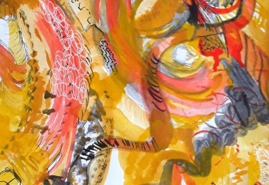
Good morning everyone. Well, just to keep you up to date, some of my website problems have been solved, thank goodness! But, things are not fully restored , so, I apologise if I can’t really follow, like and comment properly yet. Anyway, as you may be able to tell, I was feeling slightly fed up when I did one of my little scribbly doodles. Actually, it was done in about three snatched five minute sections. And, I did feel a bit better afterwards. First I scribbled away with ink, then I added watercolour and oil pastel. And then I couldn’t resist some final calligraphic marks on top.

The Tunnel

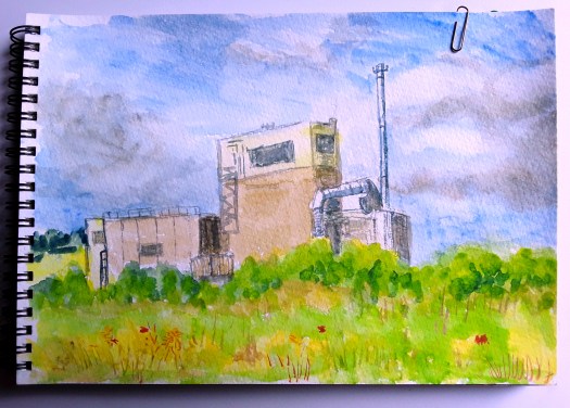
Finally, this one was completed even quicker as I was experimenting with charcoal, graphite and wash pencils. In fact, I found them as I was tidying up my studio, don’t ask! Well, I don’t think this one needs much explanation. However, you could read it as either coming out of a dark place or going onto one! Let’s see what happens next! Thank goodness I can do these scribbly doodles and feel the benefit. There are more mindful paintings on this post here.

Painting with Pen and Wash

First Snow

Good morning everyone. I painted this scene in a pen and wash workshop last week. And we invited Gary, one of our favourite tutors, to art society to work with us. Also to show us some pen and watercolour techniques. Actually, it was a very enjoyable evening and everyone was pleased with their own version of this snow scene. After a quick pencil sketch of the main shapes, we tried to ink the lines in, using sketchy, gestural marks. Then, for me, the difficult part, using two colours only and being very restrained with the paint brush! Honestly, I was dying to pile on more and more texture and detail. But, I’m really glad I followed Gary’s instructions.

And, I took away from this workshop the idea that sometimes less is definitely more! However, as our tutor explained, this is really a basic scene – you can add more style to your liking. Preferably after learning the method. By the way, we also added more pen marks at this point if we felt we needed them. Plus a few dabs of white gouache for snow on the trees.

The Cottage

Perhaps you might be interested to see this pen and wash painting I did a few years ago. In fact, I did this after another of Gary’s workshops on pen and wash, I felt so inspired that I painted a few more. Incidentally, in this picture, the pencil sketch and watercolour come first. Then detail is added later in pen, again trying not to overdo things. And, here is a post showing how I use this technique when I’m painting in plein air.

Two More Small Landscape Paintings

Small Barn

Good morning everyone. At last I managed to buy a decent watercolour pad! And I just had to paint two small landscape paintings to try it out! To be honest, I discarded the first two attempts. Because I had literally forgotten how to use the paint on good paper Actually, the old paper was not cheap at all, and strangely poor quality for this paint. Anyway, after my little practice, I really enjoyed creating pools of colour, without any effort. The paper is delicious!

By the way, this is another of those small barns in the Yorkshire Dales . And this time I have painted a backdrop of sunlit hills. Perhaps you can smell the sweet scent of warm grass, like me.

Poppy Time

Well, here is the second of my small landscape paintings, 9 by 7 ins. And, I’m definitely still experimenting here. But, I’m quite satisfied with it, especially because I put the composition together from a couple of photos and my imagination. And it’s a lovely colourful scene. However, I think I could improve on the scale and size of the flowers. In fact, that’s something I find tricky in a made-up scene like this. Of course, the only way to improve is practice, and, luckily, I enjoy painting so much, so, no problem!

By the way, all my artwork is for sale at reasonable prices. So, go to the Contact Me page, if you see anything you like. And send me an email.

My Sketchbooks Over the Years

The View from Patterdale Hotel

Good morning everyone. In my last post I showed you little watercolour sketches from my sketchbooks. And it got me thinking about how many sketchbooks I had filled over the years. Quite a few! So, I looked through one or two and found plenty that I drew whilst on holiday in the Lake District.

For example, this one is a view over to the hills from the garden at the front of Patterdale Hotel, near Ullswater. Actually, we used to stay here once or twice a year, pre pandemic. Unfortunately, I still don’t feel brave enough yet to stay in an hotel. Anyway, the views all around are spectacular. And it was very tempting to sketch while sitting on the patio garden with a cold drink after a walk in the hills.

Place Fell, from Patterdale Hotel

Well, this is another view from the garden, the majestic Place Fell, which rises to 2154 ft. How could you not draw this? If you’re wondering where the lake is, this view shows the end of the lake, which is rather boggy and soon floods after heavy rain. These two paintings from my sketchbooks are about three or four years old, but, look what else I found! A very similar sort of landscape from 2003. And, I have some even older! How time flies when you’re enjoying yourself!

A Lake View

Please note, these are all plein air sketches done in 25 to 40 minutes, to capture the moment and they are 7 by 5 inches. If you wish to see a white cottage view in the Lakes, all neatly finished off, see here.

Plein Air Painting in Cumbria

Inside Brougham Hall

Good morning everyone. We are just back from a short break in the Lake District, UK, where I managed to fit in some plein air painting. And we visited this lovely place here- Brougham Hall, pronounced ‘Broom’, apparently! Of course, quite a lot of it is in ruins now. But a friends group (volunteers) look after it, on a small budget. And they are managing a long project of restoration. However, it is quite charming and I sat in the courtyard cafe here and did this watercolour sketch. Actually, you can see the well which provided the castle’s water, the structure in bottom right.

In fact, on that day we were spoilt for choice. Because we spent the rest of the day visiting another castle and not one but two henges. In case you didn’t know they are the remains of earthwork structures constructed in Prehistoric times. Unfortunately, no one seems to know exactly why they were created. So, it’s all guesswork from there onwards. But, you can let your imagination run wild about what they were used for. Most likely meeting places of some kind, but, very evocative and intriguing!

A Plein Air Sketch of a Lake

Haweswater

Next day it was misty and drizzly, so we drove to Haweswater, a lake up on the high ground. And they enlarged this stretch of water to provide a reservoir of drinking water for Manchester. However, to achieve this they flooded the land near the top of the lake. And in my sketch here I painted the remains of the village buildings that are usually under water. After all, this has been the driest summer for years in the UK. Anyway, I tried very hard to show the misty atmosphere. But I stopped sketching when I realised I subtly changed the lighting , as it naturally happened! Obviously one of the challenges of plein air painting.

Just to remind you, I painted both of these watercolour sketches on the spot and quite quickly. So, by no means are they finished paintings. If you want to see studio painted landscapes, have a look at the landscapes in my Gallery here.

Industry and Yorkshire, New Exhibition

A Long Shift

Good morning everyone. If you follow this blog, perhaps you may know that I belong to a great group called Northern Fringe Gallery. And we have just decided to start a new group project ‘Industry and Yorkshire’. However, that’s only a working title, this project will probably evolve as it goes along.

Anyway, this is my version of a very evocative black and white photo from a book all about coal mining. Actually, my dad was a miner all his life, but not quite in conditions like these, thank goodness! Well, I painted this a few years ago, but I think it fits our theme very well. So I had it framed all ready for our show. Now have a look at the second one.

The Wool market at the Piece Hall

In fact, I have posted this watercolour painting before, see here. However, I’ll just explain that this World Heritage site in Halifax was originally a place where weavers sold their cloth. And, because the cloth was called a ‘piece’ that’s the origin of the name, Piece Hall. So you can see why I chose this for the theme. By the way, weaving was a very big industry in West Yorkshire, just as we were all about coal mining here in South Yorkshire where I live. However, spinning and weaving were also practised here too and my auntie worked in a wool spinning mill.

Of course, I shall paint a couple more for the show too. But, more of that later!

Two Paintings from my Archive

The Road to the Mountains

Good morning everyone. As part of my grand tidy-up, I looked through this old sketchbook to check for any empty pages. And I found these two paintings from my archive. Admittedly, I am not very organised, I have several sketchbooks on the go at once, with no particular plan! But the time comes when I must fill them up and put them away. Actually, I found that I had filled up this book and, in the process, I discovered these two mixed media pieces.

Over the Bay

Although I love them both, I must confess that I can barely remember doing them! Except, I do recall that it was round about the time that I was busy experimenting with coloured pencils. Perhaps six or seven years ago, possibly. And, me being me, I also couldn’t refrain from using watercolour pencil, oil pastel and marker pen too! Anyway, I am certain that I drew them from postcards or magazine cut-outs, not plein air. However, when I examine them now, I can clearly see bits that remind me of places I love to draw from life. For example, Over the Bay is definitely influenced by the hours I have spent looking and sketching at the Bay at Scarbrough on the north east coast of Yorkshire.

As for the mountain one, I can see in it the vegetation that grows on the moorland around where I live. So, I do remember happy days when I look at these paintings from my archive after all! You could see some more evocative landscape paintings in my gallery here.

Mixed Media Art Therapy Sketch

Bright Life

Good morning everyone. This is just a catch up of the quick art therapy watercolour sketches that I do in my sketchbooks. Actually, this particular one took a little bit longer, as I wanted to add more after the initial twenty minutes or so. Well, I made some shapes and colours with my travel watercolour set, which I keep very handy in my living room. And, I usually do this when I have gone a whole day without arty activities! In fact, it never fails to lighten my mood, however I’m feeling. So, I consider it a very useful way to look after my mental wellbeing. Also, it is almost entirely stress free because I make no demands on myself as regards the quality of the work. And, it’s purely experimenting and, of course, you need not show it to anyone, unless you choose to. Perhaps you could try this easy art therapy sometime! And let me know how you get on.

Anyway, after the first pass, I put the little sketchbook on the table till next day. And looked at it a lot. Then I strengthened the yellow,green and brownish red with oil pastel. Next I doodled a bit with marker pen and white gel pen to bring it together. And, it definitely cheered me up!

Bright Life – a closeup

More Art Therapy

Finally, this is another another quick piece done to calm my nerves and I did this in one pass and left it as it was. If you want to see more, have a look at this post here.

Green Veg and Purple Flowers?

Quick Sketching in Walled Gardens

The Walled Garden at Calke Abbey

Good morning everyone. Well, we just got back yesterday from a few days holiday in Derbyshire, UK. And, it was very pleasant indeed! So, I thought I’d show you some of the quick sketching I did. Actually, I painted this yesterday afternoon when we were visiting Calke Abbey, an old stately home managed by the National Trust. To be honest, we chose not to go on the tour of the house, although I’m sure it was fascinating. But we are still being a bit cautious about indoor spaces at present. However, the estate, park and gardens were very impressive.

The Walled Garden – image by Wikimedia Commons.

Part of the Walled Garden

As you can see, this section of the walled garden was laid out with delightful flower beds and very healthy looking tree ferns. But for us the best bit was the vegetable garden and the fruit trees. And we admired a medlar tree in full fruit and the most bright orange pumpkins we have ever seen! Then we walked out through one of the lovely arched entrances. Fortunately, there was a very well placed bench for me to sit on, where I quite happily spent almost an hour watercolour sketching.

Quick Sketching in the Walled Garden

The Walled Garden at Calke Abbey

To tell you the truth, I had just read an article in my art magazine about keeping plein air sketches simple. So I immediately put it into practice and followed the three steps. Firstly, make an accurate sketch using light pencil strokes. Then draw over the lines in ink – without following them too carefully. After erasing most of the pencil marks, next add colour. And, it’s nowhere as easy as it sounds! Especially the add the colour bit – but it did simplify and speed up the process. Finally, back in the cottage, I took a good look at it and just added a few more darks. In fact, I think I needed that bit of time and distance to assess it. And add the finishing touches to my quick sketching.

See more of my plein air sketching here.

Lovely Old Buildings in Watercolour

At Pot House Hamlet

Good morning everyone. Today I’d like to show you two watercolour paintings of lovely old buildings that I have just finished. In fact, you may have seen the pencil sketches of animals in the petting zoo at Pot House Hamlet before. (See here). Because we visited this place in Silkstone village on a recent sketch trip. And we were surrounded by the beautiful old buildings of this little settlement – now a garden centre, cafe, shops and small zoo. Actually, the original buildings were 17th century glass making workshops and later pottery kilns. To be honest, I’m not sure about this building, but I chose it because of the unusual shapes. And, of course, the attractive colour of the stone. Then I added more washes of colour at home – the hot sunshine drove us into the shade!

Sketching at Elsecar Heritage Centre

Secondly, this is a sketch I more or less completed en plein air here at Elsecar, despite the steady drizzle. But, when I got home, I decided to heighten the colours, just for impact. Interestingly, one of my art buddies was painting his dramatically coloured acrylic paintings that morning. And I felt that I just had to have a go! I think I need a bit more practice, but I really enjoyed it.

Watercolour sketch of the Allotment

Picking Fruit

Good morning everyone. This is a little watercolour sketch I did yesterday, when I was sitting in the shade. Actually, it was a hot day and I thought that I had been in the sun long enough. And I had been quite busy. Firstly preparing a small patch of soil in the polytunnel and putting in some lettuce seedlings. Also sowing spinach and sorrel for salad leaves – we do love salad leaves! Next, I raked a small bed of ground outside to break the soil up a bit. Then I planted sixteen chicory plants and, hopefully, we shall have some winter salad next year. Meanwhile, my husband checked the courgette plants and did a bit more picking in the blackcurrant bushes . As you can see, I just managed to sketch him, examining the bush closely, not wanting to miss a berry. Unfortunately, it’s not been a good year for blackcurrant.

Man at Work, a Watercolour Sketch

Man at Work

Did you spot him? Incidentally, if you’re wondering about the ‘palm’ tree in my watercolour sketch, it’s actually a house plant we put there a few years ago and it really flourished! But I do confess to having used artistic license on the tomatoes in the green house. In effect, they are not red yet, rather pale yellowish green at the moment.

Ripe Tomatoes?

Well, this is good evidence, I think, that I really am very busy at the moment. Because everything in the veg garden is growing madly, and it takes up all my energy. If you want to see more paintings of us working in the allotment, see this post here. Anyway, some day soon I’ll put together a post with all the paintings of the garden that I have not yet shown you. Because it really does give me a lot of inspiration.

Rotherham Steel Henge in Watercolour

Rotherham Steel Henge

Good morning everyone. Well, the image above is a page out of my sketchbook and I completed it on Thursday. You see, I went to a very interesting location with Rotherhamroar artbuddies. The Steel Henge at Centenary Riverside nature park, Rotherham. Honestly, it seemed at first like a very odd choice for a sketchtrip, but nothing could be further from the truth! Admittedly, it was a tiny green space in the middle of an industrial area. However, it was a haven for wildlife, with a river and wildflower meadows.

The Wildflower Meadow

In addition, there is this very powerful art installation right in the centre of the space. Honestly, we all reacted strongly to it, and set to work straight away with pencil, oils, acrylic and, in my case, watercolour.

Watercolour Sketching at the Henge

The History Bit

Just to give a bit of background, before much industrial development, this beautiful spot was used as a swimming place. And, very likely a picnic area by the locals. Then came the building of steel works. Actually, as they were investigating this site to add to the existing plant, the workmen found the remains of a Roman fort here. Apparently, it was sited to guard the crossing place of the River Don. What a history! (You could take a peep here at my painting of the mighty Hadrian’s Wall, another Roman remain in Britain.)

The Steel Henge

Anyway, the artist created the sculpture by using these huge pieces of steel, discarded parts of machinery that were found nearby. As you can see, the artist had the inspired idea of shaping them into a Stonehenge like formation. And, it certainly does pull at your heartstrings when you stand among the monoliths of the Steel Henge.

After my first watercolour sketch, I looked out in a different direction to see a modern factory in the distance. Now, perhaps it’s just me, but these buildings often remind me of a castle. So, that’s what I thought of as I painted. All in all, a very thought-provoking place to simply sit and sketch.

The Factory at the Edge of the Reserve

This Week’s Paintings in Watercolour

An abstract for my journal

Good morning everyone. This is a quick catch up post showing you this week’s paintings. Honestly, I haven’t really had much time for creating art. Because things have opened up a bit, I seem to be busier. And, of course, there is lots to be done in my allotment vegetable garden. For example, yesterday I spent a few hours watering everything and weeding the parsnip and broadbean plants. And it was tough on my hands as the ground was hard after heavy rain, then baking hot June sunshine.But, I can’t complain – I absolutely love the fresh, organic fruit and veg we grow.

Our Allotment Garden

Well, you can tell how much I miss painting when I take my sketching kit up to the garden. And snatch a few moments between chores. As you see, I couldn’t resist trying to paint these beautiful flowers. For example, the huge red Oriental poppies are so spectacular and so short lived. Also, the blooms of the purple irises in the tiny barrel pond last just a few days. So I had to include them in this week’s paintings. Fortunately, the mauve foxglove does stick around longer and these self seeded flowers are dotted all around the garden. However, I think you can tell by the way I overworked the watercolour that I am really missing painting with acrylic! There are some more paintings of my allotment here, you may not have seen them.

My Art Journal Abstract – One of This Week’s Paintings

As you can see, I had to do a small, intuitive abstract in my art journal in watercolour. When I was longing to do one on canvas. But, I didn’t have the time, so I really enjoyed creating this smaller one. And, it calmed my nerves, so, a good result all round! Plus the bonus is an interesting experiment in shapes and colours that I could expand into a larger version. When I have time!

A Close up of my watercolour abstract

In fact, I can see lots of possibilities of interpretation here – for some reason it reminds me of cave painting. What do you see?

Fishes Swimming in the Deep Blue Sea

Swimming Free

Good morning everyone. This is my latest little gouache painting for our Beginner Gouache group on Mewe. And I painted these fishes swimming among the coral for our March theme – Aquatic Life. If you want to see the other gouache of a lily pond that I did for the theme, see here . To be honest, I try to paint at least two each month for this group. Because it’s a great group and well worth supporting – the work we produce is really rather good. Also, I find that joining in like this is helpful for my development as an artist. For example, I think that the themes are quite inspiring (this month’s challenge is ‘Garden’). In addition, I am still quite a beginner with this medium and I do benefit from the practice of a new skill.

Fishes Swimming among the Coral

A gouche painting of tropical fish, swimming through the coral.
Photo reference by David Cloade in Unsplash

Actually, I did rather enjoy painting the faces of the fish, much to my surprise. And, I did somehow manage to put a little bit of character into them! But, we are, happily, allowed some artistic license in this group!

Swimming Free – a closeup

I was quite pleased with this effort, 11 by 8 inches in my sketchbook. However, I was disappointed that I didn’t work out how to add more vibrant flashes of green on the fish. Perhaps I need a better quality of paints, or more variety of colours. Or, maybe just more practice! I do find gouache more tricky to work with than acrylic. But I just love the chalky quality and the colours.

Fishes in a Tropical Sea

A watercolour background of sea and coral with collaged fish in black and white.
Under the sea

Finally, here’s another sketchbook page of collage fishes swimming in a watercolour sea, with some imagined coral! Well, I created this last year in deep Lockdown, hoping to cheer myself up. And, it still makes me smile! If you want to read more about this post, see here .

A Bright Red Abstract Painting

A joyful. bright red abstract in acrylic.  With soft greens and earthy yellow ochre.

Red for Happiness

Good morning everyone. I finished this bright red abstract in acrylic a couple of weeks ago. And I propped it up on the dining table so that I could look at it everyday. Actually, after all that looking, I’m still not sure what it’s all about! Of course, I am aware that it doesn’t have to be ‘about’ anything. However, I do usually have some ideas on the main themes and so on. Strangely, I don’t in this case, but I do remember that I felt calmer and more settled as I was painting. So, maybe that was its significance, to me anyway.

The Bright Red Abstract, an Earlier Version

The bright red abstract as it progressed. This version is turned a quarter to the left.
The Bright Red Abstract, an earlier version

As I might have mentioned before, I do now always rotate the painting round as I’m doing an abstract. To be honest, I used to think that this practice was pointless. But I completely changed my mind and now, I find that it helps me to work on each ‘quarter’ individually. Perhaps you noticed that in the image above, I have turned the painting around. It was in fact the first version of the painting in watercolour. Actually, it’s an important part of the development of the piece. Also, it can help to prevent the artist from inadvertently making it into a realistic scene. For example, a landscape or a group of people. But, for me, the most intriguing thing is how the picture does suggest realistic images. Even after all I do to prevent it! And they always come as a complete surprise!

What Can You See ?

Red is Happiness

Of course, I haven’t talked much about what the viewer sees in this bright, red abstract, which is, of course, very important. So, that’s the deal – I paint it and you make of it what you like! And I hope it makes you feel calmer and more settled too!

As I remember, I wrote a post about red in abstract paintings. Mainly artjournal pages – earlier in lockdown last year. See here.

Incidentally, all my original artwork is for sale at reasonable prices. This one , acrylic on paper and 16 by 12 inches (unframed) is £60 plus shipping. And if you want to treat yourself, go to the Contact Me page and send me an email.

Plein air Sketching in Yorkshire

A watercolour sketch of a beautiful old church in glowing sandstone - plein air sketching in Woolley village.
St. Peter’s at Woolley Village

Good morning everyone. Last week we went for a stroll around a very picturesque village where I did some plein air sketching. Actually, the weather was extremely cold and we saw a fair few other people, wandering aimlessly around. Well, that’s the Lockdown effect for you, but I couldn’t think of a more pleasant place for an easy winter walk.

The Village Buildings – My Plein Air Sketching

In fact, Woolley village was full of beautiful old cottages, some farm buildings and a splendid Old Hall. But it was the church that caught my eye, and we found a bench under a huge yew tree. So, this is the view right in front of us- irresistible. Just look at the glowing sandstone, the backlit holly tree and the quirky shapes of the ancient gravestones.

St. Peter’s at Woolley Village

Plein Air Sketching at this Historic Site

In fact, there has been a church on this site since Norman times, that is since the eleven hundreds. Hopefully, you can just make out the odd shapes in the bottom left of the picture. Apparently, these are shrine like tomb boxes from the Norman period. In addition to this grade 2 listed graveyard, inside the church there is a William Morris stained glass window. Unfortunately, the church wasn’t open, so that will be for another day.

A photo of St Peter's and the tranquil churchyard that I painted while plein air sketching.
St. Peter’s at Woolley, South Yorkshire

If you follow my blog, you will be aware that I love to sketch en plein air or from life outdoors. For me, this means watercolour sketching and I do like to complete the sketch whilst outside. However, for this one, I managed to do about two layers and then my fingers froze! (40 minutes). Then I finished it off at home. But you can see the Quarry Park here and Wentworth Old Church here which were completed in situ. Oh well, let’s hope for some mild spring weather soon!

Mood and Atmosphere in Abstracts

An abstract composition,  reminiscent of a bright woodland scene with a paved path to follow. A cheerful mood and atmosphere.
Down the Path

Good morning everyone. Today I’d like to talk about mood and atmosphere in intuitive abstracts. And, just to make it clear, by intuitive this is what I mean. Simply that I sit down to paint a smallish abstract work in my art journal. And I don’t have any idea about the colours and shapes I’m going to use in the composition. In other words, I work instinctively. On the other hand, that doesn’t mean to say that I am not influenced by what’s happening around me.

Also, I notice more and more often that I unconsciously choose colours and sometimes styles that I may have admired in other artist’s work. In addition I seem to include the contrasts and textures I have noticed in the natural world. But, as I said before, none of this is by deliberate choice.

Bright Mood and Atmosphere

In this little piece, I think my mood must have been upbeat. Because I went for cheerful yellow and glimpses of blue sky. Then trees and branches popped up so I went with the idea of a forest, one of my favourite motifs, actually. And, although I worked on this by rotating it round all four ways, the path was clearly obvious. So I guess my subconscious was showing me that there’s still a way to go. So, keep on keeping on!

Cheerful Optimism and Determination?

A close up of the paved path, stretching out before you, leading to the sun.
The Path

Incidentally, I wonder if this scene makes you feel the same as me? Because, of course, I have only discussed the intention and reaction of the artist. However, the reaction of the viewer is also very important. And, with a loose work like this, you can interpret it any way you like. I am sometimes quite fascinated when I talk to friends who visit my exhibitions. Naturally, at the moment this is not possible in the real world. Thank goodness I can show you my work virtually like this! And, we have all got to walk down that path a little bit further yet. Stay well.

If you want to see more of my little intuitive abstracts in mixed media, see this post here.

Through the Trees – Recent Paintings

An acrylic painting of a warm, sunny landscape  - through the trees, looking at the light of the sun.
Afternoon Sunlight

Good morning everyone. Yesterday I was having a look at all the paintings I’ve been doing since last March. And I noticed that quite a few of them feature light shining through the trees. For example, the image above is my latest acrylic done for the online course I’m following. To tell you the truth, I just love the way the shadow of the trees is laid down in stripes with the rays of the late afternoon sun.

Cheerful

In contrast, I did this intuitive abstract in mixed media back in March. You see, that was when our first lockdown started in the UK and things seemed very black. Actually, this was one of the earliest pages I completed in the journal I started. And this really did help me through. As you can see, I instinctively went for a sunlit view through the trees. Nothing was planned beforehand and afterwards I even wrote the word ” cheerful ” on the page to reinforce the optimistic message.

A Light at the End of the Tunnel, Through the Trees

A story picture.  A figure looking towards the light at the end of the tunnel, through the trees in a primeval forest.
A Light at the End of the Tunnel

And finally, I painted this acrylic canvas last April, when we were beginning to talk hopefully about vaccines . In fact, this was the third piece in a triptych telling the story of how the world has been altered by the human race – see this post here if this interests you. ( I subsequently added another two chapters to this story to give it a really happy ending! ) And, I must say, I have continued to paint around the subject of light shining through trees right up until now. But, I’ll save that for another post!

All of my work is for sale. So, if you like what you see, have a look in my Gallery page, and then go to the Contact page to have a chat (by email).

Three Mixed Media Abstracts from my Artjournal

A jumble of sharp, jagged shapes and urgent flashes of red - a mixed media abstract showing anxiety and fear.
Jagged

Hello everyone. Today I’d like to show you the work I’ve been doing in my art journal – some mixed media abstracts. Actually, I’ve continued using this journal since last March, when our first period of lockdown began. To be honest, I turn to it when I’m feeling a bit overwhelmed. As you can see in the image above, this intuitive abstract composition is quite dark and sombre looking. And there are some spiky shapes and touches of bright red to indicate danger. In fact, I used gouache paint, pencil and pen, and afterwards I felt much better!

An Experimental Mixed Media Abstract

Yellow and Grey

This drawing above is a good example of how I also use my journal to experiment with different techniques. As you can see, here I limited myself to lemon yellow and medium grey. Because I wanted to create a piece for a challenge in the Triwing Challenge group on Mewe. In truth, I would probably never have chosen this combination of colours. But it was very enjoyable and concentrated my mind on texture. You see, I had seen some fab work online with really densely applied layers. And, I used pencil, marker and oil pastel in this drawing. There’s a great freedom in scribbling in a journal. In addition, it’s therapeutic too!

A compact,crowded abstract composition of organic shapes in orange, yellow and dark green.
New Style Abstract

Finally, I’m quite proud of this little painting/ drawing. For, I tried a new style – a composition centred in the middle of the paper, with lots of white paper showing. Obviously, it’s quite different to my usual style which completely covers the space on the paper. And I tried adding graphic marks on top of acrylic paint with markers and biros. Watch out, I feel a series of mixed media abstracts coming on!

If you would like to see more Lockdown Artjournal experiments, see here and here.

Christmas Robin in Oil Pastel

Christmas Robin

Well, folks, it’s nearly here, so I thought I’d show you my Christmas Robin. In fact, this is the second version and I did enter them both into the Birdmas challenge. It was hosted by the Triwing Art Challenge blog on Mewe. Honestly, the artwork presented for this fun project was first class – Draw Twelve Birds for Christmas. And, I’m pleased to report that I did complete it in twelve days, running from December 1st till Dec 12th!

Robin in a Thorn Tree

So, here’s version one- a quick watercolour sketch in my art journal. And the super photo I used for inspiration was taken in my daughter in law’s garden. You see, she loves feeding the birds who visit and some of them become quite tame, like this lovely little Christmas robin.

The Abstracted Version of my Christmas Robin.

A Christmas robin,  drawn in oil pastel,  perching on a little branch in a thorn tree.
The Christmas Robin

After I had drawn a couple of straight up, realistic birds, I suddenly felt that I wanted to branch out a bit and use my imagination a bit more. So I drew this alternative version, and really enjoyed myself! Because I chose oil pastels from the very first sketch , I knew the lines would be a bit unpredictable. But, that’s ok – I really did want to create a loose drawing. So, this is my Christmas card to you – have a good one, in the circumstances, that is .

The Crazy Bird

A quick sketch in acrylic  marker.  Drawn from my imagination,  a bird in green and red feathers with a crest on its head, to keep my Christmas Robin company.
The Crazy Bird

Finally, here is my ten minute, acrylic marker crazy bird, created purely to cheer us all up! If you want to see more of the birds I painted for the challenge, see here and here.