Mountain Studies in Acrylic

Good morning everyone. This is the first of a little series of studies from the online course I’m enrolled on. Actually, I’ve been wanting to paint these mountain studies for a while, but my other projects kept getting in the way! For example, here is the post on dogs for my MeWe gouache group . And here is my work on old masters with Care Visions Healthy Aging . Incidentally these classes are free. So you can see I have been busy!

Mountain Studies

Four studies of mountain landscapes

Here is the full sheet of small studies from a module in the course covering landscape features. And, you might remember that I have already completed the sections on skies and trees. Incidentally, I must say that this is a very useful exercise even though I don’t enjoy doing it as much as painting a whole picture.

A simple mountain view, showing ranges of peaks, in tones of blue.
Mountain Ranges

We began with a vista of mountain ranges unfolding increasingly nearer to the viewer. Admittedly, the acrylic sketch is pretty basic. But the main teaching point was to show aerial perspective by using darker and lighter tones . This makes the faraway peaks look distant and the nearer ones look close. Easy peasy ( when someone explains it to you! )

Mountains with grassy slope in foreground

If you look closely, you can see that I have tried to show how the background hills recede.But the grassy slope although nearer is still a good distance away. In fact, I indicated this by the cool tones of the green. I need more practice here, I think! Please try not to get too distracted by the poor quality paper. ( Note to self : Use the best. )

Alpine Mountain Studies in Acrylic

Snow capped Alpine peaks in blue and white - one of my mountain studies.
Alpine Peaks

Now, this was the fun part! To be honest, I had never tried to paint high peaks and had thought it was too difficult. However, I’m quite pleased with this attempt. And I learnt how to describe form using a dark tone for deep shadow, a dull blue white for the shady side of the snow. And, finally, a brilliant white for the sunlit peaks.

The Rocky Outcrop

A lovely Australian landscape showing a rocky outcrop of red stone - one of my mountain studies.
The Crags

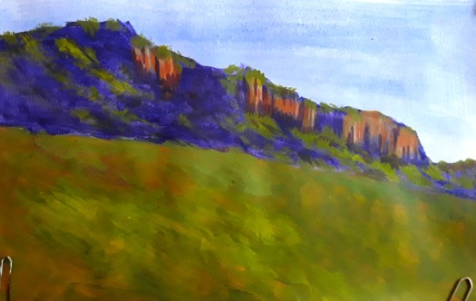
Lastly, a lovely scene of a rocky outcrop, in an Australian landscape where the rock is a strong red colour. Actually, the crags were the challenge in this study and I achieved them using a dragging motion of the brush. And then I modelled them with lighter and darker tones of the sandstone colour.

As you can see, I did learn a lot in this section and I do really appreciate the tutor – Rod Moore of the Learn to Paint Academy. So much so that I was exhausted after it and had to have a rest! Now, back to painting whole landscapes.

Painting in Monochrome in Acrylic and Watercolour

Sunday Best

Hello everyone. Today I’d like to show you some of the monochrome paintings I have done. To be honest, I haven’t actually done a lot of painting in monochrome. But I have done loads of drawings in pencil and charcoal and some of the principles are the same. Just to be clear, monochrome means using one colour only. However, you can create all the different tones of colour to create form and perspective. Of course, this is done by adding water to watercolour and white paint to acrylic to make the original colour progressively lighter. ( I’m sure some of you know this already!)

Painting in Monochrome – a Welsh Valley

A watercolour painting in sepia tones. A beautiful, tranquil landscape of brooding Welsh hills, the valley and the river. After John Sell Cotman.
A Valley in Wales, after John Sell Cotman

Well, this is a watercolour exercise I painted this week , following an online tutorial. We were advised to use sepia coloured paint or ink. But the artist himself used black ink, back in the 19th century and it has since faded to a pleasing soft brown . In fact, I mixed burnt umber and ultramarine blue to create a faded sepia look . As we were doing a study of this master’s work, we gridded up the page to copy the composition. Incidentally, this simple scene is really quite complex!

A close up of the bridge and the cattle

The different tones of the hills and trees were carefully mixed , copying the artistic decisions of the artist. Actually, I really enjoyed the experience but I must just mention how much I struggled with the paper – supposedly a good quality one . But I found that the colour wouldn’t lift off at all and also , it ran down in strange vertical lines! And now the painting pad has been firmly placed in the ‘scrap paper’ pile!

A Nostalgia Painting in Acrylic

An acrylic painting in monochrome, faded tones of brown. A man standing proudly outside his cottage in his Sunday best clothes.
Sunday Best

Finally, here’s one from the archives, inspired by an old photo from a local mining museum. This worker stands proudly outside his humble cottage in his Sunday best clothes. As you can imagine, I was well inside my comfort zone with this acrylic painting, making all my own artistic decisions . And, I’m pleased to say that this nostalgic painting went to a new home last year. But, of course, I have plenty more artwork for sale in my gallery here