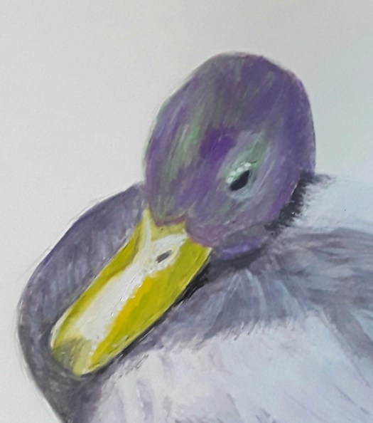
A Covid Art Journal – Work in Progress

Good Day – Bad Day

Hello everyone. I’d like to tell you all about the Covid art journal we are putting together. When I say we, I mean the Rotherham Roar group of artists that I am a member of. Obviously, we have not been able to hold our meetings in person since March now. And, as for the exhibition we were planning to put on together, that’s been put on hold. However, we’ve been meeting on Zoom. And we decided to make a record of our feelings during this strange time. For most people this has taken the form of work on paper in a sketchbook.

My Contribution to the Covid Art Journal

A bright , cheerful abstract gouache painting. My Covid art journal page.
Good Day

This is the first half of my double page spread. You see, I decided to highlight the way my mood fluctuates from one day to the next. So here we have ‘Good Day ‘ and it shows optimism, hopefully. Perhaps this day the sun is shining and I’ve been out for a walk in the fresh air. And I’ve been counting my blessings and feeling confident that things will work out well. To explain, I tried to show the beauty of the world and hope for a bright future.

The Second Half of my Pandemic Art Journal Contribution

A dark, sinister abstract with spiky shapes,  dark shadows and uncomfortable contrasts of colour. Showing the mood of a bad day for my page in the Covid art journal.
Bad Day

As you can tell, this gouache painting represents those unhappy feelings that we have probably all experienced recently. To be honest, I had fairly sad things on my mind when I painted this . And I tried to show this in the spiky shapes, gloomy shadows and uncomfortable atmosphere of the piece. Anyway, that’s enough of doom and gloom for the moment. But, I must admit that the situation and free time has given me the opportunity to do a lot of creative work. So, it’s not all bad!

Some Happy Pages from my Own Covid Art Journal

Under the Sea
Cheerful

This mixed media piece ‘ Cheerful ‘ was painted back in March, and it certainly cheered me up at the time ! You might like to have a look at more of my art journal ideas here .

See myThree Art Journal Abstracts

Frantic

Hello everyone. This morning I’d like to show you some of the art journal abstracts that I’ve been painting over the past week or so. My art journal has been such a lifeline to me during the pandemic. For example, when I felt that everything was beyond my control, I would turn to my journal. Then I would grab the nearest materials to hand and just randomly create. Invariably, I would have some precious time engrossed in painting or drawing and not dwelling on problems. And , afterwards, I would feel better !

The Ceramics Patterns One

A softly coloured,  calming abstract composition in watercolour and gouache.  Muted palette of green, gold purple and fawn. One of my art journal abstracts.
Patterns

I painted this one above very quickly in watercolour and gouache. Actually, it was only afterwards that I realised how much I had been influenced by the beautiful ceramics on display at Cannon Hall. In fact, I can also see echoes of the colours in the pieces – soft green, gold, purple and fawn. As it happens, that’s quite an attractive combination of colours to inspire feelings of calm, I think.

The Ink Drop Art Journal Abstract

A chaotic jumble of shapes, half glimpsed figures and patterns in orange and red acrylic inks, fineliner and watercolour wash. One of my art journal abstracts.
Frantic

To tell you the story behind this picture, I had watched an interesting documentary about the British artist Maggie Hambling. And she explained how, every morning she sat down and ‘ doodled ‘ or scribbled very quick sketches using acrylic inks. Interestingly, without pen or brush – just moving the ink around with the dropper in the bottle. But, as she explained, this was an exercise to loosen up before spending the rest of the day painting. As you can see, my small abstract clearly reflects my agitated state of mind ! However, I really enjoyed the process, especially adding marker and watercolour afterwards. So, having a sketchbook and a few art materials handy enables me to follow any inspiration straight away and on the spot ! ( The dining table, actually )

The Graphite Mark Making One

Making Marks

Obviously, my mind was still running on pattern in this one. But I had also been looking at art blogs online where people had been experimenting with pencil and marker. So, I had a go and, I must say, it was very soothing to do. And, I quite like the black and white movement around the page in this example of my art journal abstracts. Well, that’s another reason to keep an art journal – a little safe space to experiment and practice different media and techniques. And I was also quite pleased with some of the collage that I experimented with in my journal. See here – my underwater scene. To be honest, my journal is almost full up, but I’ve got another one, all ready in the wings and waiting to be put to good use!

My Online Learning – Gouache Landscape Painting

A sunny landscape in Australia with a small river flowing through a limestone gorge - a gouache painting done as part of my online learning.
The Creek

Good morning, everyone. I’d like to tell you about the online learning that I’ve been spending time on these past two weeks. Well, it was a free five day challenge. But I could take my time with it and that was much more doable. Actually, it was very well structured and each unit was almost self contained.

The Colour Mixing

The Colour Chart

So, we started off experimenting with colour mixing using a restricted palette – ultramarine blue ( my favourite ! ) , crimson red and yellow ochre. The yellow ochre was a bit of a surprise as the primary yellow. However, I was pleasantly surprised by how many lovely colours I could mix with this combination. Of course, white was also allowed. In fact, the main benefit of this exercise for me was that I actually sat down and did the chart. To be honest, I’ve always been too lazy to do it before!

Online Learning – the Tonal Sketch

A quick sketch of the landscape in black, white and grey to show the light and shade, part of the online learning.
The Tonal Sketch

Again, for me this was very helpful. Because I am always in too much of a hurry to plan out a light and shade version of my subject. Despite knowing that it is a Good Thing to do ! Anyway, we concentrated on five tones between light and dark. As you can see, I struggled with the ones in the middle. But, my excuse is that gouache paint is quite difficult sometimes. In fact, it can dry a different shade from the one you thought you had mixed.

The Blocking in Stage

Again, this section of the process was done quite methodically, instead of haphazardly, which is my usual method of working. In my own defence, I am a self-taught artist and it’s good to get some proper tuition.

The Finished Painting

The Creek

Finally, after two more excellent sessions, I produced this thoroughly finished off gouache painting of a summer landscape in Australia. I really did enjoy the online learning and the end product. And, I must say a big thank you to Rod Moore of the Learn to Paint Academy see here . Imagine, all this top class tuition was a fab free gift and I appreciate that. Happy Painting!

If you would like to see more of my attempts at showing light and shade in the landscape , see here . There’s another bright, sunny woodland scene in that post too, to cheer us all up!

Gouache Landscape – High Viewpoint

A dramatic gouache painting of a turquoise blue fjord in a craggy landscape.
The Fjord

Hello everyone. I thought I’d show you a gouache landscape that I did for my Beginner Gouache group. You see, this month’s theme is Norway and I found a fab high viewpoint photo by Alexey Topolyansky on Unsplash. Honestly, it just blew me away- it’s so dramatic. I’ve never been to the country so, of course, I’m not familiar with this type of scenery. But I think it’s quite beautiful with its craggy peaks and deep, still mountain lakes. However, it still posed a challenge to capture the subtle changes of colour in the sky and water in gouache. Also, the layering of textures on the rocks. Nonetheless, I am still persevering and I will continue because I love the pure, clear colour I can achieve using this medium. And, today’s takeaway is : remember to let the first layers dry overnight and then continue your layering next day!

Another Recent Gouache Landscape

Down by the River

Now, fortunately, I don’t have to remember to give a credit for the photo this time. Because this scene was painted from my imagination. As you can see, it’s just a simple view – a bit reminiscent of the Lake District in the UK. Happily, a place where I have spent many lovely holidays. Of course, it was a good opportunity to practise painting with gouache. And, on this occasion, I decided to concentrate on getting a full range of tones. So that it would appear to recede into the background. Perhaps you may remember from a previous post that I am working on this aspect of composition – see here . It’s all part of a great online course that I am working through. But, maybe more of that later ! There are plenty more gouache landscapes to be attempted – so come along with me on my artistic journey!

Another High Viewpoint View

An acrylic painting of a deep blue lake in gentle, rolling Derbyshire  hills.
Ladybower Reservoir

This is a view over the moors towards the reservoir in the Derbyshire Dales. But this one is in acrylic paint, on paper. Obviously, a more rounded, gently rising view, if you compare it to the Norwegian scene. But, in my opinion, both equally wonderful and ideal for virtual travelling in these restricted times!

Two Little Gouache Paintings

A gouache painting in tones of soft grey and ochre. A dramatically lit wall statue of Pharoah in an Egyptian temple.
Pharoah

This is the first of my little gouache paintings and I was thrilled to bits to find the fab reference photo .Thank you Elizabeth Van Der Weert ! You see, I thought the lighting was so perfect and gave just the right atmosphere I was wanting to convey. That is, a mixture of realism (after all it is just a statue ). And , a slight hint of mysticism – is it a real flesh and blood figure ? To be honest, as I was painting I had to restrain myself from using flesh tones, Of course, this would put too much life into the face and skin. Actually, I have been in this position before when painting tomb sculptures in churches. And I had to get rid of rosy cheeks and use more grey ! See my blog post here .

Meanwhile, as I was painting, I also began to think of a sort of a horror film scenario. One where the colossal, crumbling statue of the Egyptian king comes down from the temple wall and walks around ! However, I don’t possess a talent for creative writing so the plot doesn’t get anymore developed than that!

Something Completely Different – a Pattern Based Gouache Painting

A circle based pattern ,in gouache paint. restricted colour palette - inspired by a  beautiful exhibiton of ceramics.
Circle Patterns

I painted the second of my little gouache paintings after seeing a marvellous display of ceramic pieces. And they were in a display all about pattern. Actually, I have written several posts that were inspired by some of the treasures at Cannon Hall , Park and Gardens , For example, this post here on Mythical Creatures. In fact, I plan to write a post soon on these very patterns in ceramics that I saw on this occasion. So, here’s a little example to whet your appetite. And, I do apologise for the blurring – the beautiful piece was in a glass cabinet. Do you know, sometimes you don’t have to go very far from home to see something extra special ?

Inspiration for my Little Gouache Paintings

A Patterned Jug

Curved shapes in Acrylic Abstract Painting

An abstract composition, soft organic  shapes in coral contrasted with interlinking lines in teal.
Trapped

Hello everyone. This morning I thought I’d like to show you the latest in my series of acrylic abstracts. And this one, yet again is largely made up of curved shapes. Perhaps you can see in this painting how I was influenced by the present situation. In a sense, you could interpret it as organic creatures confined behind the mesh structure. Possibly a reflection of lockdown ? But, that’s not the whole story. To be honest, I was also thinking about my ‘stained glass ‘ theme which I was developing a few months ago. And, as you can see, I really got carried away with the beauty of the soft, amorphous coral coloured masses . And, what a glorious contrast they make against the teal blue.

More Curved Shapes

Curved Shapes in Gouache

This is just a quick doodle in gouache – part of my experiments to understand how to handle the paint. However, I was struck by the fact that I automatically draw rounded shapes, inspired by nature or imagination . Very rarely do I want to include many geometric or straight edge shapes in my compositions. And , I must admit, I do sometimes feel out of step with the modern trend in abstract painting . Because it seems to be composed of squares, rectangles, angles and straight edges. In fact, the very opposite of my soft, curved shapes !

The First Big Rounded Abstract

Breakthrough  - an abstract composition in yellow, gold and vibrant blue.
Breakthrough

I wonder if you remember this one from July this year ? Actually, this is the one that set me off on my mission to go larger with my round, gestural shapes. If you want to see more of the story behind this acrylic abstract see here .

Art for Sale

Trapped – in Coral and Teal

But, to go back to the star of the show, this painting is now for sale ! It’s in acrylic on paper, 16 by 20 inches, unframed. And, it’s at the very reasonable price of £60 plus shipping . I’m based in the UK and you can pay by PayPal. So, just go to the Contact page here and send me an email. Then you can have this in your home and look at it and lose yourself in the calm, comfortable, soothing atmosphere.

Landscapes in Gouache Paint – New Experiments

An atmospheric view of the sunrise over the sea in tones of greys and blues.
Sunrise

This is my first attempt at a very small painting in my experiments on landscapes in gouache, 6 by 4 inch. You see, I watched a lot of great videos online about this medium . And I was very impressed by the amount of beautiful detail in these little paintings. So, here’s my first try – just ignore the botched border . ( I’ve had some issues with the tape I used, anyone got a good recommendation? ) Anyway, this photo was given to me by a friend and it’s a sunrise scene from New Zealand. Actually, I also tried to concentrate on tonality, and I struggled with the different tones in the cliffs and hills. But, it was a good exercise and I think I did learn a bit about seeing the values of colours in the landscape Just to make it clear, this means identifying where the shadows and colours are light, darker and darkest.

A Second Attempt – Landscapes in Gouache

Down the River

As you can see, this was the second of my landscapes in gouache on a smaller scale. In fact, it’s one more super scene from a trip to New Zealand. And again, I foolishly set myself two challenges on this. Firstly, the small size (6 by 4 inch ) and secondly how to capture the quality of light on the water. To be honest, working in this way tends to make me paint more tightly and carefully. And that’s not really my style but, again, I did call this a series of experiments. Realistically, I can see how my practice on the tones of faraway hills did help here. As did the use of white gouache to create convincing water in this wide river !

A bright, cheerful gouache painting of a small stream, shaded by trees in a sunlit wood.
The Brook in the Wood

Finally, in this piece, I treated myself to a slightly larger sheet of paper 6.5 by 6.5 inch ( in a mixed media journal). The photo is by Nicola Soricelli Boerer on Artists Free Reference Photos. I must admit, I do feel a bit more comfortable with the paint now. However, I’m still learning all the time about how to paint layers without making mud! To explain, the paint never dries which makes washes and detail over a previous layer tricky ! But, I must confess, I find it quite addictive and I’m looking forward to more experiments. If you want to know more, there is a good video by Sarah Burns here .If you want to see a wood that is atmospheric in a different way (The Boy and the Bird ) have a look at my Gallery here. In fact, I almost included this one in my Halloween post here , but then I thought that might have been a bit over the top!

Halloween Paintings- Past and Present

A ghostly bride waits in the lonely graveyard, one of my favourite Halloween paintings.
Waiting at the Church

Hello everyone. I thought I’d do a quick round up of my Halloween paintings from the last couple of years. And it took me quite a while to find them in my chaotic ‘filing system’ , also known as the piles of sketch books, canvases etc. in the spare bedroom! However, the one above was easy to find because I only just completed it . You see, I painted this for an online Halloween challenge for Artists Free Reference Photos. The original photo was of a peaceful graveyard scene by Fiona Evans. But, I decided to inject a bit of melodrama into it by adding the ghostly bride, waiting at the church. Of course, this is my tribute to Tim Burton’s ‘Corpse Bride’, an image I’ve been longing to paint for a while.

The Churchyard after Dark

A digitally altered sketch of a sinister looking graveyard - one of my Halloween paintings for this season.
The Churchyard at Night

Actually, you might recognise this painting above from a recent post I wrote here . Except for the fact that I took the plein air watercolour sketch and tinkered about with it. And, in fact, this is the first time I used the editing tools on my tablet to change the colours on a piece of my own work. And, I must admit, I’m quite pleased with the outcome. Spooky or what ?

More Halloween Paintings

Which Way to Go ?

I must admit that I painted this sketch ‘Which Way to Go’ a couple of years ago. Initially, I had the idea when I was doing a series of ‘scary trees ‘ pictures. As you might know, I find a lot of inspiration in trees and this was a project to let my imagination run wild. But, at the time, I became engrossed in another theme and this painting didn’t quite get finished ! However, I’m going to include it as one of my Halloween pictures. And, I will get around to completing it soon. Because I rarely leave anything unfinished – that’s just the way I work.

Anubis

Finally, I’ll show you a little watercolour sketch I did when I visited the Ancient Egypt exhibition at our town museum .The exhibition was curated by Professor Joann Fletcher of York University, who actually comes from Barnsley. And there is an interesting review of the exhibition here . Well, the ceremonial mask of Anubis, the god of death with his jackal head looked threatening enough to me! So, I had to include it in my Halloween themed show of paintings.

Autumn Colours- a Gouache Painting

A beautiful old tree in autumn colours,  next to St. Mary's church in churchyard.
St. Mary’s

Hello everyone. Don’t you think the autumn colours have been beautiful this year ? Happily, this charming church in its tranquil garden churchyard is about five minutes walk from my house. To be honest, you wouldn’t think it was right in the middle of a busy town . Yes, I know it isn’t as busy as usual right now. But even when there are no restrictions, it still has that air of peace and quiet.

In fact, there are some glorious trees in the garden , each with its own unique character and shape . Of course, I can enjoy the sight of them all year round, in every season. However, the trees in their autumn colours have to be the most impressive sight of all.

The Dancing Leaves in Autumn Colours

The Dancing Leaves

So, in this closeup of my gouache painting, I really tried to show how the subtle yellow green leaves flickered and gleamed in the autumn sunshine. Well, I tried but it was an impossible task really.

More Autumn Colours

A basket of ripe, red apples in a basket - autumn colours in the harvest.
The Apple Harvest

As it happens, this is an oil pastel drawing of last year’s harvest. But the tree is very reliable and we usually get to eat these delicious fruits all winter ! Actually, this painting was on display for a few months in the Rotherham Art Cafe here .

A bright, impressionistic sketch of a tree in a beautiful garden, full of autumn colours.
View from the Glasshouse Window

Finally, something completely different. To explain , I went to a printing workshop in the elegant Victorian conservatory at Wentworth Castle Gardens last year . It was part of our Inktober 2019 activities. And, this is my impressionistic painting of the show of autumn colours in the garden, through the window. And, if I remember correctly, I used some acrylic inks to do a quick sketch, while my print was drying !

In my opinion, this time of year is truly beautiful. And, the display doesn’t last so long. So, get out and enjoy it while you can !

More Gouache Experiments

The Pathway to the Sea

Hello everyone. Well, as promised, I’d like to show you my gouache painting now it’s finished. Yes, yet more gouache experiments ! Just to remind you, here I wanted to use the paint in the same way as I use acrylics. That is, applied quite thickly to the paper . And, also, using bigger more gestural brushstrokes. As you can see, I really enjoyed the freedom of using the paint this way. I could allow myself go to town on painting the shape of the rocks and pebbles in the path.

To be honest, I didn’t take this photo myself. But it reminded me so much of the seaside closest to where I live . The Yorkshire coast here in the UK can be quite spectacular with its steep cliffs and rock beaches. So, I must give a shout out to L J George for the permission to use this lovely photo, on the Artists Free Reference Photos Facebook page.

Yet More Gouache Experiments

Coffee with Friends

Now, I must admit, this is not the best urban sketch style painting I have ever made. But I’d like to explain why I’m showing it. To explain, a couple of weeks ago, I met with two friends to go sketching en plein air. However, it was raining too heavily, so we went into a sweet, little cafe nearby. And we were chatting all the time, not having seen each other face to face for months. Bliss! But, when I got home, I was dying to do some sketching. And so I tried to recreate the scene from memory. As you can see, my visual memory is not so good! But, I’m sure the exercise must have been good for me. Click here to see a more successful urban sketch , drawn from life, outside, a few weeks ago in Wentworth.

The Experimental Bit

In this little painting , I tried to indicate that the trees through the window in the car park were obviously further away. And more indistinct than the figures and the furniture etc in the cafe. Also, I tried to indicate the shapes of the figures using deeper colours in the shading on the clothing. I know, just baby steps – but it sometimes feels like going back to the beginning ! And, my friend really did order a banana with her coffee !

Scene of a pathway to the sea, through rugged cliffs.  Paint applied thickly . More gouache experiments.
Banana and Coffee

Playing with Gouache Paint

Bathing in the River – Early Morning – reference photo by Frank Holleman from Unsplash

Hello everyone. I thought you might be interested to know what else I have painted while playing with gouache paint. First of all, I tried using a better quality watercolour paper. Because I wasn’t really satisfied with the mixed media paper I used for this painting here of a woman, carrying water home . To be honest, I put so many light washes on places that I rubbed the surface off ! So, I experimented on a small piece of smooth watercolour paper in this painting below.

Playing with Gouache Paint on Smooth Paper

A colourful abstract in gouache applied with watercolour techniques.
Abstract Gouache Experiment

As you can see, I put several washes on some areas to darken and strengthen them. And, the paper would easily take three or four. Also, I tried to apply dark colours over light too and that was quite successful. I must admit , I might use this as an idea for a larger, acrylic painting. And, people seemed to like it on my Instagram account here . So, next I used good watercolour paper for this painting of a figure bathing in the river. Actually, this was done for the India theme we are following in the Beginner Gouache group I belong to.

Gouache Experiment for India Theme

More Experiments – Acrylic Style

I was quite pleased with this painting and I enjoyed trying to show the early morning light on the water. In fact, I think it might be the Ganges river but I’m not sure. Anyway, I’m not really a watercolourist, so my next painting is different. And, this time, I’m using the gouache paint more as I would use acrylic paint . Obviously, gouache paint is very versatile. And, I am much more in my comfort zone when putting on thicker layers of paint ! Of course, I’ll show you the picture when it’s finished . So, that’s all for now.