Old and New Style Abstracts

The Path of Life

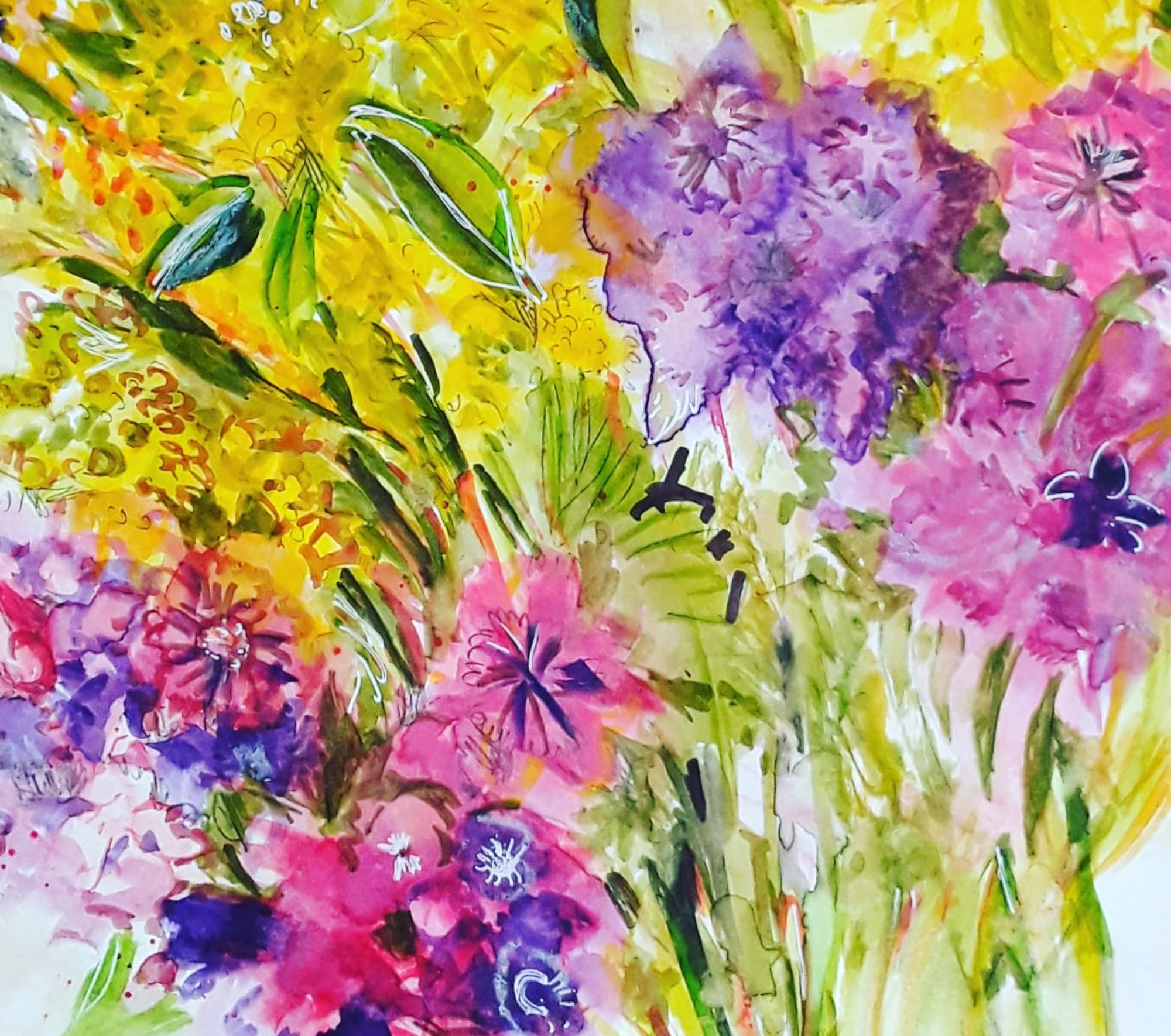
Good morning everyone. Today I’d like to show you the way my abstract painting is changing. The image above is one of my new abstracts, experiments I am creating as I follow a great online course. It’s called Painting with Yvette. And, I’m really enjoying it. Because the colours and compositions are quite different from my own intuitive abstracts.

The Abstract Section of my Exhibition

The picture above is one of the sections in my current solo exhibition at Rotherham Roar. Actually, I am pleased with the way they came together. And each one has a particular meaning to me which evolved as I painted it. In contrast to that way of creating, my new abstracts are of course suggested by the tutor. Nonetheless, the brush marks are full of significance to me the artist. Perhaps in a more subtle way than in my earlier paintings. For example, the painting at the top of this post, The Path of Life, developed out of the suggestions by Yvette on colours to choose and techniques to use. I’m very often out of my comfort zone but I do feel that I am moving on.

The Path of Life

Another of my New Abstracts

Dominant

Anyway, I’m learning new approaches and techniques on this course so that I can apply them in my own work. So, it’s all part of a learning curve and I love it!

Pink and Blue 2

What do you think, is this old or new? Find out more in this post here.
Experiments at Beginner Printing Workshop

Which Way Up?

Good morning everyone. This is just a quick catchup post, I’m quite busy with two exhibitions at the moment, so, more of that later! Anyway, we did an in house beginner printing workshop at Art Society last week. And we carved out designs on cheap polystyrene tiles. Honestly we really did have a great time. Firstly I concentrated on a simple star shaped design.

Stars 1
Stars 2

Then I went a bit more fancy, added two colours, reversed the block for the second print and used cardboard to print on ( breakfast cereal packet, actually!

Which Way Up?

Finally, I went mad and printed white, black and orange on black paper. And I tore up the two blocks into pieces and over printed with them till the paper was saturated with ink! Perhaps you can see how the protective sheet of paper I placed on top ripped out chunks of the print. All because it wasn’t dry as I took it home. In fact, it didn’t dry for a week!

Black on Black

Anyway, it was great fun and we went home full of ideas to try out on our next printing workshop. You could have a look at more mixed media experiments in this post here.

‘Floating’ Shapes – an Abstract Composition

A colourful abstract composition in crimson, blue and ochre. Shapes floating through the air or swimming.
Floating

Good morning everyone. Today I’d like to show you an acrylic abstract painting ‘Floating’ that I have just finished. Of course, now that it’s complete, you can see all kinds of motifs. But, I assure you, these were not planned or anything. And, as I painted, after the first impetuous, free stage, I began to see shapes developing. So I just helped them a little bit to emerge more clearly. Actually, what is weird is that I rotate the painting round when I do this. And still something recognisable appears! Incidentally, this is quite a contrast to how I created this post here all about floating objects. As you can perhaps see, this was carefully constructed and planned.

What do You see, Floating in Air or Swimming?

A closeup of the strange face floating up close to the viewer.
Floating – a closeup
Floating – another close up

Obviously, there is a face appearing and that’s because I sort of painted the lips while the painting was upside down. (From the way it was started, I mean). And then I just went with the flow! And, in order to explain away the fishy detail in the second closeup, I can’t! But those fish just seem to find their way into lots of my abstracts.

However, I do remember reading somewhere that the human brain is programmed into finding patterns in what we see. Particularly, we perceive faces and people very readily everywhere. Perhaps it’s some kind of survival instinct. Personally, I do enjoy looking at abstract and semi abstract work more when I can see shapes and make a story. As if this way of seeing allows me into the picture more easily. Instead of feeling that I am blocked from entering.

Straight Lines and Curved Shapes

Finally, I’d like to explore the concept of design a little. Or, to put it more simply, how to decide where to put things, and how to arrange them on the page. Naturally, this element of composition is important for figurative and abstract paintings alike. In my own case, I think about the design about half way through the process in abstract work. To be honest, I have been watching stuff recently on line about various types of composition design. And I read all about the combination of straight lines and curved shapes.

In fact, I realised that I use this style of design quite a lot in my abstracts (see here ) And, I didn’t really know I was doing it! But, I shall carry on because you can create strong compositions with a lot of movement this way. However, now I can think about trying out some more design schemes as well. Well, it’s all part of the lifelong learning plan!