Mini Exhibition at Urban Commune Gallery

Still Standing

Good morning everyone. I’d love to show you my new mini exhibition at the Urban Commune Gallery in Wakefield, UK, see here . Well, it’s a small exhibition really over two panels in this gorgeous new Gallery, but it feels a lot bigger!

Urban Commune Gallery

Actually, the commune was founded by a group of artists for the purpose of encouraging creativity in the community. And also to provide a place for local artists to show their work. In addition, they are partnered with the charity Uthink, dedicated to supporting young people in poverty. What a brilliant idea! So, I had to be a part of this and I booked some space for my new mini exhibition.

Setting Up

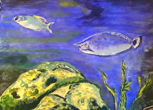
By the way, it didn’t take us long to set up. Then it was time for a cup of coffee and a look around at all the fab work on the walls and on the shelves. And chat with the artist volunteers who make all this possible.

My New Exhibition

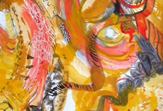
Perhaps you have seen some of this work before, if you read my blog. So, I’ll just feature this one – take a closer look at my watercolour portrait of a valley in the Yorkshire Dales

The Valley

Anyway, that’s all about this show, but I’m preparing another in this gallery. And I think it will look good, displayed the way I’ve dreamed of, so, watch this space! If you want to see more of my landscape paintings, have a look at my gallery here.

Painting Old Houses in Watercolour

Old Houses in West Yorkshire

Good morning everyone. I don’t think I have shown you this watercolour, where we were painting old houses at art society. Actually, Tony Burke, a local artist, came to our evening meeting and led us through this painting step by step. It was quite a challenge but very enjoyable. And we found this curved row of houses in a small village very unusual and inspiring. So, the perfect subject for painting old houses. In fact, this was the first time for ages that we invited a guest artist to work with us. Of course, the society was closed a long time during the pandemic. And it’s taken us a while to get back to normal. Anyway, in this exercise I learned how to blend a sunset colour into my sky. Also, Tony taught us how to add character into trees by twisting the brush when painting foliage.

Top Withens

This is another old house in West Yorkshire, but this time it’s a more famous one! Perhaps you remember this post here. Where I explained that this ruin is widely accepted as the inspiration for ‘Wuthering Heights ‘ by Emily Bronte. And I painted it for our Northern Fringe Gallery exhibition, Yorkshire Makers Inspired by Yorkshire Writers. Firstly we showed our work in Creative Arts Hub, Mirfield. Then in Queen’s Mill, Castleford. And now Skelmanthorpe Library Gallery have invited us to exhibit in a week’s time. It was a lovely surprise. What a shame you can’t all come to our preview event – you would be very welcome!

Painting Watercolour Sketches from Life

In the Park

Good morning everyone. Today I’d like to write you a quick post about sketches from life – something I love to do. Especially when the weather is kind ! Actually, this image is from a sketchtrip we went on two weeks ago. And we went to our local town park, which is a lovely, green space in the middle of an urban environment. So, here I am trying to show the patterns of light and shade, cast by the well established trees. Normally, the contrast between light and dark can be quite muted in Britain. But, on this particular day the sun was very bright and the patches of shadow were very dense.

Please bear in mind that I painted this plein air sketch quickly and instinctively. Honestly, this type of sketching is more about practising observation and recording the occasion, and less about producing a finished, complete painting. Incidentally, I’m a member of an Urbansketchers group, and our intention is to ‘ record the world, one sketch at a time’.

Sketches from Life at Pot House Hamlet

The Garden Centre

Perhaps you remember that we went sketching at Pot House Hamlet in Silkstone village recently. And I had the chance to paint a goat and some chickens (see here). Well, the place is so picturesque that I had to go back and capture this scene at the entrance to the plant shop. Of course, it was a very busy location, and I had to select what to include and what to miss out. For example, all the parked cars and the customers. You see, painting from life takes a lot of practice. And sometimes I feel like a beginner! Anyway, I enjoyed myself and the sketch is a nice reminder of my visit. Maybe you might enjoy it too, making sketches from life, if you give it a try! If you want to see more plein air sketching, have a look at this post here.

This Week’s Paintings in Watercolour

An abstract for my journal

Good morning everyone. This is a quick catch up post showing you this week’s paintings. Honestly, I haven’t really had much time for creating art. Because things have opened up a bit, I seem to be busier. And, of course, there is lots to be done in my allotment vegetable garden. For example, yesterday I spent a few hours watering everything and weeding the parsnip and broadbean plants. And it was tough on my hands as the ground was hard after heavy rain, then baking hot June sunshine.But, I can’t complain – I absolutely love the fresh, organic fruit and veg we grow.

Our Allotment Garden

Well, you can tell how much I miss painting when I take my sketching kit up to the garden. And snatch a few moments between chores. As you see, I couldn’t resist trying to paint these beautiful flowers. For example, the huge red Oriental poppies are so spectacular and so short lived. Also, the blooms of the purple irises in the tiny barrel pond last just a few days. So I had to include them in this week’s paintings. Fortunately, the mauve foxglove does stick around longer and these self seeded flowers are dotted all around the garden. However, I think you can tell by the way I overworked the watercolour that I am really missing painting with acrylic! There are some more paintings of my allotment here, you may not have seen them.

My Art Journal Abstract – One of This Week’s Paintings

As you can see, I had to do a small, intuitive abstract in my art journal in watercolour. When I was longing to do one on canvas. But, I didn’t have the time, so I really enjoyed creating this smaller one. And, it calmed my nerves, so, a good result all round! Plus the bonus is an interesting experiment in shapes and colours that I could expand into a larger version. When I have time!

A Close up of my watercolour abstract

In fact, I can see lots of possibilities of interpretation here – for some reason it reminds me of cave painting. What do you see?

Fishes Swimming in the Deep Blue Sea

Swimming Free

Good morning everyone. This is my latest little gouache painting for our Beginner Gouache group on Mewe. And I painted these fishes swimming among the coral for our March theme – Aquatic Life. If you want to see the other gouache of a lily pond that I did for the theme, see here . To be honest, I try to paint at least two each month for this group. Because it’s a great group and well worth supporting – the work we produce is really rather good. Also, I find that joining in like this is helpful for my development as an artist. For example, I think that the themes are quite inspiring (this month’s challenge is ‘Garden’). In addition, I am still quite a beginner with this medium and I do benefit from the practice of a new skill.

Fishes Swimming among the Coral

A gouche painting of tropical fish, swimming through the coral.
Photo reference by David Cloade in Unsplash

Actually, I did rather enjoy painting the faces of the fish, much to my surprise. And, I did somehow manage to put a little bit of character into them! But, we are, happily, allowed some artistic license in this group!

Swimming Free – a closeup

I was quite pleased with this effort, 11 by 8 inches in my sketchbook. However, I was disappointed that I didn’t work out how to add more vibrant flashes of green on the fish. Perhaps I need a better quality of paints, or more variety of colours. Or, maybe just more practice! I do find gouache more tricky to work with than acrylic. But I just love the chalky quality and the colours.

Fishes in a Tropical Sea

A watercolour background of sea and coral with collaged fish in black and white.
Under the sea

Finally, here’s another sketchbook page of collage fishes swimming in a watercolour sea, with some imagined coral! Well, I created this last year in deep Lockdown, hoping to cheer myself up. And, it still makes me smile! If you want to read more about this post, see here .

Painting Portraits in Acrylic and Watercolour

Painting portraits- this is a face from my imagination,  painted in subtle shades of green and yellow.
A Green Man

Good morning everyone. Over the past few weeks I’ve been thinking about painting portraits. As you can see, for this one I took the slightly unconventional idea of deliberately not using flesh coloured paint . And I used watercolour which is not as forgiving as acrylic. So I had to think carefully about where I placed the brush strokes. Actually, I wanted a chance to practise using tones to model the flesh, something I learnt on an online tutorial. And, because I didn’t use skin tones like pink , orange and brown, this allowed me to be a bit detached. Probably because I could just treat the task like a problem to be solved, instead of wanting to create a lifelike portrait. Anyway, I had a go, my watercolour skills are a bit basic, I know. On the other hand, I do feel like I learnt something from the exercise.

Painting portraits and modelling the flesh

Painting portraits and making a tribute to artist Mary Cassatt. A beautiful,  red haired woman.
My version of a portrait by Mary Cassatt

Although I haven’t quite finished this portrait, this was the exercise I did during a tutorial hosted by Care Visions. In fact, I found it very helpful and the tutor John Skelcher skillfully guided us through the process. First of all, we sketched and checked that the proportions of the face were reasonably correct. Next we painted the face and neck with a mid tone. And then I added darker paint for shadowy areas and lighter colours for highlights. Finally I understood what I was trying to do, instead of adding too many shades and colours!

Incidentally, there was one other challenge in this session – we had to use the ‘ Zorn’ palette. Just to explain, an artist called Anders Zorn (1860 – 1920) made this choice of colours famous when he created his superb portraits in oils. For your information, the restricted palette consists of red, yellow ochre and black, with white allowed too. You could try it out — it’s amazing how many colour mixes you can create with this combination.

Drawing Faces on Toned Paper

A drawing of a man in red-brown pencil and white pastel on light brown paper.
Portrait in sepia pencil

Well, just to finish off with, in this portrait exercise, I used sepia pencil for the darker tones. Then the fawn coloured paper itself for the mid tones and white pastel for the highlights. Honestly, it sounds very simple, I know, but it’s taken me years to understand it!

By the way, I made this study with the aid of a photo provided by the tutor. Whereas, the first image I showed you – the green man – I created from my imagination. Because I’ve been studying the proportions of the face recently, I think I’ve managed to improve at this. And I made the painting look a bit like a real person! (Even though the eyes are not quite right!) If you want to see my baby angel portraits, see here for my tribute to Raphael.

English Cottages in Acrylic and Watercolour

English cottages- this one is a grand house beside a large, beautiful pond. Semi-abstract style.
The Red House by the Pond

Good morning everyone. Last week I took advantage of two free tutorials online and I painted English cottages. Although this one looks to be rather a grand cottage. Of course, the location of it is superb, right next to a tranquil pond. You see, Artclassesgroup is the name of the host, and the classes took place over our school half term week. Although, to be honest, a lot of children in the UK are at home anyway right now. But, nonetheless, the group provided some good activities which were designed to interest all ages, including adults like me!

The Reflections of the Cottage

Closeup of the Water and the Reflection

As you can probably tell, I painted this in acrylic and fairly rapidly too (the class was only one hour long, but I spent another hour on it as well). Actually, I felt out of my comfort zone using this colour palette, which can be a good thing. Also I enjoyed learning a different way of depicting reflections. In this case, I roughly painted the shape of the cottage, let it dry and then very lightly brushed over the greeny blue colour of the water. Then, when that was dry, I applied some fine ripples in dryish white paint, to show the flow of the water. And all the time, I was wondering about who lived there. And I imagined being able to gaze out over that delicious view every morning, as I opened the curtains.

English Cottages in Watercolour

This white English cottage is beside a river, running through a beautiful valley. Watercolour in realistic style.
The House down by the River

And now for something completely different! In my opinion, this delicate watercolour in more realistic colours and detailed style contrasts well with the first painting. Obviously, the acrylic painting had dramatic, heightened colours and a fairly abstract brushstroke treatment. However, they are both English cottages near the water. Well, I painted this one while I was following a good tutorial hosted by Care Visions Healthy Aging group. Incidentally, I have done a few lessons with this group, including this girl on the beach here , a tribute to Joachim Sorolla. But, to return to my watercolour, here I tried to include realistic detail (not my usual style, but good practice).

Closeup of the House by the River

Although my brushstrokes are only suggestions, I have shown quite a lot of detail in the shutters, the garden shrubs and the gate. Again, what an idyllic, peaceful place to live! So, there’s some more virtual travelling for us, and I hope you enjoyed it!

If you want to see a more humble style of cottage, have a look at this post here. Then you’ll see the miner dressed in his Sunday best too!

Loose Watercolour Style for Flowers

Flowers in Watercolour

Flowers in Watercolour

A painting of a bunch of flowers ina loose watercolour style  - purple  , pink  and golden yellow
A Bunch from the Garden

This is a painting of a bunch of flowers that I quickly gathered from the allotment one day this week . It’s painted in a loose watercolour style and I can’t really call it a sketch. Because I spent about an hour and a half on it. It’s in my Lockdown art journal where I can be a bit freer and experiment ( play , really) .

I tried to use more water in the paint and let it flow around . I like using a technique called ‘ wet-in -wet ‘ when you load up your brush with fairly runny watercolour paint and paint it on top or right next to wet paint . Then watch what happens ! Sometimes the effects are quite pleasing . And then I exaggerated and worked into the bits that looked effective. I must confess that I’m not so experienced with this medium . But working in an art journal gives you the freedom to try things out , without worrying about ‘ spoiling anything ‘ .And I have noticed that I have used my journal to paint in loose watercolour style on several pieces.

Watercolour Detail 1

As you can see , there’s Sweet Williams , euphorbia and verbena in there . And also a ferny sort of plant with delicate heads of pale yellow flowers . But I’m not sure I know what it’s called . It probably planted itself !

Watercolour Detail 2

At least now I have more time to paint when I feel inspired – instead of putting it on a to-do list ! See more flowers in my gallery .

Loose Watercolour Style

Flowers in a loose watercolour style  - yellow and purple areas of colour with some close up detail
Flowers in Watercolour – painted in a loose watercolour style

This is watercolour on paper, a page in my art journal , about 10 inches square. If you want to know more , email me using the form on the Contact Me page . All my work is for sale at reasonable prices.