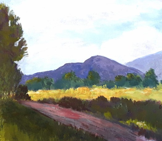
Good morning everyone. On our way back from the Yorkshire Dales, we made a detour to Halifax. Because I wanted to see one of my Australian landscape paintings in the Open Gallery. And I was pleased to see it in a good position in a smart new gallery.

Unfortunately, we were not able to attend the preview, so it was good to have a chat with Alina, the curator. In fact, the show was full of really interesting works. Also I had the chance to catch up with another artist about the art scene in the north of England. So, all in all, a very enjoyable visit.

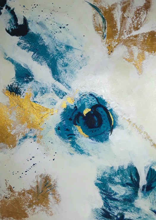
Finally, we managed to find time to dash to Hoylandswaine church, to see my paintings in the village festival art exhibition. Actually, it’s a very good show. To tell the truth, we haven’t been so active during the pandemic. So I really enjoyed being with fellow members of the Arts Group in the beautiful setting of St. John the Evangelist church.


As you can see, the church is quite beautiful, with a stained glass window by William Morris. And a mural by John Roddam Spencer Stanhope. And I was pleased to show my paintings there, work very different from my Australian landscape paintings (see here for another).