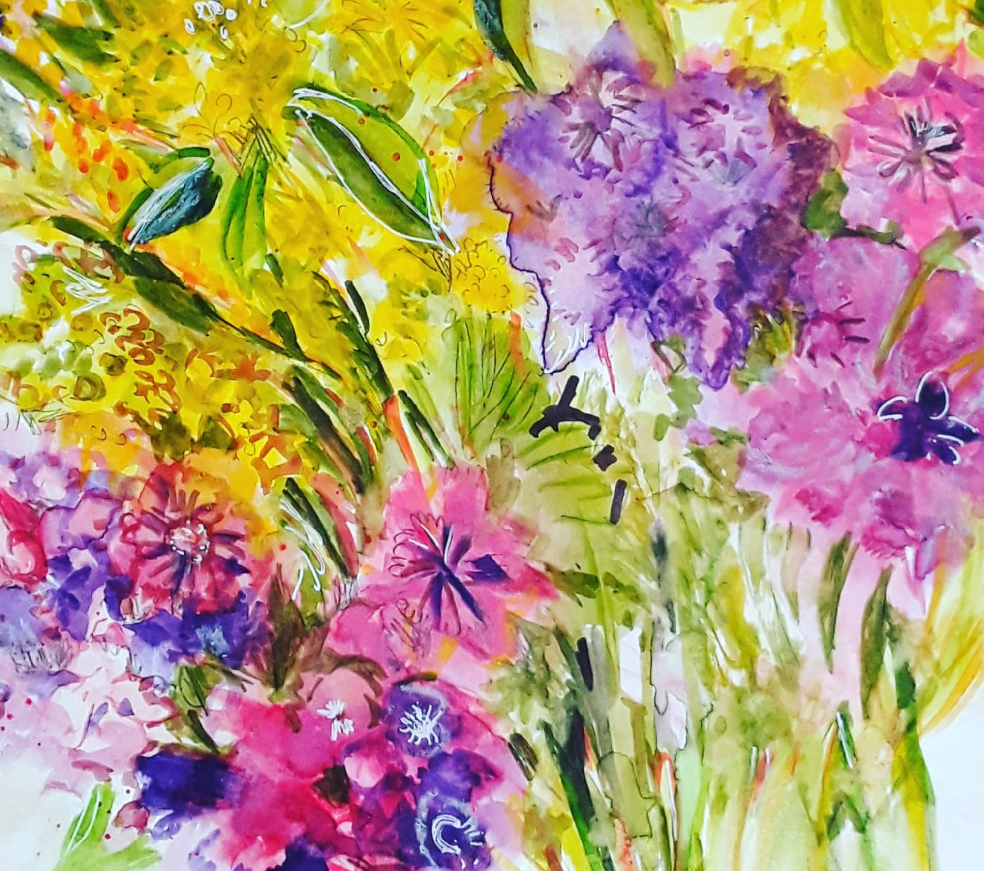
Good morning everyone. Well, as I promised, I’d like to show you the first abstract composition I painted from Painting with Yvette. And it’s a new style abstract painting, for me, that is! Actually I found out about this course by chance, just at the very time I was feeling that I needed a change of direction. To be honest, as you might have noticed, the shapes and composition are not all that different from the ones I often use in my paintings. But, first of all, the colours are very different, or, in different combinations – see this post here. Secondly, there is a lot more empty space between the elements. As you might say, a bit more breathing space. Lastly, there are more definite calligraphic marks. In fact, our tutor Yvette St Amant is very generous with her advice and guidance. So I try not to reproduce her work, but to use the ideas and develop them into my own style.

However, I find it quite difficult to achieve and, I spend a few hours on each painting, but I do feel that I am learning. Indeed, I think this is the only way to achieve progress, to spend time practising.
Another New Style Abstract

Actually, have a look at the image this way round, I’ve just this minute noticedthat in this view, a totally different idea springs to mind. To me it suggests new things on the horizon.

I think I like it better this way! And, putting gold paint on a painting and having it make sense in an abstract way is a first for me! So, I’m working on a couple more of these new direction abstract compositions at the moment. But quite slowly. And I will show you when they are ready. (By the way, these are gouache not acrylic)


Lots of interesting things going on in these abstracts. The calligraphic marks really catch my eye – I have discovered that I really like asemic writing. For some reason, the portrait-oriented version of pink and gold makes me think of a mirror. All that texture in the pink is glorious and who doesn’t love a bit of gold.
Thank you so much! I like asemic writing too, although I find it quite difficult to do. Like you, I do adore colour and using the gold is such a pleasure.
I’m left-handed and I found it hard to get a flow into asemic writing, I kept falling back into real letterforms, then I tried writing right-to-left instead and it makes a huge difference… now I’m thinking I could try vertical writing as well, see how that turns out…
I’m left handed too, I think I’ll give right to left a go. I agree,It is difficult to keep real letters out of your asemic writing.
When I paint abstracts (which isn’t very often) my mind wants it to make sense in some way. Funny – I don’t look for that from abstracts by others but I do like the second orientation of your piece because I can see that message you mention. Either way, I like this piece. Thanks for sharing it and your process.
Thank you so much, Aprille! I’m trying very hard to keep actual bits of reality out of my painting, but, of course, I do usually spot it afterwards! Especially if I rotate the picture. Thank you for your support.
You know I like your abstract works. And I like this direction you are taking. Looking forward to seeing more.
As I like yours, Claudia. I’m a bit busy right now, but there are two more in the pipeline!
Very interesting paintings
Thank you so much, Vivienne.