Abstraction in Acrylic Landscape Painting

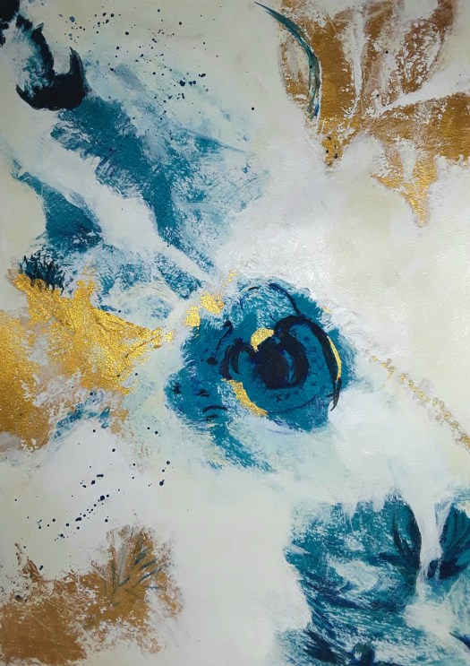
Good morning everyone. Abstraction in acrylic landscape painting – I’ve finally achieved it! Actually, I was so pleased when I came away from a workshop on Saturday with this semi-abstract landscape. To be honest, this is the furthest I’ve ever gone down the abstraction road when painting a countryside scene. In fact, our tutor encouraged us to experiment with mark making, including using a palette knife. And I think that was what helped me to stop paying too much attention to detail and accuracy.

The theme was clouds, weather and atmosphere. And, there certainly looks to be plenty of weather in those clouds! Anyway, another new method for me was to paint on a thin layer of gesso first before painting. So that way there was an opportunity to add some texture as well as a lovely surface to paint on. Of course, now I’m very keen to practise this. However, I’m busy for the next few days getting stuff ready for Artwalk Wakefield – this year I’m taking part myself! So, I’ll have to be patient, and wait a little while before I experiment with more abstraction in acrylic landscape painting.

New Exhibition at Choppards Mission

Good morning everyone. Well, we are right in the middle of our exhibition/artfair at Choppards Mission. The beautiful stone building we are in is now a church. And it’s our venue for a fringe event for Holmfirth Artweek. So, we are open until Saturday, there’s still time to go and have a look.

If I say so myself, our display of work is very pleasing! And, if you look at the poster closely, you will see my gouache painting of an old barn.

Sorry about the reflections on this one, the sun was streaming through the window! Anyway, I am really pleased with the display space I have got. Perhaps you can see the white plastic ‘bargain box ‘ ? I sold two drawings from this box, this is one here.

In fact, I had very pleasant chat with the lady who bought this. And she and her husband knew this beautiful spot in the Yorkshire Dales very well! It’s a plein air watercolour sketch of the hills near Kilnsey Crag.

And this Canalside View is an old favourite of mine, but I was glad to see it go to a new home.

I also sold a few cards and two more paintings and I have thoroughly enjoyed myself being a part of our event at Choppards Mission.

Workshop at Left Bank Leeds

In the Old Church

Good morning everyone. I had a great day sketching on Saturday at Left Bank Leeds. And we worked with a super artist, Paul Digby, who first showed us some inspiring drawings by Piranese and Seurat. Also, Hopper, Jenny Saville and Barbara Walker. Actually, he used these examples to illustrate some of the things to keep in mind when drawing. For instance, perspective, tone, atmosphere and simplicity of line. Next Paul demonstrated different ways of deepening tone with graphite. Then he taught us some simple rules of perspective. All in all, a very interesting and useful session. Then we were encouraged to find a corner of this impressive Edwardian former church and draw. In fact, it is now a very welcoming arts and community hub, the Left Bank Leeds. (Sorry about the quality of this photo, no natural light, just a desk lamp!)

A finished version

This is the finished version (just completed) and I deepened the darker tones, as Paul advised. And I think it looks more three dimensional now. As you may know, I don’t usually spend this much time on a drawing. Because my work with urban Sketchers is of necessity short, usually 20 minute sketches,completed on the spot. So, this was something new for me and very good practice. If you want to see an example of creating tones in black and white paint, see this post here.

New Paintings, Finished at Last

On the Beach

Good morning everyone. I’d like to show you these two new paintings, finished at last! Firstly, this beautiful Mediterranean scene, based on a photo from Landscape Reference Photos for Artists, here , by Penny Wohler – Stone. And this was such a pleasure to paint! In addition, gouache paint seems made for a scene which cries out for delicious textures and vibrant colours. Of course, this painting also fits in with my theme of hot, dry landscape and Australian scenes. (See here ) In fact, it’s turning into a collection now! To be honest, I couldn’t really see the point of doing a series before. But this one seems to have grown itself! Now I’ll have to think about displaying it together somewhere. Anyway, I’ll just paint a few more first.

Encounter

Secondly, a completely different intuitive abstract in watercolour, pencil and marker pens. Actually, I found this little painting when I was tidying up some sketchbooks. And, I remember trying out a tip about keeping watercolours moist – I think I proved here that it does work. Because, as you can see, the paint didn’t need much encouragement to wander across the paper nicely. So, I was pleased with it, and when it was dry, I stashed it away.

Anyway, I looked at it from all angles and embellished it with patterns and markings. Then I noticed something in it that suggested a face to face composition – I wonder if you can see it too?

Encounter – a close up

So, there you have it – two new paintings, finished at last.

On the beach – a close up

Two More Small Landscape Paintings

Small Barn

Good morning everyone. At last I managed to buy a decent watercolour pad! And I just had to paint two small landscape paintings to try it out! To be honest, I discarded the first two attempts. Because I had literally forgotten how to use the paint on good paper Actually, the old paper was not cheap at all, and strangely poor quality for this paint. Anyway, after my little practice, I really enjoyed creating pools of colour, without any effort. The paper is delicious!

By the way, this is another of those small barns in the Yorkshire Dales . And this time I have painted a backdrop of sunlit hills. Perhaps you can smell the sweet scent of warm grass, like me.

Poppy Time

Well, here is the second of my small landscape paintings, 9 by 7 ins. And, I’m definitely still experimenting here. But, I’m quite satisfied with it, especially because I put the composition together from a couple of photos and my imagination. And it’s a lovely colourful scene. However, I think I could improve on the scale and size of the flowers. In fact, that’s something I find tricky in a made-up scene like this. Of course, the only way to improve is practice, and, luckily, I enjoy painting so much, so, no problem!

By the way, all my artwork is for sale at reasonable prices. So, go to the Contact Me page, if you see anything you like. And send me an email.

More Virtual Travelling the World

Sandstone Bluff

Good morning everyone. We had a very enjoyable morning at my Meet the Artist event on Saturday at my solo show. And it was great to show family and friends my exhibition at Darfield Museum. Actually, we all imagined travelling the world while looking at the paintings. In fact, it was fascinating to hear people’s thoughts on exactly where the scenes were set. Because there were no labels on the wall next to the paintings, my visitors didn’t know the titles or locations of the scenes. For example, I described the image above as ‘Sandstone Bluff, Australia’. But a friend of mine said it reminded him of a ruined Crusader castle, somewhere in Europe!

Travelling the World, the Story Behind the Picture

Somewhere in France

Similarly, another friend was convinced that this was a painting of a town in Italy! Well, it definitely was France, see this post here for the story. However, I must admit that I did miss out the distinctive French 2cv cars on the road. So that the scene was a more simplified composition. Anyway, we both came to the conclusion that the town must have been near the French – Italian border. Perhaps you will have noticed that the tower in the distance is reminiscent of Italian architecture.

Brimham Rocks, Yorkshire Dales

Finally, just one more example of a painting that set people off virtually travelling and reminiscing. In reality, this is the scene of a very distinctive rock formation at Brimham Rocks in the Yorkshire Dales. Yet, my friends assured me that it was: a local crag on a moor, another rocky area in the Dales or a beauty spot in Devon in the south of England! And this gave me food for thought, is it better to display a label with title and explanation or not? What do you think?

Latest Exhibition at the Museum

White House in the Mountains

Good morning everyone. This is the acrylic painting that I put on the poster I made to promote my latest exhibition. Well the show opened yesterday and, I must admit that I was very pleased with the way it looked.

The Poster

Actually, the museum cafe gallery is a lovely, intimate space and we sat quite a while, looking at my paintings. In addition, the cakes are all homemade and delicious, so the time passed quite pleasantly!

Customers at the Museum Cafe Gallery

Then I took some photos, but the lighting on the paintings reflected and defeated my camera. So, apologies for that!

The Mary River, Queensland

Perhaps you might have seen this gouache painting before in this post here. However, I don’t think you know this acrylic I did a few years ago. In case you can’t tell (!) it’s my allotment.

The Allotment

After we had looked at my latest exhibition, we went into the courtyard garden to admire the scarecrows. If I could explain, it was the village Scarecrow Festival. Just a bit of fun for the children at the end of summer. Finally, we walked over the road to the church, All Saints. And it’s very picturesque, sited in a peaceful church yard. Actually there is a public footpath at the edge of the graveyard which takes you past the site of the medieval fish ponds. To be honest, the site is not restored but there is a line of willow trees that trace the line of the banks. What a pleasant afternoon out! I will probably post a bit more about my latest exhibition after the Meet the Artist event next week. Incidentally, if you are in the area, you are very welcome to join us, details on the poster.

Greetings Cards on the Windowsill
Somewhere in France and Beach Day
Swaledale Barn and The Power of the Waves

A Very Quick Catchup Post

Dream Landscape

Good morning everyone. Just as it says in the title, a very quick catchup post. In fact, I’ve not really had much time to paint lately. So these two pieces are quite literally small works done in snatches of time. To be honest, I started this gouache in five minutes before starting on breakfast! Well, you get the picture. Anyway, quite unusually for me, this was straight out of my imagination. And, I don’t really feel like it’s finished, but to add any extra elements now would look too artificial. So I’ll consider it as a study, a practice in using gouache paint.

Emotional Outburst

Now, as you can see, this one in my quick catchup post is completely different. Of course, it’s a doodle, but also a picture of my state of mind at the time. What do you reckon, anger, anxiety, bewilderment ? All of the above. We are living in such strange and difficult times and I usually try to keep my worries under control. However, sometimes they break out and I suppose there’s less harm done if it’s contained within a painting. Actually, oil pastel is really good for this kind of art therapy. Because you can pound it into the paper and get rid of all those uncomfortable feelings. Honestly, I’ve no idea what it is or if it means anything. But,I definitely felt better after I’d done it! And there’s another post here with more art therapy exercises that you may not have seen before.

Look at this Wintry Scene

Cold Day

Good morning everyone. I decided to show you my acrylic painting of this wintry scene. Although it might seem a little odd in the middle of summer! Anyway, I started painting it a few weeks ago and I enjoyed the ruggedness of the trees. Also, the cool colours of the icy cold stream. Well, I reached this stage of the painting after two sessions and then decided to leave it a while. As usual, I left it in full view in the living room to try to assess it. But quite a bit of time passed by and I had spotted all the bits I could smooth out. However, I realised that if I carried on ‘improving’ it, it might look over painted. And then, in my opinion, it wouldn’t reflect my style. So, for the first time ever, I decided to leave it and show it as finished. I hope you see my wintry scene as finished too!

There are more landscapes in all weathers and seasons in my gallery here. And, finally, I found my other painting of a brook, this time in gouache paint. And, this time in summer!

The View over to the Mountains

Bad Planning and Good Planning

Peace

Good morning everyone. Today I wanted to show you this abstract design, which required quite a lot of planning. Obviously, it’s just a modest little watercolour abstract painting, but, first I had to think hard about the background. You see, I kept the colours soft so there is not too much eye catching contrast. At the same time, I introduced a subtle sense of movement with the white paint. Honestly, I really had to restrain myself from adding loads of busyness all over the place! Anyway, I achieved it and now I could choose a motif to put over the top. But, what to choose? Not wanting to experiment on the page, I used my I pad trick and scribbled a few ideas over the image on the screen. After a few tries, I settled on a mandala.

The I pad trick

So then I felt confident enough to paint my mandala in black paint (don’t laugh, it’s an abstract one!) Actually, I haven’t got the skill or the patience to paint a good one. However, I think it’s quite effective. And the main point of the exercise for me is to take some time and thought when planning an abstract.

Peace

Bad Planning

Sunny Morning

Next, here is a glorious example of bad planning, more like my usual style! Here’s the story, l wandered into my ‘studio’ after showering one morning. And there was the usual view over the roofs, all bathed in gentle sunshine. Well, I couldn’t resist grabbing a pad and a black marker for a quick sketch. Then I used my new oil pastel pencils for the colour which didn’t of course cover the lines. So, not the best laid plan, but a real delight to record my response then and there! To sum up, I suppose I think that there is a time for careful planning and also for spontaneous response. Maybe you missed another quick response I made to this view, in a spectacular winter sunrise last year here.

Look at my Framed Abstracts

Up

Good morning everyone. I finished this small watercolour painting yesterday and, with a bit of magic, it’s now one of my new framed abstracts. Isn’t science wonderful? Only a few minutes work, and there it is , in a frame and on the wall of a virtual room!

Up in the Dining Room

Not only does it boost my confidence to see my work displayed on the wall. But also I can then easily assess the work and make mental notes how to progress in the next one.

Perhaps you might not be aware, but I can see quite a lot of influence here from the Painting with Yvette course I am following. For example, the general movement of the colour red across the paper. Also, I have used both thin, washy paint and more thickly applied coats in this composition. In addition, I have applied patches of fine surface pattern on the top layer. Obviously, this might not be all that easy to see in these images of one of my framed abstracts. But, close up it is more effective and I learned all this from this excellent course.

In the Shadows

Finally, I couldn’t resist ‘hanging’ this little abstract on the wall. And I like the way the dark, moody colour of the background complements the mysterious feeling of the painting. In fact, when I look at it now, I think of a passage back into the light from a dark place, perhaps a cave? However, it was an intuitive composition, with no planning beforehand. If you would like to see more of my abstract work, see here.

New Pale Abstracts to See

Something Blue

Good morning everyone. As you may know if you read my blog, I am at present working my way through an excellent online course by Yvette. And I am learning how to create pale abstracts, which are completely different in style to my usual paintings. In fact, in this module we are taking the approach of first creating a background of patterns in dark paint, then applying layer after layer of colours and shapes. Have a look at this image below first to see the process half way through. Then see how it ends up in the next image.

Misty Landscape, half way through
Misty Landscape, finished

In fact, this was my first attempt and I relied quite heavily on the tutor’s version. But this next one I really consider to be my own. And I think it looks well presented in this virtual room. However, my paintings are small and the blown up images really demonstrate how effective large scale abstract paintings can be. See what you think.

Something Blue

Well, I’ve been very busy with these new pale abstracts – they do take some time to do for smallish paintings. Actually, I’m half way through the third one just now, but you’ll have to wait a bit longer to see that one! Meanwhile, here’s a link to a post showing some of my ‘old style’ abstract compositions.

My Abstracts in Virtual Rooms

Blue and Gold 2

Good morning everyone. I thought I would show you the progress I have been making in my abstracts. Actually, these examples are from a lesson I was following last week . And, Yvette’s course is excellent, so I am plodding my way steadily through all the modules.

Blue and Gold 1, inspired by Yvette St Amant

To be honest, this is a copy of the tutor’s work. Because that was the only way I could really understand the techniques used. Consequently, I don’t consider the painting as one of my own. However, it was a good learning experience – I experimented with using a palette knife properly. In addition, this was the first time I applied gold paint with some confidence. But I then needed to produce my own compositions, using the style and colours suggested. As a result, first I painted the one in the virtual room you see above. And this is more close up so that you can hopefully see the textures.

Blue and Gold 2

After that, I just had to try out the method in another painting, this time introducing some soft green. And downplaying the gold. What do you think?

Blue and Gold 3

By the way, it’s quite tricky to photo the gold paint and make it shine. Often it appears to be brown. Maybe I’m using the wrong acrylic paint! Anyway, that’s my little catch up on my abstracts and there will be more to follow. If you missed this post here, an earlier report of my new learning, you may wish to have a look.

New Watercolour Techniques in Flowers

Bright Tulips

Good morning everyone. As you may know if you read my blog, I do like to follow online art courses. And I love to work in all sorts of media, and try out new watercolour techniques. So I thought I’d show you some more updates from the Watercolours Made Simple lessons.

Well, the idea is to paint flowers in a more general way than carefully including each detail of a particular flower. Actually, this is more difficult than it sounds. Because my visual memory is not too good, I had a photograph in front of me here. However I tried to view the general shapes of the blooms of the whole bunch and sort of invent newer versions of them. Obviously, such intense scrutiny of the flowers should feed into my memory. Which will help me next time I try this exercise in painting generic flowers. But why do I need to do this, you may wonder? Because then I can concentrate on placing the individual elements in a pleasing design. Afterwards it could be used for a greetings card, for example. Or just simply for a different kind of floral painting.

Alstromerias

Now, in this attempt above, I did in fact have the flowers in front of me, which made the exercise easier. Of course, I shall need a lot more practice, but it is quite enjoyable And a pleasant way of spending time on the new watercolour techniques I’m studying. Have a look at this post here for a realistic portrait of a bunch of flowers. Finally, I’ll leave you with an example of another way of painting flowers – semi abstracting from reality.

Pansies

Another Muted Abstract in Gouache

Waves

Good morning everyone. Just a short post today, I’m very busy sorting out my new solo exhibition due to open next week. Actually, there always seems to be a lot more work to do than you plan for! Anyway I did manage to finish this muted abstract, the fourth in my series in the online course I’m following. To tell the truth, I did struggle with getting it right. But, at the same time I did seem to know a bit better where I was going!

Waves- a draft

Well, this is one of the earlier stages of the painting. Perhaps it’s not as easy for you to see these details on the screen, but I studied it long and hard. Then I toned down the little dots and dashes and brightened the white areas. Finally, I was satisfied and called it finished. Now I must learn how to use the wax medium I bought, in order to give it a protective coat. Because it’s painted in gouache and I learned the hard way that this is really necessary (don’t ask!). If you want to see the other paintings in the muted abstract series, look here and here.

Here’s a sneaky peek at my exhibition poster – more of this later!

More Abstract Experiments in Gouache

Moving On

Good morning everyone. As I promised, here is the next one of my abstract experiments in gouache. And, you wouldn’t believe how many different versions I painted until I arrived at this final one!

To begin at the beginning, our tutor asked us to sketch potential compositions using shapes. I chose rectangles and a spiral and I painted in some of the soft colours suggested. And this is how it went.

Moving On – version 1

Well, this was ok but it didn’t look all that different from my usual type of abstract. Also, I thought it looked too busy. And so I decided to make more of the painting a restful creamy white.

Moving On – version 2

Now, I thought this looked better, but it still wasn’t right. So I added some gold – this is the part I love!

Moving On – version 3

Actually, I was quite pleased with this result of my abstract experiments. However, meanwhile, I had read the next lesson in the course. And I had begun to think about areas of colour forming the composition, as well as shapes. Honestly, I put down so many layers of gouache paint that I thought it might crack. Nonetheless, I struggled on and gradually eliminated the spiral, bit by bit. Until I arrived at the final version.

The Final Version of my Abstract Experiments

Moving On – the end result

Now I’m happy! Perhaps you’ve noticed that I also rotated it to find the best view. Immediately after that, I started painting two more! Of course I will show you these later. But I must point out that the moral of this story is: don’t change direction midway into a painting! Because it costs an awful lot of paint and also, it makes your brain hurt! Ah, let’s go back to the carefree days of quick, intuitive abstract painting like this here ! Only joking, I love it really.

Two New Style Abstract Paintings

Waves

Good morning everyone. Well, as I promised, I’d like to show you the first abstract composition I painted from Painting with Yvette. And it’s a new style abstract painting, for me, that is! Actually I found out about this course by chance, just at the very time I was feeling that I needed a change of direction. To be honest, as you might have noticed, the shapes and composition are not all that different from the ones I often use in my paintings. But, first of all, the colours are very different, or, in different combinations – see this post here. Secondly, there is a lot more empty space between the elements. As you might say, a bit more breathing space. Lastly, there are more definite calligraphic marks. In fact, our tutor Yvette St Amant is very generous with her advice and guidance. So I try not to reproduce her work, but to use the ideas and develop them into my own style.

However, I find it quite difficult to achieve and, I spend a few hours on each painting, but I do feel that I am learning. Indeed, I think this is the only way to achieve progress, to spend time practising.

Another New Style Abstract

Pink and Gold

Actually, have a look at the image this way round, I’ve just this minute noticedthat in this view, a totally different idea springs to mind. To me it suggests new things on the horizon.

A New Horizon

I think I like it better this way! And, putting gold paint on a painting and having it make sense in an abstract way is a first for me! So, I’m working on a couple more of these new direction abstract compositions at the moment. But quite slowly. And I will show you when they are ready. (By the way, these are gouache not acrylic)

Two More Nice Bright Abstracts

Sunshine and Rain

Good morning everyone. I did this one of my nice bright abstracts before Christmas and I’m quite pleased with the way if turned out. Again, I had no plan beforehand, except perhaps to incorporate lots of lovely, juicy colour! And, on this one I particularly enjoyed splashing the flashes of white across the gold and bronze.

Sunshine and Rain – a closeup

In fact, I noticed that I have been featuring a lot of round, globe shaped objects in my abstracts lately. Of course, if you paint them yellow your mind interprets them as the sun. And dark clouds creeping up in the background can then suggest imminent rain. So, that’s how I found the title! Anyway, I suppose this led me to thinking that it was time for a bit more development of my abstract work. However, more of that in later posts. Meanwhile, here is another of my nice, bright abstracts, completely intuitive and in a watercolour sketch book.

Afternoon in the Garden

Now, this was a lovely art therapy exercise – a quick watercolour sketch in a few spare moments. And then, some flourishes with oil pastel, ink and white gel pen. I wonder if you can see anything in it? I wonder if you see the same as me? There’s another intuitive abstract in this post here for you to puzzle out!

If you like my abstracts, I just updated my abstracts page in the gallery here. And, don’t forget, I shall be showing you some new style compositions soon.

Best Trees I Ever Painted

Tree Study 1

Good morning everyone. Actually, I’m really quite pleased with these watercolour studies – they’re my best trees ever! As it happens, I do paint trees often, either in landscapes or in urban sketching. And, I don’t think I paint them all that well. So, I decided to invest in a short online course by Watercolours Made Simple . To be honest, I’ve only looked at a lesson or two but I have been pleased with what I’ve learned so far. Otherwise, I might have continued to make it up as go along, a particular drawback of watercolour for me, I find. In fact, I think it’s really necessary to study techniques to improve. More so than in acrylic, for example. But, that’s just my opinion and I can’t claim to be particularly gifted at watercolour painting.

Learning how to paint your best trees

Anyway, this learning was good fun too, so it wasn’t a chore. Simply explained, the tutor taught us to start with the foliage first. (Who knew?). So I painted three or four irregular ovals with a watery mid green mix, leaving little patches of paper white. Then use a mix of a darker shade of the colour and a lighter one too. And, describe the shapes of the clumps of foliage, not individual leaves, with lighter colour in the sun . And, darker colour in the shade. It does help to look at a tree or a photo when doing this. After that, put in the trunks and branches, using a watery mix of lightish brown and add patches of darker shade.

Tree Study 2

Here I practised mixing lots of tree greens using yellows, blues, brown and red – see top row. Then we stayed with the greens to paint conifers and another deciduous tree. I really liked doing a row of trees on the horizon, something I always botched before. Finally, I attempted to show how some trees recede into the background when you paint a forest, mainly using the paler shade of the original green. Now, I do hope I can remember that when I’m sketching en plein air!

Big Tree in my Garden

Or in my back garden for that matter, as I did here last summer. And , even though this one was in acrylic, some of these principles would help with other kinds of paint. If you want to see some of my winter trees, see here.

Some New Small Sketchbook Abstracts

Good morning everyone. Well, I don’t know about you, but I didn’t seem to have much time to start on big projects lately. So, I thought I would show you some of the small sketchbook abstracts I managed to squeeze into my busy days. Actually, I find it quite a comfort to grab the nearest small sketchbook, relax in my armchair and paint!

Just Breathe

However, this first one started life as a rapid ink sketch, intuitive really. Then watercolour, but this time I made an effort to keep the colours very clean. That is to say, adding glazes on top of the three basic colours to add tone, instead of creating mixes on the palette. Also, having seen something online about adding depth to abstract shapes, I tried to think of them as 3d objects. Incidentally, this is very pleasurable to try. In fact, I’ve just realised these small sketchbook abstracts are arty experiments, as well as being good for stress management.

Watercolour pencil experiment

As you can see, this small sketch book abstract has been built using watercolour pencils. Actually, I haven’t played around with these for ages and I was considering taking them on an outdoor sketch trip. So I wanted to remind myself how easy it is achieve quick, bright colour. Obviously, it is very easy and so I took a couple of pencils with me when we went to the Danum museum, before Christmas. And I really enjoyed using them.

Objects in Doncaster Museum

Above all, I really love painting intuitive abstracts, whether they are small or larger, like this one in this post here.