A Country Walk in Watercolour

A Country Walk

Good morning, everyone. I’d like to show you this watercolour painting, ‘A Country Walk’. Because it’s the third exercise I have done from Paul Talbot-Greaves excellent book, 30 Minute Landscapes. And I’m really pleased with the result. But I’m well aware that I’m not yet at the stage where I could make such a beautiful, striking composition as this from a simple scene. So, I’ll keep on practising!

However, this painting was an excellent way to practise the new techniques I’m learning and have fun at the same time! For example, I practised stippling, as I explained in my last post here. Also there’s spattering of paint, created by flicking a paintbrush, loaded with paint. Please wear protective clothing! Seriously though, see if you can spot these two techniques in this closeup of a holly bush.

Trees in Closeup

A Country Walk-a closeup

And I also had the chance to practise painting nice fine branches and twigs by gradually changing brush size. Yes, I know I should have thought of that myself, but I didn’t! Finally, you might also see the shadows on the road are carefully painted by following Paul’s method. To be honest, I was very nervous about this part of the painting. Mainly, I think because I am so used to manipulating acrylic paint which very generously allows you to paint over your mistakes. In fact, I might now have a bit more confidence when painting shadows in a landscape. Instead of just fudging it and hoping for the best. Here’s a closeup of branches and shadows.

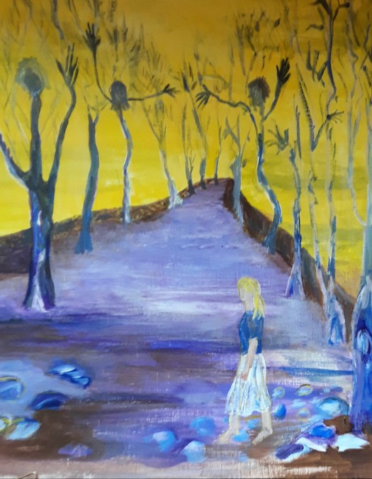
Anyway, I do think this study will help me to progress my painting. And , to finish off with, have a look at this acrylic painting from a couple of years ago, with a similar composition. Of course, this is an imaginary scene and seems to me not quite finished. Perhaps I will feel more inspired to finish it now, who knows?

Another Country Walk

Which Way Now?

Australian Landscape, Painting in Acrylic

Early Morning

Good morning everyone. As promised, here is my Australian landscape, finished only yesterday afternoon. And, I must admit, I’m really quite pleased with it. Actually, I feel now as if the tuition I’ve had access to on this course is finally coming together. If you’ve been following my blog, you will have seen many of my practice paintings of Australian landscape. I will confess that I felt out of my comfort zone with some of them. Perhaps the advice on using a restricted palette and simplifying the shapes was a lot to take in at first. Not to mention the unfamiliarity of the Queensland countryside. However, I would fully recommend this course, the Moore Method of Painting here.

Early Morning – a close up

At last, I’m beginning to pay attention to the pattern of light and shade in the scene. Also to use different kinds of brushstroke to indicate grasses, leaves and so on.

Early Morning – a close up of the rough grasses

Anyway, I definitely feel like I’m making progress, at last and I’m really looking forward to my next project, possibly an English landscape scene. Incidentally, there are some interesting paintings in my Gallery. And, if you like this one, it’s for sale. Acrylic on paper, 12 by 16 inches, unframed and without a mount. Go to the Contact Me page and drop me a line. Affordable Art, at reasonable prices. It’s £50 plus shipping , free in UK.

Painting Small Boats in Watercolour

A peaceful scene - the view over an expanse of water, with three small boats, tied up to a jetty.
Small boats on Ulley Dam

Good morning everyone. Last week I went out with some art buddies from our Rotherham Roar group, here . And we found this charming scene down the path from the visitors centre at Ulley Reservoir. And, I spent some time painting small boats. Although it was quite cold, we were all entranced by the beautiful view over the calm water. Partly because there were three brightly painted pleasure boats bobbing about, safely tied up to the jetty. Perhaps they are only available at the weekend, I’m not sure. But, I think they lead the eye quite naturally to the far hill in my composition. And, over the hill you’ll find the village of Ulley.

As you can see, the late Spring foliage on the trees is still a fresh, bright green. And it contrasts quite nicely with the blue and red paintwork of the boats. Of course, this is only a rough, quick, plein air sketch of the scene. But I hope it captures a little of the tranquillity and beauty of the morning.

Painting Small Boats at the Seaside

A man in a life jacket getting ready to push his small yacht off the beach, into the sea.
Getting Ready to Set Off

Actually, I found this acrylic painting in my stash when I was attempting to tidy my studio. In fact, I painted it from a little postcard photo. (Really, in order to get this viewpoint in real life, I would have been standing in the sea!) And it shows the picturesque Edwardian seaside resort of Filey, on the Yorkshire Coast. Incidentally, the tutor on the online course I’m following was recently encouraging us to look back at our old paintings. And, the intention was to critique them, carefully noting both the good as well as the poorer aspects of the painting. It’s all good practice in the grand plan. ( That is, of becoming a better artist!) So, wish me luck!

If you want to see a more recent example of me painting small boats, see this post here. And have a look at my tribute to artist Raoul Dufy.

Small Landscape Painting for Sale

View over the Park

Good morning everyone. Today I’d like to show you my new small landscape painting. As you may remember, I am following an online course, on Learn to Paint Academy, at my own pace. And our tutor, Rod Moore suggested something I hadn’t thought of before – small studies, brought to a finished state. Of course, this is a great way to practise techniques and experiment with composition ideas. However, it doesn’t take anywhere near the same amount of time as one of my larger works. And, it’s just as satisfying to do. But, although it sounds simple, I never thought to try it!

The painting above is 7×9 inches, acrylic on paper and I’m offering this mini landscape at £15 plus shipping, (in UK free!). So, if this quiet, end of winter, English scene appeals to you, go to the Contact Me page and email me. Then you can pay by PayPal.

The Preliminary Sketch for my Small, Landscape Painting

Cannon Hall Park

Actually, you may have seen this sketch before. If I remember, the day was icy cold – the park was looking great, peaceful and dignified. Surprisingly green for the season. And some families were calmly taking their daily Lockdown exercise in superb surroundings. Unfortunately, I only managed a quick pencil sketch and then the cold defeated me. So I had to go home and warm up and I didn’t add colour at the scene, as I prefer. Anyway, after studying with Rod for a while, I now have the confidence to paint a small, landscape painting later. In fact, that’s a departure for me because I didn’t feel I could trust my visual memory. But, now it seems to be improving! Consequently, expect to see more little paintings based on my treasure trove of sketchbook pages made en plein air. ( I made some this week, but, that’s another story, perhaps for my Tuesday blogpost!)

So, enjoy this glimpse into my world, and let me know if you would like this piece of more affordable art for yourself.

The View Over the Park

‘Floating’ Shapes – an Abstract Composition

A colourful abstract composition in crimson, blue and ochre. Shapes floating through the air or swimming.
Floating

Good morning everyone. Today I’d like to show you an acrylic abstract painting ‘Floating’ that I have just finished. Of course, now that it’s complete, you can see all kinds of motifs. But, I assure you, these were not planned or anything. And, as I painted, after the first impetuous, free stage, I began to see shapes developing. So I just helped them a little bit to emerge more clearly. Actually, what is weird is that I rotate the painting round when I do this. And still something recognisable appears! Incidentally, this is quite a contrast to how I created this post here all about floating objects. As you can perhaps see, this was carefully constructed and planned.

What do You see, Floating in Air or Swimming?

A closeup of the strange face floating up close to the viewer.
Floating – a closeup
Floating – another close up

Obviously, there is a face appearing and that’s because I sort of painted the lips while the painting was upside down. (From the way it was started, I mean). And then I just went with the flow! And, in order to explain away the fishy detail in the second closeup, I can’t! But those fish just seem to find their way into lots of my abstracts.

However, I do remember reading somewhere that the human brain is programmed into finding patterns in what we see. Particularly, we perceive faces and people very readily everywhere. Perhaps it’s some kind of survival instinct. Personally, I do enjoy looking at abstract and semi abstract work more when I can see shapes and make a story. As if this way of seeing allows me into the picture more easily. Instead of feeling that I am blocked from entering.

Straight Lines and Curved Shapes

Finally, I’d like to explore the concept of design a little. Or, to put it more simply, how to decide where to put things, and how to arrange them on the page. Naturally, this element of composition is important for figurative and abstract paintings alike. In my own case, I think about the design about half way through the process in abstract work. To be honest, I have been watching stuff recently on line about various types of composition design. And I read all about the combination of straight lines and curved shapes.

In fact, I realised that I use this style of design quite a lot in my abstracts (see here ) And, I didn’t really know I was doing it! But, I shall carry on because you can create strong compositions with a lot of movement this way. However, now I can think about trying out some more design schemes as well. Well, it’s all part of the lifelong learning plan!

Painting Portraits in Acrylic and Watercolour

Painting portraits- this is a face from my imagination,  painted in subtle shades of green and yellow.
A Green Man

Good morning everyone. Over the past few weeks I’ve been thinking about painting portraits. As you can see, for this one I took the slightly unconventional idea of deliberately not using flesh coloured paint . And I used watercolour which is not as forgiving as acrylic. So I had to think carefully about where I placed the brush strokes. Actually, I wanted a chance to practise using tones to model the flesh, something I learnt on an online tutorial. And, because I didn’t use skin tones like pink , orange and brown, this allowed me to be a bit detached. Probably because I could just treat the task like a problem to be solved, instead of wanting to create a lifelike portrait. Anyway, I had a go, my watercolour skills are a bit basic, I know. On the other hand, I do feel like I learnt something from the exercise.

Painting portraits and modelling the flesh

Painting portraits and making a tribute to artist Mary Cassatt. A beautiful,  red haired woman.
My version of a portrait by Mary Cassatt

Although I haven’t quite finished this portrait, this was the exercise I did during a tutorial hosted by Care Visions. In fact, I found it very helpful and the tutor John Skelcher skillfully guided us through the process. First of all, we sketched and checked that the proportions of the face were reasonably correct. Next we painted the face and neck with a mid tone. And then I added darker paint for shadowy areas and lighter colours for highlights. Finally I understood what I was trying to do, instead of adding too many shades and colours!

Incidentally, there was one other challenge in this session – we had to use the ‘ Zorn’ palette. Just to explain, an artist called Anders Zorn (1860 – 1920) made this choice of colours famous when he created his superb portraits in oils. For your information, the restricted palette consists of red, yellow ochre and black, with white allowed too. You could try it out — it’s amazing how many colour mixes you can create with this combination.

Drawing Faces on Toned Paper

A drawing of a man in red-brown pencil and white pastel on light brown paper.
Portrait in sepia pencil

Well, just to finish off with, in this portrait exercise, I used sepia pencil for the darker tones. Then the fawn coloured paper itself for the mid tones and white pastel for the highlights. Honestly, it sounds very simple, I know, but it’s taken me years to understand it!

By the way, I made this study with the aid of a photo provided by the tutor. Whereas, the first image I showed you – the green man – I created from my imagination. Because I’ve been studying the proportions of the face recently, I think I’ve managed to improve at this. And I made the painting look a bit like a real person! (Even though the eyes are not quite right!) If you want to see my baby angel portraits, see here for my tribute to Raphael.

Rainy Day Painting in Acrylic

A dreamy, misty view through the trees to the hills on a rainy day .
Rainy Day

Good morning everyone. I thought I should show you this rainy day painting today. Because it’s part of the online course I’m following and I have painted a couple since this! Anyway, the challenge in this simple scene is how to make all the different shades of green make sense. In fact, our tutor Rod Moore helped us through this by reminding us of the principles of colour perspective.That is, colours in the distance become cooler in the sense that there is more blue in the mix. In practice, the greens further away are bluey green and those in the foreground are yellowy green. To be honest, it’s actually much more tricky than it sounds and it involves a lot of careful colour mixing.

The Greens in the Foreground

Rainy Day – a closeup of the foreground grasses

The second big challenge in this acrylic painting is how to convey the idea of rain and dampness in the air. Well, I tried to blur the colours and shapes by using some indistinct brush strokes. But, if you go too far with this, you’re in danger of losing too much detail. And then the scene just looks confusing. So, although the features in the composition are relatively simple (trees, distant hills and a path) it wasn’t easy!

The Distant Hills in my Rainy Day Painting

A close up of the line of hills in the mist of a rainy day.
Rainy Day – a closeup of the hills and the mist

Finally, I hope you can see in this closeup how I indicated damp, misty conditions. In order to do this I brought the pale sky colour over the line of the wooded hills. And this really helped with the illusion of misty dampness I was trying to create. In effect, this is the only view of Australia in the rain that we have painted on the course. For example, take a look at this sun drenched scene here that I painted a few weeks ago.

My Abstract Impression of English Rain

Raindrops on the Window

See this post here for the story behind this picture!

Mountain Studies in Acrylic

Good morning everyone. This is the first of a little series of studies from the online course I’m enrolled on. Actually, I’ve been wanting to paint these mountain studies for a while, but my other projects kept getting in the way! For example, here is the post on dogs for my MeWe gouache group . And here is my work on old masters with Care Visions Healthy Aging . Incidentally these classes are free. So you can see I have been busy!

Mountain Studies

Four studies of mountain landscapes

Here is the full sheet of small studies from a module in the course covering landscape features. And, you might remember that I have already completed the sections on skies and trees. Incidentally, I must say that this is a very useful exercise even though I don’t enjoy doing it as much as painting a whole picture.

A simple mountain view, showing ranges of peaks, in tones of blue.
Mountain Ranges

We began with a vista of mountain ranges unfolding increasingly nearer to the viewer. Admittedly, the acrylic sketch is pretty basic. But the main teaching point was to show aerial perspective by using darker and lighter tones . This makes the faraway peaks look distant and the nearer ones look close. Easy peasy ( when someone explains it to you! )

Mountains with grassy slope in foreground

If you look closely, you can see that I have tried to show how the background hills recede.But the grassy slope although nearer is still a good distance away. In fact, I indicated this by the cool tones of the green. I need more practice here, I think! Please try not to get too distracted by the poor quality paper. ( Note to self : Use the best. )

Alpine Mountain Studies in Acrylic

Snow capped Alpine peaks in blue and white - one of my mountain studies.
Alpine Peaks

Now, this was the fun part! To be honest, I had never tried to paint high peaks and had thought it was too difficult. However, I’m quite pleased with this attempt. And I learnt how to describe form using a dark tone for deep shadow, a dull blue white for the shady side of the snow. And, finally, a brilliant white for the sunlit peaks.

The Rocky Outcrop

A lovely Australian landscape showing a rocky outcrop of red stone - one of my mountain studies.
The Crags

Lastly, a lovely scene of a rocky outcrop, in an Australian landscape where the rock is a strong red colour. Actually, the crags were the challenge in this study and I achieved them using a dragging motion of the brush. And then I modelled them with lighter and darker tones of the sandstone colour.

As you can see, I did learn a lot in this section and I do really appreciate the tutor – Rod Moore of the Learn to Paint Academy. So much so that I was exhausted after it and had to have a rest! Now, back to painting whole landscapes.

Painting in Monochrome in Acrylic and Watercolour

Sunday Best

Hello everyone. Today I’d like to show you some of the monochrome paintings I have done. To be honest, I haven’t actually done a lot of painting in monochrome. But I have done loads of drawings in pencil and charcoal and some of the principles are the same. Just to be clear, monochrome means using one colour only. However, you can create all the different tones of colour to create form and perspective. Of course, this is done by adding water to watercolour and white paint to acrylic to make the original colour progressively lighter. ( I’m sure some of you know this already!)

Painting in Monochrome – a Welsh Valley

A watercolour painting in sepia tones. A beautiful, tranquil landscape of brooding Welsh hills, the valley and the river. After John Sell Cotman.
A Valley in Wales, after John Sell Cotman

Well, this is a watercolour exercise I painted this week , following an online tutorial. We were advised to use sepia coloured paint or ink. But the artist himself used black ink, back in the 19th century and it has since faded to a pleasing soft brown . In fact, I mixed burnt umber and ultramarine blue to create a faded sepia look . As we were doing a study of this master’s work, we gridded up the page to copy the composition. Incidentally, this simple scene is really quite complex!

A close up of the bridge and the cattle

The different tones of the hills and trees were carefully mixed , copying the artistic decisions of the artist. Actually, I really enjoyed the experience but I must just mention how much I struggled with the paper – supposedly a good quality one . But I found that the colour wouldn’t lift off at all and also , it ran down in strange vertical lines! And now the painting pad has been firmly placed in the ‘scrap paper’ pile!

A Nostalgia Painting in Acrylic

An acrylic painting in monochrome, faded tones of brown. A man standing proudly outside his cottage in his Sunday best clothes.
Sunday Best

Finally, here’s one from the archives, inspired by an old photo from a local mining museum. This worker stands proudly outside his humble cottage in his Sunday best clothes. As you can imagine, I was well inside my comfort zone with this acrylic painting, making all my own artistic decisions . And, I’m pleased to say that this nostalgic painting went to a new home last year. But, of course, I have plenty more artwork for sale in my gallery here

Painting Dogs in Gouache and Acrylic Paint.

Painting Dogs  - a gouache portrait of a South African wild dog. His coat is patterned with irregular splotches of colour,  good camouflage in the grassland.
A Wild Dog – photo by Moragh Dann

Hello everyone. This is my attempt at a wild dog in South Africa . To be honest, I haven’t really spent much time painting dogs and so, I don’t have a good idea about how the body fits together. Therefore, I was very reliant on the photo, taken by Moragh Dann. Moragh tells us that these dogs are very shy and rarely seen. Also, they are on the endangered species list, so that makes encounters like this all the more precious.

Wild Dog

Firstly, I started off with a detailed pencil drawing, not something that I do often. But, I have found that since joining the Beginner Gouache Group on Mewe, I find myself working a lot more carefully. And I think the paintings are much more like illustrations too.Just to explain, our theme this month is ‘Canines’, so I was really taken with this photo.

Actually, I have been working a lot on acrylic paintings for my online course with Rod Moore (see here ) . So, coming back to gouache paint required a shift in method. The gouache paint doesn’t really dry like acrylic. Consequently, you have to use a much lighter touch when applying layers of paint so that the layer underneath doesn’t rewet. Because then it would blend in with the new layer and create a lovely mud colour!

Painting Dogs- the Face

Painting Dogs – the Face

In my opinion, this is the tricky bit. Well, you can get along ok with the ears and eyes, if you have a good photo ( which I did ). But when it comes to the muzzle, it’s quite difficult to show that the nose and mouth jut forward. Happily, at this point I did remember my classes with a tutor a few years back. And I managed to indicate a bit of foreshortening with subtle brush strokes. Hopefully, I captured a little bit of the proud, alert stance of the dog. After that, I tried to sort out the tangle of limbs in this seated pose. And, the most straight forward element of the scene – the blurry, parched grassland was soon sketched in with soft sandy colours.

A Dog in the Snow – Acrylic Paint.

Painting dogs - an acrylic portrait of a young husky dog with a thick winter coat, waiting in the snow for the off.
A Young Husky Dog

And now, for something completely different! With reference to the art classes I mentioned earlier, I painted this snow scene a few years ago. As you may be able to tell, this is painted in my favourite medium, acrylic paint. It’s much more forgiving and will allow as many revisions as necessary. In fact, I do remember enjoying the process of layering on the texture of the animal’s fur and the deep snow. But, I shall still continue to experiment with gouache, because I love a challenge! If you want to have a little look at the work I have done in gouache paint, see here .

The Quiet Stream – an Acrylic Painting

An acrylic painting of a New Zealand  landscape - The Quiet Stream.
A Quiet Stream

Happy New Year, everyone. Let’s hope it’s peaceful and full of possibilities for us all. To be honest, I don’t usually bother with resolutions. But I do intend to work hard this year studying on the online course in acrylic painting that I’m following. And this painting is one of the pieces I just completed – A Quiet Stream. But before I talk about this in detail. I’ll show you some of the studies I painted with the Moore Method of Painting.

Tree Studies

A study of eucalyptus trees in full summer leaf , as later painted in my The Quiet Stream picture.
Tree Study – Eucalyptus

Hopefully, you can see some of the detail on this. To explain, here I concentrated on giving 3d shape to the clusters of leaves and the trunks by using tones. That is, dark, medium and light shades of green.

Tree Study – Pine, Cypress and Willow

In this study, I used a fan brush for the first time. You see, I created the pine and cypress branches by holding the brush so that only the top part of one edge was touching the paper. And, yes, I found that as hard to do as it sounds! Well, for me anyway! Admittedly, it does give a very feathery effect that you couldn’t really produce with a plain brush.

A study in acrylic paint - birch trees in winter with traces of snow on the trunks.
Tree Study – Birch

Happily, I was more in my comfort zone with this one. Because I have more visual memories of winter trees, and touches of snow. And, sometimes, I feel a bit more challenged with the Australian landscape subjects that our tutor Rod Moore demonstrates so well. However, I did experiment in this study with using the edge of a square shaped palette knife to lay down the lighter marks on the tree trunks. Perhaps I might try this technique on another painting. ( I applied the dark green background simply to show off the effect of the white markings.)

Tree Study – Palms

In this last study, I used the fan brush again, this time to create the fronds of long thin leaves that make up the foliage. Well, I tried, but I definitely need more practice!

A New Zealand Landscape

The Quiet Stream

Actually, I am pleased with this acrylic painting and , I think I did a reasonable job of bringing to life this quiet stream, meandering through a little valley in my friend’s photo of New Zealand. In fact, the teaching in the demonstrations must have stayed in my mind and resurfaced in the techniques I used here.

Painting Techniques I have used in The Quiet Stream

For example, if you saw my post on painting a waterlily pond here , that’s where I learned how to convey the idea of reflections and paint credible looking leaves floating on the surface. In addition, the teaching about adjusting the tones of the greens in the trees to suggest recession (distance ) gave me more confidence. Have a look at this post here for more examples. Of course this task is made easier by keeping to a restricted palette, as my teacher suggests. All this benefit, plus , it’s fun too! For your information, I shall do regular updates on my journey through this programme of study. And , if that doesn’t help me to stick to my New Year’s resolution, I don’t know what will!

A Moorland Scene in Acrylic

In the Hills

Hello everyone. I’ve been busy working on two more projects from the Acrylic Painting course I’m following on line. But, before I tell you about the painting above- the moorland scene, I’d like to describe the first exercise I did. It was studies of skies, as part of a module on landscape features. Actually, I found it very helpful to concentrate on this subject as I have found this difficult to do. And, to be honest, I have more or less limited myself to simple sunny or overcast skies in the past. So, taking up the challenge to paint sunrise and sunset was, for me, both daunting and encouraging at the same time!

A hint of the sunrise behind a headland in a calm seascape.
Sunrise
The sun setting in a blaze of glory over a moorland scene.
Sunset

Admittedly, these little paintings are only studies, not finished works. And I had never chosen this subject before, but I felt quite pleased with my first attempt. Then, I tried my hand at clouds, something I had often included in my landscape paintings. However, by taking advantage of my tutor’s advice, Rod Moore of the Learn to Paint Academy, my clouds looked much more convincing!

Clouds in the Sky

Our final study addressed the problematic subject of heavy storm clouds and driving rain. Of course, I will need to practice this much more to improve, but, at least, I will now know how to approach it.

The Storm

A Moorland Scene

A moorland scene in acrylic,  showing a lovely path through the hills, in the north of England.
In the Hills

And now to the best bit – a landscape painting of a moorland scene. Well, to tell you the truth, the image provided was a view over Australian countryside, looking over to a mountain range. But, as we were encouraged to use the method and, also, paint the landscape we were familiar with, that’s what I did! You see, a short drive from where I live, there are moorland hills like these, with plenty of footpaths. So, I just imagined a walk in the hills and tried to convey the atmosphere of an English summer’s day. In fact, changing the colours and the vegetation whilst keeping the features and the tones was a bit mind boggling. But, I expect I’ll get better with practice! And, it’s also what I love to paint. See here for more paintings of northern England landscapes.

Two Acrylic Practice Paintings – Works in Progress

A dreamy view over the beautiful Australian countryside to the distant Mountains m, in the early morning light , one of my acrylic practice paintings.
The Red Path

As some of you may know, I am following an online course on painting at the moment. And I’d like to show you two of my acrylic practice paintings. In fact, the painting above is almost completely finished and I decided to leave it a while. To be honest, I am learning such a lot on this course. And I want to think a bit more about the techniques and design ideas I now know about. Then, later I will bring the painting to completion. However, I am fairly pleased with the stage I have brought it to. Incidentally, this method of working is quite new to me. Actually, I usually work in a more impulsive manner, but I do always put a lot of thought into my paintings.

New Techniques and Design Ideas in my Practice Paintings

In this painting, I used a different choice of colours on the palette, following the instruction given. And, this took me right out of my comfort zone, which can be a good thing! But, as you can see, these were the right choices for this dreamy Australian landscape. Secondly, I attempted to blend the colours in the sky – again something I never try to do. Admittedly, I need to practise this more, but then, hopefully, I will have acquired a new skill.

The Tribute to Monet Acrylic Painting

A spectacular deep lily pond with pink and white blossoms - one of my acrylic practice paintings.
The Lily Pond

Again, I must make it clear that this one of my acrylic practice paintings just lacks the final finishing touches. And , I’m prepared to leave it a while before I decide how much extra detail to add, if any. As you can see, there were plenty of challenges in this. Including, naturally, the subject – reflections on still water, a subject I have skillfully avoided until now! Well, I did do my best, but there’s room for improvement. On the other hand, I managed to suggest perspective in the floating flowers and leaves. That is, to put it simply, the furthest ones smaller and the nearest ones bigger and all at the correct angle to suggest they are lying on the water. Baby steps I know, but it’s very valuable to a self taught artist like me ! I really can’t wait to see what else I can learn. If you want to see a painting that I completed with the tutor’s help, see this post here . I will post another update soon!

My Online Learning – Gouache Landscape Painting

A sunny landscape in Australia with a small river flowing through a limestone gorge - a gouache painting done as part of my online learning.
The Creek

Good morning, everyone. I’d like to tell you about the online learning that I’ve been spending time on these past two weeks. Well, it was a free five day challenge. But I could take my time with it and that was much more doable. Actually, it was very well structured and each unit was almost self contained.

The Colour Mixing

The Colour Chart

So, we started off experimenting with colour mixing using a restricted palette – ultramarine blue ( my favourite ! ) , crimson red and yellow ochre. The yellow ochre was a bit of a surprise as the primary yellow. However, I was pleasantly surprised by how many lovely colours I could mix with this combination. Of course, white was also allowed. In fact, the main benefit of this exercise for me was that I actually sat down and did the chart. To be honest, I’ve always been too lazy to do it before!

Online Learning – the Tonal Sketch

A quick sketch of the landscape in black, white and grey to show the light and shade, part of the online learning.
The Tonal Sketch

Again, for me this was very helpful. Because I am always in too much of a hurry to plan out a light and shade version of my subject. Despite knowing that it is a Good Thing to do ! Anyway, we concentrated on five tones between light and dark. As you can see, I struggled with the ones in the middle. But, my excuse is that gouache paint is quite difficult sometimes. In fact, it can dry a different shade from the one you thought you had mixed.

The Blocking in Stage

Again, this section of the process was done quite methodically, instead of haphazardly, which is my usual method of working. In my own defence, I am a self-taught artist and it’s good to get some proper tuition.

The Finished Painting

The Creek

Finally, after two more excellent sessions, I produced this thoroughly finished off gouache painting of a summer landscape in Australia. I really did enjoy the online learning and the end product. And, I must say a big thank you to Rod Moore of the Learn to Paint Academy see here . Imagine, all this top class tuition was a fab free gift and I appreciate that. Happy Painting!

If you would like to see more of my attempts at showing light and shade in the landscape , see here . There’s another bright, sunny woodland scene in that post too, to cheer us all up!

Landscapes in Gouache Paint – New Experiments

An atmospheric view of the sunrise over the sea in tones of greys and blues.
Sunrise

This is my first attempt at a very small painting in my experiments on landscapes in gouache, 6 by 4 inch. You see, I watched a lot of great videos online about this medium . And I was very impressed by the amount of beautiful detail in these little paintings. So, here’s my first try – just ignore the botched border . ( I’ve had some issues with the tape I used, anyone got a good recommendation? ) Anyway, this photo was given to me by a friend and it’s a sunrise scene from New Zealand. Actually, I also tried to concentrate on tonality, and I struggled with the different tones in the cliffs and hills. But, it was a good exercise and I think I did learn a bit about seeing the values of colours in the landscape Just to make it clear, this means identifying where the shadows and colours are light, darker and darkest.

A Second Attempt – Landscapes in Gouache

Down the River

As you can see, this was the second of my landscapes in gouache on a smaller scale. In fact, it’s one more super scene from a trip to New Zealand. And again, I foolishly set myself two challenges on this. Firstly, the small size (6 by 4 inch ) and secondly how to capture the quality of light on the water. To be honest, working in this way tends to make me paint more tightly and carefully. And that’s not really my style but, again, I did call this a series of experiments. Realistically, I can see how my practice on the tones of faraway hills did help here. As did the use of white gouache to create convincing water in this wide river !

A bright, cheerful gouache painting of a small stream, shaded by trees in a sunlit wood.
The Brook in the Wood

Finally, in this piece, I treated myself to a slightly larger sheet of paper 6.5 by 6.5 inch ( in a mixed media journal). The photo is by Nicola Soricelli Boerer on Artists Free Reference Photos. I must admit, I do feel a bit more comfortable with the paint now. However, I’m still learning all the time about how to paint layers without making mud! To explain, the paint never dries which makes washes and detail over a previous layer tricky ! But, I must confess, I find it quite addictive and I’m looking forward to more experiments. If you want to know more, there is a good video by Sarah Burns here .If you want to see a wood that is atmospheric in a different way (The Boy and the Bird ) have a look at my Gallery here. In fact, I almost included this one in my Halloween post here , but then I thought that might have been a bit over the top!

Floating on Air – an Acrylic Painting

A peaceful scene , beautiful white flower-like shapes floating on air in a warm, pink sky.
Floating on Air

Hello everyone. I finished this acrylic painting quite recently. But I had started it a few weeks ago . And I had begun seeing pictures in my mind a little while before that. Pictures of things floating on air – first of all fluffy, cold snowflakes drifting down from a peaceful , warm sky . Then I visualized white flowers or petals slowly sinking on to a dry, dark landscape. To be honest, the inspiration for this idea was easy to see. Because every time I look out of my kitchen window, I see glorious, blooming begonia flowers in the windowbox. Actually I was inspired earlier by my flowers in another planting arrangement here – a painting in a very different mood.

Blooming Begonias

Begonias in the Windowbox

As you can see, these beautiful flowers with their delicate layers of petals are very appealing. However, when I picked up my paintbrush, I had decided on the main idea of something white , drifting down. Also, I was clear that that I wanted a subtle pink sky above a grey expanse – perhaps landscape or rolling waves ? After all, that’s the image that came to me. But, I kept seeing snowflakes or clouds, balloons or parachutes. And that’s what took me so much time to plan this painting. Well, a long time for me anyway.

The Close Ups

Floating on Air

I hope that I managed to capture the light, drifting quality of these white objects. In effect, I was thinking of all of the ideas I had at first. For example, clouds, snowflakes and petals, and so on. Although, obviously, the actual form they took was the shape of flowers.

A Flower Floating on Air

A close up of a flower with ruffled,  layered petals , floating on air.
White on White

As it happens, the actual painting of the white flower shape was quite difficult. In order to give it some idea of form, I had to introduce other colours to suggest the layers of ‘ petals ‘. Hopefully, you can see this in the detail above. Well, I tried ! But , I don’t think this particular inspiration has finished with me yet. And, I might have to work with it again !

From Sketch to Acrylic Painting

Scarlet Flowers

Well, here it is, as promised . A step by step demonstration of the runner bean plant in my allotment – from sketch to acrylic painting! To be honest, it really seems a long time ago now when the growth was at its height. Of course, I’m talking about August, when I did this quick, plein air sketch.

The Working Sketch

The Working Sketch of Runner Beans

As you can see, (if it’s not too faint) I wrote myself a few notes about colours. Actually, I often do this, if I plan to paint the scene later. But, on this occasion, I did find another few minutes later that day to add watercolour to the sketch . Although I took a few photos as well, a colour sketch at the scene is much more helpful.

From sketch to acrylic painting.  This is the working sketch in pencil with added watercolour.
The Runner Bean Plant in Colour

So far, so good. Perhaps you may have seen these sketches in a post I wrote a few weeks ago. And, I drew our cabbage and sprout plants too here . Really, I find my garden very inspiring. But, I’m often far too busy working on the plants to do much artwork. But, when I got home, I drafted this painting in acrylic in a couple of sessions.

From Sketch to Acrylic Painting – the First Draft

The Runner Bean Painting – First Draft

At last, some time to paint! In fact, I had already done a lot of the editing and designing of the composition in the working sketch. To explain, I had to decide which of the shapes of leaves and so on I wanted to include in the final version. Because the design would have looked too busy if I had included them all. Also, I tried to give the arrangement of the stems, beans and flowers some movement across the page. After all, this would give a more pleasing picture. Well, that’s the theory, anyway!

The Final Version

From sketch to acrylic painting  - the finished version.  A runner bean plant climbing up a cane support .
The Runner Bean Plant – Acrylic Painting

Well, this is the version I decided on. First of all, I painted in too much detail in the background. So , all that had to be calmed down so it did not take attention away from the plant . Then, I made some decisions about the different shades of green and tried to be more consistent with them. Finally, I made sure that the focal point – the scarlet flowers – were as red as I could paint them . So , I really hope you like my painting! By the way, we ate the last helping of runner beans last night at dinner. So, all the work is really worthwhile!

All my work is for sale at reasonable prices. This painting is acrylic on paper, 16 by 20 inches. Unframed and without a mount. Price – £ 60 plus shipping. I’m based in the UK . You can pay by PayPal. Just go to the Contact Me page and send me an email

Urban Sketching at Saltaire

Pen and Watercolour and Urban Sketching

Watercolour sketch with pen all in yellow mauve and brown showing huge vats in a brewery . Semi abstract style whilst urban sketching
Brewing

This is just a quick post – I wanted to share with you a watercolour sketch I did this weekend . I spent the day with Urban Sketchers Yorkshire. We went to the fabulous Salts Mill ,at Saltaire near Bradford , a World Heritage site. But , first of all , we spent the morning in a craft brewery urban sketching, looking down on the factory from a balcony. See here for some great photos of the Beer Factory.

Well, I did my usual pen sketch and I realised how many gorgeous patterns there were in the view . So , when adding watercolour , I started to emphasize and exaggerate the abstract shapes. At the moment , I’m concentrating on abstract composition in my acrylic painting so I’m a bit obsessed ! But this is the first time I’ve actually put one together while ‘ one the spot ‘ so to speak. This could be addictive !

I used some of the new techniques I’ve learned – putting more contrast in the design and trying to harmonize the colours.

I’ll post something a bit longer soon , when I’ve a bit more time, all about a great exhibition I saw in Sheffield .

Have a look here for more of my urban sketching at Saltaire and other places !

My First Solo Exhibition of Acrylic Paintings

A Walk Round My First Solo Exhibition of Acrylic Paintings

A semi-abstract acrylic painting in red and green showing apples falling from the tree at harvest time.
Apples Falling
Browsing
A photo of plates of biscuits and delicious homemade cakes
The Refreshments

Well – we had a blast at the opening of my first solo exhibition this morning at Skelmanthorpe Library Gallery.

Hanging the Exhibition

Labelling the Paintings
The curator hanging up my exhibition in gallery style
Gallery style hanging

It didn’t take us too long to put the exhibition up yesterday . Really, we were quite well organised and Mike Roberts [organiser and curator] was pretty nifty up and down the ladders.

Update – Spring Blossom in Wales – SOLD !

Spring Blossom in Wales
Elephant Festival

The Abstract Paintings at my Solo Exhibition

A big bright pink Spiral on a vibrant deep blue background  - an abstract in my first solo exhibition  .
The Spiral
A semi abstracted acrylic of a vase of sweet peas in pink , purple and green .This was the image for the poster of my solo exhibition  .
Sweetpeas

I was thrilled when Mike invited me to exhibit at this fabulous gallery for the month of January. At last – an exhibition all to myself ! I was also really pleased because Mike had seen my paintings on this new website – so , quick result ! In fact , this gallery is a new idea for the Community Library and it is really well worth supporting. Just remember , the library closes on Tuesday, Saturday afternoon and Sunday.

A semi abstracted composition portraying Jamaica and Reggae music . The best painting in  my solo exhibition.
Reggae Reggae

I would really like to say a big thank you to all my family and friends for their support this morning. You know , it really means a lot. And it was great showing off my work to you all.

2 acrylic paintings from the Landscape section - Still Standing  and Ladybower Reservoir
Boat People and Hadrian’s Wall
Ladybower Reservoir

All for Sale at my Solo Exhibition

The exhibition is open till February 1st.

These are all original artworks , painted in acrylic on paper or canvas, with the occasional watercolour and mixed media piece. And they are all for sale, with prices ranging from £30 – £150 . Please contact me if you are interested. I’m based in the UK.

Do have a look in my gallery to see more of my acrylic paintings. There’s also a more in-depth report on my exhibition in the Exhibition section on the main menu .

I hope you have enjoyed my exhibition review .

The Exhibition Poster

Margaret Hall World of Colour exhibition poster
A World of Colour

Art Cafe Exhibition of Acrylic Paintings

Acrylic Paintings in an Art Cafe Exhibition in Rotherham

A photo of my oil pastel painting Apples and Fantasy Apples  showing bright red apples in the art cafe exhibition .
Apples and Fantasy Apples
My acrylic painting  Harbour Lights  on the wall in the art cafe.A coastal landscape
Harbour Lights

This is the first post on my new blog. That is to say , I’m just getting this new blog going. Stay tuned for more. Meanwhile , this is my Art cafe exhibition !

When I was in Rotherham for a meeting on Friday, I popped into a lovely cafe Fitzwilliam and Hughes to have a look at 2 of my paintings that they have very kindly displayed – one right next to the counter! Actually, the cafe is close to the impressive Minster and you get really good views of it through the large windows.

A photo of the arched doorway of Rotherham Minster  - great artists' inspiration.
Rotherham Minster
A photo of the art cafe doorway  in Art Nouveau style - inside you can see my artcafe exhibition.
The Art Cafe

The Floods in South Yorkshire 2019

After enjoying good coffee and seriously good brownies, we walked back to the car parked next to the mighty River Don. Thankfully, the river has now gone down after last week’s floods. But it still seems to be flowing at a slightly alarming rate.

A photo of the River Don in full flow after the floods,  taken in the town centre
The Mighty River Don
A photo of counter, the till and my  painting of apples in the  cafe
Art Cafe

There was lots of lovely artwork on the walls in the café, so I felt very pleased to be included in their current exhibition. And you can see these 2 paintings along with others in my Gallery

In fact, there’s loads more of my acrylic paintings on show now in Skelmanthorpe Library Gallery – have a look at the ‘ My First Solo Exhibition ‘ post here

Oil pastel painting - red apples in a woven basket on wooden floorboards -part of my art cafe exhibition.
Apples – in oil pastel
Harbour Lights – in acrylic