Good morning everyone. This is the first intuitive abstract in acrylic that I’ve painted in a long time. That is, apart from a few doodles. But I do know why I didn’t – I was trying to concentrate on landscapes for a couple of months. Actually, I was following the advice of my online tutor, Rod Moore and I think it’s sound. Apparently, studying and practicing one subject and medium leads to more progress. And I think it’s true. But, I was having too many withdrawal symptoms and missing creating abstract composition. So I had to paint this one!
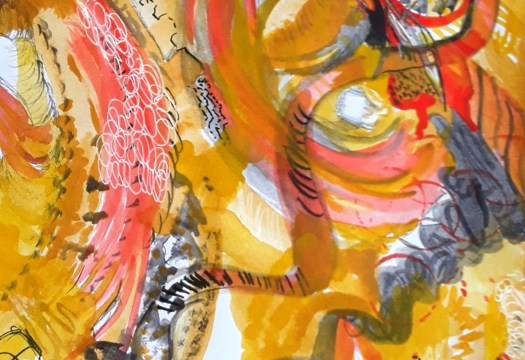
A Closeup of my Abstract in Acrylic
Flight – a closeup
In fact, I had been getting ideas all along for combinations of colours and shapes for an abstract in acrylic. So, I retrieved this idea of interlocking gears from my memory archive. And combined it with a soft colour scheme of misty blues, greens and pinks. Although I followed my usual method of painting from all four angles, the pink figure emerged, and is determined to make its way out of the picture. I’m sure this is another example of art therapy!
A Doodle Abstract in Mixed Media
A mixed media abstract
Finally, here’s one of the aforementioned doodles, this time in biro and pastels. And, I definitely felt better when I’d done it! See more abstracts in this post here.
As you may know, all my artwork is for sale at reasonable prices. Just go to the Contact Me page and email me for more details. ‘Flight’ is acrylic on canvas board, 12 by 15.5 inches, unframed, and I’m letting it go at £50 plus shipping. Affordable art!
Good morning everyone. Well, as I write this post all about summer paintings, the rain is falling in a steady drizzle. And the temperature has dropped a few degrees, so it’s not exactly hot and summery. Nonetheless, the day is warm and fine in this acrylic painting of a scene in the beautiful Yorkshire Dales. Perhaps you don’t know this area of rounded hills and sheltered valleys (the dales) in the north of England. But it’s one of our favourite spots and only a couple of hours drive from our home.
This view shows a very distinctive feature of the valley of the river Swale – the very numerous small barns. Actually, there’s practically one for each field and the farmers used them mainly for storing the hay. Whatever the reason, they are picturesque and very sketchable! In fact, the whole area is covered by a network of public footpaths and quite easy to explore. If you want to find out more about the region, look here.
Another One of my Summer Paintings
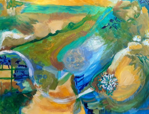
The Path to the Sea
Now, this is something completely different! And it started off as an intuitive abstract I painted in March this year. As the winter dragged on, my thoughts turned to sunshine and holidays by the sea. Slowly elements started to emerge which suggested a landscape I’ve often seen in France. Of course, this was back in the day when we used to travel – seems an age ago now! Anyway, we would often camp near a small seaside resort. And, somehow, this scene reminds me of parking the car on a rough patch of ground. Then struggling down a path made of soft sand to the idyllic beach, with only a few families to keep us company. Happy days!
Finally, I hope you enjoy looking at my summer paintings and dreaming your own dreams. Here is another lovely scene you might like. As you may know, all my paintings are for sale at reasonable prices. Affordable art! Just go to myContact Me page and get in touch.
Good morning everyone. This is a quick catch up post showing you this week’s paintings. Honestly, I haven’t really had much time for creating art. Because things have opened up a bit, I seem to be busier. And, of course, there is lots to be done in my allotment vegetable garden. For example, yesterday I spent a few hours watering everything and weeding the parsnip and broadbean plants. And it was tough on my hands as the ground was hard after heavy rain, then baking hot June sunshine.But, I can’t complain – I absolutely love the fresh, organic fruit and veg we grow.
Our Allotment Garden
Well, you can tell how much I miss painting when I take my sketching kit up to the garden. And snatch a few moments between chores. As you see, I couldn’t resist trying to paint these beautiful flowers. For example, the huge red Oriental poppies are so spectacular and so short lived. Also, the blooms of the purple irises in the tiny barrel pond last just a few days. So I had to include them in this week’s paintings. Fortunately, the mauve foxglove does stick around longer and these self seeded flowers are dotted all around the garden. However, I think you can tell by the way I overworked the watercolour that I am really missing painting with acrylic! There are some more paintings of my allotment here, you may not have seen them.
My Art Journal Abstract – One of This Week’s Paintings
As you can see, I had to do a small, intuitive abstract in my art journal in watercolour. When I was longing to do one on canvas. But, I didn’t have the time, so I really enjoyed creating this smaller one. And, it calmed my nerves, so, a good result all round! Plus the bonus is an interesting experiment in shapes and colours that I could expand into a larger version. When I have time!
A Close up of my watercolour abstract
In fact, I can see lots of possibilities of interpretation here – for some reason it reminds me of cave painting. What do you see?
Good morning everyone. A day at the seaside – I love this intuitive abstract that I made when I was thinking about a day out. Well, to be precise, I was only dreaming about going to the coast. And that’s because we haven’t been able to go for over a year now. Partly due to Covid restrictions and also for practical reasons – I chose to stay home and keep safe. Anyway, I can always dream!
A Day at the Seaside – an Abstract Acrylic
A Day at the Seaside – in my Dreams
However, I must insist that this composition must have come from my subconscious. As I have mentioned before, I do a first quick impulsive pass and create a full design, covering all the paper. Then I might leave it until next day, look at it and think about it a lot! After that, I’ll work on it from all angles and enjoy myself, creating texture. For the next session, I’ll choose which is top, and which is bottom and have a look at the balance of shapes and colours. And that’s when I get nice surprises!
The Unexpected Features
Fish or Seabirds?The Path and the Fence?
Actually, this picture almost painted itself and it was the first of my summery abstracts. Before this, most of my intuitive abstracts were in a different palette of colours. For example, here is one I did at the end of winter, with dramatic, sombre colours. In contrast, my seaside picture is in warm, mellow colours, with hints of cloudless sky and fresh vegetation. And, of course, the almost tactile yellow ochre indicating sand.
On the Shore
Finally, I made this collage a couple of years ago, partly as a tribute to the wonderful Mark Hearld. So, my imaginary scene of a day out at the seaside was made up of painted collage papers, cut-outs and watercolour. And then rounded off with a pretty, decorative border in muted colours. Ah, it’s almost as good as being there in person (almost!)
You could look at more scenes of the fab Yorkshire coast in my Gallery – Landscapes here. It’s affordable art, folks! Contact me for details here.
Good morning everyone. Today I’d like to show you an acrylic abstract painting ‘Floating’ that I have just finished. Of course, now that it’s complete, you can see all kinds of motifs. But, I assure you, these were not planned or anything. And, as I painted, after the first impetuous, free stage, I began to see shapes developing. So I just helped them a little bit to emerge more clearly. Actually, what is weird is that I rotate the painting round when I do this. And still something recognisable appears! Incidentally, this is quite a contrast to how I created this post here all about floating objects. As you can perhaps see, this was carefully constructed and planned.
What do You see, Floating in Air or Swimming?
Floating – a closeup Floating – another close up
Obviously, there is a face appearing and that’s because I sort of painted the lips while the painting was upside down. (From the way it was started, I mean). And then I just went with the flow! And, in order to explain away the fishy detail in the second closeup, I can’t! But those fish just seem to find their way into lots of my abstracts.
However, I do remember reading somewhere that the human brain is programmed into finding patterns in what we see. Particularly, we perceive faces and people very readily everywhere. Perhaps it’s some kind of survival instinct. Personally, I do enjoy looking at abstract and semi abstract work more when I can see shapes and make a story. As if this way of seeing allows me into the picture more easily. Instead of feeling that I am blocked from entering.
Straight Lines and Curved Shapes
Finally, I’d like to explore the concept of design a little. Or, to put it more simply, how to decide where to put things, and how to arrange them on the page. Naturally, this element of composition is important for figurative and abstract paintings alike. In my own case, I think about the design about half way through the process in abstract work. To be honest, I have been watching stuff recently on line about various types of composition design. And I read all about the combination of straight lines and curved shapes.
In fact, I realised that I use this style of design quite a lot in my abstracts (see here ) And, I didn’t really know I was doing it! But, I shall carry on because you can create strong compositions with a lot of movement this way. However, now I can think about trying out some more design schemes as well. Well, it’s all part of the lifelong learning plan!
Good morning everyone. Today I’d like to show you the study I made of a superb painting by the great Dufy. Actually, I did this while following a good online tutorial run by Art Enthusiasts London. Perhaps you remember my post about making a study of a Paul Klee abstract composition with the same tutor (see here ).
Unfortunately I haven’t got a lot of background about this painting. Raoul Dufy, 1877- 1953, was well known for his colourful paintings, influenced by Matisse, Cezanne and Monet. And I have long admired his bright, elegant scenes of smart seaside resorts in early 20th century France. Obviously here you can see a jumble of boats in the harbour- maybe on the Mediterranean coast.
The S Shaped Composition of the Great Dufy
Just look at how Dufy has simplified the shapes into ovals and straight lines. And then arranged them into a reverse S shaped composition, starting from bottom right and including all the boats. Masterly!
However, we also concentrated on the juxtaposition of the glorious colours the artist decided to use. No doubt they were inspired by the actual real details he could see at the quayside. But he then arranged them for maximum effect on the canvas. For example, he used complimentary colours green and red, blue and orange to make really sizzling combinations. As you can imagine, I found this exercise perfect for me – I don’t call my art activities ‘A World of Colour’ for nothing!
My Dufy Inspired Acrylic Abstract
Coastline
To tell you the truth, I was so inspired that I straight away (well next day anyway) started do an intuitive abstract . I had a print-out of the original in front of me for colour reference. And then I just let my hand paint away. But that was stage one. Then came two more sessions adding and subtracting material, balancing shapes and colours. Until the picture said ” I’m finished “. What a satisfying experience!
I hope you like my little tribute to Dufy. And you can see more abstracts in my Gallery here. All my paintings are for sale at reasonable prices. Just go to the Contact Me page here and use the form to email me.
This is just a quick post today, to keep you up to date with what I have been painting- Flash. So have a look at my latest 16 by 20 inch acrylic composition. To be honest, I am getting really comfortable with this size of paper. To explain ,it’s not so small as to cramp my gestural style of painting. And also, it’s not so large that it seems a bit of a chore to cover all the canvas with paint. Hopefully, you can see what I mean . In addition, the paintings are done more quickly. And I do enjoy finishing off a piece in roughly three sessions. But sometimes I like to take my time and develop a piece gradually. Perhaps, it’s a sign of the times that I am too restless to commit to anything that will take more time and concentration. I wonder if anyone else has felt that the Covid situation has altered their art practice?
Artist’s Inspiration for Flash
The idea for this piece literally came to me ‘ in a flash ‘ ! Suddenly , I saw some red, zigzag flashes on a beautiful, blue sky. Apparently, there was also some kind of ocean wave or strange sort of rolling landscape underneath it all . So , I just picked up my paintbrushes and started ! I must make it clear that I don’t create all my abstracts in this way. Actually, I might write a post all about it soon – so stay tuned ! Click here to see more abstracts, intuitive or otherwise !
Flash
Please don’t forget, all of my art is for sale at reasonable prices. This painting is acrylic on paper, 16 by 20 inches . It’s unframed and without a mount. I’m selling it at £60 plus shipping. And I’m based in the UK. If you feel like treating yourself . So, go to the Contact Me page and send me an email for more details.
The lovely people at the Skelmanthorpe Community Library Gallery have given me the opportunity to display my work on their Facebook page here . I’m the featured artist for a fortnight with one of my online exhibitions ! They are doing their very best to support and showcase local artists during the pandemic . I’m sure that as soon as it is safe , the gallery will be open again. Until then , we can enjoy taking part and also looking at other artists’ work in this way .
The Piece Hall – in my online exhibition
A detail from The Piece Hall watercolour sketch
The Piece Hall is a very famous site in Halifax, West Yorkshire. It is a Grade 1 listed building . It was the place where handloom weavers sold their pieces of woollen cloth in the 18th Century. As you can see , the building itself is very beautiful . So I couldn’t resist standing on the first floor balcony and doing a small watercolour sketch . Afterwards , at home I used the sketch as a reference along with a couple of postcards to create this larger piece . But , I worked fairly quickly and tried to keep the plein air feeling .
A Reworking of an Old Acrylic Painting – now in one of my online exhibitions
Coffee and Cake
Perhaps you have seen this acrylic painting in one of my blog posts . Or , if not , you might want to go and have a look at the story behind the picture here.
A Spring Painting in one of my Online Exhibitions
Snowdrops
I painted this acrylic painting just after Christmas, earlier this year for the Springtime in Yorkshire exhibition at Skelmanthorpe Gallery . But of course , as it was due to open in March it was cancelled due to the pandemic . So , it was a great chance to show the picture in my featured fortnight on the Village Art Facebook page in one of my online exhibitions. It shows a figure ( my husband actually ) on a cold day in February, admiring the Snowdrops in the big rockery at Wentworth Castle Gardens . This is a beautiful place where we quite often like to walk.
Art for Sale
All of these paintings, along with eleven more , are available to see on the display on Village Art Facebook page and to buy . If you see anything you like , send me an email , using the form on the Contact Me page
The Lockdown Art Exhibition
Family
And , finally , I was so pleased to be included in this Fronteerlockdown art exhibition on Instagram. This is my intuitive abstract and I’ve called it ‘Family’. You see , Fronteer are a husband and wife team who promote the arts in Sheffield see here. You certainly ought to look up the whole exhibition on Instagram if you can . It’s top class and , if I’m lucky , I might be included in the real life show selection as soon as it can be staged in their Gallery. I’m keeping my fingers crossed ! That’s all the news on my online exhibitions for now , but , I’ll keep you posted !
I’m very proud of this painting – let me explain why . It’s been about six or seven weeks since I felt like painting anything bigger than a small journal page. To be honest , after finishing off a large acrylic abstract begun before Lockdown and then creating just one more ( because the idea wouldn’t give me any peace until I did , see here ) I found that I could only work in a small art journal given to me as a gift . It was an absolute godsend . I could use it to make me feel calmer , and , also to express some of the feelings that I couldn’t say in words , as in this one .
Bunch from the Allotment – watercolour
Back in the studio
However , I really missed painting and , this Monday , I dragged myself to the ‘studio ‘ ( just a small bedroom really ) and , once I started working , I couldn’t stop ! A break through ! It was glorious- painting all day . I’ve decided to work larger now , I was feeling too cramped , trying to work too small so this piece is 16 by 20 inches , on paper . I completed it in two sessions of an hour and a half, on the same day . This abstract composition has been rattling around in my head about four weeks or so . So now it’s finished , I can relax .
Break Through – detail 1Break Through – detail 2
The colours are dynamic and vibrant – they make me feel positive and buoyed up . I don’t think you will be able to see the small , subtle details and texture – perhaps you can see them better in these close- ups .
I hope you enjoy looking at my paintings – all of my artwork is for sale at reasonable prices. There are lots of interesting examples of acrylic abstract painting on my Gallery page too.. If you want to know more about prices and so on , go to the Contact page and send me an email using the form.
This mixed media piece was inspired by the relentless rainy weather we had a couple of weeks ago – the raindrops splashed across the glass of the windowpanes in different patterns according to the direction of the wind . Sometimes they just landed softly and trickled down – sometimes they lashed across diagonally and , as in this art journal piece , the hailstones fell at the same time ! What strange summer weather .
Watercolour, pencil and coloured pencil – mixed media
Hailstones – an abstract interpretation
I tried to capture the subdued , melancholy feeling of a drenched world by using soft blues and greys . The gestural marks and shapes I made were at first soft and rounded, but , as the storm became more intense , I drew harder , stronger straight lines . Finally , I added my abstract interpretation of hailstones , making each one different. I don’t know if this is scientifically correct , but it’s how I imagined them – a bit like snowflakes . The hailstones are so fierce as they arrive but they only last a short while and then they quickly melt . Then the sun came nearer to a gap in the clouds and a few rays of orange light filtered through . All this may or may not be obvious when you look at the painting, but it was going through my mind as I created it . Anyway , I hope you like my weather picture : Raindrops and Hailstones.
Raindrops and Hailstones – in mixed media
I hope I have given you a brief insight into the mind of an artist . You can see more abstract compositions in blue shades in my Gallery – Abstracts here
Did you know ?
If you click on the title of any post until it is underlined , you can see the likes and comments and perhaps add your own ! And I will have a better idea of how many visitors are reading this blog .
P.S Have a look at the new gallery of my work in the sidebar of the blog. I shall keep this up to date and , remember , all of my work is for sale at affordable prices.
This time , I’d like to show you three new abstracts where I was painting in red plus a couple of other colours.
The image above is the latest page in my art journal ( 9inch square ) – a mixed media piece using collage, watercolour , pen and coloured pencil . It was quite instinctive . However , the only idea I consciously brought to it was using a restricted palette . I think that red and black go very well together and I added greys to get some mid tones into the design . The white you can see is the paper showing through . To sum up , I feel that the mood is loud , upbeat and , possibly confrontational. Can you see any images in this ? I know I can, but I’d be interested to know what your interpretations are.
This abstract is in my Gallery – Abstracts – along with lots of other interesting paintings . Click on the link here
Painting in Red and Blue – Mixed Media on Paper
Sinking
In this one , as you can see , I paired red with blue and added black for more emphasis . And you’ll see collage , watercolour , pen and oil pastel. The red is subdued in places and the blue is quite pale . The atmosphere here is more uncertain , confused and , because of the suggestion of deep water , more sinister. It’s definitely Lockdown art ! I love the way that my feelings come through in the work – but I only realise it later .
Painting in Red and Purple
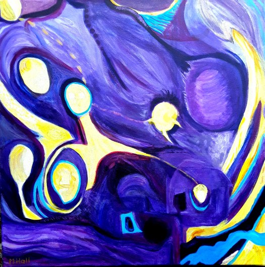
The last image I want to show you is my ‘ Hell on Earth ‘ acrylic painting on a 2 foot square canvas . As you can see , I chose red and purple colours mainly . This was actually done in response to a challenge from an online group that I belong to : paint in red and purple and orange. To be honest , this is a colour combination I wouldn’t normally choose . But I was quite pleased with the outcome . The subject matter , a ravaged landscape , really sets the scene. And the red and purple help to give quite an eerie feeling to the atmosphere. As you can see , working with a restricted palette leads me to fresh ideas and inspiration which is always welcome !
Hell on Earth
All of my one-of-a-kind artwork is for sale at reasonable prices. If you see anything you like , email me for more details , using the form on the Contact page . It’s Affordable Art !
More Blog Posts
Don’t forget to check out my blog more often – I’m writing two posts a week now and you might not want to miss out on anything !
I thought I’d just take this opportunity to showcase an acrylic painting once a month and offer it to you at a reduced price – art for sale ! You see , I have done quite a lot of artwork over the years . And , as a result , there are paintings everywhere in the house , just waiting for a new home to go to !
Anyway , this is an acrylic painting on paper , sized 16 by 12 inches . It’s unframed , without a mount , and sold as you see it . The colours are just very slightly brighter in real life . My camera didn’t pick up the vibrancy and richness of the colours, I’m afraid .
I painted it last summer when I was exploring the technique of painting over an existing finished painting . I created a semi-abstract composition using the same colour palette and atmosphere, if you like .Unfortunately , I didn’t keep a record of the original acrylic painting in this case ( see another example of this technique here )
As you can see , I was very interested in all the wooden objects in the cafe . For example , the window frames , the spokes of the chairs , the panelling and the floor boards. I also concentrated on the textures of the pretty tablecloth and the woman’s pink fluffy sweater . I expect you have already spotted the cup and the dainty , iced cake !
Coffee and Cake – a detail
Art for Sale
Would this painting look good in your kitchen ? Or perhaps in your lounge , something intriguing to look at as you enjoy a cup of coffee and a delicious cake or pastry . I wonder what she is thinking about ? You could choose a frame to match your own decor . I’m offering it at the bargain price of £40 including shipping – I’m based in the UK . Please contact me for more details by sending an email on the Contact page here .
This post is all about birds and Bird Art . I suppose I have taken more notice of the ones visiting my garden during Lockdown . I certainly have heard more birdsong than usual in the first few weeks of isolation , when the world was quieter.
This first image shows a common garden bird in the UK – a house sparrow. This bird art pencil drawing was done for a challenge set by a painting group I belong to .
An art journal page painted in Lockdown 2020
Birdman – art in Lockdown 2020
I started to keep an art journal in March and I have done a few intuitive abstract composition in mixed media like this one ( Birdman ) . I just painted in watercolour on brown toned paper without much thought , and a birdlike shape appeared , cradled in the hands of a rather strange looking man.
Seagulls
My next image is a blast from the past actually (apologies for the poor quality phone snap ) . Again , this was a challenge that I set for Barnsley Art Society a couple of years ago . Bird Art with seagulls ! Mine was painted in acrylic in just over an hour .Wouldn’t it be nice to go on a trip to the seaside right now ? ( only two hours drive from where I live )
Pigeon
And the last one I’d like to show you is a work in progress from my journal . Again , an unplanned , instinctive work , just a watercolour doodle to begin with . And then I realised I was moving towards painting a pigeon !
These are just the first layers. I shall probably add more watercolour and oil pastel then I’ll post it as soon as I have finished it . See it here .
So , that’s my post . A tribute to Birds – they have certainly kept my spirits up during this strange time . I wonder if anyone else has noticed a trend in the type of art they have been producing during social isolation ?
Bird Art Carved in Wood
A bird carved in wood on the mantelpiece in a local stately home , a pen and wash sketch done on the spot in February
Mixed Media Abstract Composition – Bird man by Margaret Hall
This is my latest mixed media experiment an abstract composition using collage, acrylic , watercolour and oil pastel . In fact , there’s even some marker and pencil in there – although the pencil might be a mistake as it is too shiny. I wonder , do you happen to know how how to apply a few sharp , precise marks over mixed media layers without using pencil ? Because I’d love to know . Anyway, I don’t really know what I’ve painted here . It was quite instinctive really . But I think it has something to do with wanting to escape from the anxiety and threat of this virus ! And it’s painted on brown paper which I bought at David Hockney’s Gallery on a trip to Saltaire ( more of that later ) .
The toned paper in this case is a rather nice brown paper. You see , I have admired other sketching friends’ drawings on brown paper sketchpads so I bought one . However, I don’t really like the effect of acrylic paint on this paper . Perhaps it was the colours I chose . But they don’t seem to have the sparkle that I like when I use white paper.
Sketching on Brown Toned Paper – the Hockney Gallery Connection
Patterns seen at the Museum
Now for the interesting par – I bought this sketchpad at David Hockney’s gallery at Saltaire . At the time , I was taking part in an Urban Sketchers crawl back in February. Maybe you remember my post all about it . Anyway , we spent the morning in a small brewery/pub and I sketched the brewing equipment in mixed media . As you can see , I used pen , pencil and watercolour . See my blog post here
The Brewery – Urban Sketching
To be honest , it was great fun – perhaps one day soon Urbansketchers Yorkshire will be able to meet up again .
David Hockney’s Gallery at the Saltaire World Heritage Site, Shipley , near Bradford , UK
A view from the gallery window across to the allotments and the model village
Salt’s Mill is actually a complex of woollen mill buildings established by Titus Salt . Also , he built the model village alongside it in the 1850’s . In effect , the village included neat, tidy terraced cottages , a church and a Sunday school . And then there were allotments , a school , a park and much more alongside the river Aire . Really , it’s quite fascinating, so go and have a look if you get the chance .
The downstairs floor of Salt’s Mill shows an exhibition of earlier Hockney artwork . Do you know, David Hockney was born and brought up in Bradford , just down the road from Saltaire .The downstairs floor is also where you can find the art shop where I bought the toned paper sketchpad . And , upstairs there’s a museum room about the history of the factory . But the star of the show is the David Hockney Gallery. In fact , it now displays some recent work from the Spring exhibition of locations in East Yorkshire . This , of course , is where the artist used to live . Enough said , just have a look at the fabulous pictures !
The Coming of Spring in Yorkshire – 2011 in David Hockney’s Gallery
By David Hockney By David Hockney By David Hockney By David Hockney
Our First Visit
The first time we visited the gallery was thirty years ago . And we were lucky enough to see the large drawing that David was sending by fax across from California ! The drawing was arriving piece by piece. Then the very large drawing was re-assembled from pieces of copy paper and displayed on the wall . This was revolutionary at the time . I love the way this artist always enjoys using the latest technology to create his work .
These ‘paintings ‘ are all actually prints of iPad drawings and I think they are absolutely stunning ! I hope that you have enjoyed my little exhibition review .
An Intuitive Abstract Composition in Pink and Green
Paradise – an abstract composition by Margaret Hall
This is the first painting in a set of three that I mentioned a couple of posts ago .And I called this one ‘Paradise ‘ . I think I must have imagined a tropical scene or a scene in a jungle . The colours I was drawn to – luscious pinks and vibrant greens – definitely fitted into this theme . I tried really hard not to paint anything too figurative and realistic . But when I stood back from my easel, I saw suggestions of a bird , an insect , perhaps an animal, flowers and leaves . So I realized that I was going to make this this acrylic abstract composition semi-abstracted not purely abstract . But that’s ok. To be honest , I often find that my paintings decide what they want to be . And , sometimes without a lot of input from me ! I even turned this one upside down several times to paint it and the motifs still appeared ! I wonder if you can see any signs of life in this jungle ( as well as the luxuriant foliage , that is ) ?
Paradise – Birds , Flowers and an Insect ? – details from my acrylic abstract
A Bird ?An Insect ?
I believe that the term ‘ paradise ‘ has its origins in a word which meant ‘garden’ , a place with lush growth and plenty of water , a place where you could rest and gaze upon a beautiful scene . When I painted this , I was thinking about the story I was telling in a series of three canvases for a commission proposal : this is the first one ‘Paradise ‘. And the second one ‘ Hell on Earth ‘ was shown in a previous post in May here and it carries the story forward .. All will become clearer soon when I reveal the third part !
This is an intuitive abstract acrylic painting on canvas from a few weeks ago on a 2 foot square canvas . Actually , this is the largest size I have ever painted. It took me a while to learn how to adapt the size and shape of the design to the square format . But , that came after the initial free expressive part of the painting . Of course , some semi-abstracted shapes crept in , but that was ok . Mainly because it fitted in well with the story I was developing over three canvases . These form a triptych which I entered in a commission to produce artwork for a chapel gallery in a local stately home . Unfortunately , I wasn’t successful but I felt it was a very useful exercise and I learned a lot about describing and presenting my work whilst doing the submission .
On a Washing Line
However , now this work can now go public and here it is in a virtual exhibition called ‘ On a Washing Line ‘ . This is presented by a group of local artists that I belong to. We were due to exhibit our recent work in the real world but this is the next best thing . And a lot of fun too !
Hell on Earth
To let you into a bit of a secret , I called the piece ‘Hell on Earth ‘ the second of three paintings on canvas . It’s a story about the difficulties the world seems to be going through just now. A dramatic piece to catch the eye and make a bold statement in a large space. But , don’t worry , the ending is hopeful and I will tell the tale in a while over a couple more posts .
You’ll see more of my abstract acrylic painting on canvas in the gallery section Abstracts here
This is my latest acrylic abstract painting. So I thought that I would explain a little bit about how I created this. In effect , how to paint an acrylic abstract ! Firstly, I followed a suggestion online to play with these three colours plus black and white and , literally , just see what happened. I did find this brief quite inspiring – choosing the colours had already been done for me . So if I could ‘ let go ‘ , I thought it might be relaxing. As opposed to the hard thinking and research that goes into , for example , one of my Story Pictures.
Great Wave on Worsbrough Reservoir
Anyway, I usually work in this ‘ portrait ‘ format and I didn’t realise how used I was to creating a rectangular composition until a friend of mine gave me some lovely square canvases. So , that was a challenge I set myself and this was the first version.
Step by Step
Version Number One
I was pleased with the movement but I realised that the ‘white ‘ shapes were not working so – on to the next version.
Version 2
So next day, I worked on the painting some more and took away a lot of the white. But meanwhile , I had been far too busy and I had added so many ‘ interesting ‘ little sections . Really, they were cute in their own way , but all together , it was too much and just confused the eye. So, they had to go – it was quite a painful experience to paint them out . In fact, I think this is why some artists find it difficult to judge when an abstract is finished . I certainly do . What do you think ? Is it finished ?
On the Wall
Well , that way of creating an intuitive abstract seems to me completely different to the way I put this next one together
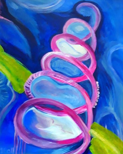
The Spiral
Believe it or not , this composition came to me as a finished design in my imagination. Actually, this hardly ever happens for me . So it was just a question of trying to put it down on paper ( or canvas in this case )
Well, that’s enough waffling from me. I hope that I have shed a bit of light on how to paint an acrylic abstract . If you want to see more of my abstract paintings , have a look in my gallery here . And , don’t forget , all of my work is for sale at reasonable prices.