Two Different Kinds of Abstract

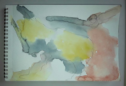
Good morning everyone. This is what’s on my easel at the moment and I must stress, it’s not finished! But, I spent a very pleasant hour getting it to this stage and it started me thinking about the different kinds of abstract I like to paint. For example, this type I would call instinctive or intuitive because I had no plan . However, I do think that some deep feelings do surface as I am painting in this way. Of course, no one may notice apart from myself. Hopefully, it will also be a fairly pleasing arrangement of shapes and colours, whether it has a deeper meaning or not .

This is a close up of different ways of applying paint, such as palette knife, dripping and scratching out. I think it just adds interest ( I love doing it too!)

And in this one, I used thin wash, stippling and spattering.

Now this was done in a totally different way – in this class we were shown how to study a real 3d ceramic object. Then take inspiration from its shape, texture and so on and I actually did find this a fascinating way to work. So, there we have at least two different kinds of abstract, but I am sure there must be more. If you paint abstracts, which method do you like to use in your creative practice?

Beautiful Dales Landscape in Gouache

A Sunny Day in the Dales

Good morning everyone. Here’s another beautiful Dales landscape in gouache, Yorkshire Dales, that is. Actually, this is just a quick post today, to keep you all updated on the artwork I have finished. And I really enjoyed painting the luscious foliage in this sunlit view. To be honest, it reminds me of many walks that we did in this part of the world. Because we have returned to this delightful place over many years, camping and staying in youth hostels. And, now, renting cottages. In fact, the area is not really so big, but each small area is very distinctive and the landscape is quite varied.

As you can see, this view is of the valley bottom, but still quite high up. Of course, the hills are not far away and the view is, in my eyes, very pleasing. At times, the weather can be challenging, even in summer. However, in my painting you can almost feel the heat rising from the grass. Also, in my imagination, I can hear the insects busily buzzing around. Incidentally, the last walk we did in Wharfedale this summer was in sun till halfway round. Then hailstones and heavy rain for the other half! But, that’s part of the charm, I suppose. Anyway, in my opinion, you can have a beautiful Dales landscape in any weather.

Pinks and Blues in Oil Pastel

Now this is something quite different, a quick intuitive abstract made in marker pen, oil pastel and pencil. And it took me about three sessions of ten minutes each while I was doing chores. And, I felt a great deal better when I finished it! How satisfying to do some art therapy in snatched moments of time. As you may know, if you read my blog. I do rely upon these abstract sketches to cheer me up. See another post here for more examples of occasions when I only had time for sketches.

New Paintings, Finished at Last

On the Beach

Good morning everyone. I’d like to show you these two new paintings, finished at last! Firstly, this beautiful Mediterranean scene, based on a photo from Landscape Reference Photos for Artists, here , by Penny Wohler – Stone. And this was such a pleasure to paint! In addition, gouache paint seems made for a scene which cries out for delicious textures and vibrant colours. Of course, this painting also fits in with my theme of hot, dry landscape and Australian scenes. (See here ) In fact, it’s turning into a collection now! To be honest, I couldn’t really see the point of doing a series before. But this one seems to have grown itself! Now I’ll have to think about displaying it together somewhere. Anyway, I’ll just paint a few more first.

Encounter

Secondly, a completely different intuitive abstract in watercolour, pencil and marker pens. Actually, I found this little painting when I was tidying up some sketchbooks. And, I remember trying out a tip about keeping watercolours moist – I think I proved here that it does work. Because, as you can see, the paint didn’t need much encouragement to wander across the paper nicely. So, I was pleased with it, and when it was dry, I stashed it away.

Anyway, I looked at it from all angles and embellished it with patterns and markings. Then I noticed something in it that suggested a face to face composition – I wonder if you can see it too?

Encounter – a close up

So, there you have it – two new paintings, finished at last.

On the beach – a close up

A Very Quick Catchup Post

Dream Landscape

Good morning everyone. Just as it says in the title, a very quick catchup post. In fact, I’ve not really had much time to paint lately. So these two pieces are quite literally small works done in snatches of time. To be honest, I started this gouache in five minutes before starting on breakfast! Well, you get the picture. Anyway, quite unusually for me, this was straight out of my imagination. And, I don’t really feel like it’s finished, but to add any extra elements now would look too artificial. So I’ll consider it as a study, a practice in using gouache paint.

Emotional Outburst

Now, as you can see, this one in my quick catchup post is completely different. Of course, it’s a doodle, but also a picture of my state of mind at the time. What do you reckon, anger, anxiety, bewilderment ? All of the above. We are living in such strange and difficult times and I usually try to keep my worries under control. However, sometimes they break out and I suppose there’s less harm done if it’s contained within a painting. Actually, oil pastel is really good for this kind of art therapy. Because you can pound it into the paper and get rid of all those uncomfortable feelings. Honestly, I’ve no idea what it is or if it means anything. But,I definitely felt better after I’d done it! And there’s another post here with more art therapy exercises that you may not have seen before.

What Inspires You to Paint?

Golden

Good morning everyone. What inspires you to paint or create? Actually, this is what we were discussing yesterday on our Art Society trip. In fact, we went to the town gallery to study and sketch the gorgeous drawings and sculptures of local artist Graham Ibbeson here . And over good strong coffee and delicious scones, the conversation turned to how we feel inspired.

So, one of my art buddies likes to take elements from an old master painting and work them into his surreal style of painting. Another friend likes to try out different media and styles for inspiration. And I talked about seeing an image in my mind’s eye, out of the blue. And then using it as the basis for a painting, which is exactly what happened here. Because I saw vaguely hexagonal shapes, the golden colour of honey and beautiful purple.

Incidentally, after I had thought about using this image for my post, it reminded me of another intuitive abstract. Also the inspiration for this earlier one had just come to me as an arrangement of shapes and colours. Usually when I’m half asleep or daydreaming.

Golden, original

Well, I do have ideas about other kinds of paintings too, this was just for abstract composition. But I’ll maybe talk about that in another post. If you want to see some more intuitive abstract paintings, see this post here. Anyway, what inspires you to paint?

Look at this Small Abstract

Big Brain

Hi everyone. This is a very short post indeed, all about a small abstract. To be honest, I’m so busy at the moment, gardening and arty business. Not to mention just running my life! Anyway, I just couldn’t stand missing my art fix another day. So I found my small drawing pad, watercolour kit and a few pencils, oil pastels etc. And then let a few colours run into each other. Next I added some small, precise marks and accents. And all this without a single conscious thought, a small abstract. Afterwards, I found out which way up I preferred it. Only then did I notice a head in profile and I had a strong idea come into my head! Namely, we need someone with a brain this big to get us out of the mess we are all in. Well, on that cheerful note, I’ll sign off and hope to write a longer, more optimistic post soon. (There is a more cheery abstract here !)

Delivering Paintings to New Shows

The Power of the Waves

Good morning everyone. This is just a quick post today – as the title says, it’s been a busy week delivering paintings. Because not only am I catching up furiously in the veg garden. But also I delivered my paintings to two galleries, well, one gallery and a church! Actually, we went to Fronteer Gallery yesterday with the seascape for their exhibition ‘The Sea’. I can’t wait to see that one, Fronteer exhibitions are always interesting, I love a theme for a show.

The Power of the Waves – close up 1
The Power of the Waves – close up 2

We also went to St. John’s church at Hoylandswaine delivering paintings because the art group in the village invited me. In fact, I have belonged to this group a number of years. Admittedly, I couldn’t go to the meetings during the worst of the pandemic. But, fingers crossed, I am gradually going out more now and things are looking more normal, socially speaking.

Sunshiny Day

To be honest, I am taking part in five exhibitions at the moment (I know!) So a lot of my work is already out on the road, so to speak. However, this abstract is a favourite of mine. And I’d like to see it in a lovely exhibition again, so the village festival show seems like a good thing to be involved in. Got to run, but if you want to see more of my abstract painting see here.

Three More Quick Little Abstracts

Quick Abstract 5

Good morning everyone. I’m showing you a catch up post about my series of quick little abstracts. Well, if I call them a series it makes it sound more serious! But it’s really because I’m so busy at the moment, and only seem to have time for small works. In retrospect, in this one I must have been greatly influenced by dark thoughts about the war in Ukraine. Perhaps it’s a cliche, but the red looks like blood to me, with something scary raining down on the city from above. Actually, I mentioned in my last post in this series that I only notice these things after the sketch is finished.

Quick Abstract 6

In fact, you may have seen this watercolour sketch before, as I included it in my post about our holiday in Scarbrough here. And I painted it after having paddled in the cold North Sea. Honestly, I found it fascinating to spot the different patterns created by the receding tide on the shore. So I had a lot of scope for decorative patterns in ink over the top of the background.

Quick Abstract 7

Finally I painted this one after a day’s work at the allotment garden, Where I immersed myself in greenery, vegetation etc. Obviously, I don’t have to tell all you gardeners out there about the rapid growth. And how all plants grow so quickly in the UK at this time of year. Admittedly, we have to work very hard weeding and cutting back, but it’s quite glorious really. If you want to see more of the greenery in my plot of land, look here. Just another one of my quick little abstracts for the series.

See my Small Watercolour Abstracts

Doodle 3

Good morning everyone. This is a quick catchup post, just to show you more of my small watercolour abstracts. Well, I’m still producing quite a few of these. And I’ve noticed that they definitely reflect my painting interests and colour choices at the time. But I don’t notice this till afterwards! For example, in this one above I’m exploring more restrained and sparse patterns, as a contrast to the busier designs of the previous little abstracts seen here.

Doodle 4

On the other hand, I noticed after I had completed this one above that it was connected to my current large acrylic. And also, the softer colours and bold black calligraphic marks are in the style on my online course. Who knew? Actually, my subconscious painting brain surprises me more every day, especially in my small watercolour abstracts!

Doodle 4 – a closeup

A Day by the Sea

North Landing, Flamborough

Good morning everyone. We’ve just spent a lovely few days by the sea. And I painted this quick watercolour sketch looking down at North Landing Bay at Flamborough on the Yorkshire coast. Although it looks deserted in my sketch, there were actually some families playing on the beach. And the snack bar was open and doing a roaring trade. Also, a small boat came back to the shore, with a few crates of fish. Then they pulled the boat up the ramp to the boat house. After I had finished my sketch, (about 30 minutes) we walked a short way along the cliff path on the headland. Actually, we were looking out for puffins, but they were all hiding! What a beautiful way to spend an afternoon.

In fact, I had paddled in the sea on the beach at Scarborough that morning, in freezing cold water. And when I got back to the flat I decided to do an intuitive abstract. So I painted an impression of the movement of the water, as the tide receded around my feet. If you look at this post here from last year, you’ll see another sketch of this coast.

The Tide

Look at my Framed Abstracts

Up

Good morning everyone. I finished this small watercolour painting yesterday and, with a bit of magic, it’s now one of my new framed abstracts. Isn’t science wonderful? Only a few minutes work, and there it is , in a frame and on the wall of a virtual room!

Up in the Dining Room

Not only does it boost my confidence to see my work displayed on the wall. But also I can then easily assess the work and make mental notes how to progress in the next one.

Perhaps you might not be aware, but I can see quite a lot of influence here from the Painting with Yvette course I am following. For example, the general movement of the colour red across the paper. Also, I have used both thin, washy paint and more thickly applied coats in this composition. In addition, I have applied patches of fine surface pattern on the top layer. Obviously, this might not be all that easy to see in these images of one of my framed abstracts. But, close up it is more effective and I learned all this from this excellent course.

In the Shadows

Finally, I couldn’t resist ‘hanging’ this little abstract on the wall. And I like the way the dark, moody colour of the background complements the mysterious feeling of the painting. In fact, when I look at it now, I think of a passage back into the light from a dark place, perhaps a cave? However, it was an intuitive composition, with no planning beforehand. If you would like to see more of my abstract work, see here.

Discover Shapes in Paint Doodles

Flight

Good morning everyone. This is a fun exercise I did in the tutorial by Charlie O’Shields in the Sketchbook Revival course by Karen Abend. And I tried to discover shapes in simple paint doodles, following the method described by Charlie. To be honest, it was easy to follow. First, scribble some marks with clean water on your brush, on watercolour paper. Most importantly, leave some blank spaces and don’t cover all the sheet. Next, quickly drop in some very wet paint and allow it to mingle. As you can probably tell, my paint blotches did start to dry a little. So I added more and ‘grew’ a few cauliflowers! But, it didn’t matter and just added to the design. When it’s thoroughly dry, take a bit of time to study it. Then pick out the outlines of anything you see in pen or fine marker. Just let your imagination go wild!

Actually, I did enjoy this playing with paint and ideas, and I felt it was a good antidote to worrying about all the sad things I hear on the news. So, if you want a little chuckle, have a look at the other daft doodles I produced.

In the Depths of the Sea
Night Time
Puppy

Finally, here’s an example of a ten minute doodle (done last night). And this shows my usual method of doodling abstracts and how to discover shapes. In fact, I draw or paint colours and shapes at random and then develop it from there. In this case, first, chop courgettes for the dinner, then sit down with marker pens, oil pastels, a biro and tiny notebook!

Courgettes for Dinner

Quick Sketch in Oil Pastel

Movement

Good morning everyone. Today this is a short post because I’m insanely busy this week! Incidentally, have you ever noticed how everything happens at once?. Not only is my show opening this week, but I’m helping to put up our group exhibition at the weekend. And, I did squeeze in an oil pastel workshop at the weekend, which was brilliant. What a difference good quality materials make. In fact, it was quite a revelation to use artists quality pastels and paper on Saturday. Not to mention learning from our excellent tutor how to blend colours and create textures. So, I promptly ordered some pastel and oil pencils online and can’t wait until they arrive. Actually, the work we produced at the class will be on display for a short while, so more of that later. And there’s a cute little bird in oil pastel here , from a while ago.

Anyway, this is an enthusiastic little oil pastel sketch I did when I got home, to practise some of the techniques. Finally, here’s a taster of the work in my new exhibition, more of that in my next post.

Jagged

Two More Nice Bright Abstracts

Sunshine and Rain

Good morning everyone. I did this one of my nice bright abstracts before Christmas and I’m quite pleased with the way if turned out. Again, I had no plan beforehand, except perhaps to incorporate lots of lovely, juicy colour! And, on this one I particularly enjoyed splashing the flashes of white across the gold and bronze.

Sunshine and Rain – a closeup

In fact, I noticed that I have been featuring a lot of round, globe shaped objects in my abstracts lately. Of course, if you paint them yellow your mind interprets them as the sun. And dark clouds creeping up in the background can then suggest imminent rain. So, that’s how I found the title! Anyway, I suppose this led me to thinking that it was time for a bit more development of my abstract work. However, more of that in later posts. Meanwhile, here is another of my nice, bright abstracts, completely intuitive and in a watercolour sketch book.

Afternoon in the Garden

Now, this was a lovely art therapy exercise – a quick watercolour sketch in a few spare moments. And then, some flourishes with oil pastel, ink and white gel pen. I wonder if you can see anything in it? I wonder if you see the same as me? There’s another intuitive abstract in this post here for you to puzzle out!

If you like my abstracts, I just updated my abstracts page in the gallery here. And, don’t forget, I shall be showing you some new style compositions soon.

New Painting in Colour Exhibition

I Dreamt of a House by the Sea

Good morning everyone. Last week I found out that Fronteer Gallery had accepted my painting ‘ I Dreamt of a House by the Sea’ into their Colour Exhibition. And I was so delighted – firstly because it’s always a pleasure to take part in their events. Secondly, because of the theme ‘Colour’. As you might have noticed, I call this website A World of Colour. So, most of my work does suit this theme. However, I chose this particular painting because it seems absolutely bursting with colour.

I Dreamt of a House by the Sea – a closeup

Virtual Travelling for the Colour Exhibition

Actually, I painted this without a plan and it was quite late on in the process before I saw what it was. Perhaps a path leading up to the house with a view of the sea. Then, later on I suggested landscape and some vegetation on the cliff. But, for me, the most striking thing about this is when I made it. Right in the middle of being isolated at home, when I was desperate to spend time by the sea! In fact, the colours, the sunshine and the sparkling air are much more reminiscent of the coast of northern France in August. Ah, those charming, unspoilt little resorts where we spent weeks camping. Happy Days! So it seemed ideal for the colour exhibition.

There are lots of seascapes for you to dream about in my gallery here. And a post all about another of my paintings in the fabulous Fronteer Gallery here.

All my paintings are for sale at reasonable prices. Just go to my Contact Me page and send me an email.

A Beach Day

This is somewhere on the coast of Queensland, Australia. And you can find out more in my post here. Well, virtual travelling is the only way for me to go, at the moment!

Black on Black, Colour Experiment

Black on Black

Good morning everyone. This acrylic painting is painted on a smallish black box canvas that I have had for ages. Frankly, I had no idea what to paint on it, but they were all the rage at the time. Anyway, I decided to have a go, just after trimming this year’s Christmas tree.

And so, as you can see, the colours red, gold and white were on my mind! Well, I put down some shapes intuitively, with the idea that the canvas would stand as the background. My daughter-in-law thought it looked quite festive! However, I hated the effect of unpainted canvas. So, I carried on my usual method of shaping the composition by layering paint. Of course, this included painting over the untouched background. Hence the title.

A close up

Incidentally, I also discovered, or perhaps consciously realised that I prefer colour to be nuanced and subtle. Rather than flat with only one tone, like the black canvas. Sorry about the glare, it’s quite difficult to photograph these colours.

I hope you enjoyed looking at my intuitive abstract – there are loads more on my Abstracts page.

The In Situ Photo

By the way, this is the room I designed the painting for!

Some New Small Sketchbook Abstracts

Good morning everyone. Well, I don’t know about you, but I didn’t seem to have much time to start on big projects lately. So, I thought I would show you some of the small sketchbook abstracts I managed to squeeze into my busy days. Actually, I find it quite a comfort to grab the nearest small sketchbook, relax in my armchair and paint!

Just Breathe

However, this first one started life as a rapid ink sketch, intuitive really. Then watercolour, but this time I made an effort to keep the colours very clean. That is to say, adding glazes on top of the three basic colours to add tone, instead of creating mixes on the palette. Also, having seen something online about adding depth to abstract shapes, I tried to think of them as 3d objects. Incidentally, this is very pleasurable to try. In fact, I’ve just realised these small sketchbook abstracts are arty experiments, as well as being good for stress management.

Watercolour pencil experiment

As you can see, this small sketch book abstract has been built using watercolour pencils. Actually, I haven’t played around with these for ages and I was considering taking them on an outdoor sketch trip. So I wanted to remind myself how easy it is achieve quick, bright colour. Obviously, it is very easy and so I took a couple of pencils with me when we went to the Danum museum, before Christmas. And I really enjoyed using them.

Objects in Doncaster Museum

Above all, I really love painting intuitive abstracts, whether they are small or larger, like this one in this post here.

Coffee for One, Lockdown Painting

Coffee for One

Good morning everyone. Well, there are only two more days to see my lockdown painting at the Open Art Exhibition by Fronteer Gallery in Sheffield, UK. But it looks really good up on the wall at Exchange Place Gallery – see this poster for details.

Honestly, I was thrilled to bits to be accepted for the Open, this is the first time I got in! And, I decided to enter a lockdown painting in acrylic that I did last summer. Actually, I just sat down to do an intuitive abstract and gradually this figure emerged. So I ran with it and developed a cafe setting around it, with the light emerging through the tall windows, revealing the stripped pine floor. She sits alone at a table for one, covered by a gorgeous pink and yellow embroidered cloth. And you can almost smell the dark brown coffee and taste the dainty chocolate cup cake. In fact, the yearning for cafe society that I suffered from last year probably inspired me to paint this picture!

However, this is what I see, and you can obviously see into it anything you like! Anyway, I’m so glad that the gallery gave my picture its few minutes in the limelight! Have a look at this post here for another intuitive abstract in a similar colour palette.

A Pink and Blue Intuitive Abstract

A pink and blue intuitive abstract,  organic shapes, swirling about in a sea of grey.
Pink and Blue

Good morning everyone. I been trying to catch up a bit recently and finish off some paintings that I had left midway. For example, this pink and blue painting first started life as a quick abstract sketched out in marker pens. In fact, I was in my studio early one morning watching the sunrise through my window. And the glorious colours – pink, soft blue and turquoise really inspired me. So, I grabbed a pack of cheap felt tip pens and a drawing pad, and created this.

The first drawing of the idea.

As you can see, I added greys to tone down the brightness. And these became quite a feature in my acrylic version on canvas board.

Pink and Blue – the Acrylic Version

Well, I really enjoyed applying the paint thickly and creating texture in this acrylic painting on board. However, it still didn’t seem quite right and so began the long wait! Actually, I looked at it everyday ( there’s stuff all over the house being “looked at”!) And then I got busy! Does this story sound familiar? Finally, I quickly finished it with some subtle marks, so, lots of thinking led to quick painting.

And, I was fairly pleased with it, so I put it on the dresser and I’m still looking at it. But now it’s stopped talking to me, so that’s ok.

You could see more of my abstracts here in my gallery . And all of my work is for sale at reasonable prices, email me via the Contact Me page for details. And here is another pink and blue abstract, acrylic on board.

Trying Out Two New Watercolours

Wandering

Good morning everyone. Firstly I’d like to show you this little abstract I did in my sketchbook. And it was very much a quick, watercolour sketch done between chores with my travel paint set. However, it was also my first chance to try out two new watercolours, Mauve and Payne’s Gray. Actually, I’ve been doing a bit of research on watercolour technique. And I read that Payne’s Gray is a much better choice for a really dark dark, if you know what I mean! Also, it doesn’t seem to muddy the colour mix either, which I was having a problem with when I used black. In addition, I chose to use Mauve in this painting too, which is new for me. And I loved it – the colours seem so fresh and glowing! I wonder if you see the same scene as me- two figures in a cave?

Anyway, this is what my subconscious came up with, seemingly without much intellectual output from me! But, when I’d finished it, I turned it round all four ways, and I liked this one too. Incidentally, do you see anything in this one? You can see more of my intuitive abstracts here.

The Entrance

Finally, if I want to use new watercolours when I’m out and about, I’ll have to sort out the colours in my little paint set or carry extra tubes. Which could be quite awkward. Ideally I need something with more space for colours and larger areas to mix washes. And, at the same time stay compact enough to manage on my knee! Has anyone any good recommendations for this impossible ask?

My Travel Set of Watercolours