New Painting in Colour Exhibition

I Dreamt of a House by the Sea

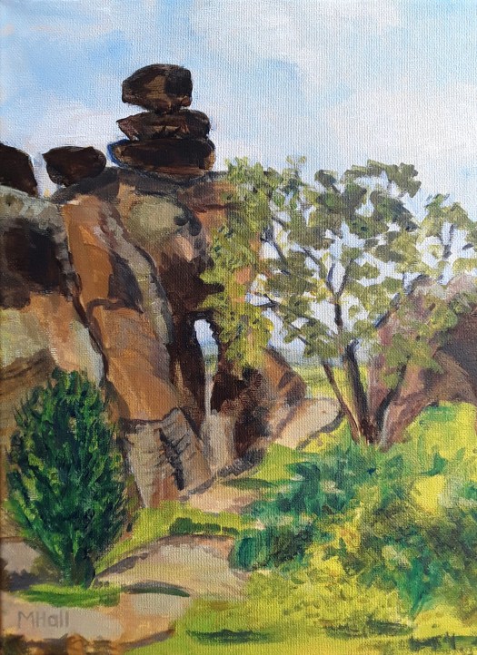
Good morning everyone. Last week I found out that Fronteer Gallery had accepted my painting ‘ I Dreamt of a House by the Sea’ into their Colour Exhibition. And I was so delighted – firstly because it’s always a pleasure to take part in their events. Secondly, because of the theme ‘Colour’. As you might have noticed, I call this website A World of Colour. So, most of my work does suit this theme. However, I chose this particular painting because it seems absolutely bursting with colour.

I Dreamt of a House by the Sea – a closeup

Virtual Travelling for the Colour Exhibition

Actually, I painted this without a plan and it was quite late on in the process before I saw what it was. Perhaps a path leading up to the house with a view of the sea. Then, later on I suggested landscape and some vegetation on the cliff. But, for me, the most striking thing about this is when I made it. Right in the middle of being isolated at home, when I was desperate to spend time by the sea! In fact, the colours, the sunshine and the sparkling air are much more reminiscent of the coast of northern France in August. Ah, those charming, unspoilt little resorts where we spent weeks camping. Happy Days! So it seemed ideal for the colour exhibition.

There are lots of seascapes for you to dream about in my gallery here. And a post all about another of my paintings in the fabulous Fronteer Gallery here.

All my paintings are for sale at reasonable prices. Just go to my Contact Me page and send me an email.

A Beach Day

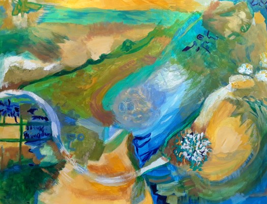
This is somewhere on the coast of Queensland, Australia. And you can find out more in my post here. Well, virtual travelling is the only way for me to go, at the moment!

Black on Black, Colour Experiment

Black on Black

Good morning everyone. This acrylic painting is painted on a smallish black box canvas that I have had for ages. Frankly, I had no idea what to paint on it, but they were all the rage at the time. Anyway, I decided to have a go, just after trimming this year’s Christmas tree.

And so, as you can see, the colours red, gold and white were on my mind! Well, I put down some shapes intuitively, with the idea that the canvas would stand as the background. My daughter-in-law thought it looked quite festive! However, I hated the effect of unpainted canvas. So, I carried on my usual method of shaping the composition by layering paint. Of course, this included painting over the untouched background. Hence the title.

A close up

Incidentally, I also discovered, or perhaps consciously realised that I prefer colour to be nuanced and subtle. Rather than flat with only one tone, like the black canvas. Sorry about the glare, it’s quite difficult to photograph these colours.

I hope you enjoyed looking at my intuitive abstract – there are loads more on my Abstracts page.

The In Situ Photo

By the way, this is the room I designed the painting for!

Some New Small Sketchbook Abstracts

Good morning everyone. Well, I don’t know about you, but I didn’t seem to have much time to start on big projects lately. So, I thought I would show you some of the small sketchbook abstracts I managed to squeeze into my busy days. Actually, I find it quite a comfort to grab the nearest small sketchbook, relax in my armchair and paint!

Just Breathe

However, this first one started life as a rapid ink sketch, intuitive really. Then watercolour, but this time I made an effort to keep the colours very clean. That is to say, adding glazes on top of the three basic colours to add tone, instead of creating mixes on the palette. Also, having seen something online about adding depth to abstract shapes, I tried to think of them as 3d objects. Incidentally, this is very pleasurable to try. In fact, I’ve just realised these small sketchbook abstracts are arty experiments, as well as being good for stress management.

Watercolour pencil experiment

As you can see, this small sketch book abstract has been built using watercolour pencils. Actually, I haven’t played around with these for ages and I was considering taking them on an outdoor sketch trip. So I wanted to remind myself how easy it is achieve quick, bright colour. Obviously, it is very easy and so I took a couple of pencils with me when we went to the Danum museum, before Christmas. And I really enjoyed using them.

Objects in Doncaster Museum

Above all, I really love painting intuitive abstracts, whether they are small or larger, like this one in this post here.

New Exhibition at the Market

Neurons

Good morning everyone. As promised, here is a review of our new exhibition at the market in Rotherham. By ‘our’ I mean ROAR – Rotherham Open Arts Renaissance, an artist’s group that I am a member of. And, we have displayed our art on a glass wall in the covered market building in the town centre.

Our New Exhibition at the Market

As you can see, this space was a bit of a challenge to use, but I think we have done well. The windows were actually different dimensions and all landscape orientation. So I could not show two nice life drawings, because they were portrait. And, obviously, framed paintings were not possible. However I think the display is excellent, including prints and some originals. Here are the other three of my paintings on show.

Clematis at Dusk
Daffs at the Allotment
In the Wood

Actually, our work is quite varied, comprising acrylic paintings, contemporary watercolour portraits, prints and mixed media collage.

Matt’s Portraits
Ken’s pencil drawing
Kevan’s print
Mixed media collage
Acrylic painting

Because of the pandemic, we have not been able to meet up so much. So it felt really good to be involved in a project together. And, also to show off our new exhibition at the market. Have a look at this post here when we went out sketching at the Steel Henge.

The Power of the Sea

The Power of the Sea

Good morning everyone. Today I’d like to show you this intuitive abstract in acrylic- it’s all about the sea. Well, it wasn’t about anything at the beginning and I was playing about with colours. As usual, I put the first draft down fairly quickly, in some gorgeous shades of green, gold and blue. Actually, if you follow my blog, you may have noticed that I love this palette. And here is another seaside picture to prove it!

The Path down to the Sea

Anyway, to get back to ‘The Power of the Sea’, I worked on the picture from all four sides next. Then, at the end of this second session, I decided which version I liked best. And I chose the one with hints of waves, a cliff edge and a busy sky. Honestly, I don’t really know how this happens! But,the next hour is spent strengthening these images, And then I do a lot of looking over the next few days( or weeks!) Finally, I spend some time balancing up the composition and adjusting colours and tones. Until the painting says ” I’m done”. So, I suppose I can’t call this only an intuitive abstract. But, also a collaboration between my subconscious and my thinking brain.

Details of ‘The Power of the Sea’

The Waves
The Cliff
The Sky

As I say, I don’t know how it happens, but it’s a lot of fun, and, quite addictive! And just look at the sea in this post here, in a very different mood.

All of my work is for sale, at reasonable prices. Just go to the Contact Me page and send me an email for more details.

Coffee for One, Lockdown Painting

Coffee for One

Good morning everyone. Well, there are only two more days to see my lockdown painting at the Open Art Exhibition by Fronteer Gallery in Sheffield, UK. But it looks really good up on the wall at Exchange Place Gallery – see this poster for details.

Honestly, I was thrilled to bits to be accepted for the Open, this is the first time I got in! And, I decided to enter a lockdown painting in acrylic that I did last summer. Actually, I just sat down to do an intuitive abstract and gradually this figure emerged. So I ran with it and developed a cafe setting around it, with the light emerging through the tall windows, revealing the stripped pine floor. She sits alone at a table for one, covered by a gorgeous pink and yellow embroidered cloth. And you can almost smell the dark brown coffee and taste the dainty chocolate cup cake. In fact, the yearning for cafe society that I suffered from last year probably inspired me to paint this picture!

However, this is what I see, and you can obviously see into it anything you like! Anyway, I’m so glad that the gallery gave my picture its few minutes in the limelight! Have a look at this post here for another intuitive abstract in a similar colour palette.

My Painting in New Exhibition

Snow’s Melting

Hello everyone. This is just a very quick post today because I’m dashing about, being involved in four exhibitions at the moment. And it feels very strange after all that time with no arty activities, then, suddenly so many opportunities. Anyway, today I’ve been to the new exhibition at the Gallery Gate gallery in Doncaster, South Yorkshire to see the Christmas show.

Well, the new exhibition is looking very good and I think my painting fits in really well. So, many thanks to Kim, curator of the gallery. I think the expression on my face says it all!

Actually, that’s all I have time for today. And, tomorrow I go to a lovely gallery in Sheffield to see my painting, which was chosen for the Fronteer Gallery Open competition. So, look out for a report on that soon.

A Pink and Blue Intuitive Abstract

A pink and blue intuitive abstract,  organic shapes, swirling about in a sea of grey.
Pink and Blue

Good morning everyone. I been trying to catch up a bit recently and finish off some paintings that I had left midway. For example, this pink and blue painting first started life as a quick abstract sketched out in marker pens. In fact, I was in my studio early one morning watching the sunrise through my window. And the glorious colours – pink, soft blue and turquoise really inspired me. So, I grabbed a pack of cheap felt tip pens and a drawing pad, and created this.

The first drawing of the idea.

As you can see, I added greys to tone down the brightness. And these became quite a feature in my acrylic version on canvas board.

Pink and Blue – the Acrylic Version

Well, I really enjoyed applying the paint thickly and creating texture in this acrylic painting on board. However, it still didn’t seem quite right and so began the long wait! Actually, I looked at it everyday ( there’s stuff all over the house being “looked at”!) And then I got busy! Does this story sound familiar? Finally, I quickly finished it with some subtle marks, so, lots of thinking led to quick painting.

And, I was fairly pleased with it, so I put it on the dresser and I’m still looking at it. But now it’s stopped talking to me, so that’s ok.

You could see more of my abstracts here in my gallery . And all of my work is for sale at reasonable prices, email me via the Contact Me page for details. And here is another pink and blue abstract, acrylic on board.

Northern Fringe Exhibition Now Open

Good morning everyone. Well, as I write this, it’s not quite true because we are opening the show tomorrow, see poster above for dates. Anyway, we have waited a long time to put on our Northern Fringe exhibition. Obviously, due to lockdowns and so on, so I’m really looking forward to going tomorrow to see everyone’s work.

As I have mentioned before, the theme is a really meaty one that you can get your teeth into! In my opinion, at least, ‘Inspired by Yorkshire Writers’. Perhaps you have seen my first entry already. But, here’s another chance.

The Green Knight, Waiting for Sir Gawain at the Doorway of his Church

And, I felt inspired to paint this by the poem ‘Sir Gawain and the Green Knight ‘ by Simon Armitage. In fact, he reworked the medieval poem about King Arthur and his knights. And it’s a really good read too.

The House on the Moor

Secondly, I painted this view of the ruined farm house on the moors near Howarth, probably the setting Emily Bronte chose for her novel, Wuthering Heights. But, I was also inspired by the poem by Ted Hughes about the day he and his wife, Sylvia Plath walked up to Top Withens.

Top Withens

Now, after having painted both of these, I was tidying my stash, and I found my Egyptian Temple painting. Actually, I did it a year ago, when I did a series of gouache paintings about Egypt. And, I had forgotten that my imagination was fired up by the exhibitions put on by Joann Fletcher in our town. Joann, born locally, is a well-known Egyptologist – her exhibitions were very good, as were the documentaries on tv. In particular, I remember her striding around the sites in baking heat, with the sun striking off the white stone.

I explain all about this painting here, it has just come back from an exhibition.

Two More Paintings for our Northern Fringe Exhibition

Egyptian Temple

Finally, just before I had to take the paintings to the gallery, I had an idea about one of Ebenezer Elliott’s poems, Trees at Brimham , in North Yorkshire. You see, this Victorian poet lived all his life in my area. And I especially like his poem about this area of rocky outcrops. As he says, the rocks and trees are shaped by each other, and live in ‘union strange’.

Brimham Rocks

Literally, I painted this acrylic painting on Saturday, Sunday and Monday and then delivered it on Tuesday! As our exhibition themes are usually ongoing, I’ve got time to paint more! Watch this space….

A Pink and Yellow Abstract

Pink and Yellow

Good morning everyone. This is just a short post today, about pink and yellow! I’m a bit busy delivering and collecting paintings, now that galleries are working again. But, more of that later.

Actually, I think I’ve mentioned before that I sometimes paint a quick watercolour abstract. Usually when I’m pressed for time and I need to be creative. Well, I painted this pink and yellow effort in lovely calming and optimistic colours. This version is the original one turned around. So have a look at the original.

As you can see, in this intuitive abstract, I seem to have created a cartoonish figure with a large smiling face. And yet, turned around, I see a bowl of fruit, perhaps on a table near the window. Or, perhaps you see something different!

Now, I must go and take my paintings to our Northern Fringe Gallery in the Ridings centre in Wakefield. And here is another post about our lovely gallery.

Watercolour Experiment in Autumn Colours

Autumn Wood

Good morning everyone. This watercolour experiment started off as a doodle really, then I began testing out different ways of manipulating the paint. After studying Paul Talbot-Greaves’ lovely book, I realised that I needed to practise techniques. And, by making a sample sheet, rather than a ‘proper’ painting so that I felt free to play. And, it definitely worked! So, here you can see wet-in-wet, stippling, spattering, dry brushing dripping and, hopefully, more movement of paint. However, it’s not in my nature not to put a bit of a story into my painting. Consequently, it became a walk in a wood at autumn time. Actually, the choices of colours and shapes must have come from my subconscious.

Autumn Wood, a closeup

In fact, I found this exercise very useful and I think I shall be a bit more confident now when painting in watercolour. Honestly, I wasn’t using enough paint or making it wet enough, so things had to change!

Last Year’s Watercolour Experiment in Autumn Colours

Lovely Autumn Day

Really, I can’t think of a better way to celebrate the season than to sit and drink in the atmosphere of a beautiful autumn day. And then to paint a memory.

You could see more of last year’s autumn plein air watercolour sketches in this post here. And, don’t forget, all my work is for sale at reasonable prices. Just go to the Contact Me page and send me an email for more details.

Trying Out Two New Watercolours

Wandering

Good morning everyone. Firstly I’d like to show you this little abstract I did in my sketchbook. And it was very much a quick, watercolour sketch done between chores with my travel paint set. However, it was also my first chance to try out two new watercolours, Mauve and Payne’s Gray. Actually, I’ve been doing a bit of research on watercolour technique. And I read that Payne’s Gray is a much better choice for a really dark dark, if you know what I mean! Also, it doesn’t seem to muddy the colour mix either, which I was having a problem with when I used black. In addition, I chose to use Mauve in this painting too, which is new for me. And I loved it – the colours seem so fresh and glowing! I wonder if you see the same scene as me- two figures in a cave?

Anyway, this is what my subconscious came up with, seemingly without much intellectual output from me! But, when I’d finished it, I turned it round all four ways, and I liked this one too. Incidentally, do you see anything in this one? You can see more of my intuitive abstracts here.

The Entrance

Finally, if I want to use new watercolours when I’m out and about, I’ll have to sort out the colours in my little paint set or carry extra tubes. Which could be quite awkward. Ideally I need something with more space for colours and larger areas to mix washes. And, at the same time stay compact enough to manage on my knee! Has anyone any good recommendations for this impossible ask?

My Travel Set of Watercolours

New Intuitive Abstract in Acrylic

Flight

Good morning everyone. This is the first intuitive abstract in acrylic that I’ve painted in a long time. That is, apart from a few doodles. But I do know why I didn’t – I was trying to concentrate on landscapes for a couple of months. Actually, I was following the advice of my online tutor, Rod Moore and I think it’s sound. Apparently, studying and practicing one subject and medium leads to more progress. And I think it’s true. But, I was having too many withdrawal symptoms and missing creating abstract composition. So I had to paint this one!

A Closeup of my Abstract in Acrylic

Flight – a closeup

In fact, I had been getting ideas all along for combinations of colours and shapes for an abstract in acrylic. So, I retrieved this idea of interlocking gears from my memory archive. And combined it with a soft colour scheme of misty blues, greens and pinks. Although I followed my usual method of painting from all four angles, the pink figure emerged, and is determined to make its way out of the picture. I’m sure this is another example of art therapy!

A Doodle Abstract in Mixed Media

A mixed media abstract

Finally, here’s one of the aforementioned doodles, this time in biro and pastels. And, I definitely felt better when I’d done it! See more abstracts in this post here.

As you may know, all my artwork is for sale at reasonable prices. Just go to the Contact Me page and email me for more details. ‘Flight’ is acrylic on canvas board, 12 by 15.5 inches, unframed, and I’m letting it go at £50 plus shipping. Affordable art!

New Painting for Abstract Show

After the Thaw

Good morning everyone. I’m so pleased – Fronteer Gallery in Sheffield accepted my acrylic painting for their new abstract show in October! As you may remember, I exhibited with them in June this year. And I showed my Egyptian Temple in their Summer Solstice exhibition.

Egyptian Temple

Work for the Abstract Show

Well, the theme for the show this time was a dream – Abstract. That’s all, so I found it wide open to interpret just as I liked. Normally, I create a new work for an open call, but this time I had one ready made.

After the Thaw – closeup

Although I started this abstract composition purely instinctively, as I worked, I realised that two main themes were influencing me. Firstly, I had recently been to a great exhibition at the Hepworth Gallery in Wakefield, by Anthony McCall. The light installation was very impressive and the museum encouraged visitors to move through the beams of light quite freely. So I painted a silhouette against the blinding white and the deep shadows the artist had created.

After the Thaw – another closeup

Secondly, the winter was quite cold that year and the snow was finally beginning to melt. And the streams were swollen, racing through sodden fields. Consequently, I added piles of soft snow, a stream and the moon piercing the darkness. However, you don’t really need to know any of that. In fact you can put your own interpretation on the scene. Or, even, obviously just look at it and react in your own way.

My Abstracts

Of course, I shall post a report of the abstract show when it is actually on the wall. Meanwhile, you could look at some of my other abstract paintings in the Abstracts section of my gallery.

As you may know, I sell all my art at reasonable prices and you can email me via my contact page.

This Week’s Paintings in Watercolour

An abstract for my journal

Good morning everyone. This is a quick catch up post showing you this week’s paintings. Honestly, I haven’t really had much time for creating art. Because things have opened up a bit, I seem to be busier. And, of course, there is lots to be done in my allotment vegetable garden. For example, yesterday I spent a few hours watering everything and weeding the parsnip and broadbean plants. And it was tough on my hands as the ground was hard after heavy rain, then baking hot June sunshine.But, I can’t complain – I absolutely love the fresh, organic fruit and veg we grow.

Our Allotment Garden

Well, you can tell how much I miss painting when I take my sketching kit up to the garden. And snatch a few moments between chores. As you see, I couldn’t resist trying to paint these beautiful flowers. For example, the huge red Oriental poppies are so spectacular and so short lived. Also, the blooms of the purple irises in the tiny barrel pond last just a few days. So I had to include them in this week’s paintings. Fortunately, the mauve foxglove does stick around longer and these self seeded flowers are dotted all around the garden. However, I think you can tell by the way I overworked the watercolour that I am really missing painting with acrylic! There are some more paintings of my allotment here, you may not have seen them.

My Art Journal Abstract – One of This Week’s Paintings

As you can see, I had to do a small, intuitive abstract in my art journal in watercolour. When I was longing to do one on canvas. But, I didn’t have the time, so I really enjoyed creating this smaller one. And, it calmed my nerves, so, a good result all round! Plus the bonus is an interesting experiment in shapes and colours that I could expand into a larger version. When I have time!

A Close up of my watercolour abstract

In fact, I can see lots of possibilities of interpretation here – for some reason it reminds me of cave painting. What do you see?

Our Solstice Exhibition Now On

Good morning everyone. Today I’d like to tell you all about our Solstice exhibition – now on show at Fronteer Gallery in Sheffield, UK. Well, we had a great launch on Monday evening, despite the Covid regulations. Of course, we had to wear masks and only ten people were allowed in the Gallery at one time. Nevertheless, I managed to have a good look around the show. And to have a nice chat with Michael and Sharon, who set the whole thing up. Actually, it’s not been the best time to open an art gallery in the pandemic, but they have done it!

I took this snap in a sort of an open space in front of the gallery which is traffic free. In fact, it’s an ideal performance area. And we watched a bit of street theatre by Pink and grAy. Sun Circle, referencing Ra, the sungod, bringing light to the world. Incidentally, this is the theme of my gouache painting too! Also, the abundance of food produced by its energy, represented by a basket of oranges.

The Artwork in Our Solstice Exhibition

Egyptian Temple

Honestly, it was a real pleasure to see my own painting up on the wall in this super gallery. It’s been so long since I could chat to people looking at my work. In addition to that I had actual contact with the other artists too! Here is just a taster of the wonderful artwork on display. I did take lots of photos, but the lighting in the rooms was too much for my little phone camera!

Julie Massie
Nicky Scott-Francis

At last, my artworld is slowly returning.

The solstice exhibition is on this week and next. Just see the poster for the dates and times it is open. And, with its wide variety of media and interpretation of the summer sun, it’s well worth a visit.

If you want to have a look at the beautiful exhibition catalogue, see here.

Sketching Scenes in Sunny Scarbrough

The Path down to the Undercliff

Hello everyone. We’ve just come back from a lovely short break in Scarbrough on the Yorkshire coast in the UK. And it was quite sunny and perfect for sketching scenes! To be honest, I did this first sketch in Ravenscar, which is a half-hour drive further north of Scarbrough. Actually, it’s quite a fascinating place, the resort that never was.

Now, I must explain that the location is stunning, right on the edge of a dramatic stretch of steep cliffs. We love to spend time there, gazing down at the lush, expanse of under cliff, which comes between the top of the cliff and the rocky beach. But, this is really the problem because the path to the beach is very steep, and the beach has very little sand. So, not at all the best place to site a resort with relaxing walks and easy access to a nice sandy beach. However, this is exactly what the Peak Estates Company tried to do in 1890. And they planned the entire resort, buying up the land and everything. Even the streets and the sewers were laid out. Unfortunately, the gamble didn’t pay off, the venture failed. Nonetheless , the place has a cafe, a hotel and a National Trust Information Centre, so it makes our visits there even more worthwhile.

Perhaps you may wish to know that I was sitting at a picnic bench on the green in front of the one and only cafe as I sketched this. And, it was closed for the day!

Sketching scenes at the Mere

The Ducks at the Mere

Yesterday, as we were setting off back home, we parked the car right next to the lake. Then we had a cup of coffee and watched the ducks, geese and swans, as they preened and squabbled. In fact, they were never still for long, a bit inconvenient when you’re sketching!

Sketching on the Balcony

Behind the Flats

Finally, here’s a watercolour painting of the view from the flat we usually stay in when we visit Scarbrough. Actually, I did a small sketch on the spot and then I painted this larger version at home two years ago. Incidentally, this view shows the undercliff area at North Bay, Scarbrough. But it’s not as extensive as the one at Ravenscar. Nor as cut off and mysterious like a little lost world!

Perhaps you would like to look at the landscapes and seascapes in my gallery here . And there are more paintings of Scarbrough there too. After all, it is one of my favourite places!

Northern Fringe Gallery Now Open

Hadrian’s Wall

Good morning everyone. Well, I’m really pleased to tell you that our Northern Fringe Gallery is now open again! And with some lovely new work in there too.

We went to the Ridings shopping centre, Wakefield at the weekend and had a good look around. Also a nice catch up with Eddie, our chairman, who is looking after the empty shop premises that we have claimed as our own. In fact, I also found out about our next project, based around the idea of Midsummer. Honestly, it was such a joy to feel connected to our artist group. Especially after so many months of communication by email.

Our Gallery

Taking my work to Northern Fringe Gallery

Hadrian’s Wall

I was so thrilled to take my interpretation of Hadrian’s Wall to be hung in our gallery. Because I felt quite proud of the way this semi abstracted view of the wall, dominating the landscape turned out. And, everything seemed to fit together, including the massive size of the stones. Also, I tried to convey the feeling of the overwhelming power of the Romans who built this huge barrier in northern England. Of course, they intended to keep the fierce Scottish tribes out of the territories that they controlled. But I also wanted to show the Scottish side of the wall, very much alive and thriving.

My Acrylic Painting of the Moors

Ladybower

This was the second picture I took to our gallery. Incidentally, you may recognise this – it’s the banner image for the home page of this website. And, I hope it best represents my description of my site, A World of Colour, with its vibrant greens and blues. In fact, this is a place we’ve walked around many times over the years. Hopefully, in this interpretation you can sense my love of the place. And enjoy the heightened colours of a still, warm summer’s day on the tops, looking down at the jewel-like expanse of the water.

My work on the wall at our Northern Fringe Gallery

It was a real morale booster to talk about the group’s future plans- all of our exhibitions in bigger galleries were put on hold. And such a pleasure to see my fellow artists’ new work. You could find out about our activities here on our website.

These two paintings are for sale at reasonable prices, plus all the work in my Gallery. (There’s a new moody painting of the Pennine moors in Yorkshire coming soon!)

A Day at the Seaside

The Path down to the Sea

Good morning everyone. A day at the seaside – I love this intuitive abstract that I made when I was thinking about a day out. Well, to be precise, I was only dreaming about going to the coast. And that’s because we haven’t been able to go for over a year now. Partly due to Covid restrictions and also for practical reasons – I chose to stay home and keep safe. Anyway, I can always dream!

A Day at the Seaside – an Abstract Acrylic

A Day at the Seaside – in my Dreams

However, I must insist that this composition must have come from my subconscious. As I have mentioned before, I do a first quick impulsive pass and create a full design, covering all the paper. Then I might leave it until next day, look at it and think about it a lot! After that, I’ll work on it from all angles and enjoy myself, creating texture. For the next session, I’ll choose which is top, and which is bottom and have a look at the balance of shapes and colours. And that’s when I get nice surprises!

The Unexpected Features

Fish or Seabirds?
The Path and the Fence?

Actually, this picture almost painted itself and it was the first of my summery abstracts. Before this, most of my intuitive abstracts were in a different palette of colours. For example, here is one I did at the end of winter, with dramatic, sombre colours. In contrast, my seaside picture is in warm, mellow colours, with hints of cloudless sky and fresh vegetation. And, of course, the almost tactile yellow ochre indicating sand.

On the Shore

Finally, I made this collage a couple of years ago, partly as a tribute to the wonderful Mark Hearld. So, my imaginary scene of a day out at the seaside was made up of painted collage papers, cut-outs and watercolour. And then rounded off with a pretty, decorative border in muted colours. Ah, it’s almost as good as being there in person (almost!)

You could look at more scenes of the fab Yorkshire coast in my Gallery – Landscapes here. It’s affordable art, folks! Contact me for details here.

An Abstracted Cityscape in Acrylic

Cityscape 1

Good morning everyone. Today I’d like to show you my attempt at a semi-abstract cityscape. Actually, I didn’t want to waste the leftover paint on my palette, so I started doodling. (Or, you could call it an intuitive abstract!). Anyway, when I saw the shape of a doorway, I thought I would try to paint a cityscape. Then, I loved the blocks of colour so much that it gradually led me into some semi- abstraction of the scene. And then a bit more! To tell the truth, this is my first attempt at this subject. That is, if you discount one collage of an imaginary view over a city that I did a few years ago. But, I would definitely like to explore this theme a bit more . And, I could even do a series, like a proper artist!

However, I must say that when I posted this on my Instagram account at least two friends saw this as an industrial scene, a steelworks melting shop to be exact. Well, at least they both liked it, so that’s the main thing.

Somewhere in France

And now, in complete contrast, this is a cityscape in southern France somewhere. That is to say, judging by the architecture and the strength of the sunlight. Obviously, I painted this based on a reference photo, and a bit of memory, not from my imagination like the first image. At the time I painted it, a few years ago, I was quite pleased with it. And, I still am, but, I’m quite glad that I am now moving away from following the photo so carefully. So, if I were to do a similar scene, I’m sure I would interpret it with more artistic licence.

An Urban Sketch Cityscape

The Calder Building at the Hepworth Gallery, Wakefield

Finally, this is an urban sketch I did, on the spot in about 30 minutes. Incidentally, I was out sketching with Urbansketchers Yorkshire, back in the day when there were no restrictions on mixing. Happy days! And, this old warehouse by the canal was part of the site dedicated to the well-known sculptor Barbara Hepworth. Well, I know it has its flaws, and I’ve learnt a bit more about perspective since then. But I do like the freshness and atmosphere I’ve captured here. Plus, of course the memory of a fab day out sketching.

So, whether I use acrylic or watercolour, a photo, my imagination or plein air approach. And, whether I paint in realistic or abstract style, I still find plenty of inspiration in this subject. You could see a very different type of cityscape if you look at this post here – the Piece Hall in Halifax, UK.