Two More Nice Bright Abstracts

Sunshine and Rain

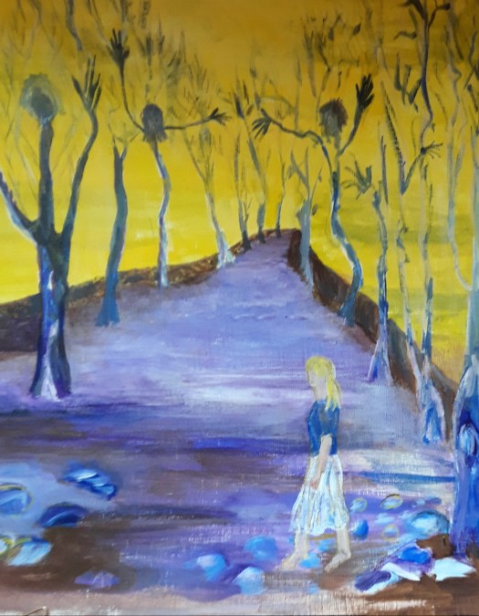
Good morning everyone. I did this one of my nice bright abstracts before Christmas and I’m quite pleased with the way if turned out. Again, I had no plan beforehand, except perhaps to incorporate lots of lovely, juicy colour! And, on this one I particularly enjoyed splashing the flashes of white across the gold and bronze.

Sunshine and Rain – a closeup

In fact, I noticed that I have been featuring a lot of round, globe shaped objects in my abstracts lately. Of course, if you paint them yellow your mind interprets them as the sun. And dark clouds creeping up in the background can then suggest imminent rain. So, that’s how I found the title! Anyway, I suppose this led me to thinking that it was time for a bit more development of my abstract work. However, more of that in later posts. Meanwhile, here is another of my nice, bright abstracts, completely intuitive and in a watercolour sketch book.

Afternoon in the Garden

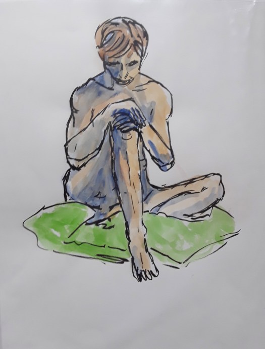
Now, this was a lovely art therapy exercise – a quick watercolour sketch in a few spare moments. And then, some flourishes with oil pastel, ink and white gel pen. I wonder if you can see anything in it? I wonder if you see the same as me? There’s another intuitive abstract in this post here for you to puzzle out!

If you like my abstracts, I just updated my abstracts page in the gallery here. And, don’t forget, I shall be showing you some new style compositions soon.

Best Trees I Ever Painted

Tree Study 1

Good morning everyone. Actually, I’m really quite pleased with these watercolour studies – they’re my best trees ever! As it happens, I do paint trees often, either in landscapes or in urban sketching. And, I don’t think I paint them all that well. So, I decided to invest in a short online course by Watercolours Made Simple . To be honest, I’ve only looked at a lesson or two but I have been pleased with what I’ve learned so far. Otherwise, I might have continued to make it up as go along, a particular drawback of watercolour for me, I find. In fact, I think it’s really necessary to study techniques to improve. More so than in acrylic, for example. But, that’s just my opinion and I can’t claim to be particularly gifted at watercolour painting.

Learning how to paint your best trees

Anyway, this learning was good fun too, so it wasn’t a chore. Simply explained, the tutor taught us to start with the foliage first. (Who knew?). So I painted three or four irregular ovals with a watery mid green mix, leaving little patches of paper white. Then use a mix of a darker shade of the colour and a lighter one too. And, describe the shapes of the clumps of foliage, not individual leaves, with lighter colour in the sun . And, darker colour in the shade. It does help to look at a tree or a photo when doing this. After that, put in the trunks and branches, using a watery mix of lightish brown and add patches of darker shade.

Tree Study 2

Here I practised mixing lots of tree greens using yellows, blues, brown and red – see top row. Then we stayed with the greens to paint conifers and another deciduous tree. I really liked doing a row of trees on the horizon, something I always botched before. Finally, I attempted to show how some trees recede into the background when you paint a forest, mainly using the paler shade of the original green. Now, I do hope I can remember that when I’m sketching en plein air!

Big Tree in my Garden

Or in my back garden for that matter, as I did here last summer. And , even though this one was in acrylic, some of these principles would help with other kinds of paint. If you want to see some of my winter trees, see here.

New Painting in Colour Exhibition

I Dreamt of a House by the Sea

Good morning everyone. Last week I found out that Fronteer Gallery had accepted my painting ‘ I Dreamt of a House by the Sea’ into their Colour Exhibition. And I was so delighted – firstly because it’s always a pleasure to take part in their events. Secondly, because of the theme ‘Colour’. As you might have noticed, I call this website A World of Colour. So, most of my work does suit this theme. However, I chose this particular painting because it seems absolutely bursting with colour.

I Dreamt of a House by the Sea – a closeup

Virtual Travelling for the Colour Exhibition

Actually, I painted this without a plan and it was quite late on in the process before I saw what it was. Perhaps a path leading up to the house with a view of the sea. Then, later on I suggested landscape and some vegetation on the cliff. But, for me, the most striking thing about this is when I made it. Right in the middle of being isolated at home, when I was desperate to spend time by the sea! In fact, the colours, the sunshine and the sparkling air are much more reminiscent of the coast of northern France in August. Ah, those charming, unspoilt little resorts where we spent weeks camping. Happy Days! So it seemed ideal for the colour exhibition.

There are lots of seascapes for you to dream about in my gallery here. And a post all about another of my paintings in the fabulous Fronteer Gallery here.

All my paintings are for sale at reasonable prices. Just go to my Contact Me page and send me an email.

A Beach Day

This is somewhere on the coast of Queensland, Australia. And you can find out more in my post here. Well, virtual travelling is the only way for me to go, at the moment!

Black on Black, Colour Experiment

Black on Black

Good morning everyone. This acrylic painting is painted on a smallish black box canvas that I have had for ages. Frankly, I had no idea what to paint on it, but they were all the rage at the time. Anyway, I decided to have a go, just after trimming this year’s Christmas tree.

And so, as you can see, the colours red, gold and white were on my mind! Well, I put down some shapes intuitively, with the idea that the canvas would stand as the background. My daughter-in-law thought it looked quite festive! However, I hated the effect of unpainted canvas. So, I carried on my usual method of shaping the composition by layering paint. Of course, this included painting over the untouched background. Hence the title.

A close up

Incidentally, I also discovered, or perhaps consciously realised that I prefer colour to be nuanced and subtle. Rather than flat with only one tone, like the black canvas. Sorry about the glare, it’s quite difficult to photograph these colours.

I hope you enjoyed looking at my intuitive abstract – there are loads more on my Abstracts page.

The In Situ Photo

By the way, this is the room I designed the painting for!

Christmas Eve in the Mountains

Christmas Eve in the Mountains

Good morning everyone. Well, obviously it’s not quite Christmas Eve just yet, but it’s been on my mind a bit this year. Because it will be different again, due to restrictions here in the UK. Normally we would visit a big house to see the lovely decorations, but we’re not too keen to be indoors with lots of people. So, just before things started tightening up we we went to the Carding Shed cafe, which is quite large and, luckily, was not crowded. And the coffee is very good! Not to mention the home baked pastries.

The Carding Shed Bar

Incidentally, I’d just like to explain that the business is part classic car repair shop and part cafe with an American diner, fifties style. So, that might help you to make sense of the photos.

Classic Car
Christmas Decs
Christmas Tree and Toy Soldier

Anyway, just to explain, the premises is a renovated industrial building in a Pennine valley, near Holmfirth. And I think the name ‘Carding Shed’ refers to one of the processes in preparing raw wool into yarn. Actually, weaving was one of the main occupations in this area of Yorkshire back in the day.

Christmas Eve in the Mountains

However, although we haven’t been very far at all this year, I do travel virtually in my paintings. For instance, I went to a beautiful little valley in the mountains here! Then I came home and painted myself this souvenir. Seriously though, I was very pleased with this as I painted it all from my imagination. And, for me, this is a big deal – something I find hard to do. So, on that note of traditional Christmas card scene, I wish you all a Happy Christmas and a peaceful New Year ( remember, snow is optional). You can find another Yorkshire snow scene in this post here.

New Exhibition at the Market

Neurons

Good morning everyone. As promised, here is a review of our new exhibition at the market in Rotherham. By ‘our’ I mean ROAR – Rotherham Open Arts Renaissance, an artist’s group that I am a member of. And, we have displayed our art on a glass wall in the covered market building in the town centre.

Our New Exhibition at the Market

As you can see, this space was a bit of a challenge to use, but I think we have done well. The windows were actually different dimensions and all landscape orientation. So I could not show two nice life drawings, because they were portrait. And, obviously, framed paintings were not possible. However I think the display is excellent, including prints and some originals. Here are the other three of my paintings on show.

Clematis at Dusk
Daffs at the Allotment
In the Wood

Actually, our work is quite varied, comprising acrylic paintings, contemporary watercolour portraits, prints and mixed media collage.

Matt’s Portraits
Ken’s pencil drawing
Kevan’s print
Mixed media collage
Acrylic painting

Because of the pandemic, we have not been able to meet up so much. So it felt really good to be involved in a project together. And, also to show off our new exhibition at the market. Have a look at this post here when we went out sketching at the Steel Henge.

The Power of the Sea

The Power of the Sea

Good morning everyone. Today I’d like to show you this intuitive abstract in acrylic- it’s all about the sea. Well, it wasn’t about anything at the beginning and I was playing about with colours. As usual, I put the first draft down fairly quickly, in some gorgeous shades of green, gold and blue. Actually, if you follow my blog, you may have noticed that I love this palette. And here is another seaside picture to prove it!

The Path down to the Sea

Anyway, to get back to ‘The Power of the Sea’, I worked on the picture from all four sides next. Then, at the end of this second session, I decided which version I liked best. And I chose the one with hints of waves, a cliff edge and a busy sky. Honestly, I don’t really know how this happens! But,the next hour is spent strengthening these images, And then I do a lot of looking over the next few days( or weeks!) Finally, I spend some time balancing up the composition and adjusting colours and tones. Until the painting says ” I’m done”. So, I suppose I can’t call this only an intuitive abstract. But, also a collaboration between my subconscious and my thinking brain.

Details of ‘The Power of the Sea’

The Waves
The Cliff
The Sky

As I say, I don’t know how it happens, but it’s a lot of fun, and, quite addictive! And just look at the sea in this post here, in a very different mood.

All of my work is for sale, at reasonable prices. Just go to the Contact Me page and send me an email for more details.

Coffee for One, Lockdown Painting

Coffee for One

Good morning everyone. Well, there are only two more days to see my lockdown painting at the Open Art Exhibition by Fronteer Gallery in Sheffield, UK. But it looks really good up on the wall at Exchange Place Gallery – see this poster for details.

Honestly, I was thrilled to bits to be accepted for the Open, this is the first time I got in! And, I decided to enter a lockdown painting in acrylic that I did last summer. Actually, I just sat down to do an intuitive abstract and gradually this figure emerged. So I ran with it and developed a cafe setting around it, with the light emerging through the tall windows, revealing the stripped pine floor. She sits alone at a table for one, covered by a gorgeous pink and yellow embroidered cloth. And you can almost smell the dark brown coffee and taste the dainty chocolate cup cake. In fact, the yearning for cafe society that I suffered from last year probably inspired me to paint this picture!

However, this is what I see, and you can obviously see into it anything you like! Anyway, I’m so glad that the gallery gave my picture its few minutes in the limelight! Have a look at this post here for another intuitive abstract in a similar colour palette.

Some Sunshiny Paintings in Acrylic

Beach day

Good morning everyone. Today I wanted to show you another one of my sunshiny paintings – finished at last! As you have probably realised, I like to complete projects fairly promptly, before I forget all my ideas. And, this one was started a couple of months ago. So, it only needed a few finishing touches and at last I got round to it.

For example, I strengthened the figures so that you can spot them better.

And I also tried to make the background recede further back by blurring the vegetation on the headland. In addition, I dulled the colour of the sand near the cliff, so that it seemed more distant.

As you may have guessed, this is a bay in Australia, somewhere, sadly, I have never been. But, I really enjoyed painting this as part of the online course I am following. Plus the fact that , in these dull, cold winter days, it cheers me up just looking at it! Actually, I might frame it and hang it on my wall so that I can feel its warmth everyday.

Somewhere in France

Finally, here’s another of my sunshiny paintings. In fact, I did this a couple of years ago and, there is some memory painted into it. Because I visited France many times and well remember walking down streets like these. Always on the shady side of the street!

In case you didn’t know, all my paintings are for sale at reasonable prices. Just go to the Contact Me page and send me an email for details.

My Painting in New Exhibition

Snow’s Melting

Hello everyone. This is just a very quick post today because I’m dashing about, being involved in four exhibitions at the moment. And it feels very strange after all that time with no arty activities, then, suddenly so many opportunities. Anyway, today I’ve been to the new exhibition at the Gallery Gate gallery in Doncaster, South Yorkshire to see the Christmas show.

Well, the new exhibition is looking very good and I think my painting fits in really well. So, many thanks to Kim, curator of the gallery. I think the expression on my face says it all!

Actually, that’s all I have time for today. And, tomorrow I go to a lovely gallery in Sheffield to see my painting, which was chosen for the Fronteer Gallery Open competition. So, look out for a report on that soon.

Work for our New Exhibition

Ready to Go On

Good morning everyone. Well, I have been quite busy again doing “art” business. In fact, I’ve realised that I’ve made myself just a bit too busy. But, in my own defence, it’s probably a natural reaction to the situation. First, no art activity for a long time. Then, say yes to every opportunity that comes along! Anyway, what could be nicer than taking part in Rotherham Roar artists’ group exhibition? Because it’s the first one we’ve had for quite a while. And so, I took these two pencil and watercolour sketches I did at life drawing class ages ago , for our new exhibition.

Ready to Go On
Thinking

In fact, the space we are exhibiting in at Rotherham Market Hall is like a wall of glass. So, works on paper and unframed are the way to go. Therefore I choose these two prints.

Working in my Allotment
Clematis at Dusk

As I recall, the flower painting was part of a project at my art society to capture the colours of flowers as the light faded. See here for more of my flower paintings.

And, finally, these last two made the final choice for our new exhibition. Up first is my version of a microscope photo of a neuron (one of those things in your brain that makes everything possible).

Neurons

And, finally, one of my favourites, a mixed media piece I call a semi abstracted memory of a walk in the woods.

A Walk in the Woods

To be honest, I’ve probably got enough work to fill the whole wall, not that I’m an excessive painter or anything! But, for now, six is enough!

A Pink and Blue Intuitive Abstract

A pink and blue intuitive abstract,  organic shapes, swirling about in a sea of grey.
Pink and Blue

Good morning everyone. I been trying to catch up a bit recently and finish off some paintings that I had left midway. For example, this pink and blue painting first started life as a quick abstract sketched out in marker pens. In fact, I was in my studio early one morning watching the sunrise through my window. And the glorious colours – pink, soft blue and turquoise really inspired me. So, I grabbed a pack of cheap felt tip pens and a drawing pad, and created this.

The first drawing of the idea.

As you can see, I added greys to tone down the brightness. And these became quite a feature in my acrylic version on canvas board.

Pink and Blue – the Acrylic Version

Well, I really enjoyed applying the paint thickly and creating texture in this acrylic painting on board. However, it still didn’t seem quite right and so began the long wait! Actually, I looked at it everyday ( there’s stuff all over the house being “looked at”!) And then I got busy! Does this story sound familiar? Finally, I quickly finished it with some subtle marks, so, lots of thinking led to quick painting.

And, I was fairly pleased with it, so I put it on the dresser and I’m still looking at it. But now it’s stopped talking to me, so that’s ok.

You could see more of my abstracts here in my gallery . And all of my work is for sale at reasonable prices, email me via the Contact Me page for details. And here is another pink and blue abstract, acrylic on board.

A Little Gouache Story Picture

Good morning everyone. Well, this story picture is finished at last! In fact, I started it back in August as a response to an open call, online. But, I didn’t like what I produced at all. And, it has been hanging around the house ever since, staring at me reproachfully. And whispering, ” Why won’t you finish me?” Anyway, I gave in on Sunday and repainted it, changing the figure into something I like. By the way, as well as the original reference photo, I looked at this image a lot for direction ( see below)

By Hugo Scheiber

When I looked him up a bit more, I really like this Hungarian artist’s expressionist painting. Hugo Scheiber 1873 – 1950. And to me, still modern and fresh looking.

The Book

What’s the story? Actually, this story picture is quite an open image and full of possibilities, what do you think? And, here’s another of mine, still waiting for its story to be told.

Castles, Palaces and Stately Homes

Once upon a Time

Good morning everyone. At this week’s meeting for our art society, we are having a Studio evening. By that we mean an opportunity to sit and paint together and have a bit of a chat. And the theme for the night is ‘Castles, Palaces and Stately Homes’, in any painting media and style. Of course, this is only a suggestion for inspiration and members often bring their own work to continue instead. But we find that it’s sometimes helpful to concentrate the mind that way.

Conisbrough Castle

The Keep

This is a quick watercolour sketch I painted in September and my intention was to show the huge, overwhelming feeling of standing at the base of the castle keep.

The Fairy Tale Castle

After a painting by John Piper

Actually, I really enjoyed painting this acrylic a while back, taking inspiration from one of my favourite artists – John Piper. But I gave it my own spin and emphasised the out of this world magical quality of it (I hope!)

Castles, Palaces and Stately Homes

Calke Abbey

As you may know, I spent a week this August in Derbyshire and saw a few beautiful old buildings. Including this imposing stately home, Calke Abbey which was rather forbidding in real life, built in greyish stone. Now, that could be a real challenge! However, I’ll show you how I get on later.

If you like looking at English stately homes see this post here.

Northern Fringe Exhibition Now Open

Good morning everyone. Well, as I write this, it’s not quite true because we are opening the show tomorrow, see poster above for dates. Anyway, we have waited a long time to put on our Northern Fringe exhibition. Obviously, due to lockdowns and so on, so I’m really looking forward to going tomorrow to see everyone’s work.

As I have mentioned before, the theme is a really meaty one that you can get your teeth into! In my opinion, at least, ‘Inspired by Yorkshire Writers’. Perhaps you have seen my first entry already. But, here’s another chance.

The Green Knight, Waiting for Sir Gawain at the Doorway of his Church

And, I felt inspired to paint this by the poem ‘Sir Gawain and the Green Knight ‘ by Simon Armitage. In fact, he reworked the medieval poem about King Arthur and his knights. And it’s a really good read too.

The House on the Moor

Secondly, I painted this view of the ruined farm house on the moors near Howarth, probably the setting Emily Bronte chose for her novel, Wuthering Heights. But, I was also inspired by the poem by Ted Hughes about the day he and his wife, Sylvia Plath walked up to Top Withens.

Top Withens

Now, after having painted both of these, I was tidying my stash, and I found my Egyptian Temple painting. Actually, I did it a year ago, when I did a series of gouache paintings about Egypt. And, I had forgotten that my imagination was fired up by the exhibitions put on by Joann Fletcher in our town. Joann, born locally, is a well-known Egyptologist – her exhibitions were very good, as were the documentaries on tv. In particular, I remember her striding around the sites in baking heat, with the sun striking off the white stone.

I explain all about this painting here, it has just come back from an exhibition.

Two More Paintings for our Northern Fringe Exhibition

Egyptian Temple

Finally, just before I had to take the paintings to the gallery, I had an idea about one of Ebenezer Elliott’s poems, Trees at Brimham , in North Yorkshire. You see, this Victorian poet lived all his life in my area. And I especially like his poem about this area of rocky outcrops. As he says, the rocks and trees are shaped by each other, and live in ‘union strange’.

Brimham Rocks

Literally, I painted this acrylic painting on Saturday, Sunday and Monday and then delivered it on Tuesday! As our exhibition themes are usually ongoing, I’ve got time to paint more! Watch this space….

A Country Walk in Watercolour

A Country Walk

Good morning, everyone. I’d like to show you this watercolour painting, ‘A Country Walk’. Because it’s the third exercise I have done from Paul Talbot-Greaves excellent book, 30 Minute Landscapes. And I’m really pleased with the result. But I’m well aware that I’m not yet at the stage where I could make such a beautiful, striking composition as this from a simple scene. So, I’ll keep on practising!

However, this painting was an excellent way to practise the new techniques I’m learning and have fun at the same time! For example, I practised stippling, as I explained in my last post here. Also there’s spattering of paint, created by flicking a paintbrush, loaded with paint. Please wear protective clothing! Seriously though, see if you can spot these two techniques in this closeup of a holly bush.

Trees in Closeup

A Country Walk-a closeup

And I also had the chance to practise painting nice fine branches and twigs by gradually changing brush size. Yes, I know I should have thought of that myself, but I didn’t! Finally, you might also see the shadows on the road are carefully painted by following Paul’s method. To be honest, I was very nervous about this part of the painting. Mainly, I think because I am so used to manipulating acrylic paint which very generously allows you to paint over your mistakes. In fact, I might now have a bit more confidence when painting shadows in a landscape. Instead of just fudging it and hoping for the best. Here’s a closeup of branches and shadows.

Anyway, I do think this study will help me to progress my painting. And , to finish off with, have a look at this acrylic painting from a couple of years ago, with a similar composition. Of course, this is an imaginary scene and seems to me not quite finished. Perhaps I will feel more inspired to finish it now, who knows?

Another Country Walk

Which Way Now?

New Portrait of my Allotment

The Discovery Apples

Good morning everyone. This is my latest portrait of my allotment. Actually, I just realised that the little watercolour sketches that I do are really portraits. And they seem to me to show different facets of something that I love, very much like artists paint a loved one over and over.

In this particular painting I wanted to make a record of how the fiery red Discovery apples glow. And can be glimpsed through the gap in the hedge that separates two sections of the allotment garden. As you can see, the Brussel sprouts plants are going from strength to strength. Also the leeks in front of them are putting on lots of leaves before the winter comes. In fact, both of these plants will stand over the winter and, hopefully, provide fresh veg till spring.

Can you spot the gardener, weeding the few summer cabbages that remain? Incidentally, I make this figure nice and vague. Because I like to think that it represents both me and my husband, as we both look after the garden. You can see the gardener in this acrylic painting here too.

This Year’s Portraits of my Allotment

Picking the Blackcurrant Crop
Oriental Poppy Flowers going Over
Dreaming of Summer

Well, this last image shows how I sat in the fairly bare winter scene, And dreamed of beautiful mauve flowers! There’s another idealised portrait based on reality here, showing how I think of the time I spend in the garden. But, in reality, we work very hard here. And, I wouldn’t have it any other way!

New Intuitive Abstract in Acrylic

Flight

Good morning everyone. This is the first intuitive abstract in acrylic that I’ve painted in a long time. That is, apart from a few doodles. But I do know why I didn’t – I was trying to concentrate on landscapes for a couple of months. Actually, I was following the advice of my online tutor, Rod Moore and I think it’s sound. Apparently, studying and practicing one subject and medium leads to more progress. And I think it’s true. But, I was having too many withdrawal symptoms and missing creating abstract composition. So I had to paint this one!

A Closeup of my Abstract in Acrylic

Flight – a closeup

In fact, I had been getting ideas all along for combinations of colours and shapes for an abstract in acrylic. So, I retrieved this idea of interlocking gears from my memory archive. And combined it with a soft colour scheme of misty blues, greens and pinks. Although I followed my usual method of painting from all four angles, the pink figure emerged, and is determined to make its way out of the picture. I’m sure this is another example of art therapy!

A Doodle Abstract in Mixed Media

A mixed media abstract

Finally, here’s one of the aforementioned doodles, this time in biro and pastels. And, I definitely felt better when I’d done it! See more abstracts in this post here.

As you may know, all my artwork is for sale at reasonable prices. Just go to the Contact Me page and email me for more details. ‘Flight’ is acrylic on canvas board, 12 by 15.5 inches, unframed, and I’m letting it go at £50 plus shipping. Affordable art!

Last of the Summer Days

View from Sandal Castle

Good morning everyone. Well, summer is officially over now and there are signs of autumn showing. But, on one of the last of the summer days last week, we had our morning coffee break at Sandal Castle. Only 15 minutes drive away, and the weather was heavenly!

To be honest, I don’t know a lot about the castle. Just a few of the walls remain but they are quite impressive on the top of a mound on a hill. So the location is significant and played an important role in the Wars of the Roses in the fifteenth century. Just think Richard the Third. See here for more details.

Anyway, what attracted me was the glorious yellow colour of the fields in the landscape. And the juxtaposition of the old stonework and the modern housing at the bottom of the slope. Of course, I know you can’t see the ruins. But, I promise I will do a plein air watercolour painting of the castle soon. Meanwhile, here’s one of my favourite acrylic paintings of summer days, from a while ago, sunny Jamaica.

Reggae, Reggae

Finally, if you missed seeing this before, here is my imaginary scene of a sunny day nearer to home.

Painting a Castle in Ruins

Ashby de la Zouch Castle

Good morning everyone. Well, this is the last of the watercolour sketches that I managed to do on my little holiday in Derbyshire. And we went to the English Heritage site at Ashby de la Zouch in Leicestershire to look around the castle in ruins. In fact, the castle was built in the 15th century and deliberately partially demolished during the Civil war in 1648. However, enough of the shape of the buildings remains so that you can imagine the life that was lived there.

Actually, the weather was unseasonably cool for August, and the light levels were low. So I had to exaggerate the shadows a bit, as I sat underneath a huge old tree to sketch. And we were looking across at the Medieval Great Hall – that’s in the centre of the picture. To the right is just the edge of the huge kitchen tower. Incidentally, there is a tunnel connecting the kitchen to the hall. Just to make sure the food doesn’t arrive at the table too cold! If you want to know, the building on the right was the chapel. Perhaps you may know that this castle was one of the settings for the novel ‘Ivanhoe’ by Walter Scott in 1819. As I’ve not read the book , I can’t tell you much more, apart from the fact that Ivanhoe was a medieval knight.

Another Castle, not in Ruins

From a painting by John Piper

Now, just to finish off with, this is a real castle, not in ruins. As I recall, we picked up a postcard in Renishaw Hall, a painting by John Piper, one of my favourite artists. Incidentally, this is my version in acrylic. And, if you want to look at a folly in my own local area, see here for another plein air sketch.