Good morning everyone. This Saturday I took my big acrylic painting to our gallery at the Ridings centre in Wakefield. Because we are getting our show ready for the 29th September – Yorkshire Makers Inspired by Yorkshire Writers. Perhaps you remember that we started this project in 2019, but the pandemic stopped it in its tracks, with only half of the artwork in the gallery.
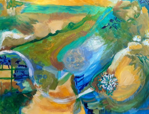
My First Painting for our Yorkshire Writers Exhibition

As you can see, here is my first piece for our current Northern Fringe Gallery exhibition and you can read all about it here. Actually, we do have super themes for our exhibitions – have a look at my Exhibitions page here. And you will see some of the work I did for the Northern Fringe Gallery exhibitions.
Anyway, just a word of explanation about this painting in which I felt inspired by poet Ted Hughes. In fact, I like many of his poems but I really loved the one entitled ‘Wuthering Heights’. And this location, Top Withens, is a ruined farmhouse on the Pennine moors near Haworth in West Yorkshire. Because it is presumed to be the setting for Emily Bronte’s novel Wuthering Heights, it’s quite a famous spot. Well, Ted Hughes and his wife, the American poet Sylvia Plath lived nearby. And they hired a local guide to take them to the house. Both poets wrote a poem about the moving experience and I chose Ted’s piece. Here he describes the wild, now abandoned spot where the story of Cathy and Heathcliff took place. As well as his wife’s reaction to the experience. You can see both poems here.

Finally, here’s a closeup so you can see the ghostly figure in the window, as described in the poem.
We are launching this exhibition 29th September at the Ridings, then it moves on to Mirfield Creative Arts Hub in October. And, I must admit that I just love being involved in art projects!