Good morning everyone. I love painting mountains and high hills. And this is my latest acrylic painting for the online course I’m following. As you can see, it’s a beautiful view over to a craggy peak in Australia. And in the foreground there is some rough pasture and a couple of shearing sheds. Admittedly, I didn’t know what the buildings were until our tutor Rod made it clear. To be honest, I’m quite out of my comfort zone with some of these scenes, having no personal knowledge of the country. But, I love the challenge! (My apologies for the fuzzy picture – that’s the last painting on poor paper, because I’ve acquired something better now!)
Mountains and High Hills in Home Territory

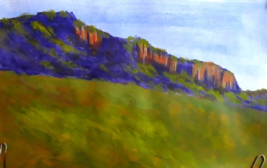
Actually, you may have seen this painting before, if you follow my blog. Because I posted it in December last year. And I explained how I altered the lie of the land and the colour emphasis. So that it was more reminiscent of the Pennine Hills in Yorkshire. Of course, these are really high hills and they can be very bleak and devoid of much vegetation. In fact, in sharp contrast to the thickly wooded peaks in the Australian landscapes. But we are encouraged to make the paintings our own, so that’s ok! If you look closely, I have even added a gorse bush, a spikey shrub that grows delicious little yellow blossoms in Spring.
Imaginary Mountains

Finally, this is an acrylic painting of a view that I made up in my head. And, that’s quite an achievement for me, as my visual imagination is not that strong. But I tried here to show how the highest peaks in a mountainous landscape can remain snow capped for a lot of the year. Also, here I experimented with applying the acrylic with a palette knife. However, I found it very difficult as the paint dries very quickly. But I’d like to try again – does anyone have a tip for this?
As usual, I’ll just remind you that all my original art is for sale at reasonable prices. Just have look at my Gallery- Landscapes here and if you like what you see, visit my Contact Me page here . And send me an email.