New Painting for Abstract Show

After the Thaw

Good morning everyone. I’m so pleased – Fronteer Gallery in Sheffield accepted my acrylic painting for their new abstract show in October! As you may remember, I exhibited with them in June this year. And I showed my Egyptian Temple in their Summer Solstice exhibition.

Egyptian Temple

Work for the Abstract Show

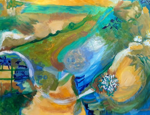
Well, the theme for the show this time was a dream – Abstract. That’s all, so I found it wide open to interpret just as I liked. Normally, I create a new work for an open call, but this time I had one ready made.

After the Thaw – closeup

Although I started this abstract composition purely instinctively, as I worked, I realised that two main themes were influencing me. Firstly, I had recently been to a great exhibition at the Hepworth Gallery in Wakefield, by Anthony McCall. The light installation was very impressive and the museum encouraged visitors to move through the beams of light quite freely. So I painted a silhouette against the blinding white and the deep shadows the artist had created.

After the Thaw – another closeup

Secondly, the winter was quite cold that year and the snow was finally beginning to melt. And the streams were swollen, racing through sodden fields. Consequently, I added piles of soft snow, a stream and the moon piercing the darkness. However, you don’t really need to know any of that. In fact you can put your own interpretation on the scene. Or, even, obviously just look at it and react in your own way.

My Abstracts

Of course, I shall post a report of the abstract show when it is actually on the wall. Meanwhile, you could look at some of my other abstract paintings in the Abstracts section of my gallery.

As you may know, I sell all my art at reasonable prices and you can email me via my contact page.

Morning Sunshine on the Crags

The Crags

Good morning everyone. I suddenly realised that I hadn’t shown you my latest Australian landscape. Actually, I finished Morning Sunshine on the Crags a couple of weeks ago. But my life is quite busy just now and it slipped through the net. However, I like to use this blog as a record of my painting life so I had to find a space for it.

Apparently this location is Kenilworth Bluff, somewhere in Australia, but that’s all I know! If you know more, please tell me. Anyway, I sort of projected my own story on to it. And I imagined myself going out for an early morning walk across the sun burned grass of the fields. Obviously, this is where the path enters the cool inviting trees and then on to the slopes.

The Path into the woods

As you can see, the rocky crags sparkle in the sunshine – the view must be spectacular from up there. Unfortunately though, I must turn back, go home and get started on my chores. So, perhaps another day I’ll walk up to the tops.

Morning Sunshine on the Crags

That’s it for today – all of my artwork is for sale. Just go to my Contact Me page here for enquiries. Of course, there are lots more landscapes with stories in my Gallery here.

Big Tree in my Garden

The Big Tree

Good morning everyone. Well, it’s finished at last! And, to be honest, I don’t really know why I didn’t complete the Big tree in my Garden earlier. Actually, I started this big painting back in the spring, after doing at least two other studies. In fact, you may remember these mixed media versions, because I think I did post them.

Study 1 for The Big Tree

As I remember, I painted the twisting shapes of the branches, still really visible in spring, before the leaves grew thicker. And I found these fascinating, at the same time realising that we had created them ourselves. Simply by hacking the growth back every year in a vain attempt to keep the tree small for our modestly sized town garden. Anyway, I sketched first in charcoal and then I worked in oil pastel.

Study 2 for The Big Tree

Now, this is the second version that I sketched in charcoal and then added watercolour and pen for finishing touches. By the way, I sketched both of these through the living room window. And, as you can see,the season is moving on!

The Big Tree

But, to get back to the bigger painting, I decided to paint the tree quite simply and make sure that it dominates the space. But I also wanted to give emphasis to the rather fine building on the other side of my garden wall. At present it is used as offices, but, using my artistic licence, I show it as the grand family home that it once was.

And, I daydream about the people who live there, do they watch my house from their windows? And, what is there over the hill that the house sits on top of? So, as you have realised, I have created an imaginary scene from the reality I live in. Because, there’s always more than meets the eye, in my imagination anyway!

The Big Tree – a closeup

Finally, this acrylic painting on paper is 16 by 20 inches and the price is £80 plus postage, free in UK. Just email me on my Contact Me page here. And, if you want to see more of my trees, see here.

I Painted these Beautiful Sunflowers

Beautiful Sunflowers

Good morning everyone. Today I’d like to show you my beautiful sunflowers, painted in acrylic on paper. Actually, I’m quite pleased with this effort and, as I said in a recent post here, I feel like I’m finally making progress. Because this picture seemed to come together fairly well.

Anyway, I also tried something different here and I used gloss medium for the bright petals and leaves. Just a dab when mixing the sunny yellow, the vibrant green of the sunflowers. Not to mention the rich purple of the irises.

In fact , the other intention of this project was to try to work in a looser style. That is, not to concentrate too much on precise detail and leave something for the viewer to work out. In other words, not to paint the picture to death! Well, I did manage to loosen up a little, but I clearly need more practice!

Sunflower in Watercolour

Now, just for the sake of contrast, I painted this sunflower in watercolour last year. And here I tried to show the accurate shape and arrangement of the petals and the seeded centre. But the actual brush strokes were quite loose and gestural. So, you see there’s clearly more than one way of painting beautiful sunflowers!

All my artwork is for sale at reasonable prices. Have a look at more flowers in my Gallery here.

Australian Landscape, Painting in Acrylic

Early Morning

Good morning everyone. As promised, here is my Australian landscape, finished only yesterday afternoon. And, I must admit, I’m really quite pleased with it. Actually, I feel now as if the tuition I’ve had access to on this course is finally coming together. If you’ve been following my blog, you will have seen many of my practice paintings of Australian landscape. I will confess that I felt out of my comfort zone with some of them. Perhaps the advice on using a restricted palette and simplifying the shapes was a lot to take in at first. Not to mention the unfamiliarity of the Queensland countryside. However, I would fully recommend this course, the Moore Method of Painting here.

Early Morning – a close up

At last, I’m beginning to pay attention to the pattern of light and shade in the scene. Also to use different kinds of brushstroke to indicate grasses, leaves and so on.

Early Morning – a close up of the rough grasses

Anyway, I definitely feel like I’m making progress, at last and I’m really looking forward to my next project, possibly an English landscape scene. Incidentally, there are some interesting paintings in my Gallery. And, if you like this one, it’s for sale. Acrylic on paper, 12 by 16 inches, unframed and without a mount. Go to the Contact Me page and drop me a line. Affordable Art, at reasonable prices. It’s £50 plus shipping , free in UK.

New Woodland Painting for Sale

Three Trees

Good morning everyone. Well, here, as I promised is my latest small, woodland painting for sale. Honestly, I really enjoyed creating this one. Probably because painting trees is one of my favourite subjects, as you might have noticed! (See this post here). Actually, I based this study on a pencil sketch in my sketchbook. As I recall, I focused down on just part of the scene to make this study. But then, as often happens, the painting took on a life of its own. Meanwhile, I deepened the shadow in the background to make more of a contrast with the glow cast by the setting sun. As you can see, the rays are falling on to the tree trunks and the soft, thick foliage.

Incidentally, have you ever walked in the wood when the sun is starting to set on a still, summer’s evening? In fact, it can look quite magical and that’s the feeling I was looking for here.

Finally, if you want to buy a unique piece of art, this woodland painting is for sale. Perhaps as a treat for yourself or a gift for a loved one. And it’s only £15 plus shipping (free if in UK). Acrylic on paper, 7 by 9 inches, unframed and without a mount. Simply go to the Contact Me page here and send me an email, payment is by PayPal. Then you can enjoy a ‘walk’ in the woods every time you look at it!

A Fascinating Little Local Museum

An old fireplace, with an oil painting hanging over the mantelpiece, and a fine wooden clock - a watercolour sketch completed on the spot.
The Mantelpiece

Good morning everyone. I did this watercolour sketch when we visited our local museum. In fact, the beautiful Maurice Dobson Museum is stuffed full of antiques and interesting objects. And, it’s quite difficult to zero down on something to draw. Actually, I’ve been there on several occasions on a sketch visit, and this time I chose the mantelpiece in the upstairs room. And, the volunteer staff call this the Domestic Life room. Because it is laid out like a normal, fairly well to do sitting room, in the past. Of course, it’s also full of many more fascinating objects than you find in a real house.

The Maurice Dobson Museum – our Local Museum

The Wash House

I like this area in the museum most of all, I think. And it’s actually in the courtyard outside. Obviously, there is a roof over this section, and the rest of the courtyard is a beautiful outdoor extension to the little cafe. (Incidentally, the cottage style planting in the borders is quite appealing). And, now we’re on the subject of the cafe, that’s where you’ll find the art by local artists on the walls. We’ve exhibited our work here several times recently, Barnsley and District Art Society, that is.

A photo of two visitors, admiring our art exhibition in the museum cafe gallery.
Admiring our Show at our Local Museum

Honestly, everyone enjoyed showing their work in such a pleasant setting, especially over a good coffee and some homemade cake! Not to mention the the warm, friendly welcome we get whenever we go. As I recall, we have had one or two great, little tea parties here on exhibition opening days!

If you want to get a better look at my ‘tomb sculpture ‘ painting (that’s the one on the wall), see here. As you may know, I painted this using sketches I made in the church at Silkstone village.

Another Small Painting for Sale

A small painting of a walk through a beautiful landscape, in the hills on a calm Spring day.
Spring Morning

Good morning everyone. Here it is – the second small painting in my new series of work for sale. If you remember, I offered my first one here , and I suppose that this scene is slightly similar. Only, the season has moved on, and now it’s early spring. To be honest, to create this landscape, I had a look through one of my little sketchbooks for inspiration. And I found this scene, it caught my eye and inspired me to paint. In fact, I have realised that I really need to like a subject in order to get my acrylic paints out. Then I set up my easel and the fun begins. However, I must admit that I can’t recall anything about where the scene was, or what happened that day.

Setting the Mood in my Small Painting

Anyway, in a way that left me carte blanche to create any mood I wanted. So, as I worked, I tried to channel brightness, in the fresh foliage of the season. Also, I wanted to indicate early morning and the optimism that you feel when you set off for a walk. Because, the landscape is one you love, and the weather promises a fine day! But, it doesn’t really matter whether you, the viewer see all that or not. In fact, the picture may conjure up quite different kinds of emotional responses for you.

Whatever you feel, if you like this acrylic painting, 7 by 9 inches, it could be yours for £15 plus shipping (free postage and packing for UK). It comes as it is – unframed and without a mount. But, securely packaged and sent to you and you pay by PayPal.

As I was writing this, it just occurred to me that I may well have been influenced by this practice painting here below. Just to recap, I painted this scene for my online course and the setting is Australian landscape. But the sentiments are the same, I think – it’s all about the pleasure of being in the outdoors.

The Red Path

Well, it could be not be easier to contact me you know. Just go to the Contact Me page and send me an email. Then you can have some original artwork at affordable prices, and there are plenty of interesting paintings in my Gallery too!

Small Landscape Painting for Sale

View over the Park

Good morning everyone. Today I’d like to show you my new small landscape painting. As you may remember, I am following an online course, on Learn to Paint Academy, at my own pace. And our tutor, Rod Moore suggested something I hadn’t thought of before – small studies, brought to a finished state. Of course, this is a great way to practise techniques and experiment with composition ideas. However, it doesn’t take anywhere near the same amount of time as one of my larger works. And, it’s just as satisfying to do. But, although it sounds simple, I never thought to try it!

The painting above is 7×9 inches, acrylic on paper and I’m offering this mini landscape at £15 plus shipping, (in UK free!). So, if this quiet, end of winter, English scene appeals to you, go to the Contact Me page and email me. Then you can pay by PayPal.

The Preliminary Sketch for my Small, Landscape Painting

Cannon Hall Park

Actually, you may have seen this sketch before. If I remember, the day was icy cold – the park was looking great, peaceful and dignified. Surprisingly green for the season. And some families were calmly taking their daily Lockdown exercise in superb surroundings. Unfortunately, I only managed a quick pencil sketch and then the cold defeated me. So I had to go home and warm up and I didn’t add colour at the scene, as I prefer. Anyway, after studying with Rod for a while, I now have the confidence to paint a small, landscape painting later. In fact, that’s a departure for me because I didn’t feel I could trust my visual memory. But, now it seems to be improving! Consequently, expect to see more little paintings based on my treasure trove of sketchbook pages made en plein air. ( I made some this week, but, that’s another story, perhaps for my Tuesday blogpost!)

So, enjoy this glimpse into my world, and let me know if you would like this piece of more affordable art for yourself.

The View Over the Park

A Day at the Seaside

The Path down to the Sea

Good morning everyone. A day at the seaside – I love this intuitive abstract that I made when I was thinking about a day out. Well, to be precise, I was only dreaming about going to the coast. And that’s because we haven’t been able to go for over a year now. Partly due to Covid restrictions and also for practical reasons – I chose to stay home and keep safe. Anyway, I can always dream!

A Day at the Seaside – an Abstract Acrylic

A Day at the Seaside – in my Dreams

However, I must insist that this composition must have come from my subconscious. As I have mentioned before, I do a first quick impulsive pass and create a full design, covering all the paper. Then I might leave it until next day, look at it and think about it a lot! After that, I’ll work on it from all angles and enjoy myself, creating texture. For the next session, I’ll choose which is top, and which is bottom and have a look at the balance of shapes and colours. And that’s when I get nice surprises!

The Unexpected Features

Fish or Seabirds?
The Path and the Fence?

Actually, this picture almost painted itself and it was the first of my summery abstracts. Before this, most of my intuitive abstracts were in a different palette of colours. For example, here is one I did at the end of winter, with dramatic, sombre colours. In contrast, my seaside picture is in warm, mellow colours, with hints of cloudless sky and fresh vegetation. And, of course, the almost tactile yellow ochre indicating sand.

On the Shore

Finally, I made this collage a couple of years ago, partly as a tribute to the wonderful Mark Hearld. So, my imaginary scene of a day out at the seaside was made up of painted collage papers, cut-outs and watercolour. And then rounded off with a pretty, decorative border in muted colours. Ah, it’s almost as good as being there in person (almost!)

You could look at more scenes of the fab Yorkshire coast in my Gallery – Landscapes here. It’s affordable art, folks! Contact me for details here.

An Abstracted Cityscape in Acrylic

Cityscape 1

Good morning everyone. Today I’d like to show you my attempt at a semi-abstract cityscape. Actually, I didn’t want to waste the leftover paint on my palette, so I started doodling. (Or, you could call it an intuitive abstract!). Anyway, when I saw the shape of a doorway, I thought I would try to paint a cityscape. Then, I loved the blocks of colour so much that it gradually led me into some semi- abstraction of the scene. And then a bit more! To tell the truth, this is my first attempt at this subject. That is, if you discount one collage of an imaginary view over a city that I did a few years ago. But, I would definitely like to explore this theme a bit more . And, I could even do a series, like a proper artist!

However, I must say that when I posted this on my Instagram account at least two friends saw this as an industrial scene, a steelworks melting shop to be exact. Well, at least they both liked it, so that’s the main thing.

Somewhere in France

And now, in complete contrast, this is a cityscape in southern France somewhere. That is to say, judging by the architecture and the strength of the sunlight. Obviously, I painted this based on a reference photo, and a bit of memory, not from my imagination like the first image. At the time I painted it, a few years ago, I was quite pleased with it. And, I still am, but, I’m quite glad that I am now moving away from following the photo so carefully. So, if I were to do a similar scene, I’m sure I would interpret it with more artistic licence.

An Urban Sketch Cityscape

The Calder Building at the Hepworth Gallery, Wakefield

Finally, this is an urban sketch I did, on the spot in about 30 minutes. Incidentally, I was out sketching with Urbansketchers Yorkshire, back in the day when there were no restrictions on mixing. Happy days! And, this old warehouse by the canal was part of the site dedicated to the well-known sculptor Barbara Hepworth. Well, I know it has its flaws, and I’ve learnt a bit more about perspective since then. But I do like the freshness and atmosphere I’ve captured here. Plus, of course the memory of a fab day out sketching.

So, whether I use acrylic or watercolour, a photo, my imagination or plein air approach. And, whether I paint in realistic or abstract style, I still find plenty of inspiration in this subject. You could see a very different type of cityscape if you look at this post here – the Piece Hall in Halifax, UK.

Purple and Yellow in Abstract Art

An abstract in purple and yellow,  full of dynamic shapes and intriguing details
Sunny Mood

Good morning everyone. This is an acrylic abstract I did recently, featuring a restricted palette of purple and yellow. With a bit of yellow ochre thrown in, plus black and white, if I remember correctly. So, today I’d like to think about how colours influence mood in abstract painting. Incidentally, I never set out trying to choose a mood or atmosphere at the start. Because I paint instinctively and ‘choose ‘ the colours and shapes unconsciously. And then analyse what I have created afterwards!

Probably I turned to making art on this occasion to help me with a low mood. As I’ve mentioned before, for me (and lots of other people, no doubt) art is therapy. It soothes my soul and very rarely do I not feel better after an hour or two of painting.

Shades of Purple and Yellow

Sunny Mood

Actually, I bought some artist’s grade cadmium yellow a few weeks ago, and I’ve never looked back! Because the pigment is nice and strong, unlike the student grade acrylic I had been using. So, I can use it freely and make a really definite mark. And, to me, the colour signifies sunshine and happy days – the vitality of life. In fact, I use it to create a cheerful atmosphere as in ‘Sunshiny Day’ here .

And, what about the purple? Well, I spent some time thinking about why I so love the colour. Usually straight out of the tube, which is rare for me. Anyway, I’ve come to the realisation that I use it to conjure up the richness and intricate variety of life. And how we should take advantage of that and live life to the full. (Apologies for the darker colours here – I found it almost impossible to get a good reproduction of the true colour purple in this painting and in the next one!)

Family

Another purple and yellow abstract,  bold, vibrant colours,  carefully  balanced with a cheerful atmosphere.
Family

Finally, I’d like to feature another purple and yellow abstract which shows my great love for these two beautiful colours. Now, if I hadn’t given it a title revealing my thoughts on the subject, what would you sense about the mood of this painting? Hopefully something cheering and heartwarming. But, who knows?

All my original artworks are available at reasonable prices. I sell them unframed and if you are interested, you could go to the Contact Me page and send me an email.

Signs of Spring in the Country Park

Signs of Spring – Blackthorn Blossom

Good morning everyone. This is a little watercolour sketch I did at Worsbrough Country Park last week. Finally we had one or two milder days and we really enjoyed the fresh air. Actually, I have been searching out the first signs of Spring this year. Because the winter did seem to me to be very long. And, it was such a pleasure to spot the first hazel catkins and the willow blossoms.

In fact I realised this year something I had never noticed before. That is, that the pussy willow flowers gradually open right out into larger flowers and the pollen escapes. Then the tree seems to be a vivid greeny yellow from a distance. As you approach, it gradually changes to be a dusty yellow colour. Just remember, the stark, dark brown branches are bare of leaves at this time. Honestly, this is the first time I ever noticed this!

One of the first signs of Spring on the willow trees

The Willow Blossom

But, just to return to the blackthorn tree and its creamy white blossom. What a welcome sight at the end of winter! Again, the branches have no leaves, and the trees are covered in clouds of creamy white blossom.

The Blackthorn Blossom

In order to sketch this view en plein air, I sat on a very comfy bench near one of the pedestrian entrances of the park. And we were looking down towards the paths that lead around the shore of the reservoir in both directions. Honestly, it was such a treat to sit in the sunshine, and see happy walkers, children and dogs relaxing. In fact, even the watercolour sketch went well until I tried to indicate the showy, white flowers! Eventually, I had to leave that part of the painting until I got home. Then, out came the little tube of white gouache paint , but even then, I couldn’t quite do the tree justice! But, it was worth it to do my first outdoor sketch of the season.

Last year’s Spring flowers

A colourful acrylic painting - semi-abstract composition of pansies and polyanthus in the rain  - the first signs of Spring in the garden.
Flowers in the Rain

Incidentally, this is an acrylic painting I did last year, in Spring to cheer myself up. It’s a semi abstracted view of pansies and polyanthus flowers in my garden, listening in the Spring showers. Well, it did cheer me up, but I’m so glad that I could go out this year. And appreciate the trees and their impressive blossoms in the Great Outdoors! If you want to read my post about last year’s exhibition ‘Springtime in Yorkshire ‘ see here .

Painting Portraits in Acrylic and Watercolour

Painting portraits- this is a face from my imagination,  painted in subtle shades of green and yellow.
A Green Man

Good morning everyone. Over the past few weeks I’ve been thinking about painting portraits. As you can see, for this one I took the slightly unconventional idea of deliberately not using flesh coloured paint . And I used watercolour which is not as forgiving as acrylic. So I had to think carefully about where I placed the brush strokes. Actually, I wanted a chance to practise using tones to model the flesh, something I learnt on an online tutorial. And, because I didn’t use skin tones like pink , orange and brown, this allowed me to be a bit detached. Probably because I could just treat the task like a problem to be solved, instead of wanting to create a lifelike portrait. Anyway, I had a go, my watercolour skills are a bit basic, I know. On the other hand, I do feel like I learnt something from the exercise.

Painting portraits and modelling the flesh

Painting portraits and making a tribute to artist Mary Cassatt. A beautiful,  red haired woman.
My version of a portrait by Mary Cassatt

Although I haven’t quite finished this portrait, this was the exercise I did during a tutorial hosted by Care Visions. In fact, I found it very helpful and the tutor John Skelcher skillfully guided us through the process. First of all, we sketched and checked that the proportions of the face were reasonably correct. Next we painted the face and neck with a mid tone. And then I added darker paint for shadowy areas and lighter colours for highlights. Finally I understood what I was trying to do, instead of adding too many shades and colours!

Incidentally, there was one other challenge in this session – we had to use the ‘ Zorn’ palette. Just to explain, an artist called Anders Zorn (1860 – 1920) made this choice of colours famous when he created his superb portraits in oils. For your information, the restricted palette consists of red, yellow ochre and black, with white allowed too. You could try it out — it’s amazing how many colour mixes you can create with this combination.

Drawing Faces on Toned Paper

A drawing of a man in red-brown pencil and white pastel on light brown paper.
Portrait in sepia pencil

Well, just to finish off with, in this portrait exercise, I used sepia pencil for the darker tones. Then the fawn coloured paper itself for the mid tones and white pastel for the highlights. Honestly, it sounds very simple, I know, but it’s taken me years to understand it!

By the way, I made this study with the aid of a photo provided by the tutor. Whereas, the first image I showed you – the green man – I created from my imagination. Because I’ve been studying the proportions of the face recently, I think I’ve managed to improve at this. And I made the painting look a bit like a real person! (Even though the eyes are not quite right!) If you want to see my baby angel portraits, see here for my tribute to Raphael.

Mountains and High Hills in Acrylic

An acrylic painting- a view of mountains and high hills in Australia,  with pasture and shearing sheds in the foreground.
The Shearing Sheds

Good morning everyone. I love painting mountains and high hills. And this is my latest acrylic painting for the online course I’m following. As you can see, it’s a beautiful view over to a craggy peak in Australia. And in the foreground there is some rough pasture and a couple of shearing sheds. Admittedly, I didn’t know what the buildings were until our tutor Rod made it clear. To be honest, I’m quite out of my comfort zone with some of these scenes, having no personal knowledge of the country. But, I love the challenge! (My apologies for the fuzzy picture – that’s the last painting on poor paper, because I’ve acquired something better now!)

Mountains and High Hills in Home Territory

A view of a track winding through Pennine hills , a stark, bleak landscape.
The Path through the Hills

Actually, you may have seen this painting before, if you follow my blog. Because I posted it in December last year. And I explained how I altered the lie of the land and the colour emphasis. So that it was more reminiscent of the Pennine Hills in Yorkshire. Of course, these are really high hills and they can be very bleak and devoid of much vegetation. In fact, in sharp contrast to the thickly wooded peaks in the Australian landscapes. But we are encouraged to make the paintings our own, so that’s ok! If you look closely, I have even added a gorse bush, a spikey shrub that grows delicious little yellow blossoms in Spring.

Imaginary Mountains

Mountains and high hills , green in the valley and snow on the peaks.
A Mountain View

Finally, this is an acrylic painting of a view that I made up in my head. And, that’s quite an achievement for me, as my visual imagination is not that strong. But I tried here to show how the highest peaks in a mountainous landscape can remain snow capped for a lot of the year. Also, here I experimented with applying the acrylic with a palette knife. However, I found it very difficult as the paint dries very quickly. But I’d like to try again – does anyone have a tip for this?

As usual, I’ll just remind you that all my original art is for sale at reasonable prices. Just have look at my Gallery- Landscapes here and if you like what you see, visit my Contact Me page here . And send me an email.

Waterlily Pond in Green and Gold

A semi-abstract interpretation of a tangle of lily pads. Green and gold on shimmering water, with glimpses of goldfish.  In gouache paint.
Waterlily Pond

Good morning everyone. Today I’d like to show you this gouache painting of a waterlily pond that I did for our Beginner Gouache group on Mewe. Well, the prompt for this month is Aquatic Life and I think it’s a great choice. Because it’s nice and wide reaching. For example, I decided to concentrate on a pool , or you could choose a river or the sea. And, even better, the Life could be animal or vegetable. Actually, the reference photo of this scene really appealed to me – it’s by Uriel Soberanes on Unsplash. In particular, I liked the arrangement of the waxy green pads, just lightly resting on the surface of the water.

The semi abstract approach to the leaves on the waterlily pond.

The Waterlily Pond – a closeup

To be honest, I was very attracted by the semi abstract jumble of leaves gently floating. And also, of course the shimmering light and reflections on the water and on the glossy pads themselves. Perhaps you remember that I am working on a theme of the semi abstract in these little gouache pieces. And you can click here to see my painting of a camel at the pyramids in this style. By the way, did you spot any other kind of life in the pond?

The Watercolour Version

A watercolour painting of waterlily leaves, in a small pond.
Waterlily Pond – the watercolour version

Finally, I just couldn’t resist exploring the subject a bit more and I tried a different medium. Frankly, I’m no expert with watercolour, but I do sometimes really love to play with it. Possibly it’s the complete contrast to acrylic paint that I like – wet and flowing rather than thick and textured. Anyway, I think I’m not done yet with this theme. And I looked up some images by Monet yesterday, seeking inspiration. So, watch this space! Meanwhile, here is my acrylic painting of a lily pond, with some more aquatic life!

A Bright Red Abstract Painting

A joyful. bright red abstract in acrylic.  With soft greens and earthy yellow ochre.

Red for Happiness

Good morning everyone. I finished this bright red abstract in acrylic a couple of weeks ago. And I propped it up on the dining table so that I could look at it everyday. Actually, after all that looking, I’m still not sure what it’s all about! Of course, I am aware that it doesn’t have to be ‘about’ anything. However, I do usually have some ideas on the main themes and so on. Strangely, I don’t in this case, but I do remember that I felt calmer and more settled as I was painting. So, maybe that was its significance, to me anyway.

The Bright Red Abstract, an Earlier Version

The bright red abstract as it progressed. This version is turned a quarter to the left.
The Bright Red Abstract, an earlier version

As I might have mentioned before, I do now always rotate the painting round as I’m doing an abstract. To be honest, I used to think that this practice was pointless. But I completely changed my mind and now, I find that it helps me to work on each ‘quarter’ individually. Perhaps you noticed that in the image above, I have turned the painting around. It was in fact the first version of the painting in watercolour. Actually, it’s an important part of the development of the piece. Also, it can help to prevent the artist from inadvertently making it into a realistic scene. For example, a landscape or a group of people. But, for me, the most intriguing thing is how the picture does suggest realistic images. Even after all I do to prevent it! And they always come as a complete surprise!

What Can You See ?

Red is Happiness

Of course, I haven’t talked much about what the viewer sees in this bright, red abstract, which is, of course, very important. So, that’s the deal – I paint it and you make of it what you like! And I hope it makes you feel calmer and more settled too!

As I remember, I wrote a post about red in abstract paintings. Mainly artjournal pages – earlier in lockdown last year. See here.

Incidentally, all my original artwork is for sale at reasonable prices. This one , acrylic on paper and 16 by 12 inches (unframed) is £60 plus shipping. And if you want to treat yourself, go to the Contact Me page and send me an email.

New Beginnings – a Story Picture

A fantasy scene of a lonely figure  about to set off on a new path, leaving her old life behind for new beginnings.  An acrylic painting.
A Different Path

Good morning everyone. Well, I thought I would show you this story picture all about new beginnings. Actually, the reason why I held back was that I never really felt that I had finished it. Just to wind back a bit, I went into this project quite blindly. To be honest, for the first time ever, I painted this narrative painting quite intuitively. And all I knew was that I wanted to do something with the idea of making a new start. Probably I started thinking about this after hearing stuff on the radio about the recovery from the pandemic . Apparently, this might be an ideal time to rethink the way we run our world.

How to Create a Story Picture on New Beginnings (Badly !)

Firstly, I sketched in a lonely figure and then I imagined surroundings that don’t quite look familiar. Next, I added a moody sky to set a slightly threatening atmosphere.Then I painted various elements like luxuriant plants, a stony path and a mysterious castle. Finally, I changed everything around, including the type of foliage, the sky and the colour scheme! In fact, I wouldn’t recommend this process at all!

An earlier version of the story picture with a stronger, moodier atmosphere.  New  Beginnings for this young woman.
A Different Path – one of the earlier versions

Unfortunately, I didn’t manage to get photos of all the different attempts I made to improve the composition. And I painted them all in acrylic paint on the same tired old piece of paper! Well, at least I taught myself to understand the importance of planning a complex composition in advance. Even if I chose the hard way to learn!

What’s the Story?

A Different Path – a closeup

Anyway, I eventually chose this version, I don’t think I could give the paper any more punishment! But, all the time I was painting I was thinking of fresh starts and a chance to break out of the old rut. And, I wonder if other people are having the same thoughts as me right now. So, what do you think this woman’s story is?

Incidentally, I have some other interesting story pictures in my Gallery here. For example, you might like to see the enigmatic Silk Princess here or the Green Knight in his rocky church here .

Winter Landscapes, in my Sketchbook

An instinctive,  semi abstract composition of trees in the mist, one of my winter landscapes. In graphite pencil, acrylic and ink.
Trees in the Mist

Good morning everyone. I thought I’d like to share with you some winter landscapes I’ve painted quite recently. In fact, I realized I’d better hurry up, as everyone is now spotlighting the signs of Spring!

Well, the image above is a mixed media piece I did instinctively straight after a short drive in local countryside. As you can see, the mist was fairly thick, and the sun just peeped through briefly in a couple of spots. Actually, I was quite fascinated by the tangle of bare, tree branches looming in and out of focus . And all this against the thick, soupy consistency of the off-white sky.

Closeup of Trees in the Mist

Winter Landscapes – Part One, the Instinctive Semi Abstract

Firstly, I scribbled some trunks, branches and random lines with a graphite pencil. And this gave me very strong marks, just what I wanted. Then, my idea was to lay in shapes in the negative spaces between the branches with acrylic paint. But the paint wouldn’t quite cooperate – I think it’s time I tried water mixable oils! However, I used what I had, sketched in some grasses and so on. Then I put some detail into the tree trunks with sepia ink, applied with a tiny brush.

A Winter Scene – Part Two , the Plein Air Sketch

A quick, en plein air sketch in watercolour.  One of my favourite winter landscapes,  Wentworth Castle Gardens.
Wentworth Castle – the Folly

And this is the other one of my winter landscapes – a watercolour sketch I did en plein air. To be honest, the ‘air’ was very cold! So I spent 20 minutes sketching from life, then painted more layers of washes at home. Again we have the bare branches against the beautiful, subtle greys of the sky. But I hope you can see the difference between the two approaches to the similar subject matter. That is, an impressionistic, imagined painting and an on the spot sketch, staying close to reality. Which style do you think gives a more effective record of a scene?

We often walk in the grounds of Wentworth Castle Gardens (NT) and I love to paint the mock castle here and the other features, such as the rockery, see here if you’d like to enjoy the views.

Painting Faces in Acrylic Paint

Painting faces. Two sweet cherubs, with small feathered wings, resting in rose pink and deep purple clouds,my study of Raphael's painting.
My Study of Raphael’s Cherubs

Good morning everyone. Well, I decided it was time to take the plunge and try painting faces! And I’m sure that lots of you will be familiar with this image taken from Raphael’s beautiful work. Because you do see it everywhere, on cards, tea towels, diaries and so on.

Raphael (1483- 1520) was an Italian painter and architect in the Renaissance period. In fact, he was very successful in his own lifetime. And he painted the little angels on this commissioned Madonna and child painting in 1512. As you can see, the clouds are not the same colour as in our Valentine’s Day version!

The Sistine Madonna by Raphael

Raphael's Sistine Madonna, a superb painting showing Mary and Jesus, two saints and the two adorable cherubs at the bottom of the picture.

As you can see, in this superb painting by Raphael, the scene shows us Mary, Jesus, two saints and the baby angels waiting and dreaming.

Anyway, I painted this study whilst following along with a free tutorial, hosted by Artclassesgroup. Actually, the tuition was very good and the tutor guided us through completing the angelic cherub on the left. You see, the session was only one hour long, so that, plus a bit of background was good going.Then I spent another hour and added the baby cherub on the right.

Half Finished Cherubs

The Three Stages of Painting Faces

Obviously, I was most interested in painting the faces, something I have tried to avoid in my painting practice. And that’s because it seems to me to be the most difficult subject of all. Fortunately, the tutor cleverly simplified it down and we were able to follow. To be honest, it had never occurred to me to treat the face like anything else I paint. So, firstly we mixed a reasonable flesh colour and covered the face in a mid tone. Then we darkened that colour mix and applied patches of colour for shadows. Lastly, (you’ve guessed it) we lightened the first mid tone and painted highlights, on the nose, forehead and so on.

Painting the Clouds

A close up of Raphael's cherubs - part of my painting faces project.
My study of Raphael’s cherubs

After all the careful brushstrokes of the faces, it was a real pleasure to let myself go and paint clouds! Not only were the colours so delicious, but also the subject really lent itself to expressive marks.And I enjoyed trying to create the fluffy texture of the wings too!

Painting faces- a close of my study of Raphael's baby angel.
A Cherub Resting on a Bed of Clouds

In all, I spent another hour to finish this and I would thoroughly recommend this exercise. Because there’s such a lot to be learnt from studying the work of great painters. And if you want to see how I painted my own version of a delightful abstract by Paul Klee see this post here.