Good morning everyone. Today I’d like to show you the study I made of a superb painting by the great Dufy. Actually, I did this while following a good online tutorial run by Art Enthusiasts London. Perhaps you remember my post about making a study of a Paul Klee abstract composition with the same tutor (see here ).
Unfortunately I haven’t got a lot of background about this painting. Raoul Dufy, 1877- 1953, was well known for his colourful paintings, influenced by Matisse, Cezanne and Monet. And I have long admired his bright, elegant scenes of smart seaside resorts in early 20th century France. Obviously here you can see a jumble of boats in the harbour- maybe on the Mediterranean coast.
The S Shaped Composition of the Great Dufy
Just look at how Dufy has simplified the shapes into ovals and straight lines. And then arranged them into a reverse S shaped composition, starting from bottom right and including all the boats. Masterly!
However, we also concentrated on the juxtaposition of the glorious colours the artist decided to use. No doubt they were inspired by the actual real details he could see at the quayside. But he then arranged them for maximum effect on the canvas. For example, he used complimentary colours green and red, blue and orange to make really sizzling combinations. As you can imagine, I found this exercise perfect for me – I don’t call my art activities ‘A World of Colour’ for nothing!
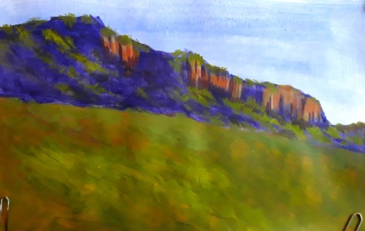
My Dufy Inspired Acrylic Abstract

To tell you the truth, I was so inspired that I straight away (well next day anyway) started do an intuitive abstract . I had a print-out of the original in front of me for colour reference. And then I just let my hand paint away. But that was stage one. Then came two more sessions adding and subtracting material, balancing shapes and colours. Until the picture said ” I’m finished “. What a satisfying experience!
I hope you like my little tribute to Dufy. And you can see more abstracts in my Gallery here. All my paintings are for sale at reasonable prices. Just go to the Contact Me page here and use the form to email me.