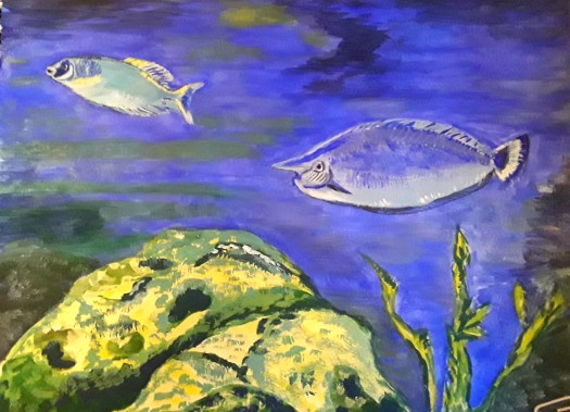
Good morning everyone. Today I’d like to show you my attempt at a semi-abstract cityscape. Actually, I didn’t want to waste the leftover paint on my palette, so I started doodling. (Or, you could call it an intuitive abstract!). Anyway, when I saw the shape of a doorway, I thought I would try to paint a cityscape. Then, I loved the blocks of colour so much that it gradually led me into some semi- abstraction of the scene. And then a bit more! To tell the truth, this is my first attempt at this subject. That is, if you discount one collage of an imaginary view over a city that I did a few years ago. But, I would definitely like to explore this theme a bit more . And, I could even do a series, like a proper artist!
However, I must say that when I posted this on my Instagram account at least two friends saw this as an industrial scene, a steelworks melting shop to be exact. Well, at least they both liked it, so that’s the main thing.

And now, in complete contrast, this is a cityscape in southern France somewhere. That is to say, judging by the architecture and the strength of the sunlight. Obviously, I painted this based on a reference photo, and a bit of memory, not from my imagination like the first image. At the time I painted it, a few years ago, I was quite pleased with it. And, I still am, but, I’m quite glad that I am now moving away from following the photo so carefully. So, if I were to do a similar scene, I’m sure I would interpret it with more artistic licence.
An Urban Sketch Cityscape

Finally, this is an urban sketch I did, on the spot in about 30 minutes. Incidentally, I was out sketching with Urbansketchers Yorkshire, back in the day when there were no restrictions on mixing. Happy days! And, this old warehouse by the canal was part of the site dedicated to the well-known sculptor Barbara Hepworth. Well, I know it has its flaws, and I’ve learnt a bit more about perspective since then. But I do like the freshness and atmosphere I’ve captured here. Plus, of course the memory of a fab day out sketching.
So, whether I use acrylic or watercolour, a photo, my imagination or plein air approach. And, whether I paint in realistic or abstract style, I still find plenty of inspiration in this subject. You could see a very different type of cityscape if you look at this post here – the Piece Hall in Halifax, UK.