Good morning everyone. Well, today I thought I would tell you all about when I went watercolour sketching with art buddies last week. Actually, I arranged the outing myself and I chose Worsbrough Mill for our get-together. Because it is an impressive site with lots of inspiration for keen sketchers. Or, even sociable art group members and friends who want to connect after some lonely times! Anyway, there was a good turnout and we had a brilliant time.
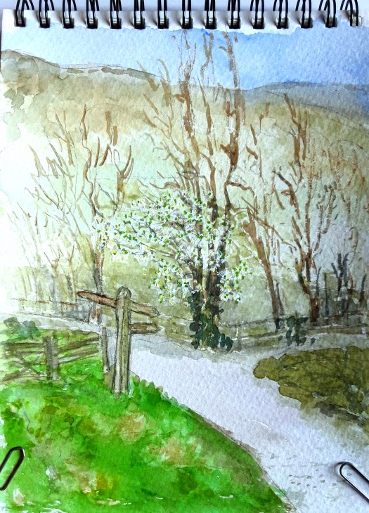
Just to explain, I sketched the scene above looking over the yard to the main mill building. In fact, my painting shows the more modern section, which was added to the old mill in the 19th century. And, the original part of the complex dates from 1625. But apparently there has been a corn mill on this site since medieval times. If you are interested in more details of the history, see this link here.
Watercolour Sketching at the Mill with Art Buddies
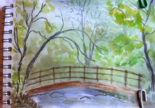
In actual fact, we were sitting on tiny fold up stools to sketch this, so the view point is very low. As you can see, the buildings are made of beautiful, old sandstone which really did glow in the grey, overcast light. Probably a little bit beyond my watercolour skills, but I had a go!

Well, after everyone had disappeared back to their cars to go home, I sneaked back to the millpond. And I did a small, 10min sketch of the scene. By now, the strong breeze blowing from the reservoir was chilly, so I went home too!
And, I couldn’t resist adding some colour later on at home. So, now I have two ‘snapshots ‘ to remind me of my morning watercolour sketching with friends!
If you’d like to see me sketching in the Mill Country Park and the paints I use, see this post here.