


Good morning everyone. As you may know if you read my blog, I do like to follow online art courses. And I love to work in all sorts of media, and try out new watercolour techniques. So I thought I’d show you some more updates from the Watercolours Made Simple lessons.
Well, the idea is to paint flowers in a more general way than carefully including each detail of a particular flower. Actually, this is more difficult than it sounds. Because my visual memory is not too good, I had a photograph in front of me here. However I tried to view the general shapes of the blooms of the whole bunch and sort of invent newer versions of them. Obviously, such intense scrutiny of the flowers should feed into my memory. Which will help me next time I try this exercise in painting generic flowers. But why do I need to do this, you may wonder? Because then I can concentrate on placing the individual elements in a pleasing design. Afterwards it could be used for a greetings card, for example. Or just simply for a different kind of floral painting.
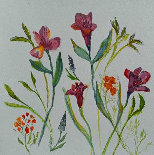
Now, in this attempt above, I did in fact have the flowers in front of me, which made the exercise easier. Of course, I shall need a lot more practice, but it is quite enjoyable And a pleasant way of spending time on the new watercolour techniques I’m studying. Have a look at this post here for a realistic portrait of a bunch of flowers. Finally, I’ll leave you with an example of another way of painting flowers – semi abstracting from reality.


