Look at this Small Abstract

Big Brain

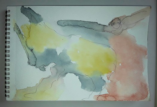
Hi everyone. This is a very short post indeed, all about a small abstract. To be honest, I’m so busy at the moment, gardening and arty business. Not to mention just running my life! Anyway, I just couldn’t stand missing my art fix another day. So I found my small drawing pad, watercolour kit and a few pencils, oil pastels etc. And then let a few colours run into each other. Next I added some small, precise marks and accents. And all this without a single conscious thought, a small abstract. Afterwards, I found out which way up I preferred it. Only then did I notice a head in profile and I had a strong idea come into my head! Namely, we need someone with a brain this big to get us out of the mess we are all in. Well, on that cheerful note, I’ll sign off and hope to write a longer, more optimistic post soon. (There is a more cheery abstract here !)

A Holiday in the Dales

Kilnsey Crag

Good morning everyone. We have just arrived home from a holiday in the Dales. That’s the Yorkshire Dales, UK, a peaceful, fairly unspoilt rural area about an hour and a half from my home. Anyway, we drove up to Kilnsey Crag, and sat on a bench overlooking the trout fishing ponds. And I attempted to capture a bit of the ridge rising up to the skyline. Actually, the most impressive part, the sheer drop of the crag is a bit more difficult to get to. So, that’s for another time!

Quiet Churchyard in Grassington

Actually, this watercolour sketch is not quite finished, but I’ll show it anyhow. Well, we spent the afternoon in Grassington, a town which is always very full of tourists. However, we found a peaceful spot to sit for a while. And I painted away, lost in my thoughts, until the rain made us move away.

Clitheroe Castle Keep

Finally, we spent a lovely day in Clitheroe on this holiday in the dales. And I couldn’t resist painting the imposing ruin of the castle keep. Amazingly, I wasn’t alone – there was a local art group there to keep me company! Perhaps you think that I make a habit of going on holiday in order to paint castles! And, you may be right – see this post here. By the way, these are plein air watercolour sketches, completed on site in roughly 40 minutes.

One More Quick Watercolour Abstract

Golden

Good morning everyone. I’m very busy at the moment, arranging exhibitions, visiting galleries and so on. So I don’t seem to have had much time to do any bigger painting projects. And I have also been finishing art society projects. Not to mention planting things at the allotment garden. But I did complete this quick watercolour abstract, thank goodness. As you may know, I hate leaving work unfinished. Anyway, this is quick abstract number 8. Actually, for this one I had a picture in my mind beforehand of hexagonal shapes. And, that along with the golden colour made me think of the shape of honeycomb. However, that was as far as the similarity went. As I painted, I got more interested in blending the gold and mauve together harmoniously. Of course, these two produce a range of soft browns. Therefore, brown was my third colour – I prefer to restrict myself to a few colours in abstract work now.

Areas of soft blending in my quick abstract

Then I decided to do the surface pattern over the soft background. On another day, in a ten minute slot of free time. Perhaps you can see that I used oil pastel, coloured pencil and markers for this stage. Frankly, the problem is knowing when to stop! Well, I added an accent of red and scribbled in some small pattern with black ink. Incidentally, I don’t think I am quite finished with this idea, so I may visit it again. Possibly with acrylic paint this time. As you may have seen on this post here, I am quite fond of the yellow and purple combination!

Finally, I can’t sign off without a mention that our Northern Fringe Gallery exhibition ‘Yorkshire Makers Inspired by Yorkshire Writers ‘ opens tomorrow at Skelmanthorpe Library Gallery. And it’s presented by Village Art. To be honest, this is the third venue on our tour! And this is one of my pieces – Top Withens, the ruined farmhouse near Haworth. Widely agreed to be the inspiration for Wuthering Heights, the famous novel by Emily Bronte.

Top Withens

Three More Quick Little Abstracts

Quick Abstract 5

Good morning everyone. I’m showing you a catch up post about my series of quick little abstracts. Well, if I call them a series it makes it sound more serious! But it’s really because I’m so busy at the moment, and only seem to have time for small works. In retrospect, in this one I must have been greatly influenced by dark thoughts about the war in Ukraine. Perhaps it’s a cliche, but the red looks like blood to me, with something scary raining down on the city from above. Actually, I mentioned in my last post in this series that I only notice these things after the sketch is finished.

Quick Abstract 6

In fact, you may have seen this watercolour sketch before, as I included it in my post about our holiday in Scarbrough here. And I painted it after having paddled in the cold North Sea. Honestly, I found it fascinating to spot the different patterns created by the receding tide on the shore. So I had a lot of scope for decorative patterns in ink over the top of the background.

Quick Abstract 7

Finally I painted this one after a day’s work at the allotment garden, Where I immersed myself in greenery, vegetation etc. Obviously, I don’t have to tell all you gardeners out there about the rapid growth. And how all plants grow so quickly in the UK at this time of year. Admittedly, we have to work very hard weeding and cutting back, but it’s quite glorious really. If you want to see more of the greenery in my plot of land, look here. Just another one of my quick little abstracts for the series.

Some Beautiful Old Stone Buildings

Kirkham Priory

Good morning everyone. I thought I would show you the last of the three watercolour sketches I did on our mini holiday. ( See the other two here) Perhaps you have noticed how much I love painting old stone buildings. So, here’s another one! In fact, I did this as we were driving home from the coast. And we stopped for an hour to eat a sandwich at Kirkham Priory, a beautiful ruin looked after by English Heritage. Well, this was the view from the picnic table and we we were in the old gatehouse. Obviously, I couldn’t resist sketching this section of the massive wall and a glimpse through the door. Meanwhile, my husband walked around the site with a guidebook, trying to imagine the splendid buildings as they once were.

Conisbrough Castle

Actually, we seem to do a lot of this, trying to imagine what old stone buildings once looked like. But, just to show you the exception to the rule, here is the keep at Conisbrough castle which is completely restored. As I recall, when we visited in November last year, we saw all three floors. Then we climbed up to the viewing platform at the top, to see a glorious view over the town. If you want to see another historic English castle, see this post here.

See my Small Watercolour Abstracts

Doodle 3

Good morning everyone. This is a quick catchup post, just to show you more of my small watercolour abstracts. Well, I’m still producing quite a few of these. And I’ve noticed that they definitely reflect my painting interests and colour choices at the time. But I don’t notice this till afterwards! For example, in this one above I’m exploring more restrained and sparse patterns, as a contrast to the busier designs of the previous little abstracts seen here.

Doodle 4

On the other hand, I noticed after I had completed this one above that it was connected to my current large acrylic. And also, the softer colours and bold black calligraphic marks are in the style on my online course. Who knew? Actually, my subconscious painting brain surprises me more every day, especially in my small watercolour abstracts!

Doodle 4 – a closeup

See my Spare Time Abstracts

Doodle 1

Good morning everyone. I think the title says it all, really, because I’m very busy at the moment. And, this is all the art I can manage to fit in at present – spare time abstracts! Actually, I saw a few things online about doodling, which seems to be very popular just now. But, to be honest, I’ve been scribbling little designs and patterns all my life. So, it seems to be quite natural to me. However, I noticed lots of ideas suggesting doing these small drawings over a background of watercolour marks. So, nothing could be easier, I use my little travel set of colours and it dries fast. Then, a little bundle of markers to choose from, and off I go!

Although, I must say the notion of using lots of surface pattern over paint is still new to me. But, that’s the fun part. And, as most of my marker pens are waterproof, it seems natural to add a bit more emphasis on top with thicker paint. Next, I have a look at the design for any ugly bits and correct them. And now I’ve done another spare time abstract! Right, back to the allotment gardening! There is some more fun doodling in this post here, using a slightly different technique.

Doodle 2

Bad Planning and Good Planning

Peace

Good morning everyone. Today I wanted to show you this abstract design, which required quite a lot of planning. Obviously, it’s just a modest little watercolour abstract painting, but, first I had to think hard about the background. You see, I kept the colours soft so there is not too much eye catching contrast. At the same time, I introduced a subtle sense of movement with the white paint. Honestly, I really had to restrain myself from adding loads of busyness all over the place! Anyway, I achieved it and now I could choose a motif to put over the top. But, what to choose? Not wanting to experiment on the page, I used my I pad trick and scribbled a few ideas over the image on the screen. After a few tries, I settled on a mandala.

The I pad trick

So then I felt confident enough to paint my mandala in black paint (don’t laugh, it’s an abstract one!) Actually, I haven’t got the skill or the patience to paint a good one. However, I think it’s quite effective. And the main point of the exercise for me is to take some time and thought when planning an abstract.

Peace

Bad Planning

Sunny Morning

Next, here is a glorious example of bad planning, more like my usual style! Here’s the story, l wandered into my ‘studio’ after showering one morning. And there was the usual view over the roofs, all bathed in gentle sunshine. Well, I couldn’t resist grabbing a pad and a black marker for a quick sketch. Then I used my new oil pastel pencils for the colour which didn’t of course cover the lines. So, not the best laid plan, but a real delight to record my response then and there! To sum up, I suppose I think that there is a time for careful planning and also for spontaneous response. Maybe you missed another quick response I made to this view, in a spectacular winter sunrise last year here.

Drawing the Figure in Movement

Figure in Movement

Good morning everyone. This is another page in the art journaling course Sketchbook Revival by Karen Abend. And I really enjoyed this tutorial by Barbara Baumann all about the gestural method of sketching the figure. That is, concentrating on the figure in movement. Basically, you sketch out the direction of the limbs, the torso and the head. Most importantly you study the angles of the tilt of the head and torso. Also, the direction of the outstretched arms and legs. Obviously the photo reference for this sketch was ideal – the pose was quite extreme. Also, unbelievably high off the ground!

The Proportions of the Body

After that, the really hard part! To be honest, I already knew about planning out the shoulders, elbows and knees as circles. But in the lesson I learned about the shapes of the upper and lower torso. And that is new to me and extremely helpful. In addition, I appreciated the tips about creating a background of dynamic lines and splodges. In my opinion is does suggest the figure in movement, which is not easy.

Ballerina in Flight

As you may know if you follow my blog, I have attended life drawing classes for a few years now. And I’ll finish up with one of my favourite drawings, done from life when we were also thinking about Matisse. In fact, a lot of his later cut- out work is very gestural. So, here’s my tribute to that great French artist. Actually, you could see more of my paintings of the figure in People, a section of my gallery.

Model in Blue

Two Paintings from my Archive

The Road to the Mountains

Good morning everyone. As part of my grand tidy-up, I looked through this old sketchbook to check for any empty pages. And I found these two paintings from my archive. Admittedly, I am not very organised, I have several sketchbooks on the go at once, with no particular plan! But the time comes when I must fill them up and put them away. Actually, I found that I had filled up this book and, in the process, I discovered these two mixed media pieces.

Over the Bay

Although I love them both, I must confess that I can barely remember doing them! Except, I do recall that it was round about the time that I was busy experimenting with coloured pencils. Perhaps six or seven years ago, possibly. And, me being me, I also couldn’t refrain from using watercolour pencil, oil pastel and marker pen too! Anyway, I am certain that I drew them from postcards or magazine cut-outs, not plein air. However, when I examine them now, I can clearly see bits that remind me of places I love to draw from life. For example, Over the Bay is definitely influenced by the hours I have spent looking and sketching at the Bay at Scarbrough on the north east coast of Yorkshire.

As for the mountain one, I can see in it the vegetation that grows on the moorland around where I live. So, I do remember happy days when I look at these paintings from my archive after all! You could see some more evocative landscape paintings in my gallery here.

Two Birds in One Week

Royal Tern, inspired by Shari Blaukopf

Good morning everyone. This is a cheeky little bird I painted from a good tutorial by Shari Blaukopf in the Karen Abend ‘Sketchbook Revival ‘ series. And it was great fun, so that makes two birds in one week! (More of that later). Anyway, the reference photo and the tuition were excellent, and I learnt how to make the feathers look more realistic. Hopefully the bird then doesn’t seem too ‘solid’, a pitfall I have fallen into sometimes. In the case of this watercolour sketch, things were a bit more tricky because of the windy weather. Perhaps you can see that the wing and breast feathers are ruffled up into a fluffy ball by the breeze. In fact, the bit I am most proud of is the effect of the reflections of the legs. Unfortunately, I know nothing about the bird itself, how about you?

The Reflections

Two Birds in One Week

A Mallard

Well, I did say two birds, so this is the other one! Actually, there were plenty of birds to spot on our quiet walk around the Dearne Valley Country Park . But this one very obligingly stood still for me to do a quick pencil sketch, as we sat in front of the small lake. By the way, we did go to see the bluebell display in the ancient woodland. And, Nature didn’t disappoint – I really love this time of year. ( You could see more of my bird sketches in this post here . )

Discover Shapes in Paint Doodles

Flight

Good morning everyone. This is a fun exercise I did in the tutorial by Charlie O’Shields in the Sketchbook Revival course by Karen Abend. And I tried to discover shapes in simple paint doodles, following the method described by Charlie. To be honest, it was easy to follow. First, scribble some marks with clean water on your brush, on watercolour paper. Most importantly, leave some blank spaces and don’t cover all the sheet. Next, quickly drop in some very wet paint and allow it to mingle. As you can probably tell, my paint blotches did start to dry a little. So I added more and ‘grew’ a few cauliflowers! But, it didn’t matter and just added to the design. When it’s thoroughly dry, take a bit of time to study it. Then pick out the outlines of anything you see in pen or fine marker. Just let your imagination go wild!

Actually, I did enjoy this playing with paint and ideas, and I felt it was a good antidote to worrying about all the sad things I hear on the news. So, if you want a little chuckle, have a look at the other daft doodles I produced.

In the Depths of the Sea
Night Time
Puppy

Finally, here’s an example of a ten minute doodle (done last night). And this shows my usual method of doodling abstracts and how to discover shapes. In fact, I draw or paint colours and shapes at random and then develop it from there. In this case, first, chop courgettes for the dinner, then sit down with marker pens, oil pastels, a biro and tiny notebook!

Courgettes for Dinner

Trying New Approaches with Flowers

The Tulips on the Table

Good morning everyone. Lately I have been working my way through the excellent tutorials in the free Sketchbook Revival course with Karen Abend. Actually, it’s finished now, but I will certainly look out for it next year. In particular I have enjoyed the sections on painting flowers. And I have been trying the new approaches introduced by several of the tutors. For example, using a looser painting technique when observing flowers from life.

Bouquet with Roses

To be honest, this was quite difficult to do, as I have always observed each flower carefully before. And then attempted to paint all details on each bloom separately. But here I observed closely first. And then tried to paint the different elements and shapes into flowers that were pleasing in the overall design. Anyway, this was my first attempt and things can only get better! In fact, this exercise ‘Mixed Media Floral Study’ was led by Joy Ting.

Trying New Approaches in Design

Flower Design 1

This was another exercise that I enjoyed, a simple flower design by Viddhi Saschit. And the tutor broke it down into easy steps, so that I created this reasonably attractive design. Afterwards I felt that I could try to paint another little pattern by myself.

Finally, I just wanted to show you The Tulips on the Table, which I did quite spontaneously in watercolour and oil pastel. And, I like to think that I put into practice some of the new ideas that I learnt. You could see more of my flower pictures here.

Experiments at Beginner Printing Workshop

Which Way Up?

Good morning everyone. This is just a quick catchup post, I’m quite busy with two exhibitions at the moment, so, more of that later! Anyway, we did an in house beginner printing workshop at Art Society last week. And we carved out designs on cheap polystyrene tiles. Honestly we really did have a great time. Firstly I concentrated on a simple star shaped design.

Stars 1
Stars 2

Then I went a bit more fancy, added two colours, reversed the block for the second print and used cardboard to print on ( breakfast cereal packet, actually!

Which Way Up?

Finally, I went mad and printed white, black and orange on black paper. And I tore up the two blocks into pieces and over printed with them till the paper was saturated with ink! Perhaps you can see how the protective sheet of paper I placed on top ripped out chunks of the print. All because it wasn’t dry as I took it home. In fact, it didn’t dry for a week!

Black on Black

Anyway, it was great fun and we went home full of ideas to try out on our next printing workshop. You could have a look at more mixed media experiments in this post here.

Try Zentangle Patterns in Animals

My Zentangle Monster

Good morning everyone. I hope you like my monster filled with Zentangle patterns. Incidentally, have you heard of Zentangle drawing? Actually, it’s been very popular for a few years now. Of course, my drawing is only inspired by this style. Because I haven’t got the hand control or the patience to do the beautiful, intricate patterns that people do. Although I do admire them very much. In fact, I heard about this style of drawing a couple of years ago at my drawing group. And we decided to use animal outlines as a template. Have a look at what I did then.

The Ink Fish ( !)
A Decorated Penguin

Anyway, the main point of these exercises is to enjoy yourself and to create a feeling of calm as you draw. And, it really does work – I feel it myself and I have seen the soothing effect on my art buddies. In fact, it doesn’t seem to matter whether you are creating something original or following along someone else’s design. Because, the result is the same – a calm, quiet room full of contented people! I drew my zentangle patterns at our art society meeting recently and I sketched a made up monster outline. Then, I amused myself drawing the lines of pattern design so that they followed the contours of the body. When I was looking through my picture gallery I found another recent attempt at the style. And, this time it was for one of last year’s Inktober prompts – tick.

Zentangle Patterns for Inktober

Tick

To be honest, I think it’s a good idea to try something completely different from your usual art practice. Certainly it refreshes your ideas, and that’s always a good thing. For myself, these new ideas seem to find their way into my quick abstracts like the fruit one in this post here. And I do believe that they can take your art into new directions that might even surprise you! But, also, it’s fun to do work that’s a bit less serious from time to time.

Going Back to Cafe Sketching

Waiting

Good morning everyone. At last, I managed to do a bit of cafe sketching, especially when in a well ventilated space, reasonably distanced from other customers. Actually, it’s probably also the first time I felt relaxed enough to do it. Anyway, we went to the Carding Shed cafe last week and I hid my sketchbook behind my bag and discreetly sketched a couple on the next table to us.

Pencil sketch

Unfortunately, I had left my tiny water bottle behind, so I couldn’t do a watercolour sketch and I had to make do with pencil only. Not my usual style. But, I completed this before they got up and went, so that was lucky.

The Couple at the Next Table

Honestly, this is something I rarely do, add colour afterwards at home. Because I much prefer sketching with the brush and splashing colour around on the scene as I drink my coffee! And, I feel that the resulting painting is more lively, even if it’s a a bit less accurate. However, I really enjoyed myself and I now look forward to doing more cafe sketching.

There are lots of paintings and drawings in my Gallery on the People section here.

Finally, I realised I had done lots of imaginary people sketches over the past year or so. No doubt missing company and lifedrawing classes, so I leave you with this latest one.

Waiting

Some New Small Sketchbook Abstracts

Good morning everyone. Well, I don’t know about you, but I didn’t seem to have much time to start on big projects lately. So, I thought I would show you some of the small sketchbook abstracts I managed to squeeze into my busy days. Actually, I find it quite a comfort to grab the nearest small sketchbook, relax in my armchair and paint!

Just Breathe

However, this first one started life as a rapid ink sketch, intuitive really. Then watercolour, but this time I made an effort to keep the colours very clean. That is to say, adding glazes on top of the three basic colours to add tone, instead of creating mixes on the palette. Also, having seen something online about adding depth to abstract shapes, I tried to think of them as 3d objects. Incidentally, this is very pleasurable to try. In fact, I’ve just realised these small sketchbook abstracts are arty experiments, as well as being good for stress management.

Watercolour pencil experiment

As you can see, this small sketch book abstract has been built using watercolour pencils. Actually, I haven’t played around with these for ages and I was considering taking them on an outdoor sketch trip. So I wanted to remind myself how easy it is achieve quick, bright colour. Obviously, it is very easy and so I took a couple of pencils with me when we went to the Danum museum, before Christmas. And I really enjoyed using them.

Objects in Doncaster Museum

Above all, I really love painting intuitive abstracts, whether they are small or larger, like this one in this post here.

New Exhibition at the Market

Neurons

Good morning everyone. As promised, here is a review of our new exhibition at the market in Rotherham. By ‘our’ I mean ROAR – Rotherham Open Arts Renaissance, an artist’s group that I am a member of. And, we have displayed our art on a glass wall in the covered market building in the town centre.

Our New Exhibition at the Market

As you can see, this space was a bit of a challenge to use, but I think we have done well. The windows were actually different dimensions and all landscape orientation. So I could not show two nice life drawings, because they were portrait. And, obviously, framed paintings were not possible. However I think the display is excellent, including prints and some originals. Here are the other three of my paintings on show.

Clematis at Dusk
Daffs at the Allotment
In the Wood

Actually, our work is quite varied, comprising acrylic paintings, contemporary watercolour portraits, prints and mixed media collage.

Matt’s Portraits
Ken’s pencil drawing
Kevan’s print
Mixed media collage
Acrylic painting

Because of the pandemic, we have not been able to meet up so much. So it felt really good to be involved in a project together. And, also to show off our new exhibition at the market. Have a look at this post here when we went out sketching at the Steel Henge.

Work for our New Exhibition

Ready to Go On

Good morning everyone. Well, I have been quite busy again doing “art” business. In fact, I’ve realised that I’ve made myself just a bit too busy. But, in my own defence, it’s probably a natural reaction to the situation. First, no art activity for a long time. Then, say yes to every opportunity that comes along! Anyway, what could be nicer than taking part in Rotherham Roar artists’ group exhibition? Because it’s the first one we’ve had for quite a while. And so, I took these two pencil and watercolour sketches I did at life drawing class ages ago , for our new exhibition.

Ready to Go On
Thinking

In fact, the space we are exhibiting in at Rotherham Market Hall is like a wall of glass. So, works on paper and unframed are the way to go. Therefore I choose these two prints.

Working in my Allotment
Clematis at Dusk

As I recall, the flower painting was part of a project at my art society to capture the colours of flowers as the light faded. See here for more of my flower paintings.

And, finally, these last two made the final choice for our new exhibition. Up first is my version of a microscope photo of a neuron (one of those things in your brain that makes everything possible).

Neurons

And, finally, one of my favourites, a mixed media piece I call a semi abstracted memory of a walk in the woods.

A Walk in the Woods

To be honest, I’ve probably got enough work to fill the whole wall, not that I’m an excessive painter or anything! But, for now, six is enough!

Sketching Faces – my New Challenge

Good morning everyone. After I’d finished the Inktober challenge this year, I realised how much I had benefited from the daily drawing exercise. So I was pleased to find a new Instagram challenge – sketching faces on #facetasticfriday. Actually, this is hosted by a great group I joined a while ago – Kick in the Creatives. And I think the reference photos are very good and sometimes different (like the one above!) As you can see, I couldn’t resist adding watercolour to the image, to bring it to life a bit. But, I drew most of my sketches just in biro, with no pencil sketch beforehand, just to add that bit of excitement when sketching faces!

Well, I’m only writing a short post today, because I’m just getting busier and busier! So, I’m off to the printers, getting some stuff ready for an exhibition, more of that later.

However, if you want to have a look at some of my adventures in portraiture, see this post here.