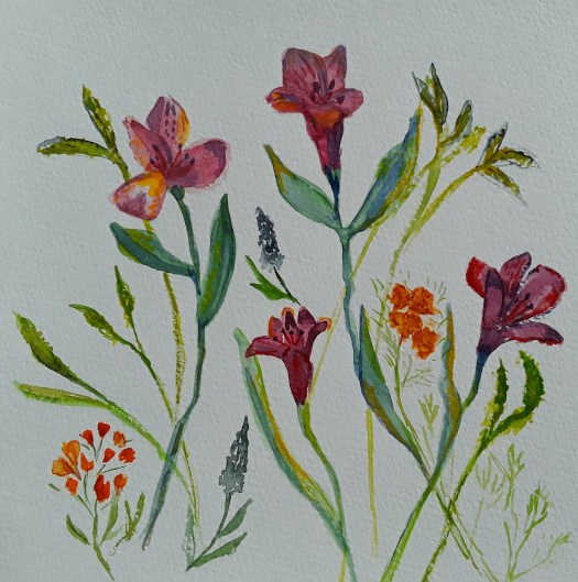
New Watercolour Techniques in Flowers

Bright Tulips

Good morning everyone. As you may know if you read my blog, I do like to follow online art courses. And I love to work in all sorts of media, and try out new watercolour techniques. So I thought I’d show you some more updates from the Watercolours Made Simple lessons.

Well, the idea is to paint flowers in a more general way than carefully including each detail of a particular flower. Actually, this is more difficult than it sounds. Because my visual memory is not too good, I had a photograph in front of me here. However I tried to view the general shapes of the blooms of the whole bunch and sort of invent newer versions of them. Obviously, such intense scrutiny of the flowers should feed into my memory. Which will help me next time I try this exercise in painting generic flowers. But why do I need to do this, you may wonder? Because then I can concentrate on placing the individual elements in a pleasing design. Afterwards it could be used for a greetings card, for example. Or just simply for a different kind of floral painting.

Alstromerias

Now, in this attempt above, I did in fact have the flowers in front of me, which made the exercise easier. Of course, I shall need a lot more practice, but it is quite enjoyable And a pleasant way of spending time on the new watercolour techniques I’m studying. Have a look at this post here for a realistic portrait of a bunch of flowers. Finally, I’ll leave you with an example of another way of painting flowers – semi abstracting from reality.

Pansies

Art Work Inspired by Japan

Full Moon, inspired by Hiroshige

Good morning everyone. This is a painting I did for this month’s theme in our Beginner Gouache group, Of course, the theme is Japan and I looked up works by Hiroshige and Hokusai, two masters of the woodblock printing technique. Actually, in this art work inspired by Japan, I did change some of the elements in the design when I painted this tribute to the artist. And I just loved working in this gorgeous limited palette of colours, a couple of blues, black and white. Perhaps you agree with me how effective these choices can be, creating a mood of calm and serenity.

The Great Wave

You may remember seeing this acrylic painting before, if you like to look at this blog. Anyway, I painted this in response to a theme for a Northern Fringe Gallery exhibition a couple of years ago. In fact, we chose from a long list of a hundred objects selected from the marvellous British Museum collection. And I chose that well-known print by Hokusai, The Great Wave. But I set it in a local beauty spot, so that the keen fisherman on the bank was blissfully unaware of the coming deluge!

Another Art Work Inspired by Japan

Mount Fuji

Finally, I couldn’t miss out this acrylic painting of the familiar iconic view of Mount Fuji. It shows the view from over the water. And this painting is at present on display at Rotherham Roar Buzz Gallery. (Incidentally, we take it down next Wednesday, the month is nearly up). So, I found at least three paintings inspired by Japan. And there are two more in existence, if only I could find them!

All my paintings are for sale at reasonable prices. To find out more, go to the Contact Me page and send me an email and we can have a chat.

Painting Spring Flowers in Watercolour

A Bunch of Daffs

Good morning everyone. Well, it really feels like spring is here, for this week at least! And I love to have spring flowers in the house. As soon as these daffodils opened up, I just had to paint them! So I practised some of the watercolour techniques I have learned from an online course. In fact, after years of trying, I finally managed to loosen up a little with watercolour. That means, more water in the mixture and just nudge it into place, instead of controlling it more tightly. Actually, I was really pleased with the end result. In fact, I succeeded better conveying the papery texture of the petals this time, I feel. Hopefully, you can see that in my photo.

Daffs at Brodsworth

Because it was so sunny and bright, we went to Brodsworth Hall for a few hours. Perhaps you remember some of the other sketches I have shown you in this blog, we do go to this garden often. As you might know, the gardens are spectacular, in all seasons. By the way, I must admit that I definitely took artistic license with this view. Because I completely missed off the main building , being far too interested in the trees and the daffodils, tiny points of golden light that studded the grass. Perhaps I will use this quick sketch in watercolour and pen in plein air as a study for a larger painting.

Finally, I couldn’t sign off without giving a mention to my acrylic painting of spring flowers. At the moment, Daffs at my Allotment is part of my exhibition Picturing the Landscape at Rotherham Roar , see this post here . Alas, very soon to come down, so there’s just a few days to see it! Well, nothing lasts for ever, not even spring!

Daffs at the Allotment

Virtual Travelling to Queensland, Australia

A Hot Day in Queensland, Australia

Good morning everyone. Today I thought I would feature some of the paintings at present on show in the Buzz Gallery at Rotherham Roar. And I think this must be my favourite, the tin roofed little house in the Outback. Actually, I did feel the heat as I was painting it, in my imagination at least. This was just one of my adventures in virtual travelling in Australia.

The Morning Sun on the Crags

Another one of the paintings I enjoyed painting was this beautiful view over the rocky, exposed crags . To be honest, I learned a useful tip from our tutor Rod Moore here. In order to achieve that effect, I painted the red rock colours with horizontal strokes and then dragged a dry brush downwards, carefully over the paint.

The Australia Section

Incidentally, I painted the Mary River picture on Rod’s course too. But this time in gouache, not acrylic. However, it didn’t make the final cut into the show. So, here it is for you to see.

The Mary River, Queensland, Australia

Well, I hope you enjoyed my virtual travelling along with me. It certainly lifted my spirits during the past two years, as you can see in this post here.

All my work is for sale at reasonable prices. For example, the Mary River painting is £40 plus shipping, unframed. Just go to the Contact Me page and send me an email for more details.

Old and New Style Abstracts

The Path of Life

Good morning everyone. Today I’d like to show you the way my abstract painting is changing. The image above is one of my new abstracts, experiments I am creating as I follow a great online course. It’s called Painting with Yvette. And, I’m really enjoying it. Because the colours and compositions are quite different from my own intuitive abstracts.

The Abstract Section of my Exhibition

The picture above is one of the sections in my current solo exhibition at Rotherham Roar. Actually, I am pleased with the way they came together. And each one has a particular meaning to me which evolved as I painted it. In contrast to that way of creating, my new abstracts are of course suggested by the tutor. Nonetheless, the brush marks are full of significance to me the artist. Perhaps in a more subtle way than in my earlier paintings. For example, the painting at the top of this post, The Path of Life, developed out of the suggestions by Yvette on colours to choose and techniques to use. I’m very often out of my comfort zone but I do feel that I am moving on.

The Path of Life

Another of my New Abstracts

Dominant

Anyway, I’m learning new approaches and techniques on this course so that I can apply them in my own work. So, it’s all part of a learning curve and I love it!

Pink and Blue 2

What do you think, is this old or new? Find out more in this post here.

Experiments at Beginner Printing Workshop

Which Way Up?

Good morning everyone. This is just a quick catchup post, I’m quite busy with two exhibitions at the moment, so, more of that later! Anyway, we did an in house beginner printing workshop at Art Society last week. And we carved out designs on cheap polystyrene tiles. Honestly we really did have a great time. Firstly I concentrated on a simple star shaped design.

Stars 1
Stars 2

Then I went a bit more fancy, added two colours, reversed the block for the second print and used cardboard to print on ( breakfast cereal packet, actually!

Which Way Up?

Finally, I went mad and printed white, black and orange on black paper. And I tore up the two blocks into pieces and over printed with them till the paper was saturated with ink! Perhaps you can see how the protective sheet of paper I placed on top ripped out chunks of the print. All because it wasn’t dry as I took it home. In fact, it didn’t dry for a week!

Black on Black

Anyway, it was great fun and we went home full of ideas to try out on our next printing workshop. You could have a look at more mixed media experiments in this post here.

New Solo Exhibition Now Open

The Poster

Good morning everyone. My new solo exhibition is now open, until the end of March at the Buzz Gallery, Rotherham Roar. What a pleasure it was to put it together and then to see it actually on the wall. Actually, I haven’t displayed works on paper unframed before. And I was surprised at the immediacy of the paintings without glass or frames. In my opinion they made much more of an impact. And I could see this in the strong emotional reactions of the visitors. Admittedly, we did it this way because the walls weren’t suitable for hanging. However, it was a bright, lively display which demanded attention. Exactly what I wanted!

The Three Sections of my New Solo Exhibition

As I was choosing acrylic paintings on paper , I realised that they fell roughly into three categories: British landscapes, Australian scenes and abstracts. So, that was how I displayed them. For example, in the general landscape section I placed this painting, a scene inspired by enjoyable holidays in the Lake District, UK.

Next, here I can show you the Australian group of paintings. And these are some of the results of an online course tutored by Rod Moore from Queensland. When two of my artbuddies said how much it reminded them of trips to Australia, I was delighted!

The Red Path

Finally, my favourite section – the abstracted and semi abstracted landscape. In fact, I kept changing my mind what to include here. But, I had to make room for this one, which certainly commanded a lot of attention!

Jagged

Well, there certainly was a great deal of work in mounting my new solo exhibition, but I had a blast! And, to top it off, the minute the show was live, a very delighted customer took my ‘Bluebell Wood ‘ painting to a new home! If you want to have a look at the last solo exhibition I did before the pandemic, see this post here.

Bluebell Wood

Quick Sketch in Oil Pastel

Movement

Good morning everyone. Today this is a short post because I’m insanely busy this week! Incidentally, have you ever noticed how everything happens at once?. Not only is my show opening this week, but I’m helping to put up our group exhibition at the weekend. And, I did squeeze in an oil pastel workshop at the weekend, which was brilliant. What a difference good quality materials make. In fact, it was quite a revelation to use artists quality pastels and paper on Saturday. Not to mention learning from our excellent tutor how to blend colours and create textures. So, I promptly ordered some pastel and oil pencils online and can’t wait until they arrive. Actually, the work we produced at the class will be on display for a short while, so more of that later. And there’s a cute little bird in oil pastel here , from a while ago.

Anyway, this is an enthusiastic little oil pastel sketch I did when I got home, to practise some of the techniques. Finally, here’s a taster of the work in my new exhibition, more of that in my next post.

Jagged

Another Muted Abstract in Gouache

Waves

Good morning everyone. Just a short post today, I’m very busy sorting out my new solo exhibition due to open next week. Actually, there always seems to be a lot more work to do than you plan for! Anyway I did manage to finish this muted abstract, the fourth in my series in the online course I’m following. To tell the truth, I did struggle with getting it right. But, at the same time I did seem to know a bit better where I was going!

Waves- a draft

Well, this is one of the earlier stages of the painting. Perhaps it’s not as easy for you to see these details on the screen, but I studied it long and hard. Then I toned down the little dots and dashes and brightened the white areas. Finally, I was satisfied and called it finished. Now I must learn how to use the wax medium I bought, in order to give it a protective coat. Because it’s painted in gouache and I learned the hard way that this is really necessary (don’t ask!). If you want to see the other paintings in the muted abstract series, look here and here.

Here’s a sneaky peek at my exhibition poster – more of this later!

Still Life in the Kitchen

Old Kitchen Scales

Good morning everyone. I really enjoyed painting this gouache portrait of old kitchen scales at art group last week. One of our members brought in loads of fascinating old objects to inspire us to do a still life. And I decided to paint quickly, like I do when I’m out urban sketching. First I did a very quick pencil sketch to set the general shape. Then I drew with the brush, something I love to do. Also, I tried to show the grime and wear and tear on this well used weight scale. Which wasn’t all that easy , actually! And it felt good to paint from life – photos obviously have their place in my art practice. But, I feel that observing and recording an object sharpens up my drawing skills.

Old Saucepan

If I remember correctly, I painted this in the Victorian kitchen of our local stately home . Back in the day when sketching groups were encouraged to linger and draw ( about two years ago!) Anyway, I used pen and watercolour and chose this little group of utensils on the old shelf near the big, black range. By the way, one of the best days to visit is when they fire up the range and demonstrate baking for the big house.

Still life in my Kitchen

Finally, here’s a painting of a fish, caught at sea by a friend of a friend and being prepared for cooking. Acrylic on box canvas, I put it on my kitchen wall! And here’s another food still life you might like to see, this time fruit.

Fish

In fact, making this post reminded me that it’s high time I updated my Still Life and Flowers section in my gallery. Oh well, that will have to be something for another day- I’m far too busy painting today!

More Abstract Experiments in Gouache

Moving On

Good morning everyone. As I promised, here is the next one of my abstract experiments in gouache. And, you wouldn’t believe how many different versions I painted until I arrived at this final one!

To begin at the beginning, our tutor asked us to sketch potential compositions using shapes. I chose rectangles and a spiral and I painted in some of the soft colours suggested. And this is how it went.

Moving On – version 1

Well, this was ok but it didn’t look all that different from my usual type of abstract. Also, I thought it looked too busy. And so I decided to make more of the painting a restful creamy white.

Moving On – version 2

Now, I thought this looked better, but it still wasn’t right. So I added some gold – this is the part I love!

Moving On – version 3

Actually, I was quite pleased with this result of my abstract experiments. However, meanwhile, I had read the next lesson in the course. And I had begun to think about areas of colour forming the composition, as well as shapes. Honestly, I put down so many layers of gouache paint that I thought it might crack. Nonetheless, I struggled on and gradually eliminated the spiral, bit by bit. Until I arrived at the final version.

The Final Version of my Abstract Experiments

Moving On – the end result

Now I’m happy! Perhaps you’ve noticed that I also rotated it to find the best view. Immediately after that, I started painting two more! Of course I will show you these later. But I must point out that the moral of this story is: don’t change direction midway into a painting! Because it costs an awful lot of paint and also, it makes your brain hurt! Ah, let’s go back to the carefree days of quick, intuitive abstract painting like this here ! Only joking, I love it really.

Two More Nice Bright Abstracts

Sunshine and Rain

Good morning everyone. I did this one of my nice bright abstracts before Christmas and I’m quite pleased with the way if turned out. Again, I had no plan beforehand, except perhaps to incorporate lots of lovely, juicy colour! And, on this one I particularly enjoyed splashing the flashes of white across the gold and bronze.

Sunshine and Rain – a closeup

In fact, I noticed that I have been featuring a lot of round, globe shaped objects in my abstracts lately. Of course, if you paint them yellow your mind interprets them as the sun. And dark clouds creeping up in the background can then suggest imminent rain. So, that’s how I found the title! Anyway, I suppose this led me to thinking that it was time for a bit more development of my abstract work. However, more of that in later posts. Meanwhile, here is another of my nice, bright abstracts, completely intuitive and in a watercolour sketch book.

Afternoon in the Garden

Now, this was a lovely art therapy exercise – a quick watercolour sketch in a few spare moments. And then, some flourishes with oil pastel, ink and white gel pen. I wonder if you can see anything in it? I wonder if you see the same as me? There’s another intuitive abstract in this post here for you to puzzle out!

If you like my abstracts, I just updated my abstracts page in the gallery here. And, don’t forget, I shall be showing you some new style compositions soon.

Best Trees I Ever Painted

Tree Study 1

Good morning everyone. Actually, I’m really quite pleased with these watercolour studies – they’re my best trees ever! As it happens, I do paint trees often, either in landscapes or in urban sketching. And, I don’t think I paint them all that well. So, I decided to invest in a short online course by Watercolours Made Simple . To be honest, I’ve only looked at a lesson or two but I have been pleased with what I’ve learned so far. Otherwise, I might have continued to make it up as go along, a particular drawback of watercolour for me, I find. In fact, I think it’s really necessary to study techniques to improve. More so than in acrylic, for example. But, that’s just my opinion and I can’t claim to be particularly gifted at watercolour painting.

Learning how to paint your best trees

Anyway, this learning was good fun too, so it wasn’t a chore. Simply explained, the tutor taught us to start with the foliage first. (Who knew?). So I painted three or four irregular ovals with a watery mid green mix, leaving little patches of paper white. Then use a mix of a darker shade of the colour and a lighter one too. And, describe the shapes of the clumps of foliage, not individual leaves, with lighter colour in the sun . And, darker colour in the shade. It does help to look at a tree or a photo when doing this. After that, put in the trunks and branches, using a watery mix of lightish brown and add patches of darker shade.

Tree Study 2

Here I practised mixing lots of tree greens using yellows, blues, brown and red – see top row. Then we stayed with the greens to paint conifers and another deciduous tree. I really liked doing a row of trees on the horizon, something I always botched before. Finally, I attempted to show how some trees recede into the background when you paint a forest, mainly using the paler shade of the original green. Now, I do hope I can remember that when I’m sketching en plein air!

Big Tree in my Garden

Or in my back garden for that matter, as I did here last summer. And , even though this one was in acrylic, some of these principles would help with other kinds of paint. If you want to see some of my winter trees, see here.

Mixed Media Art Therapy Sketch

Bright Life

Good morning everyone. This is just a catch up of the quick art therapy watercolour sketches that I do in my sketchbooks. Actually, this particular one took a little bit longer, as I wanted to add more after the initial twenty minutes or so. Well, I made some shapes and colours with my travel watercolour set, which I keep very handy in my living room. And, I usually do this when I have gone a whole day without arty activities! In fact, it never fails to lighten my mood, however I’m feeling. So, I consider it a very useful way to look after my mental wellbeing. Also, it is almost entirely stress free because I make no demands on myself as regards the quality of the work. And, it’s purely experimenting and, of course, you need not show it to anyone, unless you choose to. Perhaps you could try this easy art therapy sometime! And let me know how you get on.

Anyway, after the first pass, I put the little sketchbook on the table till next day. And looked at it a lot. Then I strengthened the yellow,green and brownish red with oil pastel. Next I doodled a bit with marker pen and white gel pen to bring it together. And, it definitely cheered me up!

Bright Life – a closeup

More Art Therapy

Finally, this is another another quick piece done to calm my nerves and I did this in one pass and left it as it was. If you want to see more, have a look at this post here.

Green Veg and Purple Flowers?

New Painting in Colour Exhibition

I Dreamt of a House by the Sea

Good morning everyone. Last week I found out that Fronteer Gallery had accepted my painting ‘ I Dreamt of a House by the Sea’ into their Colour Exhibition. And I was so delighted – firstly because it’s always a pleasure to take part in their events. Secondly, because of the theme ‘Colour’. As you might have noticed, I call this website A World of Colour. So, most of my work does suit this theme. However, I chose this particular painting because it seems absolutely bursting with colour.

I Dreamt of a House by the Sea – a closeup

Virtual Travelling for the Colour Exhibition

Actually, I painted this without a plan and it was quite late on in the process before I saw what it was. Perhaps a path leading up to the house with a view of the sea. Then, later on I suggested landscape and some vegetation on the cliff. But, for me, the most striking thing about this is when I made it. Right in the middle of being isolated at home, when I was desperate to spend time by the sea! In fact, the colours, the sunshine and the sparkling air are much more reminiscent of the coast of northern France in August. Ah, those charming, unspoilt little resorts where we spent weeks camping. Happy Days! So it seemed ideal for the colour exhibition.

There are lots of seascapes for you to dream about in my gallery here. And a post all about another of my paintings in the fabulous Fronteer Gallery here.

All my paintings are for sale at reasonable prices. Just go to my Contact Me page and send me an email.

A Beach Day

This is somewhere on the coast of Queensland, Australia. And you can find out more in my post here. Well, virtual travelling is the only way for me to go, at the moment!

Revisiting Old Sketches for Inspiration

Burbage Valley

Good morning everyone. This is a gouache painting I did before Christmas and I had a look at some old sketches for inspiration. Actually, I remember this day very well – we had gone for a short walk in Derbyshire. And we were in the beautiful Burbage valley on a hot August afternoon, when my son was small. The heat was shimmering up from the moorland grass and there were no trees to sit under. In fact, this beauty spot was quite busy with people who had come out for some fresh air. But, everyone seemed a bit subdued in the heat. As we neared the car park, my husband and son went and queued for ice creams. Meanwhile, I sat on a rock and sketched the view in my tiny sketch book.

Burbage Rocks

As I worked quickly, I thought about the ancient peoples who once lived here. Incidentally, behind me there was an Iron Age hillfort a field away. So it’s not difficult to imagine figures walking the paths all those years ago. By the way, that brings to mind a painting of mine showing a prehistoric man walking home at dusk. I must find it to show you. Anyway, if you look at this post here, you will see another sketch of the area that I did recently. Or, have a look at my page Gallery – Landscapes for more country scenes. (I’ve just updated the page). As you might have realised, I have many old sketches done over the years. Happily, I find them quite inspiring to repaint. Not to mention the lovely memories they bring back.

Black on Black, Colour Experiment

Black on Black

Good morning everyone. This acrylic painting is painted on a smallish black box canvas that I have had for ages. Frankly, I had no idea what to paint on it, but they were all the rage at the time. Anyway, I decided to have a go, just after trimming this year’s Christmas tree.

And so, as you can see, the colours red, gold and white were on my mind! Well, I put down some shapes intuitively, with the idea that the canvas would stand as the background. My daughter-in-law thought it looked quite festive! However, I hated the effect of unpainted canvas. So, I carried on my usual method of shaping the composition by layering paint. Of course, this included painting over the untouched background. Hence the title.

A close up

Incidentally, I also discovered, or perhaps consciously realised that I prefer colour to be nuanced and subtle. Rather than flat with only one tone, like the black canvas. Sorry about the glare, it’s quite difficult to photograph these colours.

I hope you enjoyed looking at my intuitive abstract – there are loads more on my Abstracts page.

The In Situ Photo

By the way, this is the room I designed the painting for!

Green and Gold Gouache Landscapes

On the Lakeshore

Good morning everyone. Now that everything is getting back to ‘normal ‘ after the festive season, I am catching back up. So, here is a little green and gold scene I painted in gouache, back in November. As I recall, the reference photo was a touristy one I saw somewhere. But I altered it quite a bit and added a figure. That’s me, standing on the rock in the cool morning air with my cagoul hood up. And, I’ve probably got my field sketching kit in my rucksack. Perhaps you’ve noticed that I’m looking at the leafless tree on the left. Unfortunately, a much more common sight now when we’re out walking. Anyway, I still managed to fit in plenty of green and gold to cheer me up. Also, it was good practice to paint in gouache and I am gradually getting more used to manipulating the paint.

In a Park, Somewhere in Wales

Actually, the title says it all! For this scene, I used an old watercolour sketch I did when we were in Wales. However, I can’t remember the location other than it was a lovely ornamental park in North Wales. And, we had the place practically to ourselves. Because the season had been quite wet, all the late spring flowering shrubs were really blooming.In addition, the foliage was glistening after a brief shower. On the technical side, the paint was gouache and I built the painting from my watercolour sketch and , surprisingly, a bit of memory. In fact, it’s really addictive and I have a huge archive of sketches to mine!

The Flowering Shrub in my Green and Gold Gouache Landscape

Incidentally, there’s another uplifting green and gold painting in this post here , this time a woodland scene.

As ever, all my work is for sale at reasonable prices. Just go to the Contact Me page and send me an email for further details.

Some New Small Sketchbook Abstracts

Good morning everyone. Well, I don’t know about you, but I didn’t seem to have much time to start on big projects lately. So, I thought I would show you some of the small sketchbook abstracts I managed to squeeze into my busy days. Actually, I find it quite a comfort to grab the nearest small sketchbook, relax in my armchair and paint!

Just Breathe

However, this first one started life as a rapid ink sketch, intuitive really. Then watercolour, but this time I made an effort to keep the colours very clean. That is to say, adding glazes on top of the three basic colours to add tone, instead of creating mixes on the palette. Also, having seen something online about adding depth to abstract shapes, I tried to think of them as 3d objects. Incidentally, this is very pleasurable to try. In fact, I’ve just realised these small sketchbook abstracts are arty experiments, as well as being good for stress management.

Watercolour pencil experiment

As you can see, this small sketch book abstract has been built using watercolour pencils. Actually, I haven’t played around with these for ages and I was considering taking them on an outdoor sketch trip. So I wanted to remind myself how easy it is achieve quick, bright colour. Obviously, it is very easy and so I took a couple of pencils with me when we went to the Danum museum, before Christmas. And I really enjoyed using them.

Objects in Doncaster Museum

Above all, I really love painting intuitive abstracts, whether they are small or larger, like this one in this post here.

See Father Christmas in Green

Good morning everyone. I’m back after three days of technical difficulties – don’t ask! And I reckon there’s just enough time to show you my gouache painting of Father Christmas, before it all comes to an abrupt end. Well, this is the way Santa was portrayed traditionally, before he was changed into red. And I’ve tried to show him as a quiet, kindly old man, on his way through the woods. Obviously delivering a sack full of gifts to some hopeful children. Happy Holidays to you all. See this post here for last year’s festive images.