Paintings Inspired by Online Tuition

Dominant

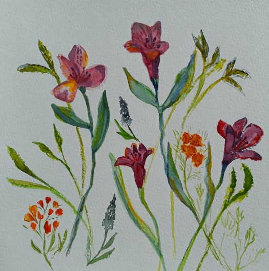
Good morning everyone. When I have ten minutes or so spare, I will always do a quick sketch.( In between finishing off online tuition projects!). On this occasion I quickly sketched a doodle in watercolour, limiting myself to three colours. When it was dry, I doodled some more, adding some black calligraphic marks on top. Later on, I strengthened these marks with one of my new soft oil pastels. Of course, you may have realised that this was influenced by the Painting with Yvette course that I am following. Otherwise I never would have tried putting this kind of a motif on top of a background.

Butterfly Wings

Now this idea is something else that I picked up from online tuition. But unfortunately I can’t remember the details, I look at so much lovely stuff online. Anyway, I did in fact take the idea and do my own version. And the method is to take images of motifs you have chosen to use as inspiration for an abstract composition. Then incorporate them into a design, without doing a realistic painting of them. For example, for this piece I sourced good photos of butterflies and flowers. Then I isolated the shapes and colours that pleased me and tried to make a harmonious pattern. Actually, it does fry your brain a bit in the process! But, I’m still keen to do more. See more intuitive abstracts in this post here

Butterfly Wings – a detail

New Watercolour Techniques in Flowers

Bright Tulips

Good morning everyone. As you may know if you read my blog, I do like to follow online art courses. And I love to work in all sorts of media, and try out new watercolour techniques. So I thought I’d show you some more updates from the Watercolours Made Simple lessons.

Well, the idea is to paint flowers in a more general way than carefully including each detail of a particular flower. Actually, this is more difficult than it sounds. Because my visual memory is not too good, I had a photograph in front of me here. However I tried to view the general shapes of the blooms of the whole bunch and sort of invent newer versions of them. Obviously, such intense scrutiny of the flowers should feed into my memory. Which will help me next time I try this exercise in painting generic flowers. But why do I need to do this, you may wonder? Because then I can concentrate on placing the individual elements in a pleasing design. Afterwards it could be used for a greetings card, for example. Or just simply for a different kind of floral painting.

Alstromerias

Now, in this attempt above, I did in fact have the flowers in front of me, which made the exercise easier. Of course, I shall need a lot more practice, but it is quite enjoyable And a pleasant way of spending time on the new watercolour techniques I’m studying. Have a look at this post here for a realistic portrait of a bunch of flowers. Finally, I’ll leave you with an example of another way of painting flowers – semi abstracting from reality.

Pansies

Painting Spring Flowers in Watercolour

A Bunch of Daffs

Good morning everyone. Well, it really feels like spring is here, for this week at least! And I love to have spring flowers in the house. As soon as these daffodils opened up, I just had to paint them! So I practised some of the watercolour techniques I have learned from an online course. In fact, after years of trying, I finally managed to loosen up a little with watercolour. That means, more water in the mixture and just nudge it into place, instead of controlling it more tightly. Actually, I was really pleased with the end result. In fact, I succeeded better conveying the papery texture of the petals this time, I feel. Hopefully, you can see that in my photo.

Daffs at Brodsworth

Because it was so sunny and bright, we went to Brodsworth Hall for a few hours. Perhaps you remember some of the other sketches I have shown you in this blog, we do go to this garden often. As you might know, the gardens are spectacular, in all seasons. By the way, I must admit that I definitely took artistic license with this view. Because I completely missed off the main building , being far too interested in the trees and the daffodils, tiny points of golden light that studded the grass. Perhaps I will use this quick sketch in watercolour and pen in plein air as a study for a larger painting.

Finally, I couldn’t sign off without giving a mention to my acrylic painting of spring flowers. At the moment, Daffs at my Allotment is part of my exhibition Picturing the Landscape at Rotherham Roar , see this post here . Alas, very soon to come down, so there’s just a few days to see it! Well, nothing lasts for ever, not even spring!

Daffs at the Allotment

Experiments at Beginner Printing Workshop

Which Way Up?

Good morning everyone. This is just a quick catchup post, I’m quite busy with two exhibitions at the moment, so, more of that later! Anyway, we did an in house beginner printing workshop at Art Society last week. And we carved out designs on cheap polystyrene tiles. Honestly we really did have a great time. Firstly I concentrated on a simple star shaped design.

Stars 1
Stars 2

Then I went a bit more fancy, added two colours, reversed the block for the second print and used cardboard to print on ( breakfast cereal packet, actually!

Which Way Up?

Finally, I went mad and printed white, black and orange on black paper. And I tore up the two blocks into pieces and over printed with them till the paper was saturated with ink! Perhaps you can see how the protective sheet of paper I placed on top ripped out chunks of the print. All because it wasn’t dry as I took it home. In fact, it didn’t dry for a week!

Black on Black

Anyway, it was great fun and we went home full of ideas to try out on our next printing workshop. You could have a look at more mixed media experiments in this post here.

Still Life in the Kitchen

Old Kitchen Scales

Good morning everyone. I really enjoyed painting this gouache portrait of old kitchen scales at art group last week. One of our members brought in loads of fascinating old objects to inspire us to do a still life. And I decided to paint quickly, like I do when I’m out urban sketching. First I did a very quick pencil sketch to set the general shape. Then I drew with the brush, something I love to do. Also, I tried to show the grime and wear and tear on this well used weight scale. Which wasn’t all that easy , actually! And it felt good to paint from life – photos obviously have their place in my art practice. But, I feel that observing and recording an object sharpens up my drawing skills.

Old Saucepan

If I remember correctly, I painted this in the Victorian kitchen of our local stately home . Back in the day when sketching groups were encouraged to linger and draw ( about two years ago!) Anyway, I used pen and watercolour and chose this little group of utensils on the old shelf near the big, black range. By the way, one of the best days to visit is when they fire up the range and demonstrate baking for the big house.

Still life in my Kitchen

Finally, here’s a painting of a fish, caught at sea by a friend of a friend and being prepared for cooking. Acrylic on box canvas, I put it on my kitchen wall! And here’s another food still life you might like to see, this time fruit.

Fish

In fact, making this post reminded me that it’s high time I updated my Still Life and Flowers section in my gallery. Oh well, that will have to be something for another day- I’m far too busy painting today!

Painting Houses for our Street

John Knox House

Good morning everyone. On Tuesday evening at our art society meeting we started a new project – painting houses for ‘our’ street. In fact, we are each taking a sheet of paper and painting or drawing a house or building. Then we will make a folding, concertina book of our street. Actually, we do a group project like this once or twice a year. And, it feels very good to be involved in something together. Especially a book which we can enjoy looking at and showing off afterwards.

Anyway, I chose this scene as my contribution – I’m guessing it’s in Edinburgh, Scotland (image from Unsplash). If you’ve got very good eyesight, the placard reads John Knox House. And now the original dwelling serves as a museum, no doubt telling the story of this religious leader in the 1500’s.

John Knox House – a closeup

As you can see in this image, I applied the paint lightly and delicately in a watercolour technique, but it was actually gouache paint. Usually with gouache I layer it on thickly and use lots of white paint to achieve that gorgeous chalky look. Instead, I painted wet on wet and encouraged the paint to be more transparent. And here are some houses in gouache, using the thicker technique.

Painting Houses in Gouache

Harbour in Norway

As I was looking at all the photos of my paintings, I realised I had actually painted loads of houses and other buildings. So, that gave me the idea to make a section for them in my gallery here – I let you know when it’s ready. Meanwhile, there are more houses here and here.

Two More Nice Bright Abstracts

Sunshine and Rain

Good morning everyone. I did this one of my nice bright abstracts before Christmas and I’m quite pleased with the way if turned out. Again, I had no plan beforehand, except perhaps to incorporate lots of lovely, juicy colour! And, on this one I particularly enjoyed splashing the flashes of white across the gold and bronze.

Sunshine and Rain – a closeup

In fact, I noticed that I have been featuring a lot of round, globe shaped objects in my abstracts lately. Of course, if you paint them yellow your mind interprets them as the sun. And dark clouds creeping up in the background can then suggest imminent rain. So, that’s how I found the title! Anyway, I suppose this led me to thinking that it was time for a bit more development of my abstract work. However, more of that in later posts. Meanwhile, here is another of my nice, bright abstracts, completely intuitive and in a watercolour sketch book.

Afternoon in the Garden

Now, this was a lovely art therapy exercise – a quick watercolour sketch in a few spare moments. And then, some flourishes with oil pastel, ink and white gel pen. I wonder if you can see anything in it? I wonder if you see the same as me? There’s another intuitive abstract in this post here for you to puzzle out!

If you like my abstracts, I just updated my abstracts page in the gallery here. And, don’t forget, I shall be showing you some new style compositions soon.

Best Trees I Ever Painted

Tree Study 1

Good morning everyone. Actually, I’m really quite pleased with these watercolour studies – they’re my best trees ever! As it happens, I do paint trees often, either in landscapes or in urban sketching. And, I don’t think I paint them all that well. So, I decided to invest in a short online course by Watercolours Made Simple . To be honest, I’ve only looked at a lesson or two but I have been pleased with what I’ve learned so far. Otherwise, I might have continued to make it up as go along, a particular drawback of watercolour for me, I find. In fact, I think it’s really necessary to study techniques to improve. More so than in acrylic, for example. But, that’s just my opinion and I can’t claim to be particularly gifted at watercolour painting.

Learning how to paint your best trees

Anyway, this learning was good fun too, so it wasn’t a chore. Simply explained, the tutor taught us to start with the foliage first. (Who knew?). So I painted three or four irregular ovals with a watery mid green mix, leaving little patches of paper white. Then use a mix of a darker shade of the colour and a lighter one too. And, describe the shapes of the clumps of foliage, not individual leaves, with lighter colour in the sun . And, darker colour in the shade. It does help to look at a tree or a photo when doing this. After that, put in the trunks and branches, using a watery mix of lightish brown and add patches of darker shade.

Tree Study 2

Here I practised mixing lots of tree greens using yellows, blues, brown and red – see top row. Then we stayed with the greens to paint conifers and another deciduous tree. I really liked doing a row of trees on the horizon, something I always botched before. Finally, I attempted to show how some trees recede into the background when you paint a forest, mainly using the paler shade of the original green. Now, I do hope I can remember that when I’m sketching en plein air!

Big Tree in my Garden

Or in my back garden for that matter, as I did here last summer. And , even though this one was in acrylic, some of these principles would help with other kinds of paint. If you want to see some of my winter trees, see here.

Mixed Media Art Therapy Sketch

Bright Life

Good morning everyone. This is just a catch up of the quick art therapy watercolour sketches that I do in my sketchbooks. Actually, this particular one took a little bit longer, as I wanted to add more after the initial twenty minutes or so. Well, I made some shapes and colours with my travel watercolour set, which I keep very handy in my living room. And, I usually do this when I have gone a whole day without arty activities! In fact, it never fails to lighten my mood, however I’m feeling. So, I consider it a very useful way to look after my mental wellbeing. Also, it is almost entirely stress free because I make no demands on myself as regards the quality of the work. And, it’s purely experimenting and, of course, you need not show it to anyone, unless you choose to. Perhaps you could try this easy art therapy sometime! And let me know how you get on.

Anyway, after the first pass, I put the little sketchbook on the table till next day. And looked at it a lot. Then I strengthened the yellow,green and brownish red with oil pastel. Next I doodled a bit with marker pen and white gel pen to bring it together. And, it definitely cheered me up!

Bright Life – a closeup

More Art Therapy

Finally, this is another another quick piece done to calm my nerves and I did this in one pass and left it as it was. If you want to see more, have a look at this post here.

Green Veg and Purple Flowers?

Going Back to Cafe Sketching

Waiting

Good morning everyone. At last, I managed to do a bit of cafe sketching, especially when in a well ventilated space, reasonably distanced from other customers. Actually, it’s probably also the first time I felt relaxed enough to do it. Anyway, we went to the Carding Shed cafe last week and I hid my sketchbook behind my bag and discreetly sketched a couple on the next table to us.

Pencil sketch

Unfortunately, I had left my tiny water bottle behind, so I couldn’t do a watercolour sketch and I had to make do with pencil only. Not my usual style. But, I completed this before they got up and went, so that was lucky.

The Couple at the Next Table

Honestly, this is something I rarely do, add colour afterwards at home. Because I much prefer sketching with the brush and splashing colour around on the scene as I drink my coffee! And, I feel that the resulting painting is more lively, even if it’s a a bit less accurate. However, I really enjoyed myself and I now look forward to doing more cafe sketching.

There are lots of paintings and drawings in my Gallery on the People section here.

Finally, I realised I had done lots of imaginary people sketches over the past year or so. No doubt missing company and lifedrawing classes, so I leave you with this latest one.

Waiting

Revisiting Old Sketches for Inspiration

Burbage Valley

Good morning everyone. This is a gouache painting I did before Christmas and I had a look at some old sketches for inspiration. Actually, I remember this day very well – we had gone for a short walk in Derbyshire. And we were in the beautiful Burbage valley on a hot August afternoon, when my son was small. The heat was shimmering up from the moorland grass and there were no trees to sit under. In fact, this beauty spot was quite busy with people who had come out for some fresh air. But, everyone seemed a bit subdued in the heat. As we neared the car park, my husband and son went and queued for ice creams. Meanwhile, I sat on a rock and sketched the view in my tiny sketch book.

Burbage Rocks

As I worked quickly, I thought about the ancient peoples who once lived here. Incidentally, behind me there was an Iron Age hillfort a field away. So it’s not difficult to imagine figures walking the paths all those years ago. By the way, that brings to mind a painting of mine showing a prehistoric man walking home at dusk. I must find it to show you. Anyway, if you look at this post here, you will see another sketch of the area that I did recently. Or, have a look at my page Gallery – Landscapes for more country scenes. (I’ve just updated the page). As you might have realised, I have many old sketches done over the years. Happily, I find them quite inspiring to repaint. Not to mention the lovely memories they bring back.

Some New Small Sketchbook Abstracts

Good morning everyone. Well, I don’t know about you, but I didn’t seem to have much time to start on big projects lately. So, I thought I would show you some of the small sketchbook abstracts I managed to squeeze into my busy days. Actually, I find it quite a comfort to grab the nearest small sketchbook, relax in my armchair and paint!

Just Breathe

However, this first one started life as a rapid ink sketch, intuitive really. Then watercolour, but this time I made an effort to keep the colours very clean. That is to say, adding glazes on top of the three basic colours to add tone, instead of creating mixes on the palette. Also, having seen something online about adding depth to abstract shapes, I tried to think of them as 3d objects. Incidentally, this is very pleasurable to try. In fact, I’ve just realised these small sketchbook abstracts are arty experiments, as well as being good for stress management.

Watercolour pencil experiment

As you can see, this small sketch book abstract has been built using watercolour pencils. Actually, I haven’t played around with these for ages and I was considering taking them on an outdoor sketch trip. So I wanted to remind myself how easy it is achieve quick, bright colour. Obviously, it is very easy and so I took a couple of pencils with me when we went to the Danum museum, before Christmas. And I really enjoyed using them.

Objects in Doncaster Museum

Above all, I really love painting intuitive abstracts, whether they are small or larger, like this one in this post here.

New Exhibition at the Market

Neurons

Good morning everyone. As promised, here is a review of our new exhibition at the market in Rotherham. By ‘our’ I mean ROAR – Rotherham Open Arts Renaissance, an artist’s group that I am a member of. And, we have displayed our art on a glass wall in the covered market building in the town centre.

Our New Exhibition at the Market

As you can see, this space was a bit of a challenge to use, but I think we have done well. The windows were actually different dimensions and all landscape orientation. So I could not show two nice life drawings, because they were portrait. And, obviously, framed paintings were not possible. However I think the display is excellent, including prints and some originals. Here are the other three of my paintings on show.

Clematis at Dusk
Daffs at the Allotment
In the Wood

Actually, our work is quite varied, comprising acrylic paintings, contemporary watercolour portraits, prints and mixed media collage.

Matt’s Portraits
Ken’s pencil drawing
Kevan’s print
Mixed media collage
Acrylic painting

Because of the pandemic, we have not been able to meet up so much. So it felt really good to be involved in a project together. And, also to show off our new exhibition at the market. Have a look at this post here when we went out sketching at the Steel Henge.

Summery Days – Painting the Sheep

Good morning everyone. I’ve been doing a bit of finishing off again and this little watercolour, Summery Days was started about a month ago. Actually, I was following a free tutorial one evening. And, putting the first layer down was straightforward, But, after that I found it difficult to make progress. So I left it to one side for a bit, busy with other projects. After a while, I couldn’t ignore it any more. So I tried to move it along by myself. Honestly, I wasn’t very confident. I often feel like that when painting a subject that wasn’t really of my own choosing. However, I persevered and I’m reasonably pleased with the end result.

Summery Days – Painting the Sheep

On the plus side, I learned how to make the sheep look more realistic . Initially I did this by putting a medium tone on the body, reserving the white of the paper for the light patches. Then I added the dark tones after. And, most importantly, I did all this as soon as possible so that the animals look part of the scene from the beginning.

Well, that’s all for now. And, I’ve now got a lovely summery picture to look at while we wait for the snow to melt here in the UK! (And here is another post with summery pictures in it.)

Work for our New Exhibition

Ready to Go On

Good morning everyone. Well, I have been quite busy again doing “art” business. In fact, I’ve realised that I’ve made myself just a bit too busy. But, in my own defence, it’s probably a natural reaction to the situation. First, no art activity for a long time. Then, say yes to every opportunity that comes along! Anyway, what could be nicer than taking part in Rotherham Roar artists’ group exhibition? Because it’s the first one we’ve had for quite a while. And so, I took these two pencil and watercolour sketches I did at life drawing class ages ago , for our new exhibition.

Ready to Go On
Thinking

In fact, the space we are exhibiting in at Rotherham Market Hall is like a wall of glass. So, works on paper and unframed are the way to go. Therefore I choose these two prints.

Working in my Allotment
Clematis at Dusk

As I recall, the flower painting was part of a project at my art society to capture the colours of flowers as the light faded. See here for more of my flower paintings.

And, finally, these last two made the final choice for our new exhibition. Up first is my version of a microscope photo of a neuron (one of those things in your brain that makes everything possible).

Neurons

And, finally, one of my favourites, a mixed media piece I call a semi abstracted memory of a walk in the woods.

A Walk in the Woods

To be honest, I’ve probably got enough work to fill the whole wall, not that I’m an excessive painter or anything! But, for now, six is enough!

Sketching Faces – my New Challenge

Good morning everyone. After I’d finished the Inktober challenge this year, I realised how much I had benefited from the daily drawing exercise. So I was pleased to find a new Instagram challenge – sketching faces on #facetasticfriday. Actually, this is hosted by a great group I joined a while ago – Kick in the Creatives. And I think the reference photos are very good and sometimes different (like the one above!) As you can see, I couldn’t resist adding watercolour to the image, to bring it to life a bit. But, I drew most of my sketches just in biro, with no pencil sketch beforehand, just to add that bit of excitement when sketching faces!

Well, I’m only writing a short post today, because I’m just getting busier and busier! So, I’m off to the printers, getting some stuff ready for an exhibition, more of that later.

However, if you want to have a look at some of my adventures in portraiture, see this post here.

Castles, Palaces and Stately Homes

Once upon a Time

Good morning everyone. At this week’s meeting for our art society, we are having a Studio evening. By that we mean an opportunity to sit and paint together and have a bit of a chat. And the theme for the night is ‘Castles, Palaces and Stately Homes’, in any painting media and style. Of course, this is only a suggestion for inspiration and members often bring their own work to continue instead. But we find that it’s sometimes helpful to concentrate the mind that way.

Conisbrough Castle

The Keep

This is a quick watercolour sketch I painted in September and my intention was to show the huge, overwhelming feeling of standing at the base of the castle keep.

The Fairy Tale Castle

After a painting by John Piper

Actually, I really enjoyed painting this acrylic a while back, taking inspiration from one of my favourite artists – John Piper. But I gave it my own spin and emphasised the out of this world magical quality of it (I hope!)

Castles, Palaces and Stately Homes

Calke Abbey

As you may know, I spent a week this August in Derbyshire and saw a few beautiful old buildings. Including this imposing stately home, Calke Abbey which was rather forbidding in real life, built in greyish stone. Now, that could be a real challenge! However, I’ll show you how I get on later.

If you like looking at English stately homes see this post here.

Going Out Sketching in Wakefield

The huge sandstone cathedral towered above me, when going out sketching in Wakefield.
A Modern Madonna and Child in Wakefield Cathedral

Good morning everyone. This is just a quick post to update you on my plein air sketching. And we spent a lovely morning, going out sketching in Wakefield. Actually, I was with Urban Sketchers Yorkshire and it was great to see everyone after a long break.

Well, the city is full of characterful streets and imposing buildings. So we headed straight for the cathedral and me and my art buddy found a little wall to sit on. Luckily, the cathedral precinct was a little quieter than the main streets. And I particularly liked being so close to the huge building. In fact, that’s what I tried to capture in the watercolour sketch – the stone work towering above me.

The Side Door

After about fifteen minutes we had enough of the battering gusts of wind, blowing round the building. So, I slapped some colour on the pen sketch and we went for a coffee in the octagonal shaped cathedral cafe.

The Modern Madonna and Child

As I recall, there was almost too much to choose from in the beautiful church. But, my eye was caught by this modern statue and I found it was very moving. Somehow it reminded me of what’s really important in this changing world – the love of family and friends.

If you like looking at sketches of English churches, see this post here and here.

A Pink and Yellow Abstract

Pink and Yellow

Good morning everyone. This is just a short post today, about pink and yellow! I’m a bit busy delivering and collecting paintings, now that galleries are working again. But, more of that later.

Actually, I think I’ve mentioned before that I sometimes paint a quick watercolour abstract. Usually when I’m pressed for time and I need to be creative. Well, I painted this pink and yellow effort in lovely calming and optimistic colours. This version is the original one turned around. So have a look at the original.

As you can see, in this intuitive abstract, I seem to have created a cartoonish figure with a large smiling face. And yet, turned around, I see a bowl of fruit, perhaps on a table near the window. Or, perhaps you see something different!

Now, I must go and take my paintings to our Northern Fringe Gallery in the Ridings centre in Wakefield. And here is another post about our lovely gallery.

Autumn Harvest in the Garden

The autumn harvest in the walled garden, some big, bright orange pumpkins.
Big Pumpkins

Good morning everyone. I painted this watercolour sketch of the autumn harvest a week ago in Wortley Hall walled garden. Actually, it’s one of our new favourite things to do – walk round and inspect all the crops! Also, we chat to the volunteer gardeners given half a chance. And ask about planting, pest deterrent and so on, only fascinating to fellow mad gardeners!

Anyway, the pumpkins were a triumph, and the earth around them was quite bare. Because all the luxuriant growth of their stems and leaves were withered away, having given their strength to the fruit. And you can see the drying green runner beans on their bamboo supports in the background. Perhaps the red bush beside them is amaranthus – I’m not quite sure. But the nasturtiums right up front, left side are in their prime. Unfortunately, I’ve not been able to get mine to flourish for a few years. When they do, we eat the peppery leaves in salads and make a pickle from the seed pods, like capers. Quite a good autumn harvest, I think.

Our Autumn Harvest, this time Last Year

A quick pencil sketch of three pumpkins, ripening on the soil.
Three Pumpkins

Perhaps you may remember this quick pencil sketch I did last year, showing some of our pumpkins ripening on the soil. Incidentally, this year’s harvest was even better . And we’ve already started enjoying my favourite, pumpkin soup. On a different note, have a look at this post here for glorious autumn colour in the leaves of trees. In effect, quite a beautiful time of year here in the north of England.