Good morning everyone. I really enjoyed painting this landscape in gouache, Another Fine Day. And it was one more step in my journey in mastering this medium. Perhaps if I painted solid for a few weeks I could get more confidence in using gouache. But, because I adore using all sorts of media and paint all kinds of subjects, my progress will be slow. Actually, what do you think – is this a disadvantage or instead, is this a gift? Anyway, I posted this on our MeWe group and then started another one!
Good morning everyone. Today I wanted to show you this abstract design, which required quite a lot of planning. Obviously, it’s just a modest little watercolour abstract painting, but, first I had to think hard about the background. You see, I kept the colours soft so there is not too much eye catching contrast. At the same time, I introduced a subtle sense of movement with the white paint. Honestly, I really had to restrain myself from adding loads of busyness all over the place! Anyway, I achieved it and now I could choose a motif to put over the top. But, what to choose? Not wanting to experiment on the page, I used my I pad trick and scribbled a few ideas over the image on the screen. After a few tries, I settled on a mandala.
The I pad trick
So then I felt confident enough to paint my mandala in black paint (don’t laugh, it’s an abstract one!) Actually, I haven’t got the skill or the patience to paint a good one. However, I think it’s quite effective. And the main point of the exercise for me is to take some time and thought when planning an abstract.
Peace
Bad Planning
Sunny Morning
Next, here is a glorious example of bad planning, more like my usual style! Here’s the story, l wandered into my ‘studio’ after showering one morning. And there was the usual view over the roofs, all bathed in gentle sunshine. Well, I couldn’t resist grabbing a pad and a black marker for a quick sketch. Then I used my new oil pastel pencils for the colour which didn’t of course cover the lines. So, not the best laid plan, but a real delight to record my response then and there! To sum up, I suppose I think that there is a time for careful planning and also for spontaneous response. Maybe you missed another quick response I made to this view, in a spectacular winter sunrise last year here.
Good morning everyone. I finished this small watercolour painting yesterday and, with a bit of magic, it’s now one of my new framed abstracts. Isn’t science wonderful? Only a few minutes work, and there it is , in a frame and on the wall of a virtual room!
Up in the Dining Room
Not only does it boost my confidence to see my work displayed on the wall. But also I can then easily assess the work and make mental notes how to progress in the next one.
Perhaps you might not be aware, but I can see quite a lot of influence here from the Painting with Yvette course I am following. For example, the general movement of the colour red across the paper. Also, I have used both thin, washy paint and more thickly applied coats in this composition. In addition, I have applied patches of fine surface pattern on the top layer. Obviously, this might not be all that easy to see in these images of one of my framed abstracts. But, close up it is more effective and I learned all this from this excellent course.
In the Shadows
Finally, I couldn’t resist ‘hanging’ this little abstract on the wall. And I like the way the dark, moody colour of the background complements the mysterious feeling of the painting. In fact, when I look at it now, I think of a passage back into the light from a dark place, perhaps a cave? However, it was an intuitive composition, with no planning beforehand. If you would like to see more of my abstract work, see here.
Good morning everyone. This is another page in the art journaling course Sketchbook Revival by Karen Abend. And I really enjoyed this tutorial by Barbara Baumann all about the gestural method of sketching the figure. That is, concentrating on the figure in movement. Basically, you sketch out the direction of the limbs, the torso and the head. Most importantly you study the angles of the tilt of the head and torso. Also, the direction of the outstretched arms and legs. Obviously the photo reference for this sketch was ideal – the pose was quite extreme. Also, unbelievably high off the ground!
The Proportions of the Body
After that, the really hard part! To be honest, I already knew about planning out the shoulders, elbows and knees as circles. But in the lesson I learned about the shapes of the upper and lower torso. And that is new to me and extremely helpful. In addition, I appreciated the tips about creating a background of dynamic lines and splodges. In my opinion is does suggest the figure in movement, which is not easy.
Ballerina in Flight
As you may know if you follow my blog, I have attended life drawing classes for a few years now. And I’ll finish up with one of my favourite drawings, done from life when we were also thinking about Matisse. In fact, a lot of his later cut- out work is very gestural. So, here’s my tribute to that great French artist. Actually, you could see more of my paintings of the figure in People, a section of my gallery.
Good morning everyone. As part of my grand tidy-up, I looked through this old sketchbook to check for any empty pages. And I found these two paintings from my archive. Admittedly, I am not very organised, I have several sketchbooks on the go at once, with no particular plan! But the time comes when I must fill them up and put them away. Actually, I found that I had filled up this book and, in the process, I discovered these two mixed media pieces.
Over the Bay
Although I love them both, I must confess that I can barely remember doing them! Except, I do recall that it was round about the time that I was busy experimenting with coloured pencils. Perhaps six or seven years ago, possibly. And, me being me, I also couldn’t refrain from using watercolour pencil, oil pastel and marker pen too! Anyway, I am certain that I drew them from postcards or magazine cut-outs, not plein air. However, when I examine them now, I can clearly see bits that remind me of places I love to draw from life. For example, Over the Bay is definitely influenced by the hours I have spent looking and sketching at the Bay at Scarbrough on the north east coast of Yorkshire.
As for the mountain one, I can see in it the vegetation that grows on the moorland around where I live. So, I do remember happy days when I look at these paintings from my archive after all! You could see some more evocative landscape paintings in my gallery here.
Good morning everyone. Lately I have been working my way through the excellent tutorials in the free Sketchbook Revival course with Karen Abend. Actually, it’s finished now, but I will certainly look out for it next year. In particular I have enjoyed the sections on painting flowers. And I have been trying the new approaches introduced by several of the tutors. For example, using a looser painting technique when observing flowers from life.
Bouquet with Roses
To be honest, this was quite difficult to do, as I have always observed each flower carefully before. And then attempted to paint all details on each bloom separately. But here I observed closely first. And then tried to paint the different elements and shapes into flowers that were pleasing in the overall design. Anyway, this was my first attempt and things can only get better! In fact, this exercise ‘Mixed Media Floral Study’ was led by Joy Ting.
Trying New Approaches in Design
Flower Design 1
This was another exercise that I enjoyed, a simple flower design by Viddhi Saschit. And the tutor broke it down into easy steps, so that I created this reasonably attractive design. Afterwards I felt that I could try to paint another little pattern by myself.
Finally, I just wanted to show you The Tulips on the Table, which I did quite spontaneously in watercolour and oil pastel. And, I like to think that I put into practice some of the new ideas that I learnt. You could see more of my flower pictures here.
Good morning everyone. I did a bit of tidying yesterday, because we could hardly move in the living room and hall. And all because I brought my stuff back from two exhibitions and failed to store it away! Anyway, to be honest, the space was already packed to capacity with sketchbooks and loose pieces on paper. And while I was shuffling paper, I came across some work I had done for my group projects. Somehow, this kind of painting ranks a bit lower in my mind than my own self lead creations. Actually, I shouldn’t really think that way, so, to make up for it, here they are in the spotlight.
Gouache Paintings of Brazil – one of our Group Projects
As you can see, the title says it all and this was for our Beginner Gouache group on the Mewe platform. In fact, we are a friendly bunch. None of us claim to be experts and we help each other along the way. And help is very welcome when you’re trying to make progress with this challenging medium!
The House for a Folding Book of a Street Project
A House for the Street
This is my second offering for the street and it is also in gouache paint. (Because it is so easy to take out and use at our art society meetings). If you would like to see my first house, look at this post here and keep watching this channel for an update on the book. In construction as we speak!
An Unfinished Project
Reading
Finally, here’s a finished painting for one of the group projects I intended to enter, but never quite completed. To be honest, I didn’t think it was quite good enough, the brief for the open call was very restricting. And the image I ended up with didn’t inspire me. So, this princess stayed at home! And now I’ll get back to finding space to store all of these paintings I’ve “tidied”!
Good morning everyone. When I have ten minutes or so spare, I will always do a quick sketch.( In between finishing off online tuition projects!). On this occasion I quickly sketched a doodle in watercolour, limiting myself to three colours. When it was dry, I doodled some more, adding some black calligraphic marks on top. Later on, I strengthened these marks with one of my new soft oil pastels. Of course, you may have realised that this was influenced by the Painting with Yvette course that I am following. Otherwise I never would have tried putting this kind of a motif on top of a background.
Butterfly Wings
Now this idea is something else that I picked up from online tuition. But unfortunately I can’t remember the details, I look at so much lovely stuff online. Anyway, I did in fact take the idea and do my own version. And the method is to take images of motifs you have chosen to use as inspiration for an abstract composition. Then incorporate them into a design, without doing a realistic painting of them. For example, for this piece I sourced good photos of butterflies and flowers. Then I isolated the shapes and colours that pleased me and tried to make a harmonious pattern. Actually, it does fry your brain a bit in the process! But, I’m still keen to do more. See more intuitive abstracts in this post here
Good morning everyone. I thought I would show you the progress I have been making in my abstracts. Actually, these examples are from a lesson I was following last week . And, Yvette’s course is excellent, so I am plodding my way steadily through all the modules.
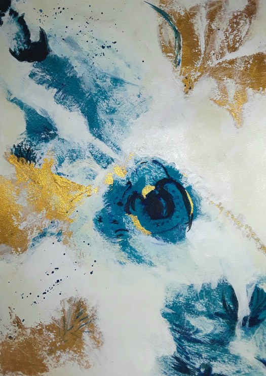
Blue and Gold 1, inspired by Yvette St Amant
To be honest, this is a copy of the tutor’s work. Because that was the only way I could really understand the techniques used. Consequently, I don’t consider the painting as one of my own. However, it was a good learning experience – I experimented with using a palette knife properly. In addition, this was the first time I applied gold paint with some confidence. But I then needed to produce my own compositions, using the style and colours suggested. As a result, first I painted the one in the virtual room you see above. And this is more close up so that you can hopefully see the textures.
Blue and Gold 2
After that, I just had to try out the method in another painting, this time introducing some soft green. And downplaying the gold. What do you think?
Blue and Gold 3
By the way, it’s quite tricky to photo the gold paint and make it shine. Often it appears to be brown. Maybe I’m using the wrong acrylic paint! Anyway, that’s my little catch up on my abstracts and there will be more to follow. If you missed this post here, an earlier report of my new learning, you may wish to have a look.
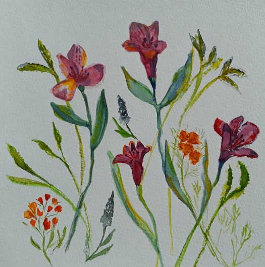
Good morning everyone. As you may know if you read my blog, I do like to follow online art courses. And I love to work in all sorts of media, and try out new watercolour techniques. So I thought I’d show you some more updates from the Watercolours Made Simple lessons.
Well, the idea is to paint flowers in a more general way than carefully including each detail of a particular flower. Actually, this is more difficult than it sounds. Because my visual memory is not too good, I had a photograph in front of me here. However I tried to view the general shapes of the blooms of the whole bunch and sort of invent newer versions of them. Obviously, such intense scrutiny of the flowers should feed into my memory. Which will help me next time I try this exercise in painting generic flowers. But why do I need to do this, you may wonder? Because then I can concentrate on placing the individual elements in a pleasing design. Afterwards it could be used for a greetings card, for example. Or just simply for a different kind of floral painting.
Alstromerias
Now, in this attempt above, I did in fact have the flowers in front of me, which made the exercise easier. Of course, I shall need a lot more practice, but it is quite enjoyable And a pleasant way of spending time on the new watercolour techniques I’m studying. Have a look at this post here for a realistic portrait of a bunch of flowers. Finally, I’ll leave you with an example of another way of painting flowers – semi abstracting from reality.
Good morning everyone. Well, it really feels like spring is here, for this week at least! And I love to have spring flowers in the house. As soon as these daffodils opened up, I just had to paint them! So I practised some of the watercolour techniques I have learned from an online course. In fact, after years of trying, I finally managed to loosen up a little with watercolour. That means, more water in the mixture and just nudge it into place, instead of controlling it more tightly. Actually, I was really pleased with the end result. In fact, I succeeded better conveying the papery texture of the petals this time, I feel. Hopefully, you can see that in my photo.
Daffs at Brodsworth
Because it was so sunny and bright, we went to Brodsworth Hall for a few hours. Perhaps you remember some of the other sketches I have shown you in this blog, we do go to this garden often. As you might know, the gardens are spectacular, in all seasons. By the way, I must admit that I definitely took artistic license with this view. Because I completely missed off the main building , being far too interested in the trees and the daffodils, tiny points of golden light that studded the grass. Perhaps I will use this quick sketch in watercolour and pen in plein air as a study for a larger painting.
Finally, I couldn’t sign off without giving a mention to my acrylic painting of spring flowers. At the moment, Daffs at my Allotment is part of my exhibition Picturing the Landscape at Rotherham Roar , see this post here . Alas, very soon to come down, so there’s just a few days to see it! Well, nothing lasts for ever, not even spring!
Good morning everyone. Today I thought I would feature some of the paintings at present on show in the Buzz Gallery at Rotherham Roar. And I think this must be my favourite, the tin roofed little house in the Outback. Actually, I did feel the heat as I was painting it, in my imagination at least. This was just one of my adventures in virtual travelling in Australia.
The Morning Sun on the Crags
Another one of the paintings I enjoyed painting was this beautiful view over the rocky, exposed crags . To be honest, I learned a useful tip from our tutor Rod Moore here. In order to achieve that effect, I painted the red rock colours with horizontal strokes and then dragged a dry brush downwards, carefully over the paint.
The Australia Section
Incidentally, I painted the Mary River picture on Rod’s course too. But this time in gouache, not acrylic. However, it didn’t make the final cut into the show. So, here it is for you to see.
The Mary River, Queensland, Australia
Well, I hope you enjoyed my virtual travelling along with me. It certainly lifted my spirits during the past two years, as you can see in this post here.
All my work is for sale at reasonable prices. For example, the Mary River painting is £40 plus shipping, unframed. Just go to the Contact Me page and send me an email for more details.
Good morning everyone. Today I’d like to show you the way my abstract painting is changing. The image above is one of my new abstracts, experiments I am creating as I follow a great online course. It’s calledPainting with Yvette. And, I’m really enjoying it. Because the colours and compositions are quite different from my own intuitive abstracts.
The Abstract Section of my Exhibition
The picture above is one of the sections in my current solo exhibition at Rotherham Roar. Actually, I am pleased with the way they came together. And each one has a particular meaning to me which evolved as I painted it. In contrast to that way of creating, my new abstracts are of course suggested by the tutor. Nonetheless, the brush marks are full of significance to me the artist. Perhaps in a more subtle way than in my earlier paintings. For example, the painting at the top of this post, The Path of Life, developed out of the suggestions by Yvette on colours to choose and techniques to use. I’m very often out of my comfort zone but I do feel that I am moving on.
The Path of Life
Another of my New Abstracts
Dominant
Anyway, I’m learning new approaches and techniques on this course so that I can apply them in my own work. So, it’s all part of a learning curve and I love it!
Pink and Blue 2
What do you think, is this old or new? Find out more in this post here.
Good morning everyone. This is just a quick catchup post, I’m quite busy with two exhibitions at the moment, so, more of that later! Anyway, we did an in house beginner printing workshop at Art Society last week. And we carved out designs on cheap polystyrene tiles. Honestly we really did have a great time. Firstly I concentrated on a simple star shaped design.
Stars 1Stars 2
Then I went a bit more fancy, added two colours, reversed the block for the second print and used cardboard to print on ( breakfast cereal packet, actually!
Which Way Up?
Finally, I went mad and printed white, black and orange on black paper. And I tore up the two blocks into pieces and over printed with them till the paper was saturated with ink! Perhaps you can see how the protective sheet of paper I placed on top ripped out chunks of the print. All because it wasn’t dry as I took it home. In fact, it didn’t dry for a week!
Black on Black
Anyway, it was great fun and we went home full of ideas to try out on our next printing workshop. You could have a look at more mixed media experiments in this post here.
Good morning everyone. My new solo exhibition is now open, until the end of March at the Buzz Gallery, Rotherham Roar. What a pleasure it was to put it together and then to see it actually on the wall. Actually, I haven’t displayed works on paper unframed before. And I was surprised at the immediacy of the paintings without glass or frames. In my opinion they made much more of an impact. And I could see this in the strong emotional reactions of the visitors. Admittedly, we did it this way because the walls weren’t suitable for hanging. However, it was a bright, lively display which demanded attention. Exactly what I wanted!
The Three Sections of my New Solo Exhibition
As I was choosing acrylic paintings on paper , I realised that they fell roughly into three categories: British landscapes, Australian scenes and abstracts. So, that was how I displayed them. For example, in the general landscape section I placed this painting, a scene inspired by enjoyable holidays in the Lake District, UK.
Next, here I can show you the Australian group of paintings. And these are some of the results of an online course tutored by Rod Moore from Queensland. When two of my artbuddies said how much it reminded them of trips to Australia, I was delighted!
The Red Path
Finally, my favourite section – the abstracted and semi abstracted landscape. In fact, I kept changing my mind what to include here. But, I had to make room for this one, which certainly commanded a lot of attention!
Jagged
Well, there certainly was a great deal of work in mounting my new solo exhibition, but I had a blast! And, to top it off, the minute the show was live, a very delighted customer took my ‘Bluebell Wood ‘ painting to a new home! If you want to have a look at the last solo exhibition I did before the pandemic, see this post here.
Good morning everyone. Today this is a short post because I’m insanely busy this week! Incidentally, have you ever noticed how everything happens at once?. Not only is my show opening this week, but I’m helping to put up our group exhibition at the weekend. And, I did squeeze in an oil pastel workshop at the weekend, which was brilliant. What a difference good quality materials make. In fact, it was quite a revelation to use artists quality pastels and paper on Saturday. Not to mention learning from our excellent tutor how to blend colours and create textures. So, I promptly ordered some pastel and oil pencils online and can’t wait until they arrive. Actually, the work we produced at the class will be on display for a short while, so more of that later. And there’s a cute little bird in oil pastel here , from a while ago.
Anyway, this is an enthusiastic little oil pastel sketch I did when I got home, to practise some of the techniques. Finally, here’s a taster of the work in my new exhibition, more of that in my next post.
Good morning everyone. Just a short post today, I’m very busy sorting out my new solo exhibition due to open next week. Actually, there always seems to be a lot more work to do than you plan for! Anyway I did manage to finish this muted abstract, the fourth in my series in the online course I’m following. To tell the truth, I did struggle with getting it right. But, at the same time I did seem to know a bit better where I was going!
Waves- a draft
Well, this is one of the earlier stages of the painting. Perhaps it’s not as easy for you to see these details on the screen, but I studied it long and hard. Then I toned down the little dots and dashes and brightened the white areas. Finally, I was satisfied and called it finished. Now I must learn how to use the wax medium I bought, in order to give it a protective coat. Because it’s painted in gouache and I learned the hard way that this is really necessary (don’t ask!). If you want to see the other paintings in the muted abstract series, look here and here.
Here’s a sneaky peek at my exhibition poster – more of this later!
Good morning everyone. I really enjoyed painting this gouache portrait of old kitchen scales at art group last week. One of our members brought in loads of fascinating old objects to inspire us to do a still life. And I decided to paint quickly, like I do when I’m out urban sketching. First I did a very quick pencil sketch to set the general shape. Then I drew with the brush, something I love to do. Also, I tried to show the grime and wear and tear on this well used weight scale. Which wasn’t all that easy , actually! And it felt good to paint from life – photos obviously have their place in my art practice. But, I feel that observing and recording an object sharpens up my drawing skills.
Old Saucepan
If I remember correctly, I painted this in the Victorian kitchen of our local stately home . Back in the day when sketching groups were encouraged to linger and draw ( about two years ago!) Anyway, I used pen and watercolour and chose this little group of utensils on the old shelf near the big, black range. By the way, one of the best days to visit is when they fire up the range and demonstrate baking for the big house.
Still life in my Kitchen
Finally, here’s a painting of a fish, caught at sea by a friend of a friend and being prepared for cooking. Acrylic on box canvas, I put it on my kitchen wall! And here’s another food still life you might like to see, this time fruit.
Fish
In fact, making this post reminded me that it’s high time I updated my Still Life and Flowers section in my gallery. Oh well, that will have to be something for another day- I’m far too busy painting today!
Good morning everyone. As I promised, here is the next one of my abstract experiments in gouache. And, you wouldn’t believe how many different versions I painted until I arrived at this final one!
To begin at the beginning, our tutor asked us to sketch potential compositions using shapes. I chose rectangles and a spiral and I painted in some of the soft colours suggested. And this is how it went.
Moving On – version 1
Well, this was ok but it didn’t look all that different from my usual type of abstract. Also, I thought it looked too busy. And so I decided to make more of the painting a restful creamy white.
Moving On – version 2
Now, I thought this looked better, but it still wasn’t right. So I added some gold – this is the part I love!
Moving On – version 3
Actually, I was quite pleased with this result of my abstract experiments. However, meanwhile, I had read the next lesson in the course. And I had begun to think about areas of colour forming the composition, as well as shapes. Honestly, I put down so many layers of gouache paint that I thought it might crack. Nonetheless, I struggled on and gradually eliminated the spiral, bit by bit. Until I arrived at the final version.
The Final Version of my Abstract Experiments
Moving On – the end result
Now I’m happy! Perhaps you’ve noticed that I also rotated it to find the best view. Immediately after that, I started painting two more! Of course I will show you these later. But I must point out that the moral of this story is: don’t change direction midway into a painting! Because it costs an awful lot of paint and also, it makes your brain hurt! Ah, let’s go back to the carefree days of quick, intuitive abstract painting like this here ! Only joking, I love it really.
Good morning everyone. Well, as I promised, I’d like to show you the first abstract composition I painted from Painting with Yvette. And it’s a new style abstract painting, for me, that is! Actually I found out about this course by chance, just at the very time I was feeling that I needed a change of direction. To be honest, as you might have noticed, the shapes and composition are not all that different from the ones I often use in my paintings. But, first of all, the colours are very different, or, in different combinations – see this post here. Secondly, there is a lot more empty space between the elements. As you might say, a bit more breathing space. Lastly, there are more definite calligraphic marks. In fact, our tutor Yvette St Amant is very generous with her advice and guidance. So I try not to reproduce her work, but to use the ideas and develop them into my own style.
However, I find it quite difficult to achieve and, I spend a few hours on each painting, but I do feel that I am learning. Indeed, I think this is the only way to achieve progress, to spend time practising.
Another New Style Abstract
Pink and Gold
Actually, have a look at the image this way round, I’ve just this minute noticedthat in this view, a totally different idea springs to mind. To me it suggests new things on the horizon.
A New Horizon
I think I like it better this way! And, putting gold paint on a painting and having it make sense in an abstract way is a first for me! So, I’m working on a couple more of these new direction abstract compositions at the moment. But quite slowly. And I will show you when they are ready. (By the way, these are gouache not acrylic)