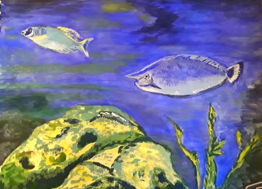
Waterlily Pond in Green and Gold

A semi-abstract interpretation of a tangle of lily pads. Green and gold on shimmering water, with glimpses of goldfish.  In gouache paint.
Waterlily Pond

Good morning everyone. Today I’d like to show you this gouache painting of a waterlily pond that I did for our Beginner Gouache group on Mewe. Well, the prompt for this month is Aquatic Life and I think it’s a great choice. Because it’s nice and wide reaching. For example, I decided to concentrate on a pool , or you could choose a river or the sea. And, even better, the Life could be animal or vegetable. Actually, the reference photo of this scene really appealed to me – it’s by Uriel Soberanes on Unsplash. In particular, I liked the arrangement of the waxy green pads, just lightly resting on the surface of the water.

The semi abstract approach to the leaves on the waterlily pond.

The Waterlily Pond – a closeup

To be honest, I was very attracted by the semi abstract jumble of leaves gently floating. And also, of course the shimmering light and reflections on the water and on the glossy pads themselves. Perhaps you remember that I am working on a theme of the semi abstract in these little gouache pieces. And you can click here to see my painting of a camel at the pyramids in this style. By the way, did you spot any other kind of life in the pond?

The Watercolour Version

A watercolour painting of waterlily leaves, in a small pond.
Waterlily Pond – the watercolour version

Finally, I just couldn’t resist exploring the subject a bit more and I tried a different medium. Frankly, I’m no expert with watercolour, but I do sometimes really love to play with it. Possibly it’s the complete contrast to acrylic paint that I like – wet and flowing rather than thick and textured. Anyway, I think I’m not done yet with this theme. And I looked up some images by Monet yesterday, seeking inspiration. So, watch this space! Meanwhile, here is my acrylic painting of a lily pond, with some more aquatic life!

A Bright Red Abstract Painting

A joyful. bright red abstract in acrylic.  With soft greens and earthy yellow ochre.

Red for Happiness

Good morning everyone. I finished this bright red abstract in acrylic a couple of weeks ago. And I propped it up on the dining table so that I could look at it everyday. Actually, after all that looking, I’m still not sure what it’s all about! Of course, I am aware that it doesn’t have to be ‘about’ anything. However, I do usually have some ideas on the main themes and so on. Strangely, I don’t in this case, but I do remember that I felt calmer and more settled as I was painting. So, maybe that was its significance, to me anyway.

The Bright Red Abstract, an Earlier Version

The bright red abstract as it progressed. This version is turned a quarter to the left.
The Bright Red Abstract, an earlier version

As I might have mentioned before, I do now always rotate the painting round as I’m doing an abstract. To be honest, I used to think that this practice was pointless. But I completely changed my mind and now, I find that it helps me to work on each ‘quarter’ individually. Perhaps you noticed that in the image above, I have turned the painting around. It was in fact the first version of the painting in watercolour. Actually, it’s an important part of the development of the piece. Also, it can help to prevent the artist from inadvertently making it into a realistic scene. For example, a landscape or a group of people. But, for me, the most intriguing thing is how the picture does suggest realistic images. Even after all I do to prevent it! And they always come as a complete surprise!

What Can You See ?

Red is Happiness

Of course, I haven’t talked much about what the viewer sees in this bright, red abstract, which is, of course, very important. So, that’s the deal – I paint it and you make of it what you like! And I hope it makes you feel calmer and more settled too!

As I remember, I wrote a post about red in abstract paintings. Mainly artjournal pages – earlier in lockdown last year. See here.

Incidentally, all my original artwork is for sale at reasonable prices. This one , acrylic on paper and 16 by 12 inches (unframed) is £60 plus shipping. And if you want to treat yourself, go to the Contact Me page and send me an email.

Painting Faces in Acrylic Paint

Painting faces. Two sweet cherubs, with small feathered wings, resting in rose pink and deep purple clouds,my study of Raphael's painting.
My Study of Raphael’s Cherubs

Good morning everyone. Well, I decided it was time to take the plunge and try painting faces! And I’m sure that lots of you will be familiar with this image taken from Raphael’s beautiful work. Because you do see it everywhere, on cards, tea towels, diaries and so on.

Raphael (1483- 1520) was an Italian painter and architect in the Renaissance period. In fact, he was very successful in his own lifetime. And he painted the little angels on this commissioned Madonna and child painting in 1512. As you can see, the clouds are not the same colour as in our Valentine’s Day version!

The Sistine Madonna by Raphael

Raphael's Sistine Madonna, a superb painting showing Mary and Jesus, two saints and the two adorable cherubs at the bottom of the picture.

As you can see, in this superb painting by Raphael, the scene shows us Mary, Jesus, two saints and the baby angels waiting and dreaming.

Anyway, I painted this study whilst following along with a free tutorial, hosted by Artclassesgroup. Actually, the tuition was very good and the tutor guided us through completing the angelic cherub on the left. You see, the session was only one hour long, so that, plus a bit of background was good going.Then I spent another hour and added the baby cherub on the right.

Half Finished Cherubs

The Three Stages of Painting Faces

Obviously, I was most interested in painting the faces, something I have tried to avoid in my painting practice. And that’s because it seems to me to be the most difficult subject of all. Fortunately, the tutor cleverly simplified it down and we were able to follow. To be honest, it had never occurred to me to treat the face like anything else I paint. So, firstly we mixed a reasonable flesh colour and covered the face in a mid tone. Then we darkened that colour mix and applied patches of colour for shadows. Lastly, (you’ve guessed it) we lightened the first mid tone and painted highlights, on the nose, forehead and so on.

Painting the Clouds

A close up of Raphael's cherubs - part of my painting faces project.
My study of Raphael’s cherubs

After all the careful brushstrokes of the faces, it was a real pleasure to let myself go and paint clouds! Not only were the colours so delicious, but also the subject really lent itself to expressive marks.And I enjoyed trying to create the fluffy texture of the wings too!

Painting faces- a close of my study of Raphael's baby angel.
A Cherub Resting on a Bed of Clouds

In all, I spent another hour to finish this and I would thoroughly recommend this exercise. Because there’s such a lot to be learnt from studying the work of great painters. And if you want to see how I painted my own version of a delightful abstract by Paul Klee see this post here.

English Cottages in Acrylic and Watercolour

English cottages- this one is a grand house beside a large, beautiful pond. Semi-abstract style.
The Red House by the Pond

Good morning everyone. Last week I took advantage of two free tutorials online and I painted English cottages. Although this one looks to be rather a grand cottage. Of course, the location of it is superb, right next to a tranquil pond. You see, Artclassesgroup is the name of the host, and the classes took place over our school half term week. Although, to be honest, a lot of children in the UK are at home anyway right now. But, nonetheless, the group provided some good activities which were designed to interest all ages, including adults like me!

The Reflections of the Cottage

Closeup of the Water and the Reflection

As you can probably tell, I painted this in acrylic and fairly rapidly too (the class was only one hour long, but I spent another hour on it as well). Actually, I felt out of my comfort zone using this colour palette, which can be a good thing. Also I enjoyed learning a different way of depicting reflections. In this case, I roughly painted the shape of the cottage, let it dry and then very lightly brushed over the greeny blue colour of the water. Then, when that was dry, I applied some fine ripples in dryish white paint, to show the flow of the water. And all the time, I was wondering about who lived there. And I imagined being able to gaze out over that delicious view every morning, as I opened the curtains.

English Cottages in Watercolour

This white English cottage is beside a river, running through a beautiful valley. Watercolour in realistic style.
The House down by the River

And now for something completely different! In my opinion, this delicate watercolour in more realistic colours and detailed style contrasts well with the first painting. Obviously, the acrylic painting had dramatic, heightened colours and a fairly abstract brushstroke treatment. However, they are both English cottages near the water. Well, I painted this one while I was following a good tutorial hosted by Care Visions Healthy Aging group. Incidentally, I have done a few lessons with this group, including this girl on the beach here , a tribute to Joachim Sorolla. But, to return to my watercolour, here I tried to include realistic detail (not my usual style, but good practice).

Closeup of the House by the River

Although my brushstrokes are only suggestions, I have shown quite a lot of detail in the shutters, the garden shrubs and the gate. Again, what an idyllic, peaceful place to live! So, there’s some more virtual travelling for us, and I hope you enjoyed it!

If you want to see a more humble style of cottage, have a look at this post here. Then you’ll see the miner dressed in his Sunday best too!

Looking at the Great Dufy

My study of an abstract painting by the great Dufy.  Showing boats jumbled up in a Mediterranean harbour, with sizzling colours.
My study of Raoul Dufy’s “Boats at Martigues”

Good morning everyone. Today I’d like to show you the study I made of a superb painting by the great Dufy. Actually, I did this while following a good online tutorial run by Art Enthusiasts London. Perhaps you remember my post about making a study of a Paul Klee abstract composition with the same tutor (see here ).

Unfortunately I haven’t got a lot of background about this painting. Raoul Dufy, 1877- 1953, was well known for his colourful paintings, influenced by Matisse, Cezanne and Monet. And I have long admired his bright, elegant scenes of smart seaside resorts in early 20th century France. Obviously here you can see a jumble of boats in the harbour- maybe on the Mediterranean coast.

The S Shaped Composition of the Great Dufy

Just look at how Dufy has simplified the shapes into ovals and straight lines. And then arranged them into a reverse S shaped composition, starting from bottom right and including all the boats. Masterly!

However, we also concentrated on the juxtaposition of the glorious colours the artist decided to use. No doubt they were inspired by the actual real details he could see at the quayside. But he then arranged them for maximum effect on the canvas. For example, he used complimentary colours green and red, blue and orange to make really sizzling combinations. As you can imagine, I found this exercise perfect for me – I don’t call my art activities ‘A World of Colour’ for nothing!

My Dufy Inspired Acrylic Abstract

My abstract composition,  possibly hinting at a coastal scene. Using colours and structure inspired by the great Dufy.
Coastline

To tell you the truth, I was so inspired that I straight away (well next day anyway) started do an intuitive abstract . I had a print-out of the original in front of me for colour reference. And then I just let my hand paint away. But that was stage one. Then came two more sessions adding and subtracting material, balancing shapes and colours. Until the picture said ” I’m finished “. What a satisfying experience!

I hope you like my little tribute to Dufy. And you can see more abstracts in my Gallery here. All my paintings are for sale at reasonable prices. Just go to the Contact Me page here and use the form to email me.

Mood and Atmosphere in Abstracts

An abstract composition,  reminiscent of a bright woodland scene with a paved path to follow. A cheerful mood and atmosphere.
Down the Path

Good morning everyone. Today I’d like to talk about mood and atmosphere in intuitive abstracts. And, just to make it clear, by intuitive this is what I mean. Simply that I sit down to paint a smallish abstract work in my art journal. And I don’t have any idea about the colours and shapes I’m going to use in the composition. In other words, I work instinctively. On the other hand, that doesn’t mean to say that I am not influenced by what’s happening around me.

Also, I notice more and more often that I unconsciously choose colours and sometimes styles that I may have admired in other artist’s work. In addition I seem to include the contrasts and textures I have noticed in the natural world. But, as I said before, none of this is by deliberate choice.

Bright Mood and Atmosphere

In this little piece, I think my mood must have been upbeat. Because I went for cheerful yellow and glimpses of blue sky. Then trees and branches popped up so I went with the idea of a forest, one of my favourite motifs, actually. And, although I worked on this by rotating it round all four ways, the path was clearly obvious. So I guess my subconscious was showing me that there’s still a way to go. So, keep on keeping on!

Cheerful Optimism and Determination?

A close up of the paved path, stretching out before you, leading to the sun.
The Path

Incidentally, I wonder if this scene makes you feel the same as me? Because, of course, I have only discussed the intention and reaction of the artist. However, the reaction of the viewer is also very important. And, with a loose work like this, you can interpret it any way you like. I am sometimes quite fascinated when I talk to friends who visit my exhibitions. Naturally, at the moment this is not possible in the real world. Thank goodness I can show you my work virtually like this! And, we have all got to walk down that path a little bit further yet. Stay well.

If you want to see more of my little intuitive abstracts in mixed media, see this post here.

Studying Old Masters – Acrylic Painting

A Study by me of “A Small Rhythmic Landscape by Paul Klee

Good morning everyone. Over the years I have done my fair share of studying old masters, in paint and pencil. In fact, I have always considered it a very useful exercise. And you can learn quite a lot by trying to recreate some of the effects produced by the artist. Actually, this seems to work whether you use the same materials or not. For example the type of paint e.g oils or acrylic, or support (canvas or paper) and so on. In my opinion, there’s always something to be gained by looking closely at the composition, choice of colours and the actual brushstrokes.

And, in my experience, it doesn’t matter which stage you are at in your painting journey. But, the key point is to approach the exercise with the intention to learn . And not to put too much pressure on yourself to paint an exact copy. But it is more enjoyable all round if you choose an artist you admire, or even love! Ok, I confess, I’ve got quite a few ‘ Van Gogh’s ‘ in the archive!

Studying Old Masters – Joachin Sorolla

A study by me of a joyful, bright abstract landscape by Paul Klee with hills, trees and flowers. Studying old masters.
A study by me of ‘ Lowtide – Elena at Biarritz ‘ by Joaquin Sorolla

Well, this is the study I painted in acrylics a few days ago whilst following an online tutorial. Actually, see here for my post on a John Sell Cotman study I completed with this same tutor. To be honest, I’m very fond of this Spanish artist, Joaquin Sorolla, and he is very well-known for painting light. As you can see, I attempted to show the glare of the hot summer sun at the beach. In particular, the extremely subtle play of light on the white cotton material of the young girl’s dress. Admittedly, not an easy task, but it really made me practise mixing slight shifts in tone. And, I will need to improve this skill if I want to progress in my painting. In effect, this is the value in studying old masters.

My Study of Paul Klee’s Abstract Landscape

A study by me of ‘ A Small Rhythmic Landscape ‘ by Paul Klee

Finally, I’d like to show you my study of a fab abstract landscape by Paul Klee. He was a Swiss artist who taught at the famous Bauhaus school of art and design. And I love everything he painted! In order to recreate this work in the class I followed online, we first laid down the grid of lines . As you might imagine, these represent the contours and field boundaries of the land. Then came the fun part. First of all, a soft , hazy background of light brown. Then we treated each section separately using a limited palette of yellow ochre, cobalt blue, crimson, black and white. And the finishing touches were the ‘lollipop’ trees and the tiny flowers.

To sum up, whilst working on this piece, I concentrated on choosing harmonious combinations of the colours obtained from the limited palette. Also, I had to think very carefully about the placement of the features in this tightly controlled composition. If you want to see some of my much less tightly controlled abstracts, see this post here. But, I just love studying like this – an unexpected bonus of having lots of free time at the moment.

Through the Trees – Recent Paintings

An acrylic painting of a warm, sunny landscape  - through the trees, looking at the light of the sun.
Afternoon Sunlight

Good morning everyone. Yesterday I was having a look at all the paintings I’ve been doing since last March. And I noticed that quite a few of them feature light shining through the trees. For example, the image above is my latest acrylic done for the online course I’m following. To tell you the truth, I just love the way the shadow of the trees is laid down in stripes with the rays of the late afternoon sun.

Cheerful

In contrast, I did this intuitive abstract in mixed media back in March. You see, that was when our first lockdown started in the UK and things seemed very black. Actually, this was one of the earliest pages I completed in the journal I started. And this really did help me through. As you can see, I instinctively went for a sunlit view through the trees. Nothing was planned beforehand and afterwards I even wrote the word ” cheerful ” on the page to reinforce the optimistic message.

A Light at the End of the Tunnel, Through the Trees

A story picture.  A figure looking towards the light at the end of the tunnel, through the trees in a primeval forest.
A Light at the End of the Tunnel

And finally, I painted this acrylic canvas last April, when we were beginning to talk hopefully about vaccines . In fact, this was the third piece in a triptych telling the story of how the world has been altered by the human race – see this post here if this interests you. ( I subsequently added another two chapters to this story to give it a really happy ending! ) And, I must say, I have continued to paint around the subject of light shining through trees right up until now. But, I’ll save that for another post!

All of my work is for sale. So, if you like what you see, have a look in my Gallery page, and then go to the Contact page to have a chat (by email).

Three Mixed Media Abstracts from my Artjournal

A jumble of sharp, jagged shapes and urgent flashes of red - a mixed media abstract showing anxiety and fear.
Jagged

Hello everyone. Today I’d like to show you the work I’ve been doing in my art journal – some mixed media abstracts. Actually, I’ve continued using this journal since last March, when our first period of lockdown began. To be honest, I turn to it when I’m feeling a bit overwhelmed. As you can see in the image above, this intuitive abstract composition is quite dark and sombre looking. And there are some spiky shapes and touches of bright red to indicate danger. In fact, I used gouache paint, pencil and pen, and afterwards I felt much better!

An Experimental Mixed Media Abstract

Yellow and Grey

This drawing above is a good example of how I also use my journal to experiment with different techniques. As you can see, here I limited myself to lemon yellow and medium grey. Because I wanted to create a piece for a challenge in the Triwing Challenge group on Mewe. In truth, I would probably never have chosen this combination of colours. But it was very enjoyable and concentrated my mind on texture. You see, I had seen some fab work online with really densely applied layers. And, I used pencil, marker and oil pastel in this drawing. There’s a great freedom in scribbling in a journal. In addition, it’s therapeutic too!

A compact,crowded abstract composition of organic shapes in orange, yellow and dark green.
New Style Abstract

Finally, I’m quite proud of this little painting/ drawing. For, I tried a new style – a composition centred in the middle of the paper, with lots of white paper showing. Obviously, it’s quite different to my usual style which completely covers the space on the paper. And I tried adding graphic marks on top of acrylic paint with markers and biros. Watch out, I feel a series of mixed media abstracts coming on!

If you would like to see more Lockdown Artjournal experiments, see here and here.

Christmas Robin in Oil Pastel

Christmas Robin

Well, folks, it’s nearly here, so I thought I’d show you my Christmas Robin. In fact, this is the second version and I did enter them both into the Birdmas challenge. It was hosted by the Triwing Art Challenge blog on Mewe. Honestly, the artwork presented for this fun project was first class – Draw Twelve Birds for Christmas. And, I’m pleased to report that I did complete it in twelve days, running from December 1st till Dec 12th!

Robin in a Thorn Tree

So, here’s version one- a quick watercolour sketch in my art journal. And the super photo I used for inspiration was taken in my daughter in law’s garden. You see, she loves feeding the birds who visit and some of them become quite tame, like this lovely little Christmas robin.

The Abstracted Version of my Christmas Robin.

A Christmas robin,  drawn in oil pastel,  perching on a little branch in a thorn tree.
The Christmas Robin

After I had drawn a couple of straight up, realistic birds, I suddenly felt that I wanted to branch out a bit and use my imagination a bit more. So I drew this alternative version, and really enjoyed myself! Because I chose oil pastels from the very first sketch , I knew the lines would be a bit unpredictable. But, that’s ok – I really did want to create a loose drawing. So, this is my Christmas card to you – have a good one, in the circumstances, that is .

The Crazy Bird

A quick sketch in acrylic  marker.  Drawn from my imagination,  a bird in green and red feathers with a crest on its head, to keep my Christmas Robin company.
The Crazy Bird

Finally, here is my ten minute, acrylic marker crazy bird, created purely to cheer us all up! If you want to see more of the birds I painted for the challenge, see here and here.

Two Acrylic Practice Paintings – Works in Progress

A dreamy view over the beautiful Australian countryside to the distant Mountains m, in the early morning light , one of my acrylic practice paintings.
The Red Path

As some of you may know, I am following an online course on painting at the moment. And I’d like to show you two of my acrylic practice paintings. In fact, the painting above is almost completely finished and I decided to leave it a while. To be honest, I am learning such a lot on this course. And I want to think a bit more about the techniques and design ideas I now know about. Then, later I will bring the painting to completion. However, I am fairly pleased with the stage I have brought it to. Incidentally, this method of working is quite new to me. Actually, I usually work in a more impulsive manner, but I do always put a lot of thought into my paintings.

New Techniques and Design Ideas in my Practice Paintings

In this painting, I used a different choice of colours on the palette, following the instruction given. And, this took me right out of my comfort zone, which can be a good thing! But, as you can see, these were the right choices for this dreamy Australian landscape. Secondly, I attempted to blend the colours in the sky – again something I never try to do. Admittedly, I need to practise this more, but then, hopefully, I will have acquired a new skill.

The Tribute to Monet Acrylic Painting

A spectacular deep lily pond with pink and white blossoms - one of my acrylic practice paintings.
The Lily Pond

Again, I must make it clear that this one of my acrylic practice paintings just lacks the final finishing touches. And , I’m prepared to leave it a while before I decide how much extra detail to add, if any. As you can see, there were plenty of challenges in this. Including, naturally, the subject – reflections on still water, a subject I have skillfully avoided until now! Well, I did do my best, but there’s room for improvement. On the other hand, I managed to suggest perspective in the floating flowers and leaves. That is, to put it simply, the furthest ones smaller and the nearest ones bigger and all at the correct angle to suggest they are lying on the water. Baby steps I know, but it’s very valuable to a self taught artist like me ! I really can’t wait to see what else I can learn. If you want to see a painting that I completed with the tutor’s help, see this post here . I will post another update soon!

My Online Learning – Gouache Landscape Painting

A sunny landscape in Australia with a small river flowing through a limestone gorge - a gouache painting done as part of my online learning.
The Creek

Good morning, everyone. I’d like to tell you about the online learning that I’ve been spending time on these past two weeks. Well, it was a free five day challenge. But I could take my time with it and that was much more doable. Actually, it was very well structured and each unit was almost self contained.

The Colour Mixing

The Colour Chart

So, we started off experimenting with colour mixing using a restricted palette – ultramarine blue ( my favourite ! ) , crimson red and yellow ochre. The yellow ochre was a bit of a surprise as the primary yellow. However, I was pleasantly surprised by how many lovely colours I could mix with this combination. Of course, white was also allowed. In fact, the main benefit of this exercise for me was that I actually sat down and did the chart. To be honest, I’ve always been too lazy to do it before!

Online Learning – the Tonal Sketch

A quick sketch of the landscape in black, white and grey to show the light and shade, part of the online learning.
The Tonal Sketch

Again, for me this was very helpful. Because I am always in too much of a hurry to plan out a light and shade version of my subject. Despite knowing that it is a Good Thing to do ! Anyway, we concentrated on five tones between light and dark. As you can see, I struggled with the ones in the middle. But, my excuse is that gouache paint is quite difficult sometimes. In fact, it can dry a different shade from the one you thought you had mixed.

The Blocking in Stage

Again, this section of the process was done quite methodically, instead of haphazardly, which is my usual method of working. In my own defence, I am a self-taught artist and it’s good to get some proper tuition.

The Finished Painting

The Creek

Finally, after two more excellent sessions, I produced this thoroughly finished off gouache painting of a summer landscape in Australia. I really did enjoy the online learning and the end product. And, I must say a big thank you to Rod Moore of the Learn to Paint Academy see here . Imagine, all this top class tuition was a fab free gift and I appreciate that. Happy Painting!

If you would like to see more of my attempts at showing light and shade in the landscape , see here . There’s another bright, sunny woodland scene in that post too, to cheer us all up!

Curved shapes in Acrylic Abstract Painting

An abstract composition, soft organic  shapes in coral contrasted with interlinking lines in teal.
Trapped

Hello everyone. This morning I thought I’d like to show you the latest in my series of acrylic abstracts. And this one, yet again is largely made up of curved shapes. Perhaps you can see in this painting how I was influenced by the present situation. In a sense, you could interpret it as organic creatures confined behind the mesh structure. Possibly a reflection of lockdown ? But, that’s not the whole story. To be honest, I was also thinking about my ‘stained glass ‘ theme which I was developing a few months ago. And, as you can see, I really got carried away with the beauty of the soft, amorphous coral coloured masses . And, what a glorious contrast they make against the teal blue.

More Curved Shapes

Curved Shapes in Gouache

This is just a quick doodle in gouache – part of my experiments to understand how to handle the paint. However, I was struck by the fact that I automatically draw rounded shapes, inspired by nature or imagination . Very rarely do I want to include many geometric or straight edge shapes in my compositions. And , I must admit, I do sometimes feel out of step with the modern trend in abstract painting . Because it seems to be composed of squares, rectangles, angles and straight edges. In fact, the very opposite of my soft, curved shapes !

The First Big Rounded Abstract

Breakthrough  - an abstract composition in yellow, gold and vibrant blue.
Breakthrough

I wonder if you remember this one from July this year ? Actually, this is the one that set me off on my mission to go larger with my round, gestural shapes. If you want to see more of the story behind this acrylic abstract see here .

Art for Sale

Trapped – in Coral and Teal

But, to go back to the star of the show, this painting is now for sale ! It’s in acrylic on paper, 16 by 20 inches, unframed. And, it’s at the very reasonable price of £60 plus shipping . I’m based in the UK and you can pay by PayPal. So, just go to the Contact page here and send me an email. Then you can have this in your home and look at it and lose yourself in the calm, comfortable, soothing atmosphere.

Landscapes in Gouache Paint – New Experiments

An atmospheric view of the sunrise over the sea in tones of greys and blues.
Sunrise

This is my first attempt at a very small painting in my experiments on landscapes in gouache, 6 by 4 inch. You see, I watched a lot of great videos online about this medium . And I was very impressed by the amount of beautiful detail in these little paintings. So, here’s my first try – just ignore the botched border . ( I’ve had some issues with the tape I used, anyone got a good recommendation? ) Anyway, this photo was given to me by a friend and it’s a sunrise scene from New Zealand. Actually, I also tried to concentrate on tonality, and I struggled with the different tones in the cliffs and hills. But, it was a good exercise and I think I did learn a bit about seeing the values of colours in the landscape Just to make it clear, this means identifying where the shadows and colours are light, darker and darkest.

A Second Attempt – Landscapes in Gouache

Down the River

As you can see, this was the second of my landscapes in gouache on a smaller scale. In fact, it’s one more super scene from a trip to New Zealand. And again, I foolishly set myself two challenges on this. Firstly, the small size (6 by 4 inch ) and secondly how to capture the quality of light on the water. To be honest, working in this way tends to make me paint more tightly and carefully. And that’s not really my style but, again, I did call this a series of experiments. Realistically, I can see how my practice on the tones of faraway hills did help here. As did the use of white gouache to create convincing water in this wide river !

A bright, cheerful gouache painting of a small stream, shaded by trees in a sunlit wood.
The Brook in the Wood

Finally, in this piece, I treated myself to a slightly larger sheet of paper 6.5 by 6.5 inch ( in a mixed media journal). The photo is by Nicola Soricelli Boerer on Artists Free Reference Photos. I must admit, I do feel a bit more comfortable with the paint now. However, I’m still learning all the time about how to paint layers without making mud! To explain, the paint never dries which makes washes and detail over a previous layer tricky ! But, I must confess, I find it quite addictive and I’m looking forward to more experiments. If you want to know more, there is a good video by Sarah Burns here .If you want to see a wood that is atmospheric in a different way (The Boy and the Bird ) have a look at my Gallery here. In fact, I almost included this one in my Halloween post here , but then I thought that might have been a bit over the top!

Autumn Colours- a Gouache Painting

A beautiful old tree in autumn colours,  next to St. Mary's church in churchyard.
St. Mary’s

Hello everyone. Don’t you think the autumn colours have been beautiful this year ? Happily, this charming church in its tranquil garden churchyard is about five minutes walk from my house. To be honest, you wouldn’t think it was right in the middle of a busy town . Yes, I know it isn’t as busy as usual right now. But even when there are no restrictions, it still has that air of peace and quiet.

In fact, there are some glorious trees in the garden , each with its own unique character and shape . Of course, I can enjoy the sight of them all year round, in every season. However, the trees in their autumn colours have to be the most impressive sight of all.

The Dancing Leaves in Autumn Colours

The Dancing Leaves

So, in this closeup of my gouache painting, I really tried to show how the subtle yellow green leaves flickered and gleamed in the autumn sunshine. Well, I tried but it was an impossible task really.

More Autumn Colours

A basket of ripe, red apples in a basket - autumn colours in the harvest.
The Apple Harvest

As it happens, this is an oil pastel drawing of last year’s harvest. But the tree is very reliable and we usually get to eat these delicious fruits all winter ! Actually, this painting was on display for a few months in the Rotherham Art Cafe here .

A bright, impressionistic sketch of a tree in a beautiful garden, full of autumn colours.
View from the Glasshouse Window

Finally, something completely different. To explain , I went to a printing workshop in the elegant Victorian conservatory at Wentworth Castle Gardens last year . It was part of our Inktober 2019 activities. And, this is my impressionistic painting of the show of autumn colours in the garden, through the window. And, if I remember correctly, I used some acrylic inks to do a quick sketch, while my print was drying !

In my opinion, this time of year is truly beautiful. And, the display doesn’t last so long. So, get out and enjoy it while you can !

New Paintings for our Exhibition

A bright, colourful abstract composition in orange and blue. One of the new paintings for our exhibition
Sunshiny Day

Last Friday I went to look around our gallery in the Ridings Shopping Centre in Wakefield. Perhaps you may remember that I am a member of an artists group called Northern Fringe Artists. And we have a lovely gallery in a shop unit there. So I took some new paintings for our exhibition. Obviously, we like to change things around so that visitors have something fresh to look at. Actually, I’m quite fond of this painting – Sunshiny Day . In fact, I painted it quite simply to cheer myself up last year . Because we were in the middle of a dark , damp winter and I was longing for some sunshine! Incidentally, I borrowed the title from the lyrics of a song by Bill Withers ‘ Lovely Day ‘, an old favourite of mine.

Elephant Festival

Another One of the New Paintings for Our Exhibition

To be honest, this was great fun to do. In my opinion, elephants are fascinating animals to paint. I could really go to town on the pinkish tinge of the skin on the elephant’s face and ears. Actually , I’ve done another sketch of a model of an elephant in battle armour . It’s somewhere about -I’ll find it and show you soon. As I recall, I was at the Leeds Armouries Museum, back in January, with Urban Sketchers Yorkshire. Do you remember those days when being out with a group of friends was a pleasant, stress-free experience?

The Apple and Pear Harvest

A semi abstract scene showing apples rolling on the grass under the tree - green and red.
Apples Falling

When Inspiration Strikes

As you can probably see, I used this painting for one of the online posters I made for my solo exhibition. Have a look at this post here to see the other paintings on show in January this year. However, this painting does have a nice back story. Well, we went to Cannon Hall Museum, Park and Gardens last year to join in the celebrations on Pear Day. There are lots of heritage varieties of pear trees in the Walled Garden there. And, it’s usually quite a jolly day. As usual, I took my sketchbook with me. And , in spite of all the luscious pears on display, a box of apples, spilling out over the grass caught my eye. A couple of watercolour sketches and a few photos later, I went home and started painting an acrylic painting of the scene. You see, when inspiration strikes, you’ve just got to go with the flow!

Experiments in Gouache

An abstract in  bright jewel like colours divided by a diagonal line. One of my Experiments in gouache.
On Either Side of the Divide

This is the very first of my experiments in gouache paint. Because, as you might know, I paint mostly in acrylic and also sometimes in watercolour and mixed media. Anyway, I picked up a couple of very cheap starter sets of gouache paints. Actually, as far as I can tell, the paint is watercolour as a base and then body colour is added. Hopefully, I’ve got that right – I’m no expert! In fact, the combination of the two elements makes the paint opaque instead of translucent. And then, obviously, it doesn’t behave on the paper exactly like watercolour. As you might be able to see, I tried to apply it as acrylic on this painting. But , it isn’t acrylic either, so I couldn’t layer it on thickly as I tried to do. I’m not sure where this leaves me, which is why I am calling these paintings experiments in gouache!

More Experiments in Gouache

Fetching Water – reference photo by Ibrahim Rifath in Unsplash

This is a little painting I did on unsuitable paper in my art journal for a great new group I have joined. Well, it’s called ‘Beginner Gouache’ and it’s on a new media platform MeWe – new to me , anyway. To be honest, I like it because we can pass on useful tips to each other about the painting process . Also, because it’s a lovely group, we can encourage and support each other at the same time. However, to get back to the unsuitable paper, it’s mixed media paper in my art journal. And it does a pretty good job of handling most of what I throw at it – see this post here . But very wet gouache paint is a step too far for it, as I have found out in my experiments in gouache. And, if you want to watch a good tutorial on using gouache, click here . As you will see, the medium is very versatile ( and the artist Shari Blaukopf is very good too! )

Another Abstract in Gouache

Doodle Abstract

I really enjoyed working on this. Actually , I was reading a good book on abstract composition which reminded me about the ‘ doodle and fill it in’ approach. But the book also taught me about the importance of colour balance in abstracts. And I tried to put it into practice in this painting. To sum up, I really like using gouache. However, I do consider myself to be a beginner. And I’ll probably show you a few more of my experiments as I go along!

Drylands – Art for Sale

Picture of the Month

Drylands

I just finished this acrylic painting today , and I wanted to show it to you straight away ! This painting – Drylands – Art for Sale – needs to be featured all by itself, I think . To be honest, I am quite pleased with it . You see, it’s another experiment with a restricted palette of colour. And this time, I used soft browns, vibrant orange and a touch of gold. In fact, I mixed the shades of brown from blue and a ready made orange. Surprisingly, this combination includes the three primary colours red , yellow and blue. Because, of course, the orange is a mixture of red and yellow. ( In actual fact, it took me a while to figure this out ) . And I had never tried to mix browns before, always using the brown umber straight from the tube. But, I must say, I really prefer the DIY mixtures. And, that’s what I like about these experiments – I always learn something!

Drylands – Art for Sale -The Dead Trees

A detail from ‘Drylands’

Clearly, when I painted this parched landscape with its swathes of dusty foliage, I must have been thinking of the climatic changes taking place in the world. For example, it seems that dry, hot regions seem to be getting hotter and drier. If you would like to see another surreal landscape painting, look at this post here .

A close up of the sky

I’m including this shot in order to try to show the intense and rich colour of the sky . There are also passages of interesting textures, as there are on most of my paintings. Unfortunately, these details don’t show up so well on a screen.

Well, I hope you like my painting ‘Drylands’ . As I said earlier , it is a work in acrylic on paper, 16 by 20 inches, unframed and without a mount. And , it’s priced at £60 plus shipping ( I’m based in the UK ). So you can pay by PayPal and I’ll package it up and send it off to you without delay ! Just go to the Contact Me page here and send me an email for further details. Then you can frame it to suit your taste and enjoy soaking up the evocative atmosphere it seems to create.

Drylands – Art for Sale

Magazine Article about my paintings

Bluebell Wood

At last – I’m famous ! (Well , nearly ). Because there is now a magazine article showing my artworks. To explain, I am a member of the Barnsley U3A group. And this is a great , world wide organisation which is run entirely by volunteers of retirement age . In fact, we are called the University of the 3rd Age . Perhaps you have heard of us – our aim is learning, companionship and fun ! The group in my home town is fantastic . So when Derek , editor of our branch’s magazine asked permission to publish some of my paintings I quickly agreed !

The magazine article

To be honest, Derek had seen my work on this website, which is nice. Hopefully, you can read the text as it is a bit small. There are just over a thousand members in the group now , I think. And our magazine ‘ The Buzz ‘ is also published on our website see here .

More Paintings from the Magazine Article

A soft dreamy painting of a street in the south of France on a hot afternoon- featured in the magazine article
Somewhere in France
A semi abstracted scene of jungle vegetation  - Paradise. Featured in my magazine article
Paradise

These two images above were also featured in the magazine article. In addition to some details about the artist groups I belong to including Northern Fringe. Have a look at this post here to see our latest exhibition ‘Inspired ‘at the Ridings Centre, Wakefield. It’s about the third exhibition down.

To be honest, I did also promote Barnsley Art Society too. Although we are not very active at the moment, obviously. But you might be interested to have a look at our Facebook page here . Who knows , if you are nearby , you may like to take part in our arty activities when we start up again.

Of course, I didn’t forget to say some nice things about the U3A group too ! And they were all quite sincere. Actually . I belong to the painting group which we attend each week. And I also really enjoy the drawing group which inspires me to practise drawing skills . In actual fact , I really do need the practice ! Finally, I’d like to say a big Thank You to Derek for putting together a great Autumn issue during Lockdown ( especially the bit with my feature! )

Watercolour Flowers from my Allotment

A bright bunch of watercolour flowers in a small, glass vase
Watercolour Flowers from my Allotment

When I want to do a quick painting I will often sit down at my dining table to work . Of course, if I have a large chunk of spare time, I go into my ‘ studio ‘ . To be honest, this is also known as the spare bedroom and it’s where my easel is set up. And , this is where the acrylic paints live. So it’s all a tiny bit more serious ! Anyway , I had half an hour – so I gave myself a little treat and just painted. I chose watercolour flowers from my allotment. Actually, I had noticed last Thursday that I wasn’t achieving the results I wanted with watercolour . I was out urban sketching with art buddies in the park – see here . And when I looked at my friend’s lovely delicate sketch of the mansion, I realised I could do better !

Trying different watercolour paper

You see, I always use the same brand of paper in different , handy sized sketchbooks when I’m out plein air painting. In effect, I was well satisfied with the quality. But, things had changed and the paper was now quite poor. And , it took me a while to notice ! So, out came some better watercolour paper from the stash. And , now I could try laying down pools of colour and wet in wet technique without fighting to drag the paint over the paper !

More Watercolour Flowers

Sweetpeas and other watercolour flowers in a pretty china cup.
Allotment Bunch
Another Allotment Bunch

As you can see , I did manage to find some decent paper for these two paintings of watercolour flowers. These are from a little while ago and , quite by chance it would seem, the paper was better ! Well, now I know and I won’t make that mistake again !

Watercolour Flowers from my Allotment

For those who like to know , here we have cosmos, sweetpeas, marigold, cerinthe and sweet Williams. A real cottage garden bunch. For lots more flowers in all kinds of media , see my gallery here .